If you are using an outdated version of DHTMLX Suite 5 and require the documentation for it,
please contact us,
and we will send it to you.
Our aspiring JavaScript widget library has received a new update 6.3 with essential UX enhancements and deeper UI customization. From now on, end users can handily navigate through Grid cells with the help of keyboard shortcuts. Developers can create any kind of custom HTML content inside DHTMLX Grid, TreeGrid, Menu, Ribbon, Toolbar, and Sidebar components. Besides, the library obtains an AJAX helper for creating asynchronous web apps on the fly.
Get down to testing a new version 6.3 free of charge for 30 days >
Grid and TreeGrid Updated
Keyboard Navigation in Grid
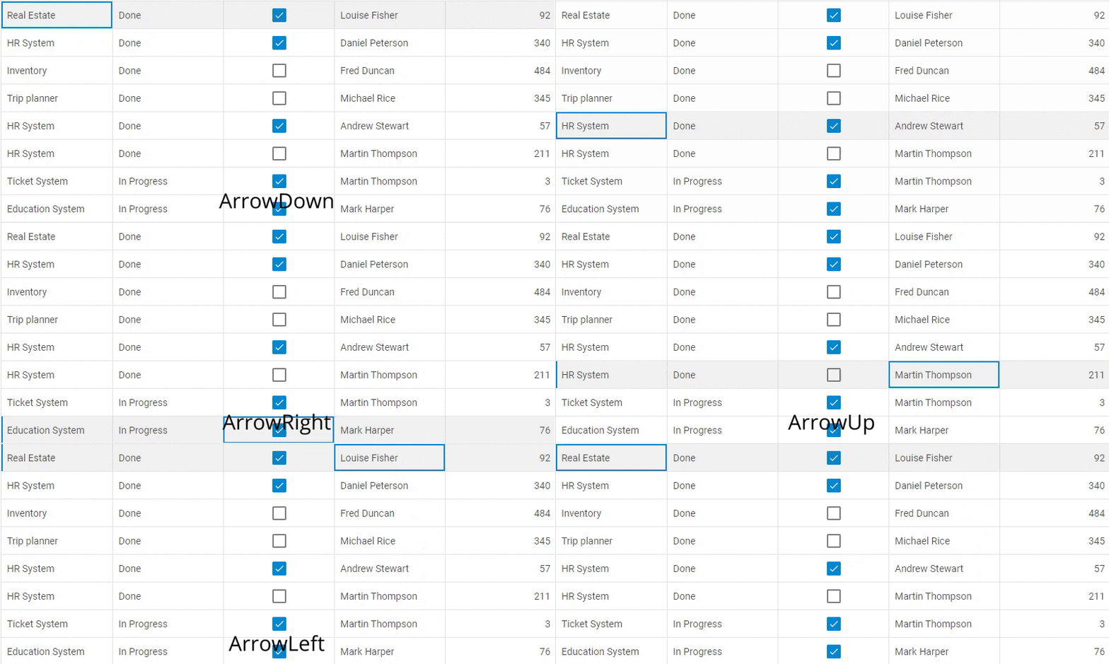
V6.3 delivers a convenient set of keyboard shortcuts for navigating data in Grid. Due to a wide variety of shortcut keys, developers can greatly speed up the work with huge data tables. The default set of shortcuts enables users to scroll the grid up and down as well as navigate to the beginning or end of the data table, while the selected cell remains unchanged.
If needed, developers can quickly disable the default keyboard navigation:
columns: [// columns config],
data: dataset,
keyNavigation: false
});
Additionally, the selection property enables developers to make the selection of cells possible for end users with the help of shortcut keys:
 Check the sample >
columns: [// columns config],
data: dataset,
selection: "complex",
keyNavigation: true // true - by default
});
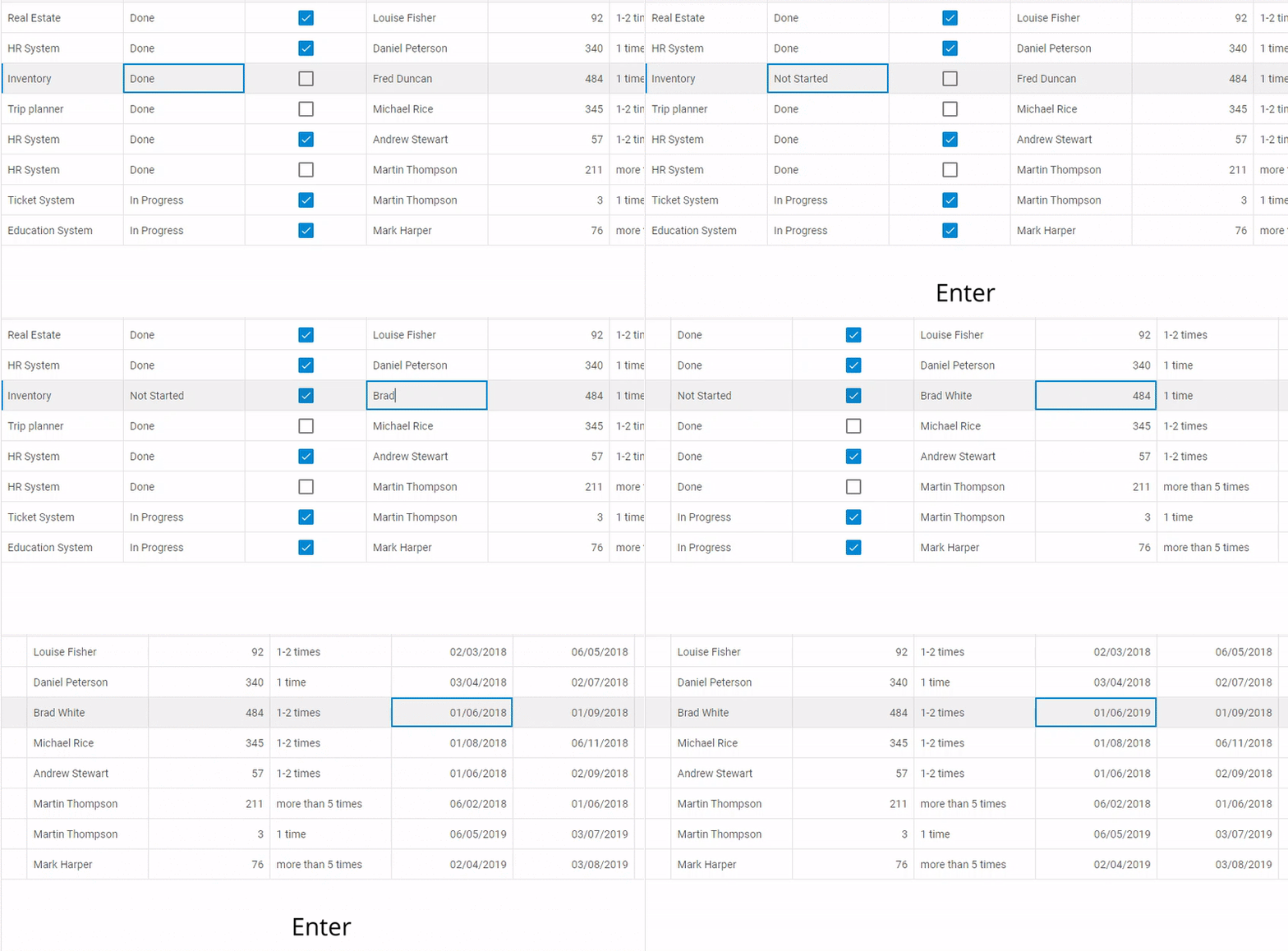
Besides, developers have broadened keyboard navigation in Grid to provide end users with shortcut keys for editing the content of cells. The Enter key opens an editor and allows saving changes, while the Esc key closes an editor without saving changes. To enable this feature, you need to set the editing property in the configuration object of Grid to true:
columns: [// columns config],
data: dataset,
selection: "complex",
editing: true,
keyNavigation: true // true - by default
});
Custom HTML Content in Grid and TreeGrid
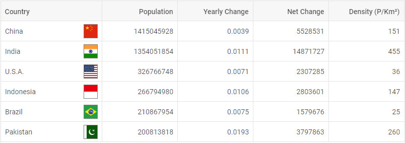
More customization opportunities have come with v6.3. The update brings out the ability to add any custom HTML content into the cells of Grid and TreeGrid right in the dataset. You can choose whether to use custom HTML elements either in all columns or only in particular columns of your data table.
For instance, in order to display countries’ flags together with their names in the first column of Grid, you need to specify the path to an image of the flag in the dataset and apply the htmlEnable: true configuration property:
{
"country": "<span>China</span><img src='../flags/cn.jpg' />",
"id": "1"
}
];
var grid = new dhx.Grid("grid", {
columns: [
{
width: 200, id: "country", header: [{ text: "Country" }],
htmlEnable: true
},
{
width: 150, id: "urban", header: [{ text: "Urban Pop" }]
},
// more columns
],
data: dataset
});
Menu, Ribbon, Sidebar, and Toolbar Updated
Custom HTML Content
There is no limit to customization possibilities of your web apps with DHTMLX. V6.3 rolls out the ability to equip DHTMLX navigation components (Menu, Toolbar, Ribbon, and Sidebar) with any kind of custom content you might need to see in your apps. It’s possible to add a custom element like an image, icon, or other HTML content into the component itself or into its controls:
 Uploader inside the Ribbon component. Check the sample >
The add method makes it easy to add custom content to the component – DHTMLX Ribbon in the first example above:
type: "customHTML",
html: "<div id='preloader'><div id='loader'></div></div >"
});
Meanwhile, the html property allows displaying custom content inside a control – for example, showing the uploader in the Progress button of DHTMLX Ribbon:
type: "block",
title: "Progress",
items: [
{
html: "<div id='preloader'><div id='loader'></div></div >",
size: "auto"
}
]
};
The same principle applies to other navigation components: Menu, Toolbar, and Sidebar.
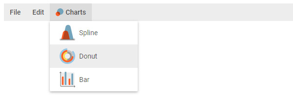 Menu items with custom icons. Check the sample >
Charts Updated
Minor enhancements have been made to DHTMLX Charts. From now on, you can fine-tune your charts and equip bars and pie slices with formatted data labels via the showTextTemplate property. Thus, your bar charts can include not only values but also currency symbols (or any other symbols), for instance:
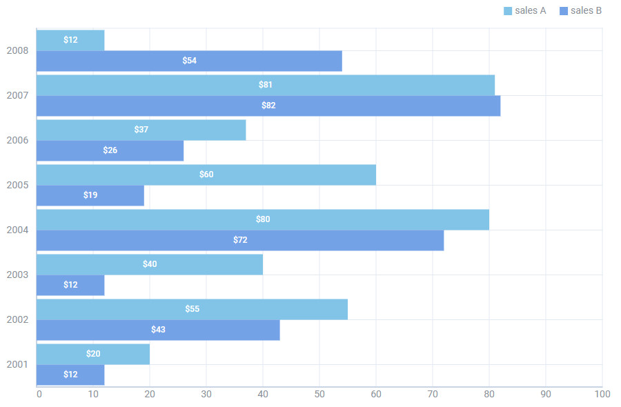 Check the sample >
AJAX Helper
In addition to new features and improvements, DHTMLX developers have prepared the AJAX helper at the request of our clients. It works smoothly with DHTMLX components and allows them to exchange data with a web server without reloading the page. The helper makes use of the dhx.ajax object with four common methods: delete, get, post, and put.
Other Updates
Calendar API Enlarged
The Calendar component is much more developer-friendly now, as we have included a range of new events for listening to user actions (cancelClick, modeChange, monthSelected, yearSelected) as well as the getCurrentMode() method for determining what the component is currently displaying: calendar, month, year, or time picker.
Manipulating Nodes in Tree and TreeGrid
Starting with v6.3, developers can collapse and expand all nodes of DHTMLX Tree and TreeGrid at once with the help of a couple of simple methods: collapseAll and expandAll. Check the sample >
CSS Measurement Units in List and DataView
In DHTMLX List and DataView developers can set the height of items (as well as of the whole component) not only as a number but also as a string value in any CSS measurement unit: px, %, em, whatnot. For instance, define the height of the list item as 30px:
var list = new dhx.List("list_container", {
itemHeight:"30px"
});
We do hope our December update will contribute to the efficient development of your web apps with DHTMLX. Please leave us your feedback in the comments section below.
We invite our current clients to download the latest version in their Client’s Area.
If you’re new to the DHTMLX UI components library, feel free to download and test the trial version 6.3.

