We are thrilled to present a highly anticipated release of DHTMLX Scheduler 7.0. It is another major step in the development of this JavaScript scheduling library. If the previous major update of Scheduler focused on the internal structure of the project, the new version is related to significant improvements on the user interface side.
First of all, this major update is notable for greatly enhanced styling capabilities, including rewritten Scheduler themes, simplified customization of themes with CSS variables, updated default Terrace theme, a new Dark theme, and other useful changes. Moreover, you’ll be pleased to see the renewed Agenda view that offers a new way of displaying a list of upcoming events. We also updated the Tooltip API to simplify the attachment of tooltips to custom elements and added a new way of enabling the Scheduler export.
Now let us review all these novelties in more detail.
Updates in Scheduler Themes
Themes play a crucial role in the styling capabilities of modern JavaScript libraries. But the importance of themes lies not only in making web apps more visually appealing since they also help in achieving such goals as personalized user experience, enhanced accessibility, brand consistency, and more. Using themes included in JavaScript libraries, web developers get the necessary flexibility to tailor the UI to various project requirements with less time and effort. That is why we decided to introduce a range of updates and improvements related to themes in Scheduler 7.0.
Overhauled Themes
The core styles of DHTMLX Scheduler were developed some time ago focusing on cross-browser compatibility. However, as legacy browsers became obsolete, these implementations also started showing their age. If you’ve used our Scheduler, you may have noticed some issues. The default Terrace theme appeared outdated and needed rejuvenation, theme customization required writing extensive CSS code, and certain elements struggled with overflow and faced issues while rendering on smaller screens. The new Scheduler version tackles all these issues.
We have fully rewritten all the themes from scratch, making sure to adopt modern practices.
Let us provide you with more details in the following sections.
Updated Terrace Theme
In v7.0, the Terrace theme has undergone an overhaul towards a fresh and vibrant appearance that aligns with modern design standards.
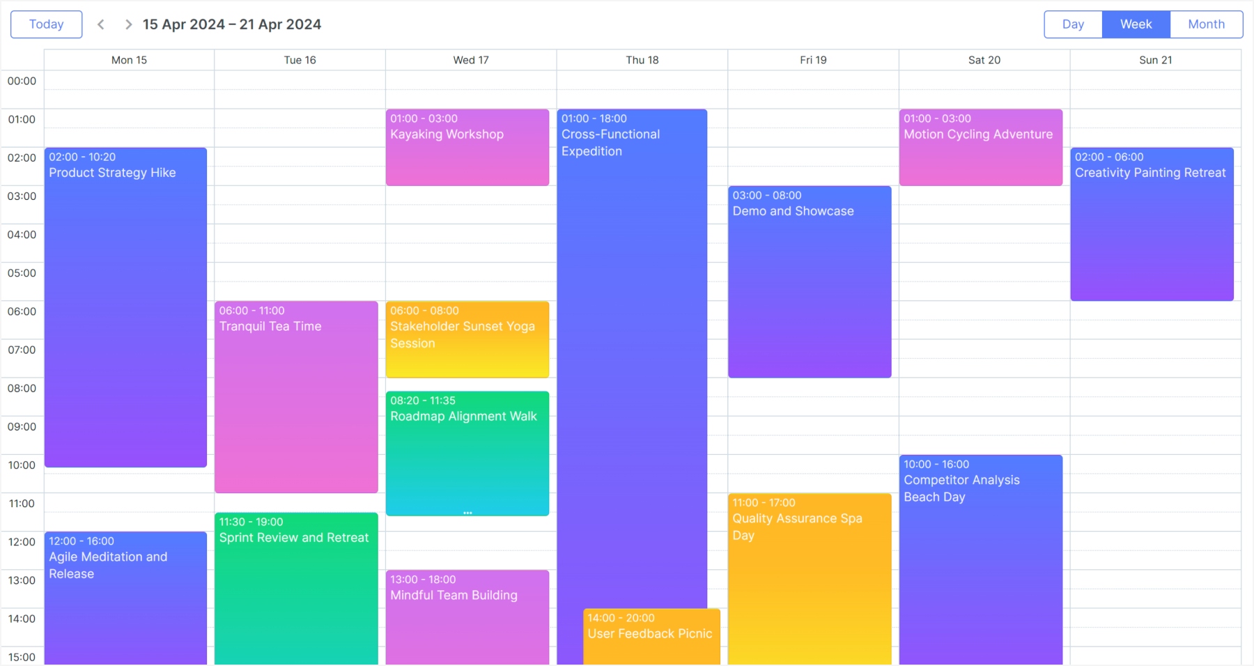 Check the sample >
The Terrace theme has been updated for easier customization and resolving numerous visual issues.
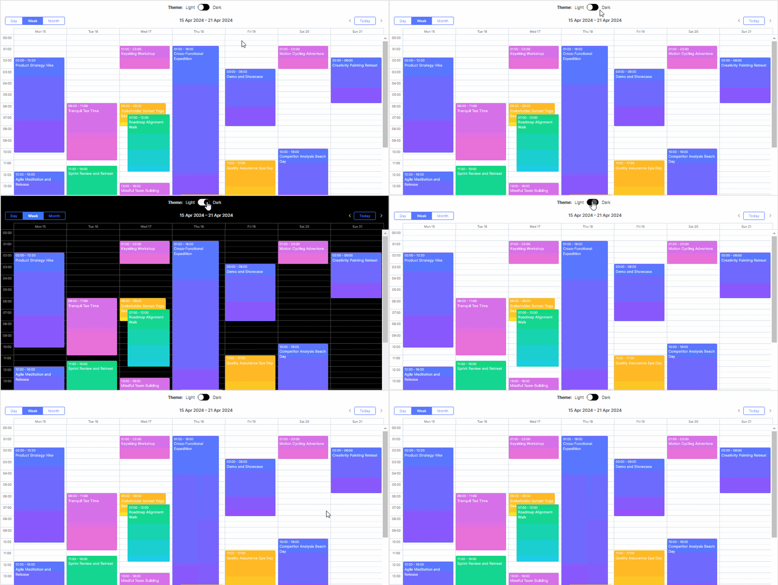
New Dark Theme
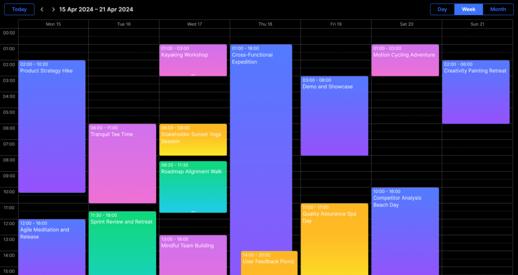
If you take a look at the top design trends of recent years, you are most likely to find a dark theme (or dark mode) in the list. Dark themes not only give a modern look to the UI but also contribute to reduced eye fatigue, improved accessibility, enhanced focus on the content, and an extended battery life on mobile devices. So if you lack this feature in your JavaScript scheduling calendar built with DHTMLX, there is good news for you. In version 7.0, we added the dark option to the list of available built-in themes in our Scheduler component.
 Check the sample >
Changes in Theme Structure
This major update brings significant changes to the CSS structure of our themes. Firstly, all themes are now defined in a single CSS file, simplifying theme management. You can enable the needed theme directly in the code in two ways:
- by setting the property:
- by using a method call:
This enhancement allows for seamless switching between themes at runtime. It means that themes can be applied dynamically based on application settings, providing a more flexible and user-friendly experience.
Customizing Themes with CSS Variables
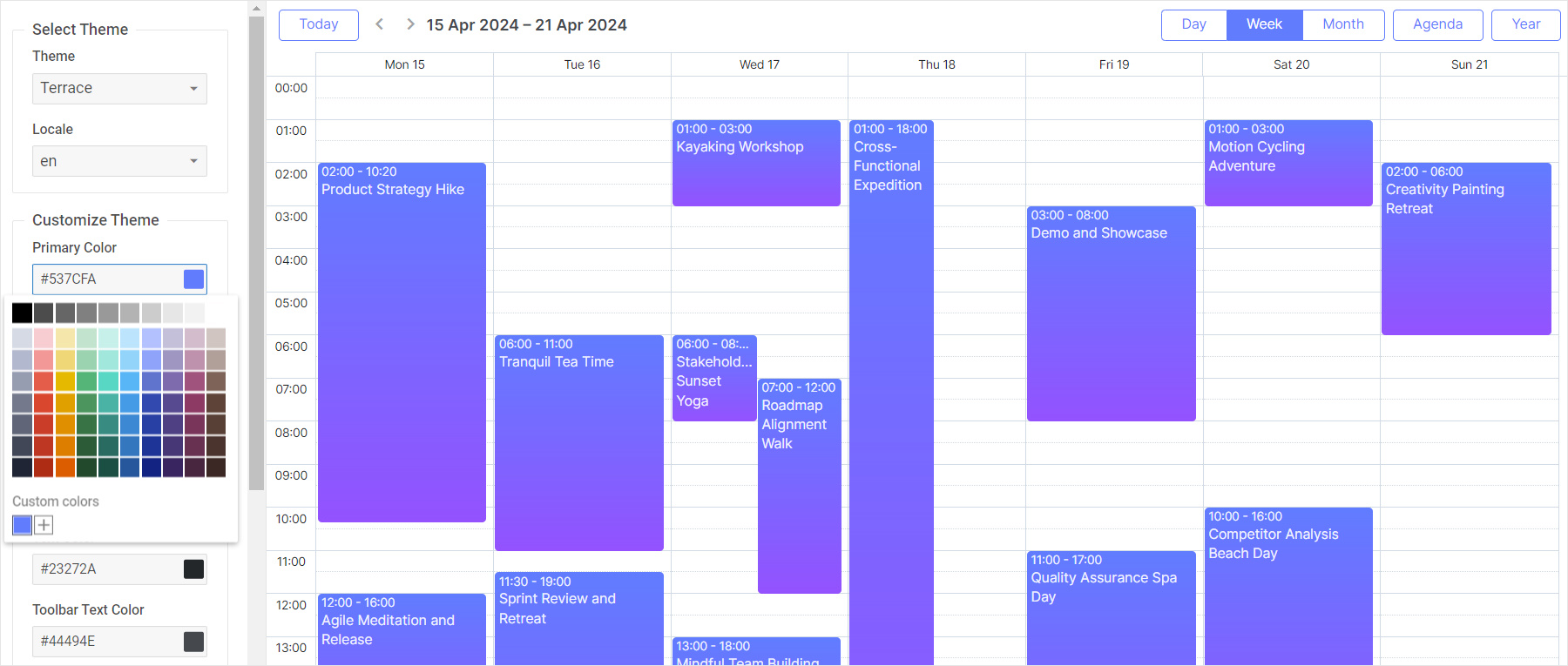
In this release we’ve introduced support for CSS variables, marking a significant advancement in theme customization. CSS variables, also known as custom properties, offer a more dynamic and efficient approach to styling. And that’s exactly what you need to be able to customize existing Scheduler themes with less time and effort.
From now on, you can easily modify the appearance of the Scheduler by changing a few key variables. This means that altering colors, fonts, and other stylistic elements across the entire application can now be accomplished with minimal code changes.
Here is a quick example to show you the benefit of the new styling approach. A common Scheduler customization case for developers is changing event colors. In previous versions of the Scheduler component, it required updating specific styles like in the code below:
.dhx_cal_event.manager_event div{
background-color: #009966 !important;
color: black !important;
}
/*multi-day event in month view*/
.dhx_cal_event_line.manager_event{
background-color: #009966 !important;
color: black !important;
}
/*event with fixed time, in month view*/
.dhx_cal_event_clear.manager_event{
color: black !important;
}
With Scheduler v7.0, you simply redefine the CSS variables responsible for event colors:
--dhx-scheduler-event-background: #009966;
--dhx-scheduler-event-color: black;
}
Altering colors, fonts, and other stylistic elements across the Scheduler can now be accomplished much faster. For instance, changing the color scheme of your JavaScript scheduling calendar is as simple as redefining a set of color variables. This change simplifies customization and ensures flexible, scalable theme development, thereby enabling developers to create more personalized user experiences with ease.
 Check the sample >
Other Minor Theme Improvements
Apart from the major changes described above, DHTMLX Scheduler 7.0 also delivers plenty of minor but still useful improvements in themes, and they deserve your attention.
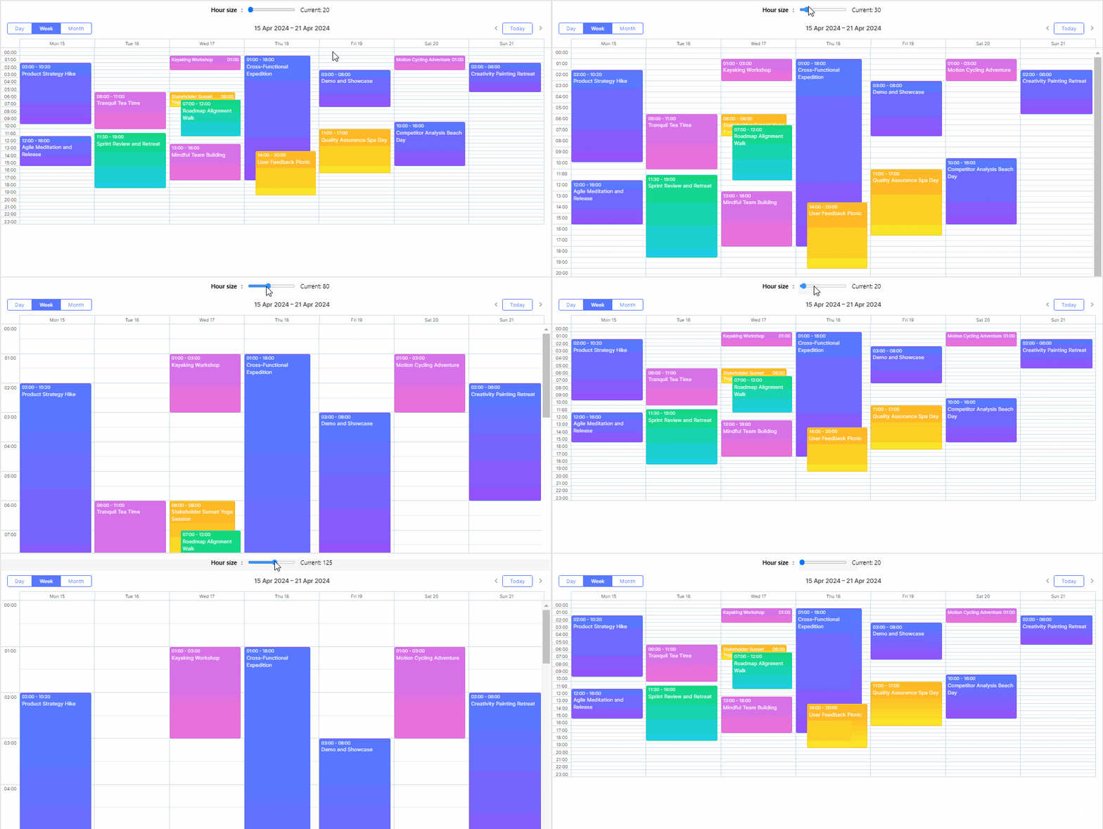
In previous versions, the Scheduler’s background grid for days was specified using a background image, which caused some inconvenience when scaling or changing the height of the time scale. Now the background grid is implemented with blocks, therefore you just need to change the hour_size_px config to set a new height for the scheduler’s time scale.
This change not only simplifies the configuration but also allows for simple and powerful scaling of the Day/Week views:
 Check the sample >
Starting from v7.0, the dimensions of some Scheduler elements can be simply set via CSS styles instead of using the scheduler.xy config. For instance, now it is much easier to ensure that navbar buttons do not overlap on small screens but move to a new line.
Earlier you needed to write custom code to nicely display short custom events (less than 30 minutes). The new version renders such events out of the box.
Lastly, it should be noted that style customizations used in old Scheduler versions aren’t automatically compatible with the fully rewritten styles delivered in v7.0. But at the same time, the new class names and HTML structure remained very similar to the old ones, so we expect that the migration is not going to be a big issue.
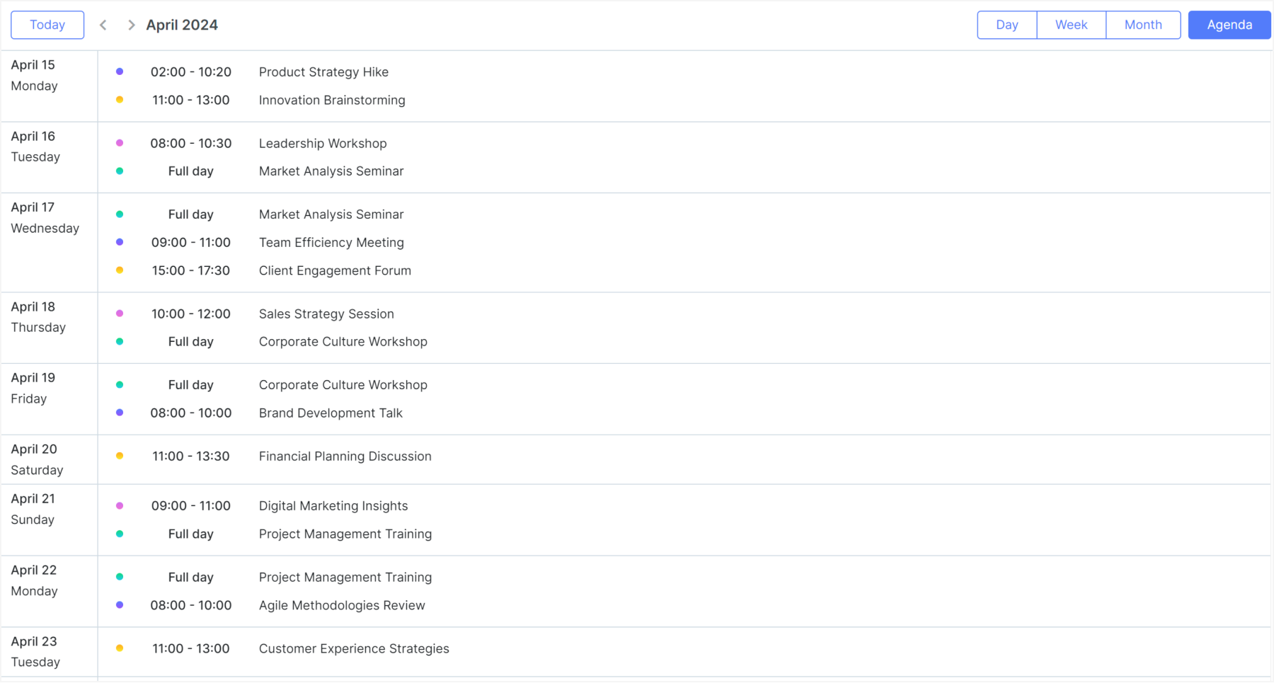
New Setup of Agenda View
The Agenda view is one of five basic options included in our JavaScript scheduling library to keep track of all planned arrangements. For version 7.0, our development team rolled out a fully redesigned Agenda view. The new Agenda view works just like a List View used in Google Calendar and other similar tools.
Although the old Agenda View is now deprecated, it is still available if needed in your project.
Updated Tooltip API
This major release brings along an updated API that greatly simplifies the process of adding tooltips to any element within the Scheduler.
With the new scheduler.ext.tooltips.tooltipFor() method, you can effortlessly attach tooltips using CSS selectors. Here’s an example:
selector: ".dhx_matrix_scell",
html: function (event, node) {
const sectionId = scheduler.getActionData(event).section;
const timeline = scheduler.getView("timeline");
const section = timeline.y_unit[timeline.order[sectionId]];
return `Tooltip for <b>${section.label}</b>`;
}
});
The helper enables you to add a tooltip to any element using its CSS selector and works the same way as the Tooltip extension of DHTMLX Gantt.
New Way of Enabling Scheduler Export
Exporting is a significant feature of DHTMLX Scheduler. Earlier you could start using it after including the export api.js file on the HTML page or by putting it in the configuration folder and importing it (when using JS frameworks and Node.js). In v7.0, we provide a more convenient way to enable this functionality. Now you can set it to work with the plugins() method:
export_api: true
});
Learn more about this novelty in the migration notes.
Other Improvements
Now we want to highlight other minor but helpful changes delivered in v7.0.
Formatting and Styling Time Slots in Day/Week Views
In version 7.0, you can use the scheduler.templates.time_slot_class and scheduler.templates.time_slot_text templates to specify the styles and HTML content of the time slot elements of the Day/Week views:
if(date.getHours() < 7 || date.getHours() > 18){
return "custom_color";
}
};
Map View
Markers of the Map view now can be customized using the scheduler.ext.mapView.createMarker function:
PinElement } = await google.maps.importLibrary("marker");
scheduler.ext.mapView.createMarker = function(config){
const pinViewGlyph = new PinElement({
glyphColor: "white",
});
return new AdvancedMarkerElement({
...config,
content: pinViewGlyph.element,
});
};
Extra Space Inside Day Columns
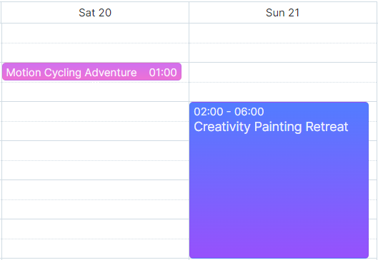
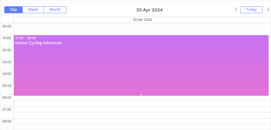
In our standard Scheduler configuration, events in the Day view occupy the entire width of their respective columns, as it is shown in the image below:
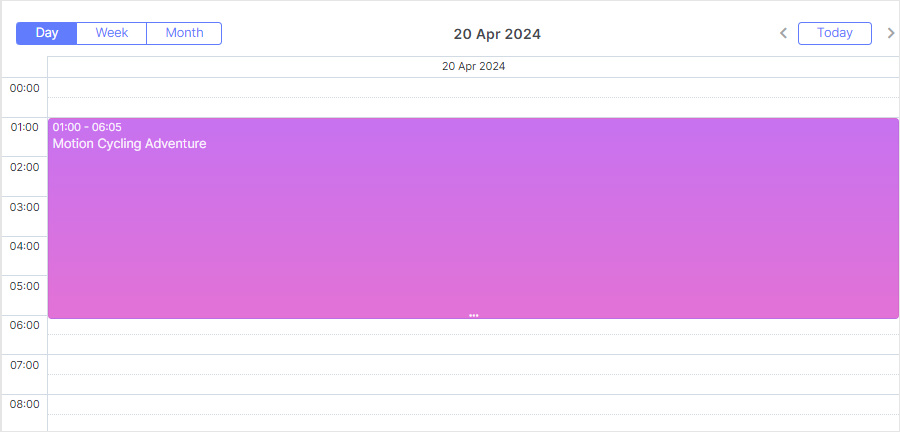
Being efficient in terms of space utilization, this design presented a challenge for some end-users. The thing is that the absence of empty space in the day column can hinder the ability to create new events with drag-and-drop. To solve this problem, we’ve introduced a new configuration option – scheduler.config.day_column_padding.
This feature enables you to reserve some horizontal space next to the event boxes. By implementing this padding end-users are guaranteed ample space within the day container to conveniently create new events as needed. Therefore, this API addition enhances the Scheduler’s usability and flexibility.
In this release, we also updated type definitions.
Last but not least, all versions (trial and licensed) of DHTMLX Scheduler can be installed using npm or yarn without extra steps.
The “What’s new” section will help you to make a quick revision of all the novelties included in this major update.
If you want to try the new version of DHTMLX Scheduler in a real-case scenario, download a free 30-day trial version. For our current clients, v7.0 is available in their Client’s Area.
We hope that this release will enhance your experience with DHTMLX Scheduler and contribute to the success of your web projects. We also invite you to share your thoughts on this big update in the comments below.
