JavaScript Datepicker Library
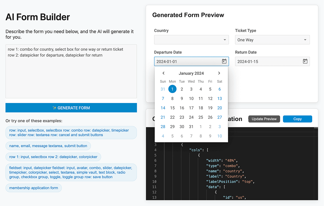
A convenient JavaScript datepicker for selecting dates and date ranges in scheduling and booking applications based on DHTMLX Calendar.
Part of the leading-edge Suite UI widget library.
JavaScript Datepicker Features
- Ability to select a range of dates
- 3 views: calendar, month, year
- Ability to set inactive dates
- Configurable first day of the week
- Ability to add time picker
- 12-hour and 24-hour time format
- Ability to highlight dates
- Ability to add numbers of weeks
- Built-in multilingual support
- Touch support
- TypeScript support
- Cross-browser compatibility
- Full control with JavaScript API
- Highly configurable
- Fully customizable
- Accessibility support
How to Create a Datepicker in JavaScript
Why Choose DHTMLX JavaScript Datepicker?

An easy-to-use popup JavaScript datepicker for your app
Datepicker is a lightweight cross-browser control based on DHTMLX JavaScript Calendar. It is easily configurable. All you need to do is to attach a date picker to a text input field and show a popup with a calendar when a user clicks on the input field. The calendar attached provides a fast and intuitive date selection in web-based apps.

A convenient tool for selecting date ranges
DHTMLX datepicker features custom date format, the choice of any day as the first day of the week, a year drop-down list, and multilanguage support. Our HTML datepicker can also be used as a date range selection tool when dates prior to and after the available date range are disabled accordingly. Besides, you can add a time picker for a more precise selection of date and time.

A highly customizable UI datepicker
Just like DHTMLX Calendar, our datepicker can be customized to bits to match your web app. You can modify every aspect of its look and feel: add a border and apply a shadow, change colors of all elements including the background, numbers, highlighted dates, and date ranges. By default, the UI of our datepicker is based on Material design.
Support for Angular, React, and Vue.js
DHTMLX datepicker can be easily used in web apps built with the help of the most popular frameworks: Angular, React, and Vue.js. We provide JavaScript datepicker examples for these frameworks to speed up web development of your web applications. You're welcome to evaluate DHTMLX datepicker and other widgets during a 30-day free trial period.
Support & Learning Resources for JavaScript Datepicker
We provide comprehensive documentation with technical samples. Moreover, our dedicated support team is fast and qualified. Find the suitable way to get support:
Other Suite Widgets
Need help with DHTMLX DatePicker integration into your app? Contact us


