React developers, we heard you! Following the enthusiastic reception of our React Gantt chart, we are thrilled to announce the release of DHTMLX React Scheduler! This novelty brings the full power of our time-proven JavaScript Scheduler to the React ecosystem. In this release article, we’ll introduce its core capabilities and show how it fits into your React stack.
What to Expect from DHTMLX React Scheduler
The decision to release the new Scheduler solution comes in response to a strong demand for advanced scheduling functionalities that can be seamlessly integrated into modern React applications.
Just like its React Gantt counterpart, the new Scheduler is optimized for the latest React versions (starting from v18), thereby allowing you to benefit from the latest React features and performance optimizations. This approach will make it easier for your team to enhance and maintain the scheduling app as requirements evolve.
Now, it is time to explore what exactly makes DHTMLX React Scheduler a valuable addition to a developer toolkit.
Scheduler That Feels Native to React
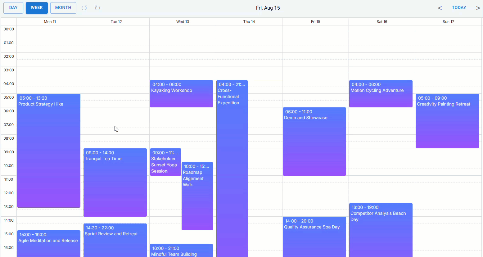
The React Scheduler is designed with React developers in mind, meaning it works the React way. You can build powerful multi-view scheduling calendars using well-known React concepts like props and state. To be specific, props allow you to configure Scheduler elements and dynamically pass data into the component, while state handles real-time updates and user interaction tracking. This approach ensures a smooth and responsive scheduling experience in React apps.
The React Scheduler is installed via npm. Here is an example of importing and rendering the Scheduler:
import ReactScheduler, { SchedulerConfig } from "@dhx/react-scheduler";
import "@dhx/react-scheduler/dist/react-scheduler.css";
import "./styles.css"
import { demoData } from "./DemoData";
export default function BasicScheduler() {
const [events, setEvents] = useState(demoData.events);
const config: SchedulerConfig = {
first_hour: 8,
last_hour: 20,
time_step: 15
};
return (
<div style={{ height: '100vh' }}>
<ReactScheduler
events={events}
config={config}
date={new Date("2025-08-15T00:00:00Z")}
view={"month"}
/>
</div>
);
};
The new Scheduler supports React Components, so you can personalize various parts of the scheduling solution by creating custom, reusable UI elements. Additionally, it adheres to React’s declarative approach, making data handling predictable and your code easier to maintain.
Extensive Functional Capabilities
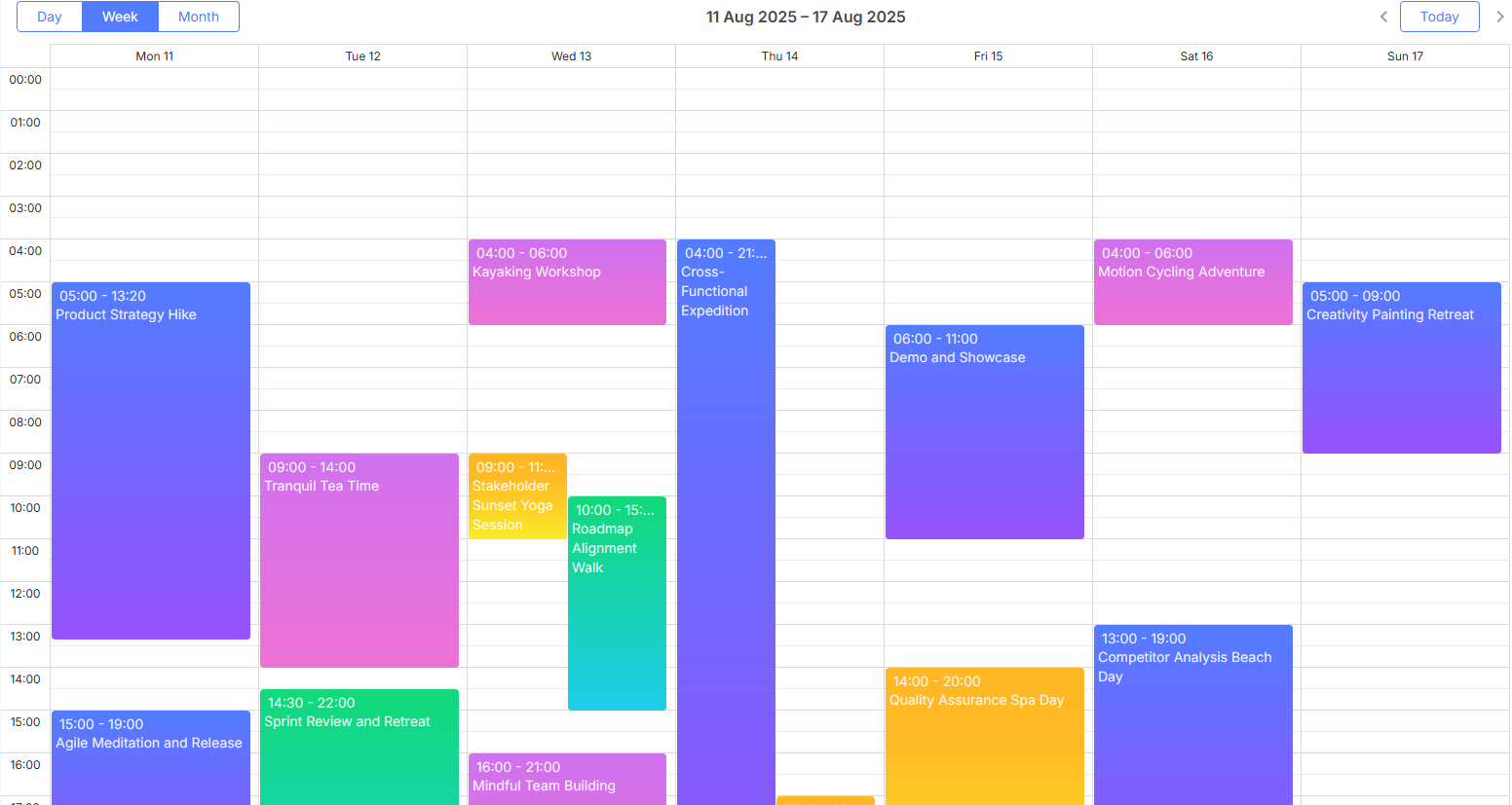
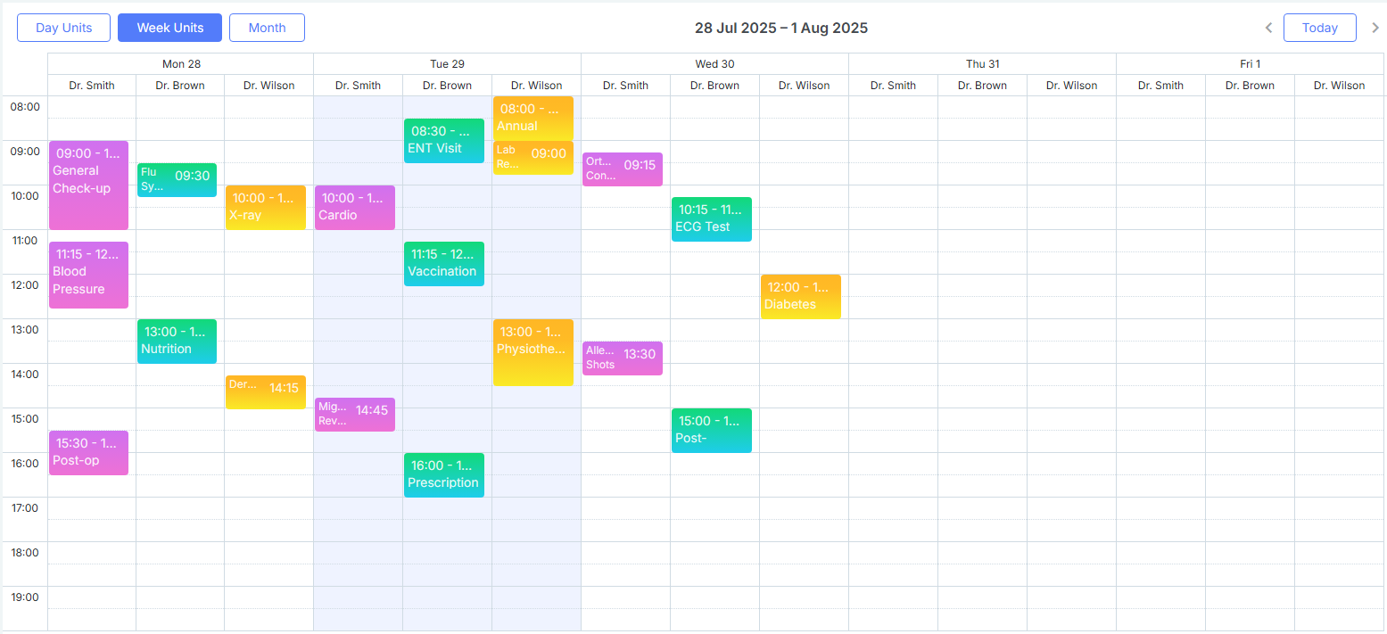
New UI components are often introduced with basic capabilities, leaving room for further development based on user feedback. But DHTMLX React Scheduler was designed to be a step ahead from the start. This novelty is already geared up for complex scheduling scenarios, featuring advanced views such as Timeline, Resource (Units), and the ability to block and highlight time slots. How is it possible? You simply adopt the extensive feature set of our JavaScript Scheduler via its API.
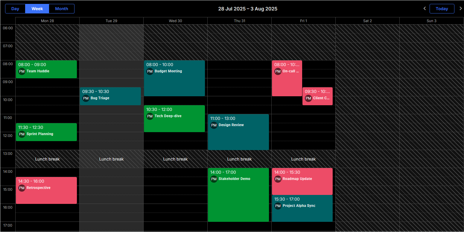
Simplified Customization and Multiple Styling Options
The new React Scheduler stands out with its strong customization and styling flexibility, giving ample opportunities to tailor every part of the scheduling UI to any project requirements. Using custom React components, you can easily modify the default look and feel settings of events, tooltips, editing form (Lightbox), and other Scheduler elements.
For instance, you can use custom React components in Scheduler templates:
event_class: (start, end, event) => {
return ("templates-" + event.classname) || '';
},
event_text: (start, end, event) => {
return <EventTextBox event={event} />;
}
}), []);
React components are also effective for fine-tuning editing capabilities in your scheduling calendar. The default editing form (Lightbox) can be replaced with a custom React-based modal or other component, as explained in the documentation.
In the example below, you can see a custom editor integrated in the React Scheduler:
Most of the styling needs in React Scheduler can be covered with a set of built-in themes that can be activated via the skin prop and changed dynamically, as shown in the code sample below:
const [events, setEvents] = useState(demoData.events);
const [theme, setTheme] = useState<string>("terrace");
const switchTheme = () => {
setTheme((prevTheme) => (prevTheme === "terrace" ? "dark" : "terrace"));
};
return (
<div style={{ height: '100vh' }}>
<Button variant="contained" onClick={() => switchTheme()}>Switch Theme</Button>
<ReactScheduler
theme={theme}
events={events}
date={new Date("2025-08-15T00:00:00Z")}
view={"month"}
/>
</div>
);
};
Any targeted styling changes in existing Scheduler themes can be easily introduced using CSS variables:
--dhx-scheduler-base-colors-primary: #01579B;
--dhx-scheduler-event-background: #33B579;
--dhx-scheduler-event-color: #FFFFFF;
--dhx-scheduler-base-colors-border: #B0B8CD;
--dhx-scheduler-border-radius:2px;
}
Many developers use the Material UI library to solve various styling issues in their React projects. If you are one of them, you don’t need to change the habit since our new React Scheduler supports Material UI.
With such a powerful styling toolkit, any design objective in your scheduling calendar becomes achievable.
Designed to Work Smoothly with TypeScript, Redux, and SSR Frameworks
The new DHTMLX React Scheduler is designed to seamlessly integrate into the modern development environments used with React. It offers out-of-the-box compatibility with TypeScript, including full support for JSX and TSX, enabling static typing and better maintainability. You can also count on Redux for centralized state management of complex Scheduler data, providing better control over data flow and ensuring predictable updates within your React solutions.
save: (entity: string, action: string, payload: any, id: any) => {
if (entity !== "event") return;
switch (action) {
case "update":
dispatch(updateEvent(payload));
break;
case "create":
dispatch(createEvent(payload));
break;
case "delete":
dispatch(deleteEvent(id));
break;
default:
console.warn(`Unknown action: ${action}`);
return;
}
},
};
return (
<div style={{ height: "100%", display: "flex", flexDirection: "column" }}>
{Toolbar}
<ReactScheduler
…
data={dataBridge}
/>
</div>
);
This in its turn paves the way to powerful features such as multi user synchronization or undo/redo functionality.
In addition, our React Scheduler plays well with popular SSR frameworks like Next.js and Remix without additional configuration. These frameworks will help significantly enhance performance, which is critical for business apps with comprehensive scheduling UIs, while also improving routing flexibility and supporting better scalability.
These integrations will empower React teams to move fast and build advanced scheduling apps with confidence.
One Price for JavaScript + React Scheduler Pack
There is one final point that we must address in the release article, namely, the way the new React Scheduler will be distributed on the market. If you purchase the React Scheduler under a Commercial, Enterprise, or Ultimate license, you’ll receive a package that includes both the JavaScript and React versions for the price of one.
Already using our JavaScript Scheduler and have an active license? Great! Just send your license number to contact@dhtmlx.com, and we’ll give you access to the React version as well.
These are the essential points about DHTMLX React Scheduler. Check out the documentation for more details.
If you want to explore the capabilities of DHTMLX React Scheduler before adding it to your project, a free 30-day trial version is available for downloading.
You are welcome to share your thoughts about DHTMLX React Scheduler in the comments section below.