Today, we are releasing the first update of our JavaScript UI widgets library in 2026. The new DHTMLX Suite 9.3 further extends the configuration capabilities of the Grid component with more flexible export to popular formats, a new date filter type for columns, adjustable drag-and-drop behavior in the TreeMode, and better control over footer positioning.
Other Suite widgets also received useful updates: Tree now supports customizable tooltips for items, while Window allows you to programmatically set the active state of windows.
In this blog post, we’ll take a closer look at what’s new in v9.3.
Highly Configurable Grid Export
The DHTMLX JavaScript DataGrid component offers a wide range of configuration options for presenting tabular data on a web page. With Suite 9.3, we set out to bring a similar high level of flexibility to Grid export. And now exporting Grid data has become as configurable as displaying it.
To extend the capabilities of the standard export, you’ll need the new exportConfig property, which is now available in the Grid API. This callback function receives the current Grid configuration (config) and the selected export format (exportType) and returns an export configuration object. The object includes parameters for defining changes that should be reflected in the exported file:
- columns – column transformations
- data – filtering or modifying row data
- spans – cell merging manipulations
- typeConfig – format-specific settings (filenames, delimiters, themes)
- Grid properties – any Grid property (set as a key:value pair) that should be modified in the exported file
Now, let us consider the main scenarios of how the exportConfig property helps dynamically change the structure and content of the resulting grid table in CSV, Excel, PDF, and PNG formats using code snippets from this new sample:
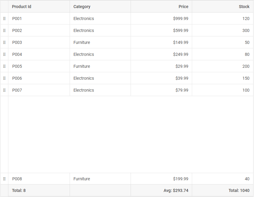
- Data filtering
In practice, it is not always necessary to export all grid data for further usage in different formats. The exportConfig property allows you to decide if specific columns, rows, or spans should not be included in the final export file.
For instance, if grid columns or rows contain confidential or excessive information, you can exclude this kind of data from export files by specifying filter conditions and returning null in the corresponding callback methods.
// Column transformation
columns: column => {
// Completely exclude the "experience_level" column from any export
if (column.id === "experience_level") return null;
// For spreadsheet formats (Excel/CSV), keep columns as is
if (exportType === "xlsx" || exportType === "csv") {
return column;
}
// For PDF/PNG, remove HTML templates and uppercase the headers
column.template = null;
column.header[0] = column.header[0].text.toUpperCase();
return column;
},
// Row data filtering
data: row => {
// Exclude young animals (age <= 3) from the export
if (row.animal_age <= 3) return null;
// Business logic example: do not export Dogs to CSV and Cats to Excel
if (exportType === "csv" && row.animal_type === "Dog") return null;
if (exportType === "xlsx" && row.animal_type === "Cat") return null;
return row;
},
}),
As you can see from the code above, conditions can be applied to all export formats or to specific ones.
The same approach works for spans:
spans: (span) => {
// Exclude cells' merges when exporting to CSV,
// as the CSV format does not support merged cells
if (exportType === "csv") return null;
return span;
}
})
- Content transformation
The exportConfig property helps you define not only what to display in the exported grid file but also how to do it. That’s how easy you can remove column HTML templates and uppercase headers for PDF and PNG formats, while preserving the original columns’ appearance for Excel and CSV:
if (exportType === "xlsx" || exportType === "csv") {
return column;
}
// For PDF/PNG, remove HTML templates and uppercase the headers
column.template = null;
column.header[0].text = column.header[0].text.toUpperCase();
return column;
},
- Styling adjustments
Taking advantage of the ability to override any Grid property, you can change the way the Grid table looks in the exported file. Here is how to modify the header height specifically for the Excel file using headerRowHeight:
- Format-specific settings
Using the typeConfig property in the exportConfig configuration object, you can go much further and specify unique settings for specific formats:
csv: {
name: "cat_report", // Resulting CSV filename
rowDelimiter: "\t", // Use Tab as row delimiter
columnDelimiter: ";" // Use Semicolon as column delimiter
},
xlsx: {
name: "dog_report", // Resulting Excel filename
tableName: "Main Report", // Sheet name in the Excel workbook
dateFormatMask: "dd.mm.yyyy" // Excel-specific date format mask
},
pdf: {
theme: "dark", // Apply the dark theme to the PDF document
scale: 0.8, // Content scaling (80%)
format: "A4" // Page format
}
};
const grid = new dhx.Grid("grid_container", {
columns: [
// columns config
],
data:dataset,
exportConfig: (config, exportType) => ({
// Pass settings from our object based on the export type
typeConfig: exportConfig[exportType]
})
});
As you can see, the code above adds CSV delimiters, Excel date masks, and a dark theme for PDF.
Overall, the new exportConfig property is a powerful addition to the Grid export API, offering great opportunities to create meaningful reports with only the essential insights from the data table displayed in the UI.
Concluding the topic of data export, we would like to mention that export functions in Grid and Chart components now return a promise of data export.
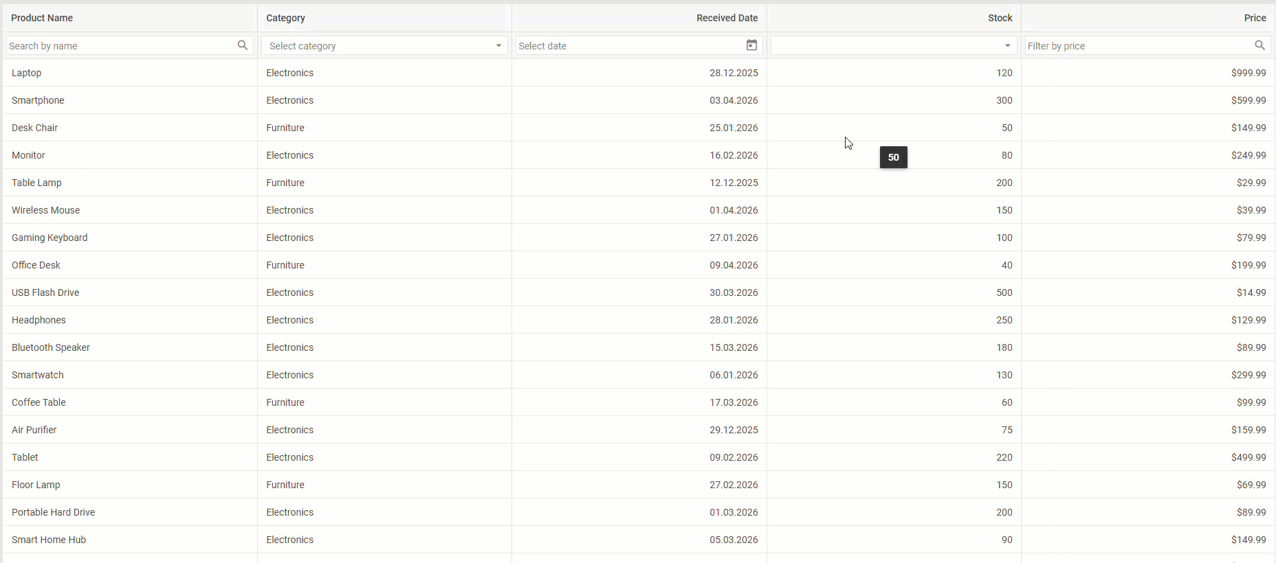
New Filter Type for Grid Columns
Data filtering is one of the core features for effective data management. That is why our team continues empowering this already robust functionality with valuable enhancements. In v9.3, we’ve extended the list of available filtering options with the new dateFilter type. It allows end-users to filter records by a specific date (single mode) or date ranges (range mode) via a calendar view built with the corresponding Suite widget.
The single mode is used by default, while the range mode can be enabled in the filterConfig object by setting the value of the range parameter to true. Also, there are other configuration parameters for dateFilter, such as date format and placeholder. That’s how to put it all together:
id: "receivedDate",
minWidth: 200,
type: "date",
dateFormat: "%d.%m.%Y",
header: [
{ text: "Received Date" },
{
content: "dateFilter",
filterConfig: {
placeholder: "Select date",
range: true,
}
}
],
},
If custom logic is needed, it can be applied to any filter type, including dateFilter, by setting the customFilter attribute when configuring the header/footer content of the column. This sample includes custom conditional logic for dateFilter.
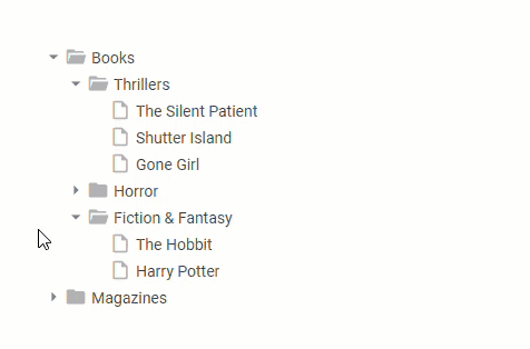
Fine-Tuned Drag-and-Drop Behavior in Grid’s TreeGrid Mode
DHTMLX Grid provides a TreeGrid mode that allows presenting data as hierarchical structures and reordering them with drag-and-drop. However, each use case may require different rules for reorganizing hierarchies. To help you address various requests related to the drag-and-drop behavior in TreeGrid mode, we’ve introduced a new configuration option – dropBehaviour.
Inherited from the Tree widget, this new Grid property allows specifying how a dragged item (row) is placed relative to a target item. It offers three modes for dropping dragged items, namely sibling-level reordering, child nesting, and combined (complex) behavior (default option).
type: "tree",
columns: [
...//column configuration
],
data: dataset,
autoWidth: true,
dragItem: "both",
dropBehaviour: "complex" // enables one of the drop modes "child" | "sibling" | "complex" (default)
});
With this novelty, you get more precise control over hierarchical structures in the TreeGrid mode.
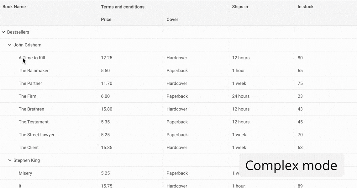
New Footer Positioning Logic
The updated Grid component provides an extra layout control for footers and bottom-pinned (frozen) rows of the data table. For this purpose, the Grid API now includes the footerPosition property. It offers relative (default value) and bottom values that determine the positioning of the footer and bottom-pinned rows. By default, the footer/frozen row immediately follows the Grid content. After changing the value of footerPosition to bottom, the footer/frozen row stays fixed at the bottom of the container, like in the example below:
Regardless of the amount of data in the grid table, footers and frozen rows will be rendered according to the specified setting.
Customizable Tooltips for Tree Items
The Suite’s Tree widget is a reliable tool for building tree-like structures on a web page. Now, you have an opportunity to complement your Tree-based hierarchies with informative tooltips.
The new Suite 9.3 comes with the tooltip property that ensures flexible tooltip configuration for Tree items. To be more specific, this property allows enabling a standard tooltip, defining custom tooltip content with a function, and most interestingly, applying an object configuration for advanced tooltip customization.
While the standard tooltip is clear and predictably displays the value of an item, two other options require clarification with examples.
Here is a function-based approach to defining a tooltip:
tooltip: (item) =>
(item.value + (item.items ? ` (${item.items?.length})` : "") + "")
});
In this example, the function returns a string that will show the item value and the number of its child items, if they exist. But what if you need to specify not only the tooltip content, but also its behavior and styling?
In this case, you can resort to the object configuration in the tooltip property, providing the ability to flexibly customize the tooltip’s content, appearance, delay, and positioning:
tooltip: {
htmlEnable: true,
// Delay 100ms before showing
showDelay: 100,
// The tooltip will appear to the top of the item
position: "top", // "right" | "bottom" (default) | "center" | "left" | "top"
// CSS class for styling
css: "custom-tooltip-style",
// Template function
template: (item) => item.items
? `<b>${item.value}</b> (${item.items.length})`
: `<b>${item.value}</b><br/>Size: ${item.size || "N/A"}`
}
});
Active State Option for Window Widget
If your web application should include multiple overlapping windows on a single page, the Window widget from our Suite is exactly what you need, especially after a useful improvement delivered in v9.3. The novelty lies in the possibility of activating a currently overlapped window and bringing it to the foreground. It is done programmatically via the new setActive() method, the operating principle of which is shown in the basic example with two windows below:
...windowConfig,
title: "Window 1",
});
const window2 = new dhx.Window({
...windowConfig,
title: "Window 2",
});
// displaying both windows
window1.show();
window2.show(); // Window 2 is currently on top
// bringing Window 1 to the front without refreshing its content
window1.setActive();
Thanks to the use of setActive(), you can update the window stacking order without rerendering the content.
That’s all about the updates included in DHTMLX Suite 9.3. The complete list of new features is also available for a quick review in the “What’s New” section of the Suite documentation.
Between the releases of DHTMLX Suite 9.2 and 9.3, our team devoted considerable attention to the question of using Suite widgets and other DHTMLX products with AI technologies. As a result, we created two demo apps – AI Review Analysis and AI Form Builder. They vividly demonstrate how AI can boost the efficiency of tools built with DHTMLX Grid and Form. Moreover, we also launched the DHTMLX MCP server designed to facilitate your experience with the DHTMLX documentation via popular AI assistants.
For those who want to see how new features prove their worth in real-case scenarios, download a free 30-day trial version and get down to testing. Existing customers can access DHTMLX Suite 9.3 from their Client’s Area.