We are thrilled to present a new update to our JavaScript UI widgets library, bringing the Suite’s Grid widget to a new level. While nominally it is a minor release, it introduces a range of API modules that will enable developers to configure more interactive and user-friendly data tables with spreadsheet-like capabilities. To be specific, this update enriches our JavaScript Grid with history management, clipboard operations, advanced data selection, and new range selection options. These new API modules come with advanced settings. Moreover, you’ll certainly enjoy seeing significant enhancements in drag-and-drop functionality, a new approach to exporting Grid data to Excel, updated integration samples with top JavaScript frameworks, and more.
Get ready to meet the new Suite 9.2 with features that are typically reserved for major version jumps!
History Module (PRO)
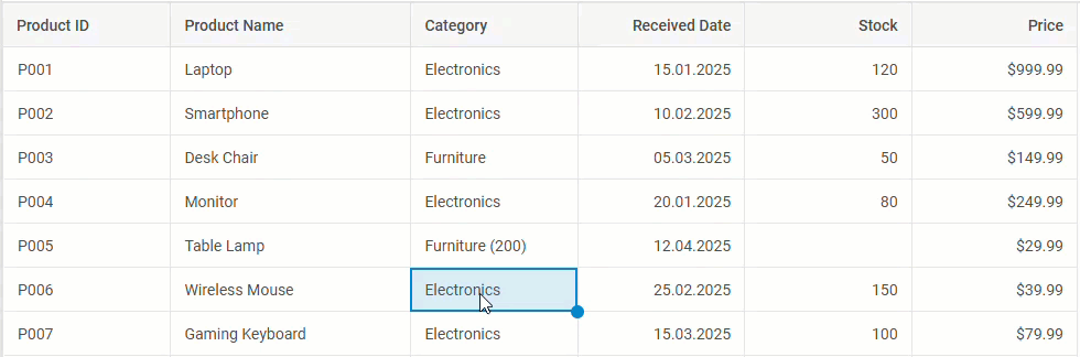
Data editing is an integral part of working with JavaScript data tables, where errors or accidental changes are not rare. To ensure greater control over recent grid interactions, DHTMLX Grid v9.2 introduces the History module. It is designed to automatically track user actions via the UI (like cell edits, structural changes, content clearing, etc.) and temporarily store them, thereby maintaining a reliable record of changes within the grid. Also, the module allows adding undo/redo capabilities for reverting to previous states or repeating actions using the corresponding operations.
To enable this functionality, you should activate the history property in the Grid configuration. This property includes the limit parameter aimed at specifying the number of actions to be recorded in the grid table history.
For instance, the data table configuration below includes the history module with a limit of 10 actions:
columns,
data,
clipboard: true,
history: {
limit: 10,// Limits the history to 10 actions
},
editable: true,
autoWidth: true,
autoHeight: true
});
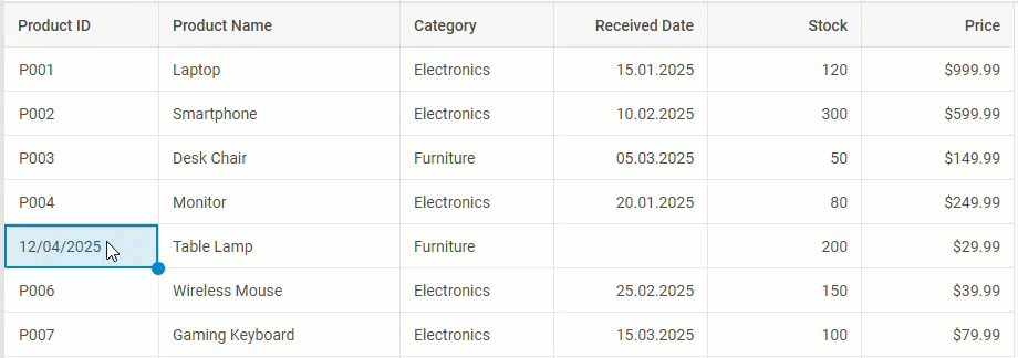
To show you how the limit parameter works in action, we set its value to 3 in the example below:
 Check the sample >
The rich API of the History module offers a range of methods and events for managing the history of actions within the Grid component, including adding, removing, or clearing table rows, as well as editing individual (or multiple) cells.
Undo and redo operations are applied to Grid history actions using the undo() and redo() methods, respectively. This functionality is quite flexible thanks to the availability of related events in the history config, such as beforeUndo, afterUndo, beforeRedo, and afterRedo.
Overall, the History module ensures a smoother and safer editing experience, especially in large or collaborative data tables.
RangeSelection Module (PRO)
The new RangeSelection module may seem like a small feature, but it is a crucial part of the new Grid functionalities for effective data management. The module offers the API for intuitive management of range selection, which is essential for selecting and handling multiple cells in the grid table.
In the Grid configuration, you can specify this feature using the rangeSelection property as a boolean or as an object to fine-tune its behavior.
Regarding additional configuration options for the RangeSelection module, we can point out the following capabilities:
- Setting range selection via the setRange() method:
// other configuration
columns: [
{ id: "a", header: [{ text: "A" }] },
{ id: "b", header: [{ text: "B" }] },
],
data: [
{ id: "1", a: "A1", b: "B1" },
{ id: "2", a: "A2", b: "B2" },
],
rangeSelection: true
});
grid.range.setRange({ xStart: "a", yStart: "1" })
The method includes the range parameter for defining a selection range with start and end coordinates for columns and rows.
You can choose to merge the new range with the existing one using the method’s join parameter:
grid.range.setRange({ xStart: "a", yStart: "1" });
grid.range.setRange({ xEnd: "b", yEnd: "2" }, true); // merges with the current range
If some coordinates are omitted, they are automatically filled in:
grid.range.setRange({ xStart: "a", yStart: "1" }); // ending coordinates are not specified
Note: the starting ID for at least one coordinate is required!
- Resetting range selection via the resetRange() method:
grid.range.setRange({ xStart: "a", yStart: "1" });
grid.range.resetRange();
Both setRange() and resetRange() methods come with related events for a more flexible configuration.
Apart from that, there are methods of the range object for getting the current range selection (getRange()), checking the module state (isDisabled()), determining whether a cell is in the range (isRanged()), and more.
While RangeSelection is technically a separate module, it lays the foundation for two more new modules of the Grid component, which we’ll consider below.
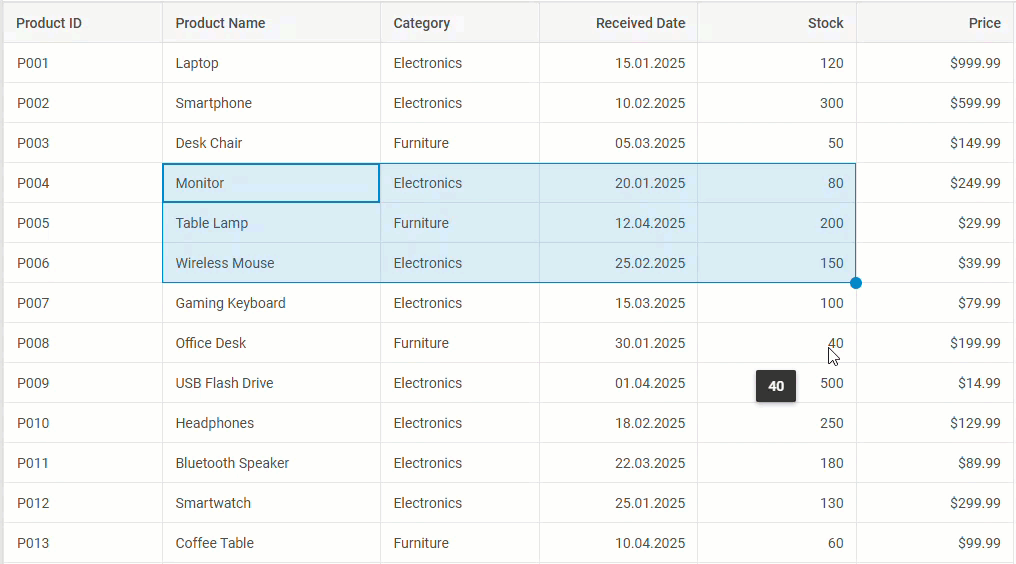
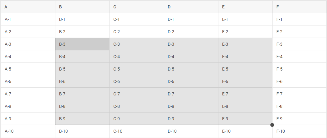
BlockSelection Module (PRO)
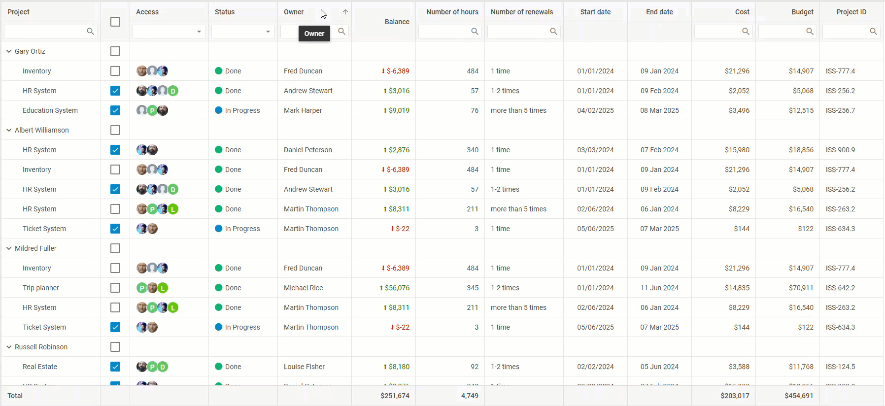
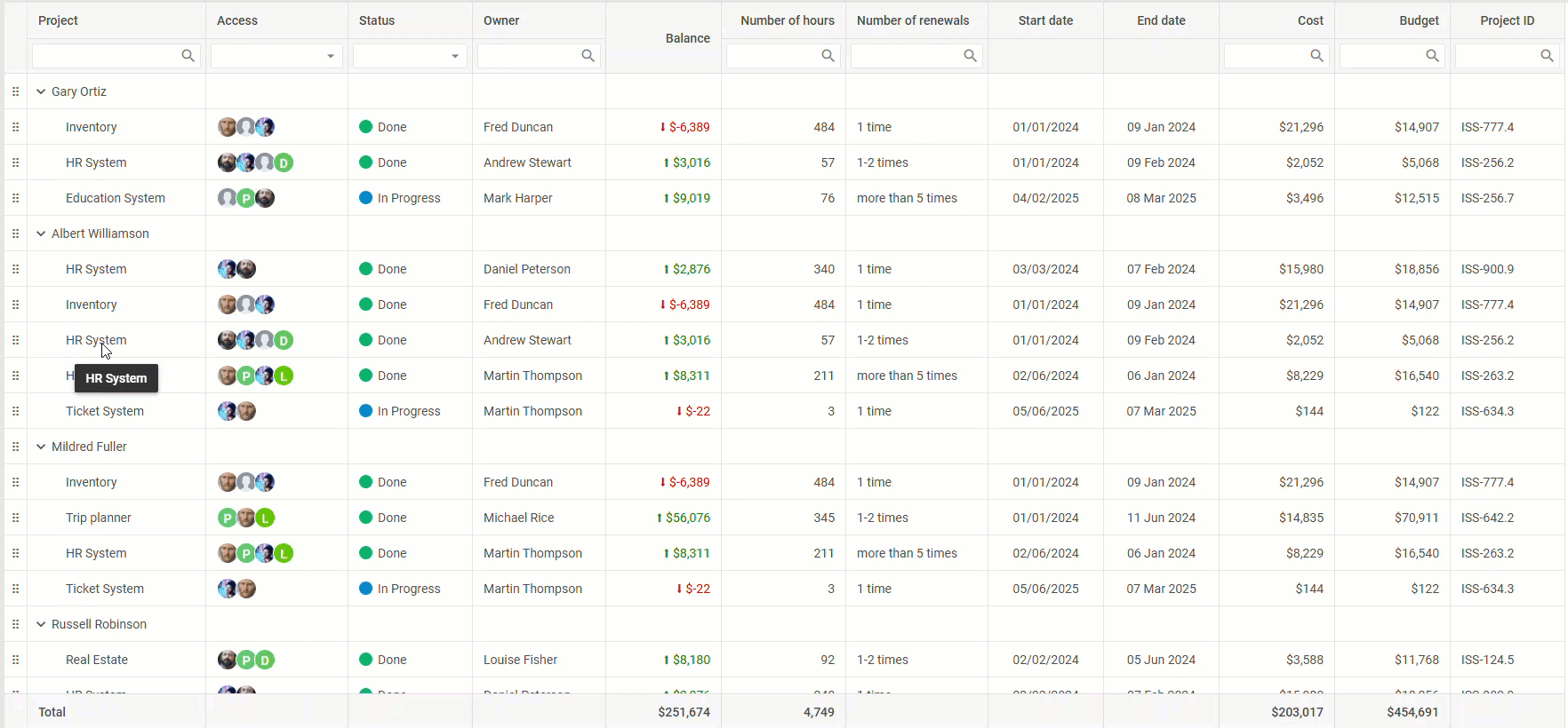
The updated DHTMLX Grid also features the BlockSelection module, which allows for selecting multiple adjacent cells using the mouse, touch gestures, or keyboard combinations, similar to Excel or Google Sheets.
 Check the sample >
As in the example above, cell blocks can be selected by clicking and dragging over the required grid area or by using the “Shift+click” combination.
For those who are familiar with keyboard navigation for selecting and managing ranges in Google Sheets, our Grid offers a similar approach for selecting cell blocks in data tables with keyboard and mouse combinations.
To make the BlockSelection work in your JavaScript data table, you need to add the blockSelection property in the Grid configuration. Similar to the RangeSelection module, it can be set as a simple boolean value or as an object to unlock additional configuration options.
One of such extra options is called a selection handle, appearing in the bottom-right corner of the selected range after being enabled via blockSelection.handle. By default, it ensures that the data from pre-selected cells will be sequentially inserted into the range determined with the handle by dragging.
 Check the sample >
It is possible to override the default selection handle behavior using the handler function. In the example below, you can see that the use of the selection handle leads to the generation of new values in the selected area in accordance with the specified logic:
 Check the sample >
The behavior of the BlockSelection module in cell selection, selection handle, and with other modules depends on the configured mode. For instance, cell selection in the range mode relies on the RangeSelection API, while the manual mode implies the use of custom event-based logic.
Also, you can change the styling of BlockSelection using CSS like in the example below:
 Check the sample >
For more details on BlockSelection setup and customization, check out the configuration guide.
This module is another important addition to the Grid API that sets the stage for the next major functionality of this release.
Clipboard Module (PRO)
The DHTMLX Suite 9.2 brings in spreadsheet-like usability into grid-based interfaces with the new Clipboard module. Fueled by data from the RangeSelection API and the BlockSelection module (automatically enabled during Clipboard initialization), it allows end users to easily copy, cut, and paste data from a selected range of cells within a table. These actions can also be performed between multiple grid instances or with external tools such as Microsoft Excel and Google Sheets.
To activate the clipboard support in the Grid configuration, you need the clipboard property that can be used in two ways:
- as a boolean value to enable the Clipboard module with the default behavior
columns: [
{ id: "a", header: [{ text: "A" }] },
{ id: "b", header: [{ text: "B" }] },
],
data: [
{ id: "1", a: "A1", b: "B1" },
{ id: "2", a: "A2", b: "B2" },
],
blockSelection: { mode: "range" }, // required for Clipboard to function (initializes automatically)
clipboard: true // enables the Clipboard module
});
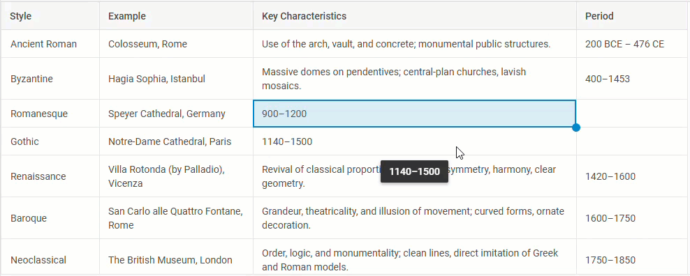
As you can see from the example above, clipboard operations are accompanied by helpful messages clarifying when any of the clipboard operations take place. These clarifications are generated with the help of events included in the Clipboard module, which are listened to via the grid.clipboard object.
- as an object for advanced clipboard settings
Complex data tables often come with various column types (date, number, editors, etc.); therefore, the Clipboard module requires extended settings for processing clipboard operations in tables with particular column types properly. If your project has specific requirements for data formatting during clipboard operations, you can benefit from new formatter functions (or simply formatters) such as copyModifier, cutModifier, and pasteModifier. These functions help modify the data format before the corresponding operations are performed.
Formatter functions are suitable for the following scenarios:
1. Format control.
When the default clipboard behavior does not cover project needs, formatters can be used to apply the desired format. For instance, when a grid column configuration has editorType: “combobox”, which typically involves the “id” and “value” parameters for cells, the copy operation will be applied to “id”, which makes little sense. A more reasonable approach is to copy the visible label (“value”) shown in the combobox. The copyModifier function allows you to specify what gets copied to the clipboard:
if (cell.column.editorType === "combobox") {
const options = cell.column.options;
const option = options.find(opt => opt.id === value);
return option ? option.value : value;
}
return value;
}
2. Compatibility with external systems.
Formatters come into play for data exchange with external tools by ensuring data compatibility. For instance, it may be necessary to preserve a number mask when copying data from one grid table to another one. Here’s how the copyModifier function can preserve the applied number mask (dollar sign) when copying numeric cell content, instead of copying only the raw number:
// Format numbers with currency prefix and two decimal places
if (cell.column.type === "number" && cell.column.numberMask) {
const numValue = parseFloat(value);
return `$${numValue.toFixed(2)}`; // e.g., 10 becomes $10.00
}
// other settings
}

3. Customization.
In some cases, required pieces of tabular data may come with additional symbols that you don’t want to see after pasting data (brackets, dashes, etc.). Therefore, it is great to have an opportunity to add extra info or remove excessive items from the data. In DHTMLX Grid, this kind of customization can be performed with the formatters:
// Handle pasted numeric values
if (cell.column.type === "number") {
const cleaned = value.replace(/[^0-9.]/g, ""); // Remove non-numeric characters
return isNaN(cleaned) ? value : parseFloat(cleaned); // Convert to number or keep original
}
}
4. Preprocessing before validation.
If users paste dates in the “dd/mm/yyyy” format while your grid expects “yyyy-mm-dd”, the pasteModifier can help by converting the format during pasting and ensure it is valid:
if (cell.column.type === "date") {
const dateFormat = cell.column.dateFormat || "dd/mm/yyyy";
const regex = /^(\d{2})\/(\d{2})\/(\d{4})$/; // for dd/mm/yyyy
const match = value.match(regex);
if (match) {
const date = new Date(`${match[3]}-${match[2]}-${match[1]}`);
if (!isNaN(date.getTime())) {
return `${match[3]}-${match[2]}-${match[1]}`; // ISO format
}
}
return value; // validation will handle invalid cases
}
return value;
}
This ensures that pasted values are in the correct format before the grid validates or inserts them.
It is also necessary to mention the main aspects of pasting data from the clipboard. The content is inserted in the selected range (defined by rangeSelection) in accordance with the order of copying and adapts based on the range size:
- If the range is smaller than the copied area, the data is fully pasted when grid space allows.
- If the range is larger, copied values repeat cyclically to fill the full range.
As a result, end-users will enjoy flexible and predictable pasting of project data in a spreadsheet-like manner.
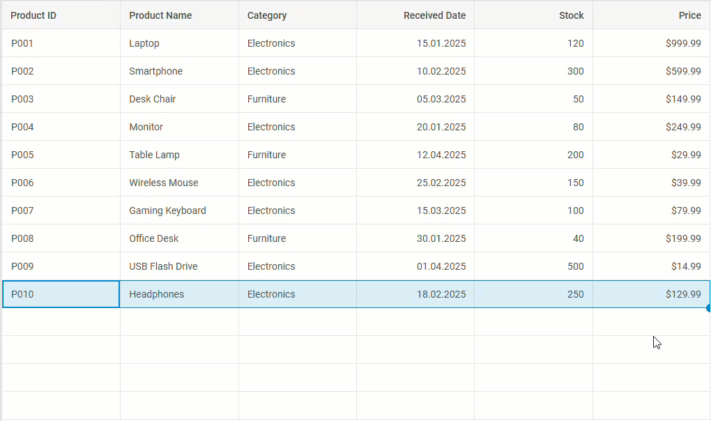
Improved Drag-and-Drop Functionality
Drag-and-drop is a core feature for conveniently managing the structure of a grid table via the UI. In version 9.2, we focused on making the drag-and-drop capabilities of our Grid more intuitive and visually apparent.
From now on, end-users can benefit from a visual indicator (a horizontal placeholder line) that appears dynamically as you drag any row or column across the table. The updated drag-and-drop functionality will make it much easier to reorder tabular elements (rows and columns) or create hierarchical structures.
Apart from that, v9.2 also introduces the DragPanel module to make row dragging more intuitive. Besides its practical value, this tool helps deal with situations when conflicting configurations (such as BlockSelection or Clipboard modules) are used.
 Check the sample >
Under the hood, the DragPanel module is initialized with the dragPanel property, which can be set as a boolean or an object (for extra config options). When the Grid configuration includes drag-and-drop for rows (dragItem: “row” or dragItem: “both”) or one of the two new modules (BlockSelection or Clipboard), the DragPanel module springs into action without extra code needed.
columns: [
{ id: "a", header: [{ text: "A" }] },
{ id: "b", header: [{ text: "B" }] },
],
data: [
{ id: "1", a: "A1", b: "B1" },
{ id: "2", a: "A2", b: "B2" },
],
dragItem: "both", // enables row Drag-and-Drop
blockSelection: true, // triggers `DragPanel` activation when `dragItem` is enabled
// or
dragPanel: true // enables the `DragPanel` module
});
You can also customize how the DragPanel looks and behaves using various configuration settings.
These new visual cues greatly improve usability when managing grid structures, especially with hierarchical relations.
Other Improvements
Updated Grid Export to Excel
Starting from version 9.2, exporting grid data to Excel becomes more functional and convenient. For this purpose, we adopted the JSON2Excel library that simplifies the conversion of JSON files to Excel. With this novelty, you can expect seamless export of spans, number masks, dates, column’s editor options, and footers. You can test the updated export to Excel using this sample. In this section, you can find instructions for exporting grid data to Excel. Also, check out the migration notes related to the export update.
Updated Integration Demos with Frameworks
DHTMLX Suite widgets are widely used in web apps based on popular JavaScript frameworks. To facilitate the implementation of our widgets in projects built with Angular, React, Vue, or Svelte, we refreshed the integration demos and added detailed guides in the documentation.
That’s it about the novelties delivered in DHTMLX Suite 9.2. This release proves that even a minor update can deliver major improvements. If you want to go through the list of new Grid features and dig deeper into some specifics and details, check the “What’s New” section.
Please, bear in mind that all new modules in v9.2 are available only in PRO edition of the DHTMLX Grid (or DHTMLX Suite) package!
For those who are ready to test how the new modules turn DHTMLX Grid into a more intuitive and efficient tool for modern web apps, download a free 30-day trial version of v9.2. Our current clients can access DHTMLX Suite 9.2 via their Client’s Area.