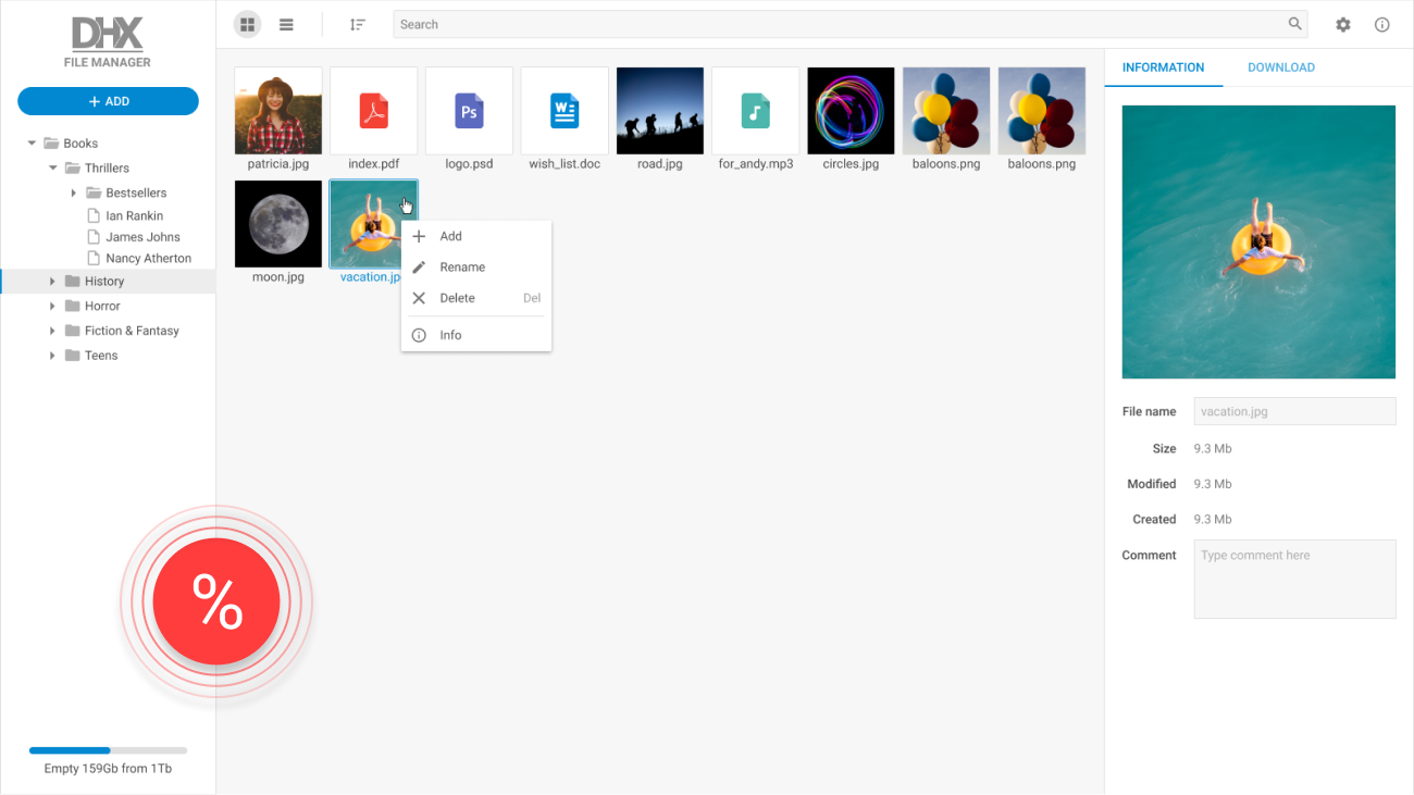
React Layout
Build intuitive web interfaces with our React layout component. Part of the modern and highly flexible Suite UI library.
Product Features
- Cross-browser compatibility
- Support for IE11+
- Full control with JavaScript API
- All-encompassing customization
- Horizontal, vertical, and mixed layouts
- Custom HTML content in cells
- Ability to attach any DHTMLX components to cells
- Progress bar
- Cell headers with icons and images
- Configurable size of cells
- Collapsibility
- Resizability
- Ability to add and remove cells to/from a layout
- Ability to hide and show cells
- Ability to check the cell’s visibility
- Accessibility support
How to Initialize a React Layout Component
Why Choose React Layout by DHTMLX?
Easy way to organize UI elements
dhtmlxLayout is an effective and highly customizable tool to specify the main scheme of your application or web page. Our React layout component allows defining the interface structure, arranging blocks with content and setting their sizes. You can build horizontal, vertical and mixed layouts where both rows and columns are used.
Rich API to control React page layout
DHTMLX enables building a custom layout with a complex structure by including nested rows and columns. Cells can contain any HTML content as well as any DHTMLX components you want. Our advanced API allows adding, removing, hiding, and showing cells. You can collapse and resize columns and check their visibility on the fly.
Complete customization via CSS
Our users are able to enhance the appearance of a basic React Material layout. The width and height of a cell are entirely modifiable. You can add headers together with particular icons and images. Besides, the desired look and feel is achieved via CSS. Just add new CSS classes with custom settings thus styling any cells you want.
Additional support for Angular and Vue.js
As a part of the Suite UI library, the DHTMLX Layout component can be used in applications based on the top three current frameworks such as React, Angular, and Vue.js. You can try out our progressive dhtmlxSuite by downloading a free 30-day trial version.
Support & Learning Resources
We provide comprehensive documentation with technical samples. Moreover, our dedicated support team is fast and qualified. Find the suitable way to get support:
Other Suite Components
Need help with dhtmlxLayout integration into your app? Contact us


