If you are using an outdated version of DHTMLX Suite 5 and require the documentation for it,
please contact us,
and we will send it to you.
This article is a part of the series about DHTMLX JavaScript and HTML5 Charts – providing insights and best practices for the most popular graph types. Today, we’ll try to find out what a line chart is used for and what design tricks are needed to provide a better user experience.
Test our charting library during a 30-day free trial period.
A series of data points, joined by a line in a dot-to-dot fashion, can show startling results along its peaks and valleys. A simple line chart has the power to display the dynamic, highlight successes, and warn about potential dangers – all in seconds.
Horizontal line charts are primarily used for displaying behavior over a period of time: technology trends by a year, price dynamics over a quarter, website page visits per hour, and so on. In most cases, the way the data is trending allows predicting easily the results of data not yet recorded.
The time unit (years, months, days, etc.) is distributed evenly along the horizontal x-axis. The magnitude of each data element in the series is represented by its position on the vertical y-axis.
Specificities of a JavaScript Dynamic Line Chart
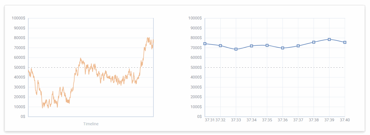
Dynamic or real-time charts are useful in displaying data that changes with time like a stock price, exchange rate, etc. These graphs are interactive, support animation and live updates.
Keys to Create a Simple JavaScript Line Chart
Consider Adding Data Comparison
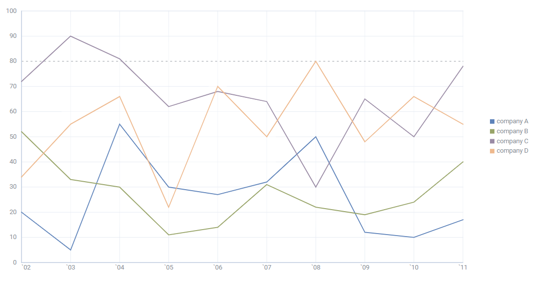
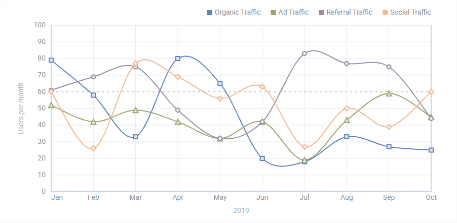
It’s possible to include more than one line on the same axis. Thus, for instance, you can compare the number of tasks completed by each team for a certain period of time. Such a horizontal line graph depicts the totals with a separate line for a team.
However, if you’re building a multiple line chart, do not match too many data series. Graphs with more than 5 lines usually become cluttered and hard to understand.
Prefer Contrasting Colors for Multiple Lines
Users should not spend too much time trying to perceive your graph clearly. So when you draw a JavaScript line chart with multiple items, set clear contrasting colors. The color difference allows viewers to capture the aha moment quickly.
The palette you choose should be pleasing to look at. We recommend avoiding jarring and eyesore colors as well as variations of the same shade. If you have to build a JS line chart for a dashboard or business report, select a few brand colors harmonizing with each other.
Do Not Overwhelm Your JavaScript Line Chart with Text
When you add the text content, don’t be tempted to overcrowd the chart with too many symbols. There’s no need to mark every value on the x-axis and include all the data you have about the chart. Try to avoid bulky legends, paragraphs of texts, and multiple axis labels.
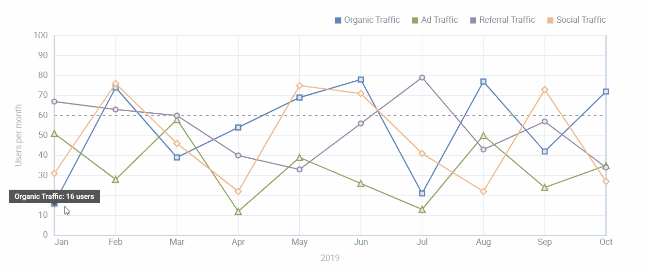
Instead, you need readable titles and labels. The axis’ intervals have to be spaced evenly. Use special marks to label specific numbers that make sense for your datasets. Moreover, you can add tooltips to show the values when a user hovers over the data items.
Alternatives to a JS Horizontal Line Chart
We should note that line charts are not suitable for all kinds of data. For example, they fail in demonstrating percentages and proportions. Instead, consider choosing a pie chart. If you want to show how values differ in various categories or at the same time intervals, consider using JavaScript bar charts.
Differences Between a Line Graph and Spline Chart
Are you looking for a way to display changes over time that isn’t a line graph? Then you may experiment with a JavaScript/HTML5 spline chart. Line and spline charts are deeply related, the only difference is that the spline includes a fitted curve linking each data point in a series.
Why Choose DHTMLX JavaScript Visualization Library to Build a Line Chart
Our JavaScript charting library provides a simple and convenient way to integrate 10+ chart types into your web applications and interfaces. You can create Bar and X-Bar, Line and Spline, Area and Spline Area, Pie and Donut, Radar and Scatter graphs. Some of them have 3D variations.
Modern Design
DHTMLX follows the guidelines of a Material Design styling. We’ll help you build scalable web interfaces with a user-friendly look and feel.
Rich Configuration
A comprehensive DHTMLX Chart API allows configuring any element to achieve the desired appearance without a hitch. For instance, you can add multiple data items into your dynamic line chart. A new item will appear along the x-axis.
type:"line",
scales: {
"bottom" : {
text: "text",
showText: false
},
"left" : {
maxTicks: 10,
max: 100,
min: 0
}
},
series: [
{
value: "value",
color: "#5E83BA",
strokeWidth: 2
}
]
};
var chart = new dhx.Chart("chart", config);
chart.data.parse([
{
value: Math.random() * 100,
text: "u" + Date.now() + 1
},
{
value: Math.random() * 100,
text: "u" + Date.now() + 2
},
{
value: Math.random() * 100,
text: "u" + Date.now() + 3
}
]);
function add() {
chart.data.add({
value: Math.random() * 100,
text: "u" + Date.now()
});
};
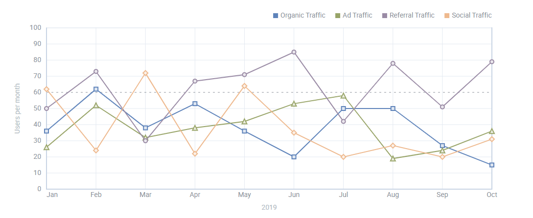
You can enable a legend and define its position. Indeed it should be available if your goal is to display more than one data series. The legend will provide information about the tracked data to help your users translate the graph.
scales: {
// scales config
},
series: [
// list of series
],
legend: {
series: ["A", "B", "C"],
valign: "top",
halign: "right"
}
});
The API allows configuring a scale and setting a title for it. Besides, you can add a threshold line at any defined level to look for the particular value.
type:"line",
scales: {
"bottom" : {
text: 'month'
},
"left" : {
padding: 10,
max: 90
}
},
series: [
{
value: 'company A',
strokeWidth: 2
// more options
}
]
});
Plus, our users can set maximum points to show an average number of values if your data is too large to display all the values in the chart.
type:"line",
maxPoints:100
});
Simple Customization
DHTMLX Charting library lets you modify several aspects of the chart’s appearance. You can set the type of the point of the data item (circle, triangle, rectangular or rhombus state) and define its color. Series lines can be repainted and dashed. Moreover, developers can add new CSS classes in case they need specific options.
Conclusion
A line chart is a powerful data visualization tool for many different areas, including finance, marketing, and project management. It is extremely effective for monitoring trends over a certain period of time and making predictions. If two or more lines are on the graph, it can be used as a comparison between them.
DHTMLX Chart component is a part of the JavaScript widget library – DHTMLX Suite. You can download a dhtmlxChart free trial version as well as estimate a complete Suite kit with 20+ UI widgets included.
Our advanced solutions allow building rich web interfaces that are compatible with all modern browsers. Plus, we offer examples of smooth integration into applications based on React, Angular, and Vue.JS.
Access our documentation to get more information about dhtmlxChart features.
If you have questions for our team or want to share your opinion, do not hesitate to contact us.