If you are using an outdated version of DHTMLX Suite 5 and require the documentation for it,
please contact us,
and we will send it to you.
We continue learning about the DHTMLX Chart library. In this article, we explain the basic principles of a JavaScript pie chart and characterize the ways to use circle graphs effectively. You are free to try dhtmlxChart by downloading a 30-day trial version.
Effective Tips to Create a Pie Chart Using JavaScript
Widely used in presentations and infographics, an HTML/JavaScript pie chart is a common way to illustrate quantity proportions between categories. By cutting a pie into slices, you highlight the size of each data point and thus compare parts to the whole graph, equal to 100%.
Pie charts are perfect for giving the reader a quick understanding of the proportional data distribution. However, there are many ways to get them wrong.
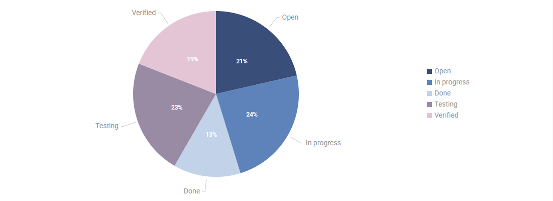
According to Develux, the following are the rules of thumb for building an effective JavaScript pie chart:
- You have only one data series.
- None of the data values are less than or equal to zero.
- The values have to differ. Small differences in slices are hard to understand, so users won’t be able to see which parts are larger or smaller without a hint. Moreover, having similar-sized categories makes a pie chart look cluttered.
- There’s an adequate small number of slices, e.g. from 6 to 10 categories maximum. As the number of values shown increases, the size of each segment becomes smaller. It makes a chart difficult for the eye to distinguish between the relative sizes of the different sectors.
- You can sort slices by value in clockwise decreasing order starting at 12 o’clock.
- A slice that contains a total amount of some values (commonly named as “other” or “other types”) is usually placed in the end even if it is not the smallest category. This method is to not distract from the individual categories of interest.
JavaScript Pie Chart Types and Ways to Use Them Efficiently
Let’s say you have to compare the workload of your development team for the first 5 months of the year. Then you can build a simple pie chart in HTML to see how much (i.e., how many tasks) the team has contributed to the development process as a whole.
Take a look at the pie graph presented below, used to showcase the workload for five months:
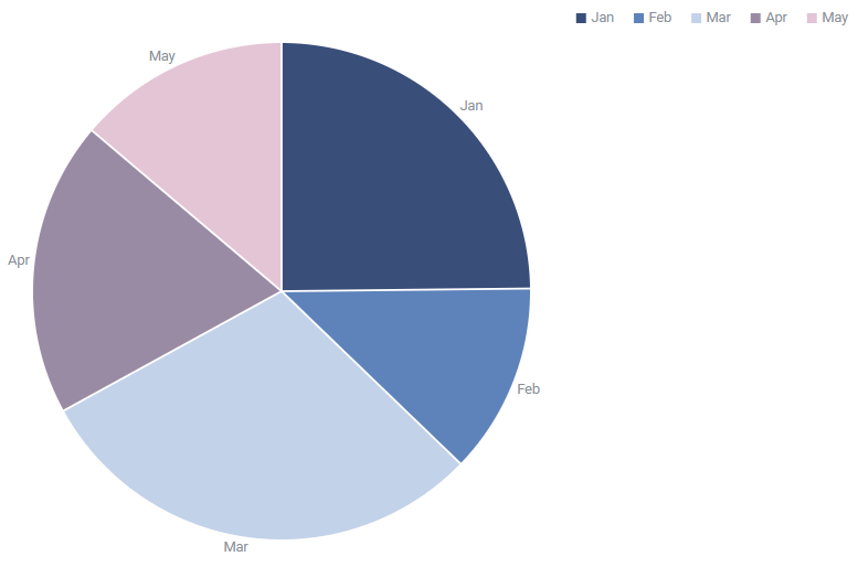
This HTML pie chart example gives a quick comparison between the number of completed tasks per month and the activity during the first part of the year. We are able to deduce the following points at a glance: March was the most productive month while the lowest activity level took place in February and May.
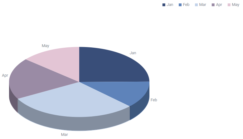
A 3D pie chart adds a pinch of aesthetics to the flat 2D graph by making it deeper:
You can separate one or more segments from the circle and create an exploded pie chart. The separated slices look as if they were cut from the pie and moved from its center. This effect is applied to either draw special attention to the slice or to highlight smaller chart categories with minimum values.
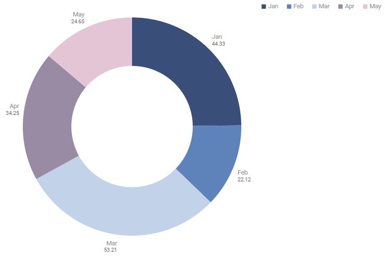
Another variation of a JavaScript pie chart is a donut graph with a hole in the center. This type of circular graph offers a better data intensity ratio to standard pie charts. Donut charts are more space-efficient because the blank space inside can be used to display additional information.
Summing up, wherever you can use a pie chart, you might as well create 3 other types described above.
Reasons to Create a Pie Chart in JavaScript with DHTMLX
DHTMLX Chart library is an effective and time-saving solution to assemble a pie chart using JavaScript. Apart from Pie and Donut charts, including 2D and 3D variations, the component also provides 8 types of commonly used graphs: Bar and X-Bar, Line and Spline, Area and Spline Area, Radar and Scatter.
Material Design Styling
Our JavaScript pie chart library follows the rules of a Material-based design. We cover best practices to help you build modern web interfaces that are scalable across all major platforms and devices.
Multiple Configuration Options
dhtmlxChart API properties allow configuring all chart types while the config options are individual for particular types. For instance, look how to create a pie chart in HTML using JavaScript:
type:"pie"
});
Since pie graphs are primarily for showing data proportions, the percentage represented by each category should come next to the corresponding slice of a chart. You can build a JavaScript pie chart with labels, enable the legend and define its position:
scales: {
// scales config
},
series: [
// list of series
],
legend: {
series: ["A", "B", "C"],
valign: "top",
halign: "right"
}
});
Advanced Customization Opportunities
dhtmlxChart comes with a broad set of config options that offer complete control over Pie, Pie3D and Donut graphs appearance. The component allows building a chart with monochrome fill or defining a color for each sector, which can be divided by lines with custom colors.
You can connect chart slices with labels by adding lines. Besides, pie and donut charts can display the percentage and values of data items as well as come naked without labels.
As far as a legend is a part of a JavaScript pie chart, its look may be turned according to your project specifications. Thus, you can choose square or circle marker shapes, apply custom paddings and margins between legend items and the scale.
Take a look at the screenshot below. We built an interactive dashboard that can be embedded in real-life web applications, for example, CRM systems. Here you can find a customized pie chart in monochrome blue colors with a one-column legend on the right. We also added an area chart, both are in the same style.
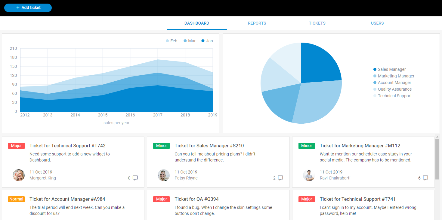
Check the full UI Dashboard demo >
Moreover, you are able to tailor all chart elements (including those omitted in config options) to suit your needs by adding new CSS classes.
Conclusion
Pie and donut charts are commonly used to visualize data as a circle sliced into sectors that each represent a percentage of the whole. Despite their benefits, circle graphs are increasingly criticized and overlooked by the web community. We at DHTMLX are aware of how important and sometimes difficult it is to build a clear and intuitive pie chart. So in this article, we tried to bring useful tricks in pie charting.
Being a part of the Suite UI widget library, Chart component helps to build rich web interfaces and applications that are compatible with all modern browsers and popular frameworks including Angular, React, and Vue.js.
You can download a 30-day trial version of dhtmlxChart or test a full Suite kit with 20+ UI components included. Access our documentation to receive thorough information about DHTMLX JavaScript charts features.
Do you have any questions for our team? Feel free to contact us and share your concerns.