If you are using an outdated version of DHTMLX Suite 5 and require the documentation for it,
please contact us,
and we will send it to you.
DHTMLX Chart, a part of the modern Suite UI library, consists of different types of graphs. One of the most widely used is a javascript bar chart, which allows comparing data categories and seeing their changes over time. Try out dhtmlxChart by downloading a 30-day free trial.
Where to Use JavaScript Bar Charts?
A bar graph is a visual tool that allows comparing data among categories. The chart displays categorical data as rectangular bars with heights equivalent to the values that they represent. Usually, the categories appear along the horizontal axis, and a vertical one represents a measured value of the categories being compared.
Simply put, bar charts are a must-have in the data visualization arsenal. They are quick to create, show comparison clearly, and are easy for the audience to understand.
A bar chart in JavaScript has the following fields of use:
- Providing an intuitive view to the values of each category.
- Comparing sets of data between different groups at a glance. Thus, for example, users can analyze data by a quarter or annually and see how results are distributed throughout each year.
- Tracking big changes in data over time (for example, months or years).
What Are the Ways to Visualize Data With a Bar Graph?
If you have to show the frequency and ratio of each category, a single bar chart would be the best solution. Thus you will see the values of items clearly with the length of each bar.
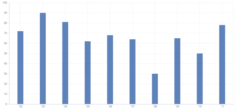
Moreover, a simple JavaScript bar chart allows arranging bars in any order. Bar graphs organized from highest to lowest incidence are called Pareto charts. In this way, the graph visually depicts which situations are more significant.
A single HTML bar chart is intuitive to view the values. However, there is one noticeable limitation: as soon as you have more than about 10 categories being displayed next to each other, labels can become hard to read. Indeed Y-bar graphs don’t leave much space for the text below.
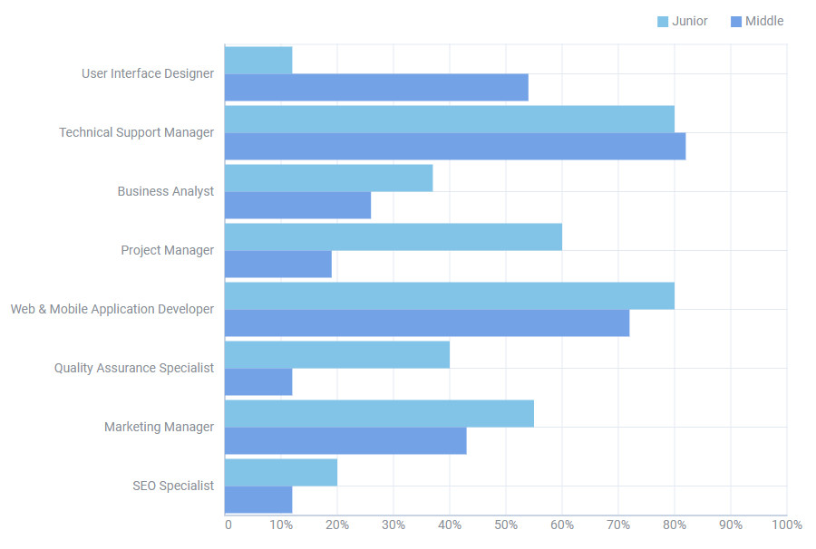
A horizontal bar chart in HTML/JavaScript solves this issue. X-Bar graphs allow for much longer label text because the labels are above each other and not beside.
 Check the sample >
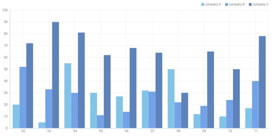
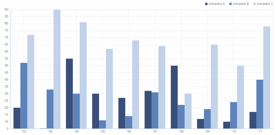
Some bar graphs present columns sorted in groups, showing the values of more than one measured variable. These are clustered bar charts used to compare multiple series inside the same category.
In clustered bar charts, each categorical group consists of two or more bars. Let us suppose that a business owner decided to compare the revenue of his 3 companies. Thus he can build a grouped graph.
Below you can see a clustered HTML bar chart example with different colored bars to represent each company. The horizontal axis shows the months of the year and the vertical one illustrates the profit.
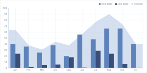
As a clustered bar chart makes it complex to show the differences between the totals of each group, JavaScript stacked bar graph comes in to fix it. It is composed of multiple bar series placed vertically one after the other. If there are any negative values, they are stacked in reverse order below the chart’s axis baseline.
HTML stacked bar chart is a good choice if you have to:
- Demonstrate the total size of the groups.
- Track the variation in the individual values along with their total value.
- Visualize data that is naturally divided into components, like sales by district, time span or product type.
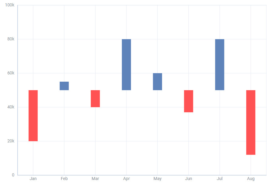
With a vertical diverging bar chart in JavaScript, end-users can view the spread of negative and positive values. The key point is comparing data with a middle point and categorizing chart bars above and below a common baseline.
 Check the sample >
Why Build JavaScript Bar Chart with DHTMLX?
Building a bar chart using JavaScript is simple and convenient with our dhtmlxChart component, which also provides 10 other types of graphs: X-Bar, Line and Spline, Area and Spline Area, Pie and Donut (that have 2D and 3D variations), Radar and Scatter charts.
Material Styling
Back in 2014, Google announced guidelines designed to support a common look and feel across applications that run on Google platforms. This effort, called Material Design, uses more grid-based layouts, improved color palette, clearer label formatting, and depth effects such as lighting and shadows.
We at DHTMLX respect common practices and have designed our Chart component in Material style.
Suitable Configuration
Our bar chart is highly flexible. Users can easily modify scales, series, and legend and even toggle off a series in a legend by using our API.
Here you can see how to create a bar chart in HTML using JavaScript and configure series:
type:"bar",
scales: {
"bottom" : {
text: "month"
},
"left" : {}
},
series: [
{
id: "A",
value: "company A",
fill: "#394E79",
stacked: stacked,
color: "none"
},
{
id: "B",
value:"company B",
fill: "#5E83BA",
stacked: stacked,
color: "none"
}
]
});
You are also able to choose the proper type of scales and tailor it depending on your needs:
type:"area",
scales: {
"bottom" : {
text: 'month'
},
"left" : {
padding: 10,
max: 90
}
},
series: [
{
value: 'company A',
strokeWidth: 2
// more options
}
]
});
The configuration of a chart legend includes a number of options, for instance, enabling you to add a legend and define its position:
scales: {
// scales config
},
series: [
// list of series
],
legend: {
series: ["A", "B", "C"],
valign: "top",
halign: "right"
}
});
Flexible Customization
Style manipulations are achieved via CSS. dhtmlxChart component lets you control several aspects of bar appearance, tailor paddings, margins, and sizes of all graph’s elements. Our users can specify colors and transparency, apply a color gradient to bars as you can see in the screenshot below.
However, despite the endless opportunities for customizing our JavaScript bar chart library, we highly recommend to choose a proper style and focus on it. Do not mix various styles too freely inside the single chart.
DHTMLX Chart is a part of the Suite UI widget library. Thus, you can test and order dhtmlxChart as a separate component or choose a complete Suite library with 20+ full-featured widgets. Our cutting-edge JavaScript library allows building modern and rich web interfaces, makes them compatible with all modern browsers and provides integrations with React, Vue.js, and Angular.
Conclusion
Data visualization gets easier and more exciting when you understand what tools and under what conditions are the best. A simple bar chart, for example, allows comparing values in a single data series. Users are able to analyze data sets between different groups and capture data changes over time.
DHTMLX fully-featured JavaScript chart library offers different graph types to illustrate whatever you need and build a rich user experience. Get deeper insight into the features of our charts by accessing our documentation.
You can download a 30-day trial version for free in case you decided to try dhtmlxChart library possibilities.
Do not hesitate to contact us if you have any issues or leave your comments below.