If you are using an outdated version of DHTMLX Suite 5 and require the documentation for it,
please contact us,
and we will send it to you.
It’s been a month and a half since the large-scale update of the whole JavaScript widget library DHTMLX Suite v6.0. We’ve been gathering your feedback, prioritizing features for future releases, and working hard to deliver the next update 6.1. And now our minor release brings out editing for dhtmlxGrid and dhtmlxTree, multiselection and drag-n-drop of multiple items and inline editing in dhtmlxList and dhtmlxDataView as well as a range of other essential features for building top-notch user interfaces.
dhtmlxGrid New Features and Updates
Data Editing
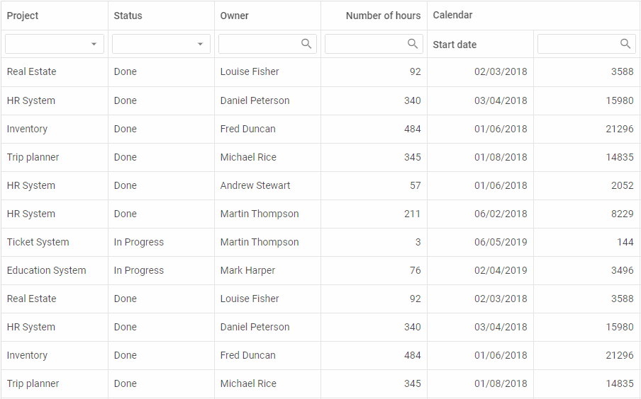
V6.1 provides new editing capabilities for our JavaScript Data Grid. Now end users can easily edit any cells they need on the fly. When they double click a cell, an appropriate editor appears: a simple input field, selection box or datepicker:
 Check the sample >
As you can also see from the recording above, there appeared a new column type – date, which enables end users to choose a date on a calendar in the column “Start date”.
In order to achieve that and make an entire Grid editable, developers need to specify the editing:true property in the Grid configuration:
columns: [// columns config],
data: data,
editing: true
});
However, you can limit a choice of columns that can be edited by end users if you set the editing:true property in the configuration of specific columns. For instance, here is how we can make only the first column editable:
columns: [
{
width:150,id:"project",
editing:true,
header: [
{text:"Project"}, {content:"selectFilter"}
]
},
{ width:150, id:"owner", header: [{text:"Owner"},{content:"inputFilter"}]},
{ width:150, id: "hours", header: [{text:"Hours"}, {content:"inputFilter"}]},
// more columns
],
data: data
});
By default, columns have an input type of the editor for working with plain text. If a column has a type “date”, then a datepicker editor will be used. Developers can also set a specific date format for editing:
// if the type:"date" config is set in the column config,
// there's no need to specify the type of the editor
width: 150, id: "start_date",
header: [{ text: "Calendar", colspan: 2 }, { text: "Start date" }],
type: "date", dateFormat: "%d/%m/%Y"
}
In order to equip a cell with a selection box with options to choose from, you’ll need to specify the select editor type and and add the desired options for selection:
width: 150, id: "status", header: [{text: "Status"}, {content: "selectFilter"}],
editorType: "select", options: ["Done", "In Progress", "Not Started"]
}
Additionally, now developers have a straightforward way to edit any Grid cell using the edit method. Here is how we can edit the first cell of the “project” column with just one line of code:
Vertical Spans in Header
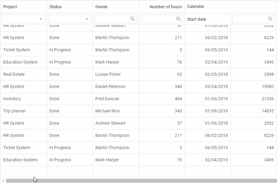
Besides, now our Grid allows creating not only horizontal but also vertical spans in the header:
 Check the sample >
Empty Grid
On top of all, v6.1 makes it possible to initialize an empty Grid, without any data loaded into it. It also introduces the ability to automatically add an empty row into the end of the Grid when the last empty row is filled out with the help of the autoEmptyRow property:
columns: [// columns config],
autoEmptyRow:true,
data: dataset
});
Check the documentation >
 Check the sample >
Complex Selection
V6.1 delivers the ability to highlight a selected cell together with a row it belongs to. Check the documentation >
dhtmlxDataView and dhtmlxList New Features
Inline Editing
Besides dhtmlxGrid, our data processing components – DataView and List – also become easily editable starting from v6.1. There are two ways of setting up the editing functionality. The first one is via the API with the help of the edit method. It allows developers to define which item should be edited. For example, the following line of code instructs DataView to enable editing of the item with the id “1”:
However, there is a more convenient way, which gives end users an opportunity to edit all items at once. It can be enabled using the editing configuration option before the initialization of the component:

The same edit method and editing configuration option can be applied in dhtmlxList. Read more in the documentation >
As for dhtmlxTree, previously developers were able to use the edit method for changing particular items. Now they can turn on inline editing of all Tree items with the help of the editing configuration property as well:
Multiple Selection and Drag-n-Drop
V6.1 introduces a multiple selection of List and DataView items and multiple drag-n-drop.
By default, it’s possible to select just one item in a DataView or List at a time. However, with the multiselection configuration option developers can enable the selection of multiple items at once:
Multiselection has two modes of work. The default one makes use of “Ctrl + click” combination for selecting several items. But developers may switch on a simple click mode, which allows selecting multiple items by means of clicks only:
multiselection:true,
multiselectionMode:"click"
});
Drag-n-drop of multiple items can be easily enabled by specifying the multiselection:true configuration property in addition to the dragMode. For example, let’s set up the drag-n-drop of multiple items in the DataView:
dragMode:"source",
multiselection:true
});

Other Updates
In addition to the main features presented above, we’ve updated a range of other UI components included in dhtmlxSuite: ComboBox, Form, Popup, Window – as well as Data and Tree Collection. For instance, dhtmlxCombo received the ability to hide and show a popup via the Popup API. dhtmlxWindow got a special method for checking the window’s visibility – isVisible. Learn about all the updates of JavaScript UI components in the documentation.
We invite you to try out dhtmlxSuite 6.1 during a 30-day evaluation period and benefit from the assistance of our technical support team.
Current clients are welcome to download the latest version in their Client’s Area.
We’ll be looking forward to your feedback! Stay tuned for future updates!