If you are using an outdated version of DHTMLX Suite 5 and require the documentation for it,
please contact us,
and we will send it to you.
Our JavaScript UI widgets are empowered with new abilities, boosted performance, and a more developer-friendly API in v6.2.
Now DHTMLX Grid is equipped with new filter and editor types, drag-n-drop of rows, hiding and resizing of columns, and export to CSV. DHTMLX Calendar receives a new range selection mode. Form and Layout components become much more convenient and flexible to work with due to newly introduced API methods and events. Besides, v6.2 brings out helper guides on how to use DHTMLX default icons and CSS classes to accelerate web development.
Download evaluation version 6.2 and try it out in your projects free of charge for 30 days!
Grid with Surpassing Performance and Enriched Functionality
First and foremost, v6.2 has made our Grid blazing fast accelerating its speed to 2.5x:
New Editor and Filter Types
Secondly, the update introduces two new types of editors for cells of Grid columns: combobox and checkbox.
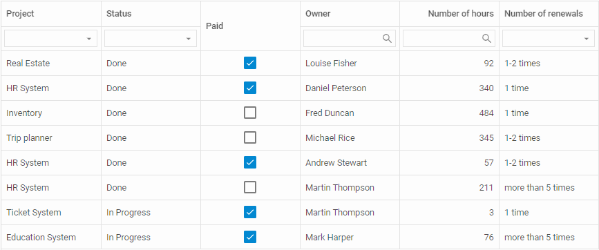
A combobox editor represents a dropdown list of options, which can be filtered by typing in text in the editor cell. This type of editor is enabled by setting the editorType: “combobox” property for a particular column and specifying options to choose from:
width: 160, id: "test", header: [{ text: "Test" }], type: "string",
editorType: "combobox", options: ["1 time", "1-2 times", "more than 5 times"]
}
A checkbox editor can be applied for columns with a binary choice. In order to implement this type of editor, you only need to specify the type: “boolean” property for a column. In case the editing option is enabled in the whole Grid, then the checkbox editor will be switched on for the respective columns by default.
// if the type:"boolean" config is set in the column config,
// there's no need to specify the type of the editor
width: 160, id: "test",
header: [{ text: "Test" }],
type: "boolean"
}
Apart from the editing functionality, a combo box control can be used as a filter in the Grid header or footer for quickly searching for the necessary data:
width: 160, id: "renewals",
header: [{ text: "Number of renewals" }, { content: "comboFilter" }],
type: "string", editorType: "combobox",
options: ["1 time", "1-2 times", "more than 5 times"]
}
Various additional configuration properties allow developers to refine this filter type depending on their needs – for example, load data dynamically while scrolling the list of options. Read more in the documentation >
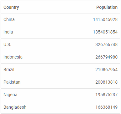
Drag-n-Drop of Rows
Starting with v6.2, end users are able to easily rearrange Grid rows by dragging and dropping them with the mouse. Drag-n-drop operations can be enabled within one Grid or several Grids according to the specified mode. For instance, here you can see how to drag-n-drop rows within one Grid by setting the dragMode:both property in the configuration object of Grid:
columns: [
{ id: "country", header: [{ text: "Country" }] },
{ id: "population", header: [{ text: "Population" }] }
],
data: dataset,
dragMode: "both"
});
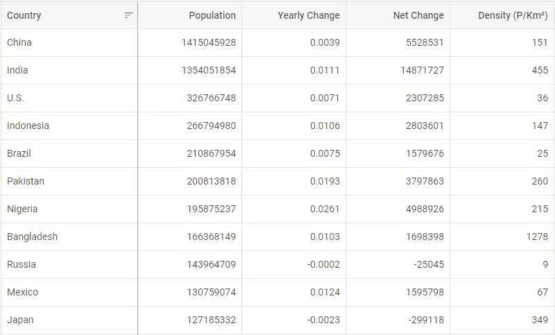
Manipulating Columns
Another enhancement in v6.2 concerns the flexibility of working with Grid columns. The update delivers a wide range of new configuration properties for controlling the maximum and minimum column width, making columns hidden, and resizing them from the UI.
For example, the hidden:true property specified in the config of a column hides it in Grid:
width: 150, id: "population", header: [{ text: "Population" }]
},
{
hidden: true, width: 150, id: "yearlyChange", header: [{ text: "Yearly Change" }]
}
The resizable:true option specified in the configuration of the whole Grid or a particular column enables manipulating the columns’ size by end users with the help of the mouse:
columns: [// columns config],
data: dataset,
resizable: true
}
 Check the sample >
Meanwhile, developers can disable the resizing of specific columns by setting the resizable:false property in their config:
columns: [
{ width: 150, id: "test1", header: [{ text: "Test1" }] },
{ width: 150, id: "test2", header: [{ text: "Test2" }], resizable: false }
],
data: dataset,
resizable: true
}
On top of all, you can predefine the limits, within which columns can be resized from the UI, by defining their minimum and maximum width.
Export to CSV
In addition to Excel, now Grid supports exporting of its data into the CSV format. You can choose to export data to a CSV file or just as a string. Read more in the documentation >
In v6.2 DHTMLX TreeGrid also receives all the new features and improvements described above. For all the details, study the documentation.
New Range Mode in DHTMLX Calendar
Besides the ability to link two calendars for showing a date range on them, v6.2 allows displaying a range of dates on one calendar only. This mode is easily enabled via the range:true option in the calendar configuration object, where you should also define the start and end dates of your range:
css: "dhx_widget--bordered",
range: true,
value: ["03/06/19", "15/06/19"]
});

Enlarged API in Form and Layout
Now working with Form and Layout components is much more straightforward and intuitive, as v6.2 supplies them with a wide range of methods and events.
From now on, developers are able to manipulate separate Form controls: DatePicker, Checkbox, ColorPicker, Combo, Input, RadioGroup, Select, SimpleVault, Slider, Text, Textarea, TimePicker – and update their configuration on the fly. Check Form API >
Moreover, new Layout events provide more control over the components’ behavior in order to assemble complex user interfaces, especially with custom content in them.
DHTMLX Guides for CSS Classes and Icons
Apart from the new functionality, our dev team designed special guides, which would assist you in the development of web apps using our UI library:
- Decorating apps with icons
- Working with CSS classes in DHTMLX components and outside of them
We’re eager to receive your feedback about the release and continue our work on the Suite UI widget library. Don’t hesitate to contact us and share your ideas!
Try out the latest v6.2 during a 30-day evaluation period >
Current clients are welcome to get their updated version in Client’s Area.
Related Materials:
- Full what’s new list
- Suite samples
- Suite documentation