We start the year 2020 with the new release of DHTMLX UI widget library – Suite 6.4. The update encompasses the most sought-after features boosting the performance of all JavaScript UI components.
The highlight of the release is the lazy loading of data in Grid and List, which accelerates data processing and saves you time and resources. Among other highly demanded features delivered in v6.4 are sorting operations in Grid and TreeGrid, advanced multiselection of Grid rows and cells, ability to disable an entire form or some of its controls, deeper customization of Charts, attaching Window to a custom node, and manipulating separate tabs in Tabbar.
However, that’s not all – read more in the release article and download Suite trial version 6.4 for testing the updated components for free for 30 days!
DHTMLX Grid Updated
Grid Lazy Loading [PRO]
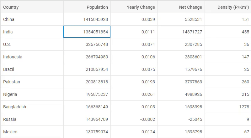
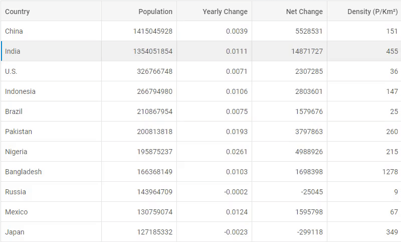
Our JS data table component DHTMLX Grid is reinforced with lazy loading of data, which allows steadily adding data piece by piece for rendering records in the visible area of the Grid. Such dynamic loading reduces the amount of time and resources allocated for data processing and makes it smooth and speedy.
Lazy loading is enabled via the LazyDataProxy helper:
limit: 30,
prepare: 5,
delay: 150,
from: 0
});
The parameters of its object constructor allow you to define the URL where data should be loaded and some other optional settings such as a limit of records and delay time for dynamic loading. Learn more about lazy loading in Grid >
After the LazyDataProxy initialization, you only have to call the load method and pass the lazyDataProxy as a parameter:
grid.data.load(lazyDataProxy);
Now, you’ll be all set for efficient data processing with DHTMLX Grid!
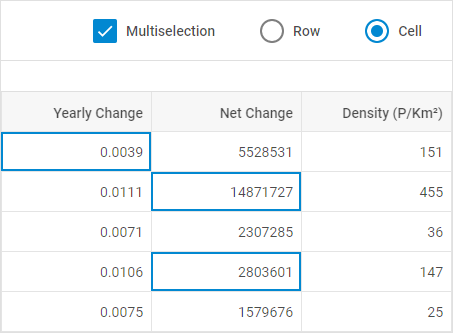
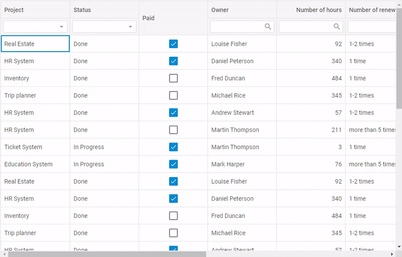
Multiselection of Grid Cells and Rows
V6.4 introduces the ability to select multiple cells and rows in DHTMLX Grid. With the help of Ctrl and Shift shortcuts, end users can select random cells and rows situated in any order or an entire range of cells or rows.
For example, that’s how we turn on the multiselection of rows by setting the multiselection property to true and specifying the selection property to “row”:
columns: [// columns config],
multiselection:true,
selection:"row",
data: dataset
});
Besides the ability to switch on the multiselection functionality for end users, developers can manipulate the selection of Grid cells and rows on their own via the API.
The setCell() method allows defining which cells to select. Here we set up the the multiselection of one cell in the Yearly Change column and two cells in the Net Change column. By specifying the ctrlUp: true and shiftUp: false parameters we determine that it’s possible to select only separate cells, not ranges:
grid.selection.setCell(grid.data.getId(1),"netChange", true, false);
grid.selection.setCell(grid.data.getId(3),"netChange", true, false);
Grid and TreeGrid Updated
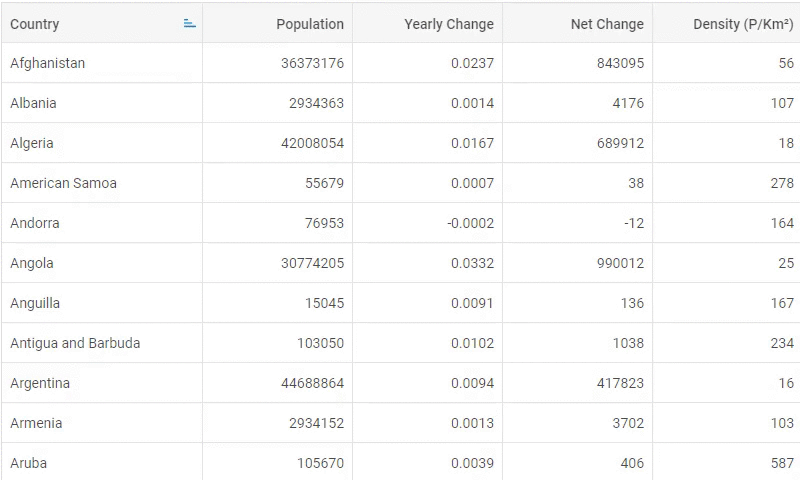
Sorting Operations
From now on, you are free to choose which columns should be sortable in DHTMLX Grid and TreeGrid. In order to enable sorting of particular columns you need to specify the sortable: true property in their configuration while setting sortable: false in the configuration of Grid (or TreeGrid) to disable sorting in the rest of columns.
In the example below only the columns with countries and density can be sorted:
columns: [
{ width: 200, id: "country", header: [{ text: "Country" }], sortable: true },
{ width: 150, id: "land", header: [{ text: "Land" }] },
{ width: 150, id: "density", header: [{ text: "Density" }], sortable: true }
],
data: dataset,
sortable: false,
});
Additionally, the new getSortingState method gives you an opportunity to receive the id of the column, by which Grid (or TreeGrid) is sorted, as well as the order of sorting (ascending or descending).
Adjusting Columns’ Width
Both Grid and TreeGrid obtain a new ability to adjust the width of their columns to the size of the entire table using the autoWidth configuration option:
columns: [// columns config],
autoWidth:true,
data: dataset
});
If needed, it’s possible to change the width of a specific column to match the size of its content (cells or headers) automatically with the help of the adjust property:
columns: [
{ id: "country", header: [{ text: "Country" }], adjust: "data" },
{ id: "population", header: [{ text: "Population" }] }
],
adjust: false,
data: dataset
});
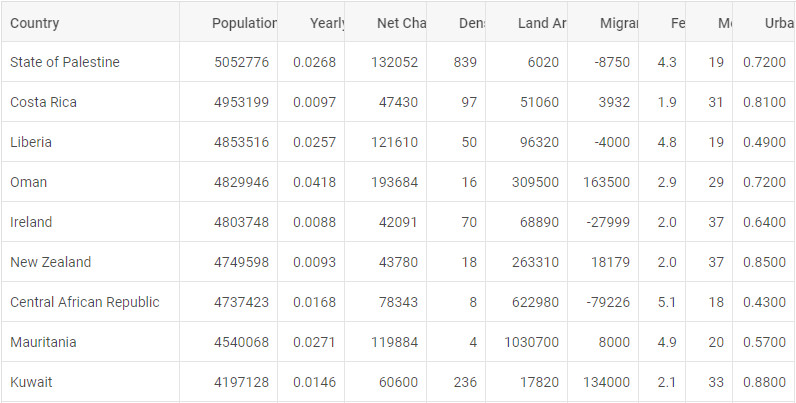
As shown in the data table below, the width of all columns is adjusted to the width of Grid, however, the first column matches the width of its cell content:
 Check the sample >
In addition to the new functionality described above, now DHTMLX Grid and TreeGrid components allow developers to verify if a column is displayed or hidden via the isColumnHidden method. Grid keyboard shortcuts are also enlarged with new combinations for navigating Grid cells and changing the selection of cells simultaneously:
Charts Updated
Our appealing JS charting library acquires more flexibility in v6.4. New features include the ability to rotate scale labels and data labels inside bar and X-bar charts and use up to four axes (two vertical and two horizontal).
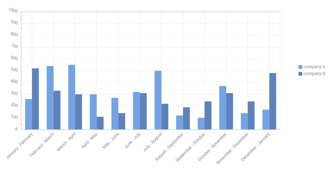
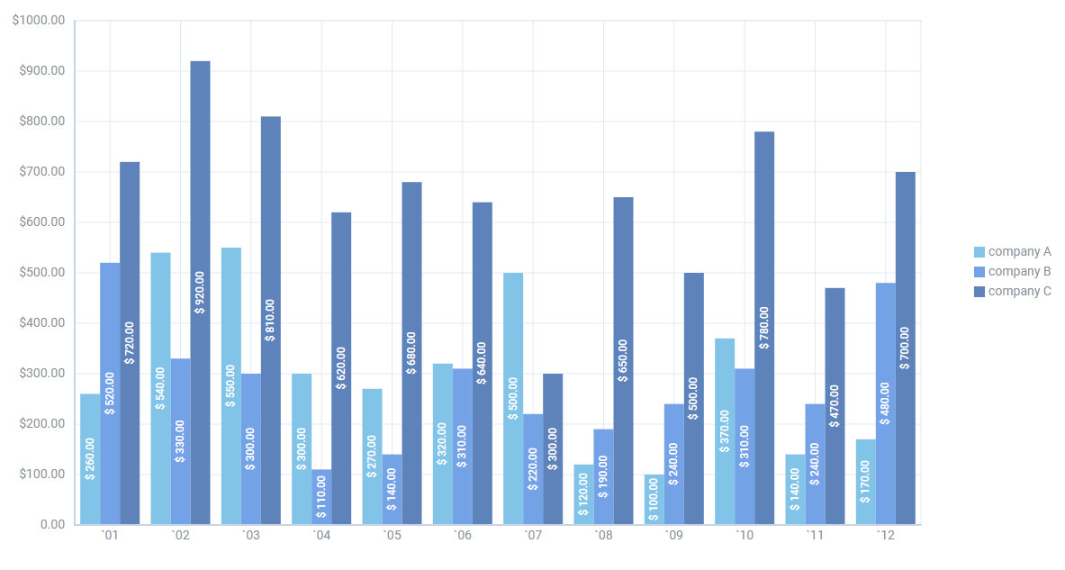
Apart from that, we added a new event for tracking clicks on data series serieClick.
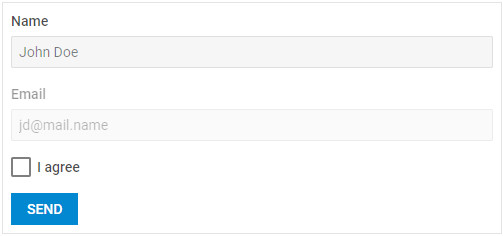
Form Updated
Starting with v6.4, developers can disable an entire form or its elements, so that end users won’t be able to interact with them. For that purpose, you just need to add the disabled: true property in the configuration of the form:
css: "dhx_widget--bordered",
disabled: true
});
For instance, in order to disable a button control of the form, you need to apply the disable() method of the object returned by the getItem() method:
Tabbar Updated
Now working with DHTMLX tabbar becomes more convenient, as a new range of methods lets developers manipulate not only the entire tab bar but also separate tabs. For instance, here is how we can disable one of the tabs in DHTMLX Tabbar with the help of the disableTab() method:
// -> true|false

Following the same logic, you can equip particular tabs with the close button by specifying the ids of the chosen tabs in the closable property:
closable: ["paris", "london"]
});
Window Updated
The release brings out the ability to attach DHTMLX window to a custom node instead of the body of the page. It’s possible due to the node property, where you can specify the container for your window:
node:"customDiv"
});
Other Updates
In the release article, we’ve described the most-awaited features of the Suite UI library 6.4. However, the update rolled out many other useful improvements:
- Calendar and TimePicker: the new clear method
- ColorPicker: the ability to specify the palette or picker mode of the component; the clear method
- ComboBox: data object; specifying the label position; events updated
- DataView: events and multiselection updated
- Layout: expanding and collapsing Layout cells; events and methods updated
- List: lazy loading [PRO]
- Menu, Ribbon, Sidebar, Toolbar: checking if an item is disabled; methods and events updated
- Slider: checking if the slider is disabled; defigning the label position of slider.
You can get acquainted with the full list of updates 6.4 in the documentation.
Try out all the new features – download the DHTMLX Suite 6.4 trial version (free for 30 days).
We invite our current clients to get the latest version of our UI library in their Client’s Area.
Looking forward to your feedback!