When building a JavaScript scheduler, it is often needed to provide end-users with the opportunity to edit scheduled events exactly the way they like. That’s what web developers really appreciate in DHTMLX Scheduler since it provides full freedom of action in this regard. It comes with the lightbox pop-up that allows changing the details of events via various controls on the fly.
But what if you want to complement the Scheduler’s lightbox with widgets from our Suite library? The good news is that it can be done and we’ll help you out with this task.
In this article, we provide you with step-by-step instructions on how to embed Suite widgets into the lightbox of the Scheduler component.
6 Steps to Add DHTMLX Calendar to Scheduler’s Lightbox
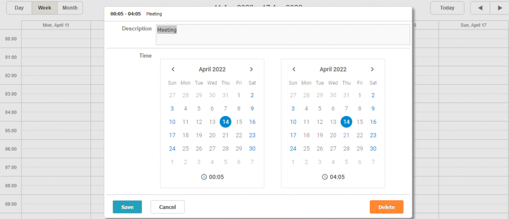
Any widget from the DHTMLX Suite library can be seamlessly incorporated into the editing form of our Scheduler component. The algorithm is pretty much the same for all widgets. Therefore, we take the DHTMLX Calendar as an example of how you can do it in practice. We’ll put this functionality with enabled time pickers inside the scheduler’s lightbox. It will help to conveniently specify the date and duration of events in 12- or 24-hour formats.
Here is how the expected result should look like:
Step 1
First of all, it is necessary to create a new editor object in scheduler.form_blocks. For this purpose, you have to use the render method that returns HTML elements. In this method, you simply create containers, in which date pickers will be generated.
render:function(config){ // config- section configuration object
return `<div class='custom_date_editor-wrapper'>
<div name="start_date"></div>
<div name="end_date"></div>
</div>
`;
},
set_value:function(node,value,ev,config){
},
get_value:function(node,ev,config){
},
focus:function(node){
}
};
Step 2
After that, you have to create public variables startDateCalendar and startDateCalendar:
let endDateCalendar;
These variables are used for getting access to the calendar objects, where time pickers are to be placed.
Step 3
The next step is to create the initCalendars() function. It is called when you need to initialize calendars all over again i.e. each time when opening the lightbox. This function also deletes any old calendars, if they exist, using the destructor method before creating new ones. The value of the timePicker property should be set to true to complement date selection with the ability to choose the time for scheduled events. In the code example below, we also used the dhx_widget–bordered CSS class that helps to specify borders for the calendar.
if(startDateCalendar){
destroyCalendars();
}
startDateCalendar = new dhx.Calendar(startDateElement, {
timePicker: true,
css: "dhx_widget--bordered"
});
endDateCalendar = new dhx.Calendar(endDateElement, {
timePicker: true,
css: "dhx_widget--bordered"
});
}
function destroyCalendars(){
if(startDateCalendar){
startDateCalendar.destructor();
endDateCalendar.destructor();
startDateCalendar = null;
endDateCalendar = null;
}
}
Step 4
Now it is time to consider the set_value function in the lightbox control object. This method is called whenever the control receives new values. It happens when the lightbox is opened and when the control receives a new value via API.
That is where you have to initialize the calendars and populate their values:
initCalendars(node.querySelector("[name='start_date']"), node.querySelector("[name='end_date']"));
startDateCalendar.setValue(new Date(ev.start_date));
endDateCalendar.setValue(new Date(ev.end_date));
},
Step 5
To enable the control to save the values in the event, it’s necessary to return these values from the get_value function.
In our case, the function will look like this:
const start_date = startDateCalendar.getValue(true);
const end_date = endDateCalendar.getValue(true);
ev.start_date = start_date;
ev.end_date = end_date;
return {
start_date,
end_date
};
},
It is important to clarify two important things that you are doing here:
- You modify the event passed via arguments and assign new date values to this object directly. This is a common approach for controls that are mapped to several different properties of the event.
- You return the date picker values from the function as the { start_date, end_date } object. It allows the scheduler.formSection(name).getValue() method to get access to the control values.
When implementing a simpler control that is mapped to a single property of the event object, you won’t need to modify the event object and only need to return the value from the method. The return value will be assigned to the corresponding property of the event object automatically. You can check the colorpicker example to see how it works in practice.
Step 6
Finally, it is required to destroy calendars when they are no longer needed. It is usually done using the onAfterLightbox event of DHTMLX Scheduler:
In this sample, you can see the event calendar with the embedded time picker functionality and play around with it.
Final Words
Following the steps provided in this guide, you can quickly enrich your JavaScript scheduler with numerous useful editing options using any widget from DHTMLX Suite. Here are also examples of schedulers with the DHTMLX Slider and DHTMLX Color Picker embedded into the editing form. If you want to enrich the Scheduler’s lightbox with your own controls, this guide will help you to do it right.
For those who are new to our products and want to try them in action, make use of free 30-day trial versions.