This major release is a turning point in the evolution of the DHTMLX Diagram editor. Initially conceived as a helpful addition to our main JavaScript diagram library, this out-of-the-box JavaScript tool has quickly gained popularity among web developers. Therefore, it is not surprising that the main novelties and improvements in v6.0 are directly related to the Diagram editor. Most of the requests received from our customers revolve around new configuration and customization opportunities in the editor. So we are happy to say that our efforts in that direction have yielded great results in DHTMLX Diagram 6.0.
It is hard to give you a short description of the new features delivered in v6.0. Why so? Because it is easier to say what remained unchanged – the scope of changes and improvements in the editor, especially in API, is mind-blowing. The modified DHTMLX Diagram editor is made to be as developer-friendly as possible. Flexible configuration and extended customization of the editor control elements, multiple new options for interacting with diagram elements, and built-in themes – this is not a complete list of editor novelties included in v6.0. End-users will enjoy better interaction with the editor’s shapes and connecting lines, a more functional but compact toolbar with all available control elements at hand, and an overall improved experience with the editor’s UI.
We did not forget about the Diagram component which now also supports new themes and several other features for working with diagrams.
In this blog post, we review all the novelties in more detail.
New Customizable Themes
Before we focus on major changes introduced in the Diagram editor, we want to start with a prominent styling feature provided for our diagramming library in v6.0.
Most of our latest releases include a major styling improvement in the form of new built-in themes and now the same can be said about the DHTMLX Diagram. In version 6.0, you have an opportunity to instantly change the appearance of both the Diagram component and the editor by applying four different themes – Light (default), Dark, Light High Contrast, and Dark High Contrast.
 Dark Theme. Check the sample >
To set a particular theme in your project, you need to use either the dhx.setTheme() method or the data-dhx-theme attribute. When it comes to configuring themes, you have to bear in mind that the default theme (light) contains variables of the color scheme in CSS variables. They enable you to change the color scheme of other themes automatically, at the same time, you can configure themes individually. All built-in themes can be customized by overriding the values of internal CSS variables.
In the Diagram editor, you can not only apply new built-in themes but also modify the appearance of Shapebar items in two ways:
- by redefining the CSS variables that specify the color scheme
- by defining custom CSS variables
Full information on new themes and working with them is provided on the Themes page.
Now, we proceed to highlight new capabilities delivered for the Diagram editor in v6.0.
Deeper Insight into Renewed Diagram Editor
The DHTMLX Diagram editor is valued by many as a great addition to any web app, where it is necessary to have a convenient and fast way to solve various data visualization tasks. But we know that you want to see our editor more adaptable to particular project requirements. The updated DHTMLX Diagram editor is exactly about that. It allows you to fully implement your ideas regarding the structural and functional peculiarities of your editor in practice with less time and effort.
Let us consider the new Diagram editor capabilities in more detail.
Managing Views in Diagram Editor
Our JavaScript diagram editor comes with 3 views (control elements) designed for visualizing data in real time – Toolbar, Shapebar, and Editbar. The new version provides an opportunity to manage the visibility and behavior of these elements during the editor configuration.
Control elements of the editor are configured using the view property. It includes three parameters, where you can specify the visibility (if boolean) and appearance (if object) of corresponding control elements:
type: "default",
view: {
toolbar: {
css: "toolbar_custom",
items: ["file", "separator", "scale"],
},
shapebar: {
width: 400,
},
editbar: false,
}
});
In addition, the view object provides three new methods to specify how the editor is displayed: show(), hide(), isVisible().
In the editor’s UI, the visibility of all control elements can be managed via the Toolbar.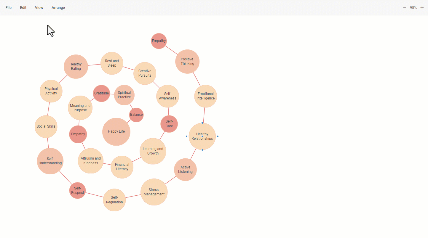
Check the sample >
More details on configuration options for each control element of the editor will be provided in the corresponding sections below.
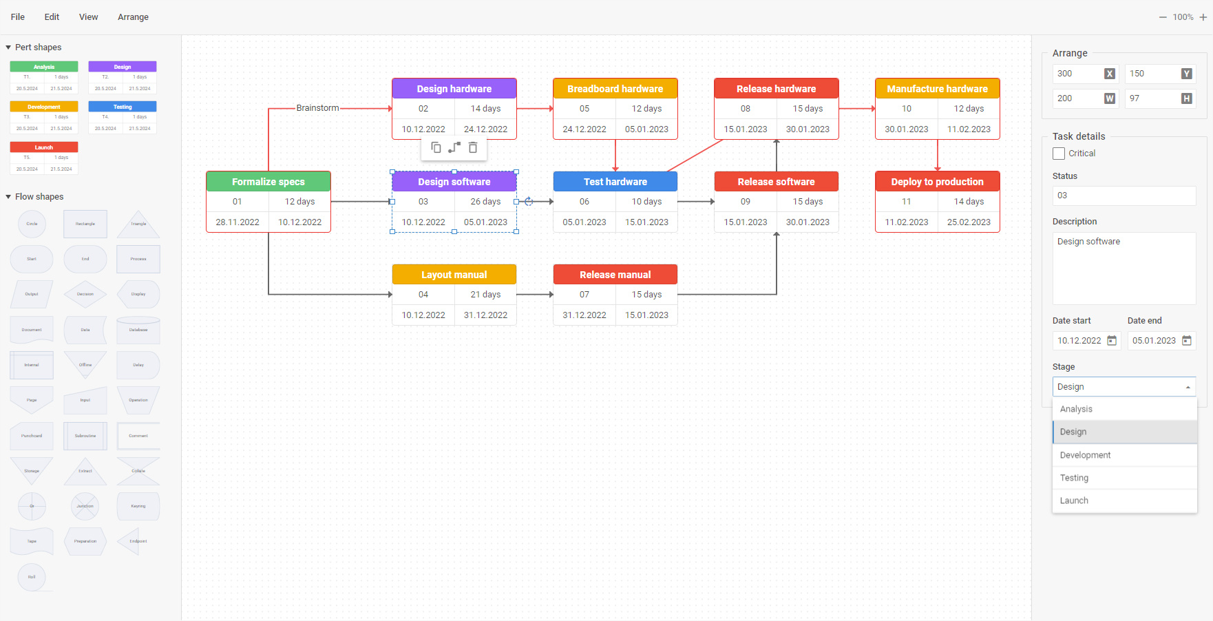
Highly Customizable Editbar
It is probably the most intriguing and substantial part of this release. In version 6.0, we bring the Editbar’s panel configurability and customizability of the diagram editor to a new level. Now you have a great opportunity to adjust this part of the editor to your needs and apply custom logic. The list of capabilities includes the following:
- dynamic Editbar management depending on the selected shape (or other conditions)
- creation of custom controls
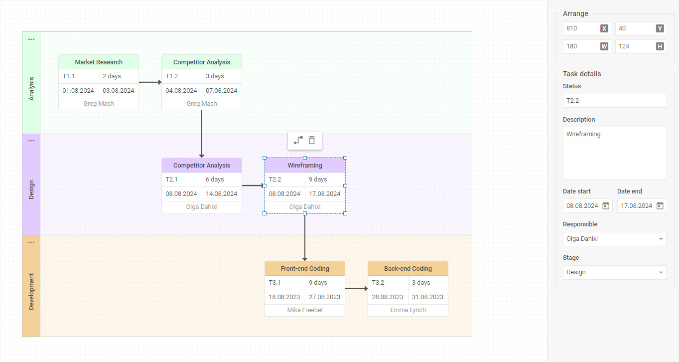
- creation of HTML content
Under the hood, these scenarios are implemented with a set of new options in the editbar property of the view configuration object.
Here we should point out two key properties:
This property enables you to build custom Editbar controls consisting of basic and/or complex controls. Basic controls allow displaying and/or changing the value of one of the properties of the selected diagram element (shape, line, group, swimlane, etc.), while complex elements consist of several basic ones.
Complex controls are commonly created using a basic fieldset control. Combining basic controls can be useful when separating individual controls into logical blocks, thereby making them reusable. You can override complex controls made of basic ones using the $properties service property. Complex controls may also include complex elements that cannot be overridden.
This addition to the Diagram Editor API brings in a range of configuration options that modify controls for diagram items (shapes, groups, swimlanes, etc.). It allows adding custom controls to particular items.
Using this property, you can set various conditions for displaying the Editbar. For instance, the Editbar can be displayed depending on the type of the selected element (rectangle, circle, card, etc.), lack of selected elements, and selection of several elements. Another peculiar condition type is the belonging of a diagram element to a specific semantic group (starting with the $ symbol). In this case, all element types belonging to a certain group will be overridden when defining the property.
In addition, you can also change the styling of the Editbar with the css property and change its width using the width property.
The default Editbar is specified using the editbar:true setting.
Flexible Toolbar Configuration
Previously, the Toolbar of our editor covered the basic needs related to the management of editing processes, but now you can enable end-users to do much more! Starting from v6.0, you get plenty of options to fine-tune the Toolbar according to any project requirements.
The default toolbar configuration of the DHTMLX Diagram editor in the default mode now includes 4 main sections with elements used for certain purposes:
- File – importing and exporting files
- Edit – managing and modifying diagram shapes, connectors, groups, and swimlanes
- View – managing the view of editor elements
- Arrange – positioning of editor elements
As has been mentioned earlier, the Toolbar is configured using the view property during the initialization of the Diagram editor. For this purpose, you have a pack of new properties:
- css – allows adding a custom CSS class
- navigationType – helps determine the action (click or hovering) to start interaction with toolbar items
- items – an array of controls (items) placed in the toolbar via strings (service elements) or objects (service elements and base elements)
Toolbar controls are represented as service elements. You can find the full list of available service elements. Apart from that, it is also possible to complement the Toolbar with Base elements (button, datepicker, input, etc.) using the object approach. You can find more info about all applicable base elements on the page about diagram toolbar.
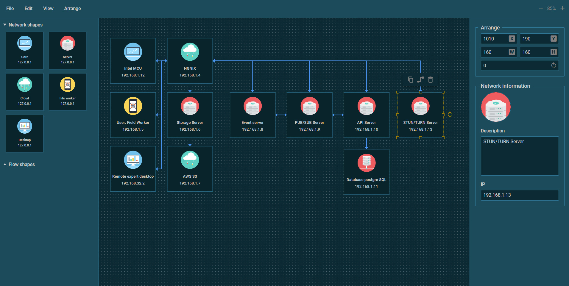
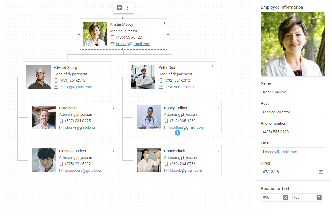
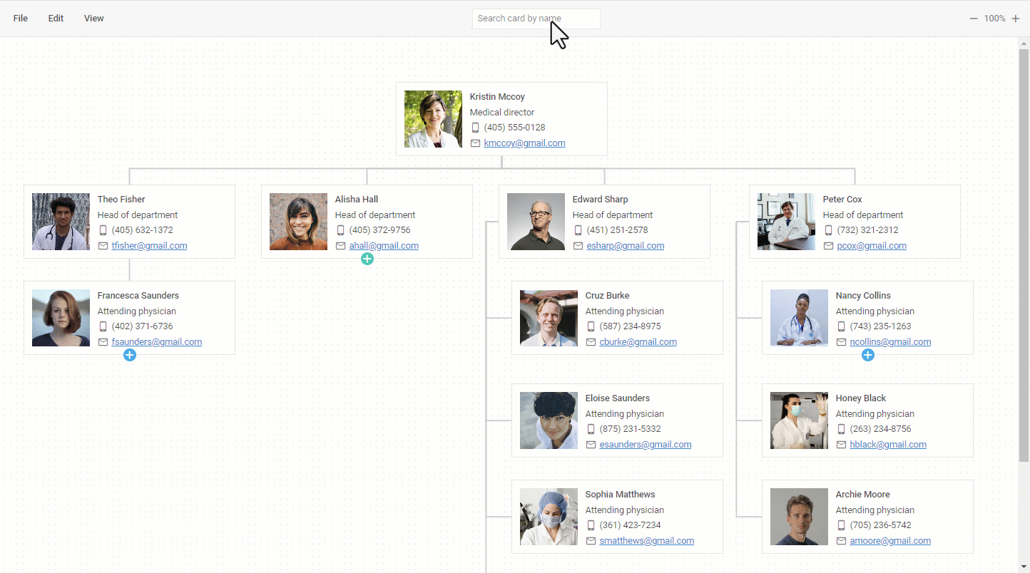
For instance, you can add a search box using the Input control to make it easier for end-users to find a particular shape in the diagram like in the org chart below:
Another example shows the editor’s Toolbar with custom icons for switching to the Dark theme and disabling the edit mode.
 Check the sample >
Moreover, the Toolbar API of our Diagram editor includes numerous methods and events of the Suite’s Toolbar and TreeCollection. To manipulate data in the Toolbar, you should use the parse() method.
Optimized Configuration of Shapebar Structure
Considerable API changes delivered in v6.0 touched upon the Shapebar of the editor as well. If the default settings of the Shapebar are not suitable for your goals, now you have everything you need to conveniently adjust the Shapebar structure in the desired way.
By default, the Shapebar includes 3 sections (Shapes, Groups, Swimlanes), but now you can enrich it with new options for more use-case scenarios. For instance, you can add predefined shapes for building family trees that present a person’s lineage in a conventional tree structure.
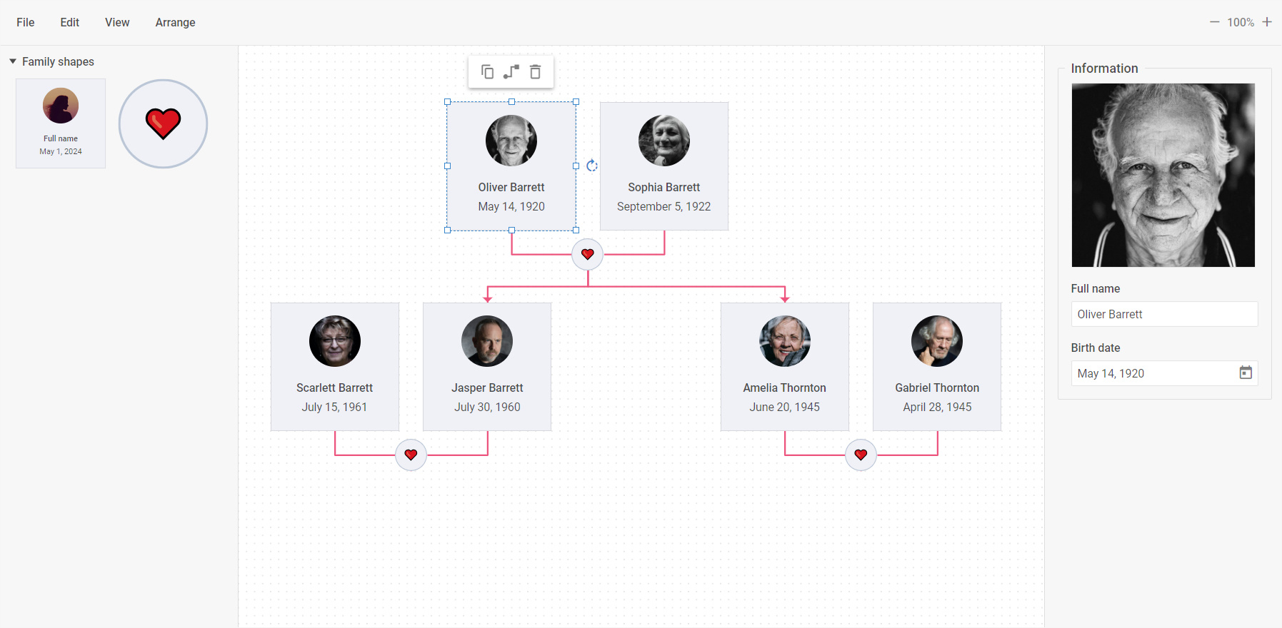 Check the sample >
These custom shapes are added to the editor’s shapebar via the new sections property. This property enables you to add your sections with certain controls in the required order and arrange them in the shapebar the way you like.
Depending on the selected diagram items, there are 4 scenarios for their configuration in certain sections:
- rendering of basic sections using the sections configuration object
- specifying types of shapes via string literals
- redefining basic properties of any shape and rendering it with new parameters (e.g. circle shapes with modified text and color settings)
- creating Shapebar sections containing mixed types of diagram elements (e.g. combine 1st and 3rd approaches)
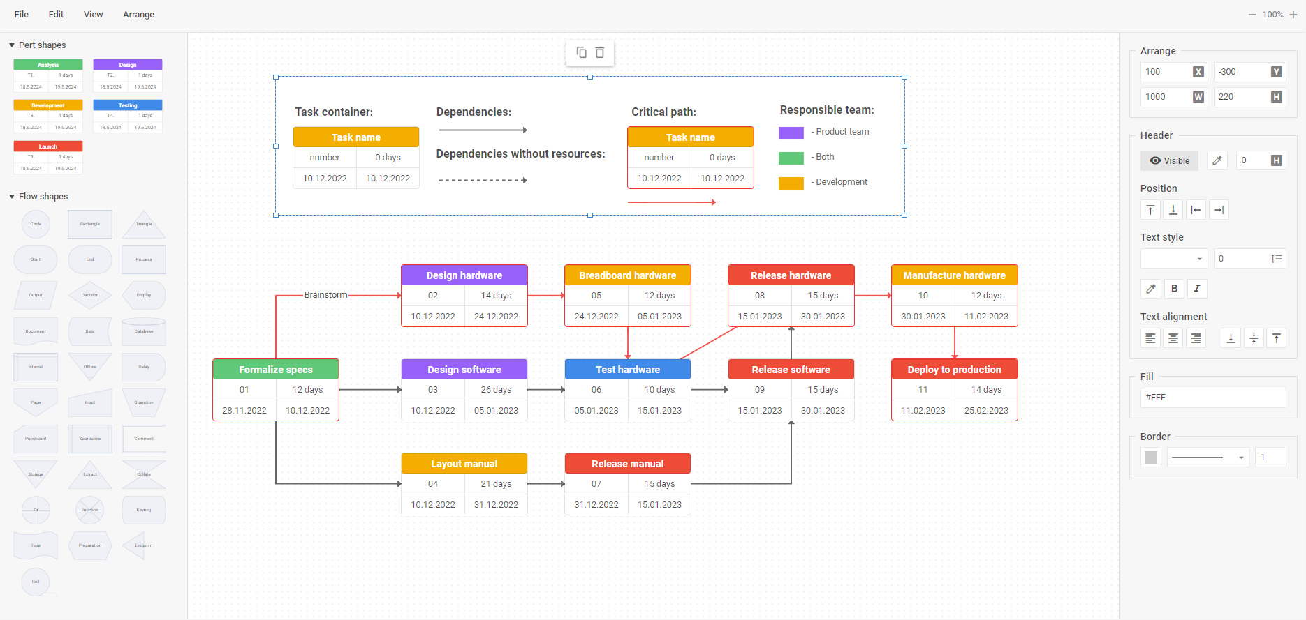
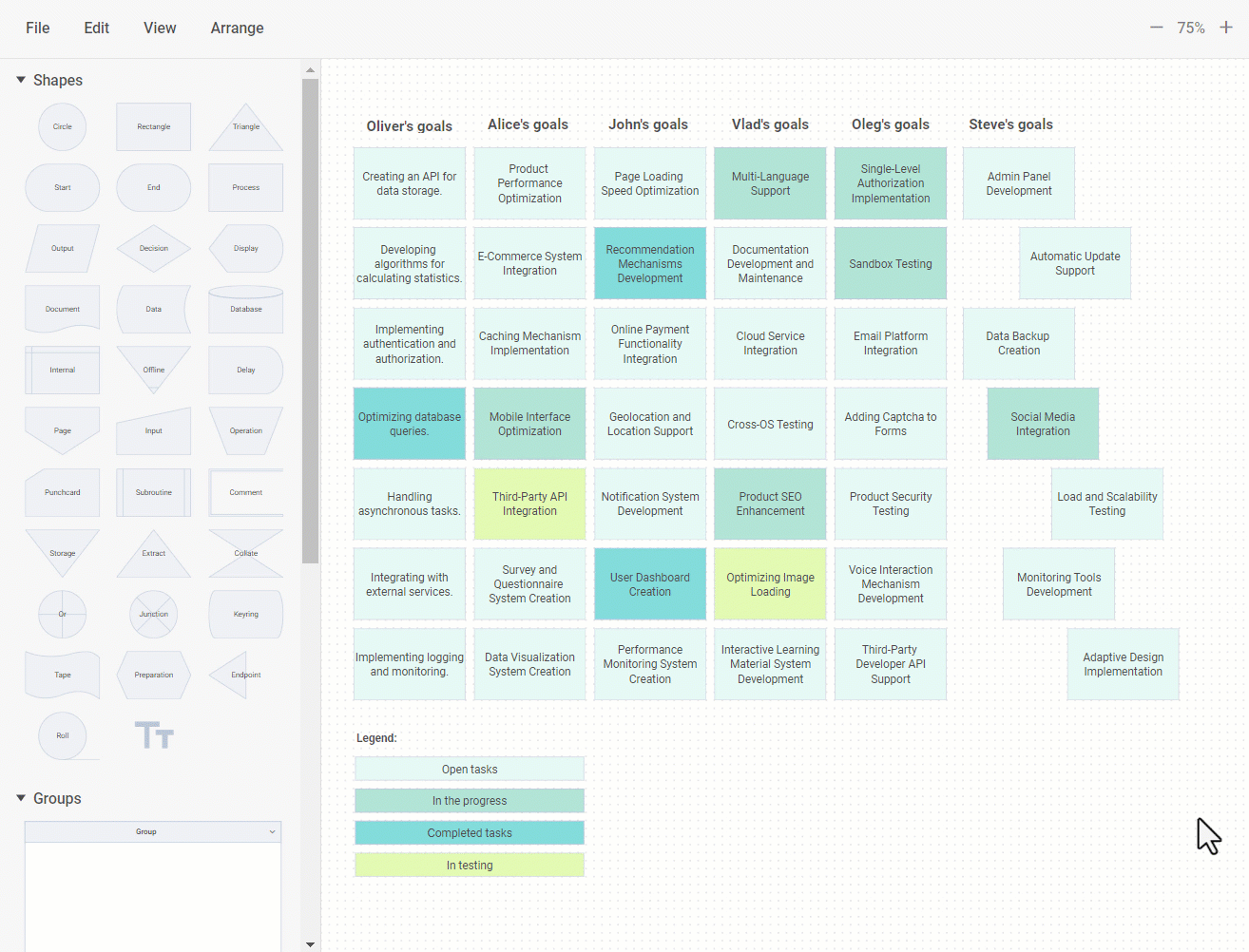
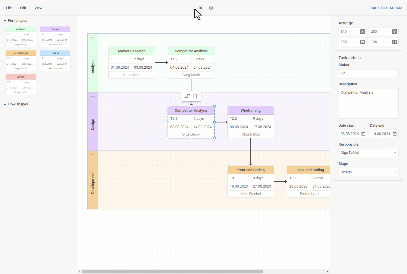
The sections property now also serves for adding the same items with different settings. In the sample below, you can see custom PERT shapes with specific settings in the Shapebar. These shapes are intended for building a PERT chart that displays different stages of a project.
 Check the sample >
If necessary, you can also modify the shapebar appearance with the css property. To be more specific, this property enables you to apply custom CSS classes to change the way diagram items are presented in the Shapebar. It is also possible to change the styling of Shapebar items by changing their color schemes with custom CSS variables or by redefining the default color scheme of a given theme.
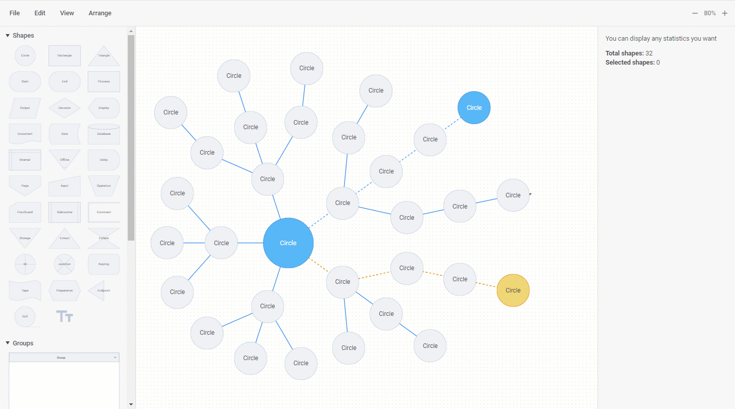
Modified API for Items Selection
The new version brings in significant changes for selection operations in the editor. Starting from v6.0, it is possible to simultaneously select multiple diagram items in the Diagram editor via API. Our developers reworked already existing methods and events in the selection API and added some novelties. Here we should emphasize the add() method complemented with the join and batch parameters and the new getIds() method. Here is how selection now works in code:
const diagram = new dhx.Diagram("diagram_container", {
select: true
});
// loading data
diagram.data.parse(data);
diagram.selection.add({ id: "1" }); // -> returns true if the item has been selected
console.log(diagram.selection.getIds()); // -> ["1"]
// adds the item with the id:"2" to the already selected items
diagram.selection.add({ id: "2", join: true });
console.log(diagram.selection.getIds()); // -> ["1", "2"]
// removes the previously selected items and adds the item with the id:"3"
diagram.selection.add({ id: "3" });
console.log(diagram.selection.getIds()); // -> ["3"]
You can get acquainted with all updated methods and events included in the Selection API on this page about selection.
Simplified Management of Line Titles
In the user interface of our JavaScript Diagram editor, the ability to add titles for lines connecting shapes helps make diagrams more comprehensible and informative. But technically, it has been impossible to consider titles as separate entities from lines and track line title manipulations until now. In v6.0, we eliminated this issue.
Now you can easily manipulate line titles via the DataCollection API. You can find all available configuration properties for a line title object on this configuration properties page.
As an example, there is a way to iterate over line titles as child elements of lines via the eachChild() method of DataCollection:
type: "default",
});
editor.parse([
...
{ type: "line", id: "line_1", from: "shape_1", to: "shape_2" },
{ type: "lineTitle", id: "title_1", parent: "line_1", text: "Text 1", distance: 50 },
{ type: "lineTitle", id: "title_2", parent: "line_1", text: "Text 2", distance: 70 }
]);
editor.diagram.data.eachChild("line_1", (child) => {
console.log(child.id); // => "title_1", "title_2"
});
You can also make use of all DataCollection events when working with line titles. Here is how to easily disable the line title feature with the beforeAdd event of DataCollection:
These API changes focused on line title management are applied only in the default mode of Diagram and Diagram Editor.
Updated Move Events
Invoking callback functions with multiple arguments can be inconvenient, especially when you need the last one. In the DHTMLX Diagram editor, it applies to the events associated with moving shapes, groups, and items of diagrams. In v6.0, the callback function of each moving event takes an object as a parameter. We also complemented such events with the batch property that provides the ids of dragged diagram elements. As a result, it becomes much easier to track the process of moving diagram elements in the grid area of the editor.
Copy Manager
Previously, you had to use the DataCollection API for configuring the interaction with diagram elements in the editor. This approach can cause some difficulties when it comes to copying groups, swimlanes, or several shapes. This issue is solved with the arrival of the copy manager in v6.0.
To access the copy manager via the editor, you should use the model object. The copy manager API comprises 4 new methods: copy(), copyStyles(), paste(), pasteStyles().
Bear in mind that copy() and paste() methods of the copy manager work only when the editor is initialized in the default mode.
In the user interface, the process of copying diagram elements is available not only via personal toolbars of shapes or hotkeys but also via the Toolbar of the editor.
Other Improvements
It is time to highlight other minor novelties introduced for the Diagram editor in v6.0.
Limiting Editor’s Functionality
When visualizing data in the DHTMLX Diagram editor, it may be needed to disable or hide some functionalities of the editor. In v6.0, our development team introduced several such options.
It has become possible to disable the ability to connect diagram shapes via lines. It can be done during the initialization by setting the value of the connectionPoints parameter to false.
type: "default", // only "default"
connectionPoints: false, // true by default
});
In a similar fashion, you can also hide 5 connection points that usually appear on the default (or custom) shapes when hovering over them.
If necessary, it is also nit a problem to disable the ability to resize shapes via the resizePoints property:
type: "default", // "org" | "mindmap" | "default"
resizePoints: false, // true by default
});
When exporting diagrams from the editor to the PDF and PNG formats, they are saved with the grid. Now you have an opportunity to export diagrams without the grid by disabling it during the initialization:
type: "default", // "org" | "mindmap" | "default"
grid: false, // true by default
});
All these features can also be enabled via the editor’s Toolbar.
Updated Magnetic Config
The magnetic property is responsible for displaying snap lines when moving a shape in the default mode of the editor. Starting from v6.0, we extended this property with a new boolean parameter – show. By setting the value of this parameter to false, you’ll hide snap lines, and if needed, make them visible again by changing the value to true. This feature is also manageable via the Toolbar.
Extended Zoom In and Zoom Out Events
In v6.0, zoomIn and zoomOut events in the Diagram editor API received the new step parameter. It is a value that shows the step of changing in the scale property.
Destructor() Method in Diagram Editor
The Diagram Editor API received the new destructor() method used to remove the editor instance. It will help you to simplify the use of the Diagram editor in projects based on JavaScript frameworks.
The “What’s new” section will help you to quickly browse through all the novelties delivered in this release.
All necessary migration information to v6.0 is presented in the corresponding section of our documentation.
Don’t miss a great chance to try all new diagramming capabilities right now, and download a free 30-day trial version of the DHTMLX Diagram v6.0. For our current clients, v6.0 is available in their Client’s Area.
Stay tuned for more DHTMLX releases in the coming months!