Forms can be used in web apps for multiple purposes, but the most common application scenarios are user authentication and authorization via login forms. Such forms are an integral part of identity access management (IAM) aimed at securely managing user validation and resource access. According to Statista, the IAM market generated approximately 16.17 billion U.S. dollars in revenue during 2023, and this number is expected to reach around 18.5 billion U.S. dollars in 2024.
In this blog post, we provide you with a step-by-step guide on how to build a basic login form using our JavaScript UI widget library.
Step 1: Creating a Window
First of all, let us create a window that will contain our future login form. DHTMLX Suite includes a widget (DHTMLX Window) for implementing this functionality as well, so it will be convenient to use this widget at this stage.
The initialization is pretty simple and presupposes the use of the dhx.Window object constructor:
width: 550, // width of the window
height: 600 // height of the window
})
winForm.show(); // opens the window
As a result, you should get a simple window element on your web page.
 Check the sample >
Step 2: Adding a Tabbar to the Window
The next step is to add a tabbar element to the window created in the previous step. For this purpose, we will use the corresponding widget from the Suite library.
The tabbar is initialized similarly with the dhx.Tabbar object constructor:
mode: "top", // specifies the location of tabs
tabAlign: "middle", // defines the tabs align
css: "dhx_widget--bordered", // css classes applying to our tabbar
views: [ //the list of the tabs
{ tab: "login", id: "login" }
]
})
You may notice that we’re adding “dhx_widget–bordered” CSS class to the tabbar, but it is not defined anywhere.
This is one of the predefined CSS classes available in DHTMLX Suite. You can check the full list with the details on this documentation page.
This CSS class is used to add borders on all sides of the tabbar.
Now, you need to attach the tabbar to the window. It is done with the attach() method that should be added after the tabbar initialization:
Note that when attaching a tabbar to a window with the attach() method you should not define any container for the tabbar, since dhx.Window will serve as this container. Therefore, you should use null as the first parameter in its constructor:
Now, the initialization code should look like this:
closable: false,
width: 550,
height: 600
})
winForm.show();
const loginTabbar = new dhx.Tabbar(null, {
mode: "top",
tabAlign: "middle",
css: "dhx_widget--bordered",
views: [
{ tab: "login", id: "login" }
]
})
winForm.attach(loginTabbar)
That’s how you will complement the window with a blank “Login” tab that will be further elaborated in the next step.
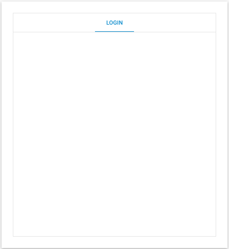 Check the sample >
Step 3: Creating a Form
Now, we proceed to the most interesting part of our guide, namely adding a login form to the tabbar with the DHTMLX Form widget.
Once again, we start with the initialization of the Form widget:
First, create the form object:
padding: "40px 10px 10px 10px", // paddings of the form
rows: [ //structure of the form controls group
]
})
After that, you need to attach the form to the tabbar:
To make the form interactive, you need to add the following form controls:
- Input for the username
- Input for the password
- Button for the form submission
More details on the input control are provided on this documentation page.
The username input will have a simple config:
label: "Username", //control label
type: "input", //control type
name: "user", //control name used during the form sending
},
With the password input control, you’ll also need to define the “password” input type for it:
label: "Password",
type: "input",
name: "pass",
inputType: "password"
},
The Login button configuration looks like this:
name: "login",
type: "button",
submit: true, //enables the button to send form data to a server
text: "Log in", //text of the button
}
After putting together all these parts in the form config, you will get the following:
padding: "40px 10px 10px 10px",
rows: [
{
label: "Username",
type: "input",
name: "user",
},
{
label: "Password",
type: "input",
name: "pass",
inputType: "password"
},
{
name: "login",
type: "button",
submit: true,
text: "Log in",
}
]
})
loginTabbar.cell("login").attach(loginForm)
That’s what you should see in the UI:
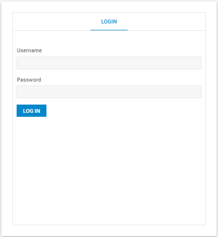 Check the sample >
Then, you need to pay attention to the arrangement of added elements. Specifically, you need to align the Login button to the right side of the form. You cannot align the controls themselves. Alignment can be applied to the form group sections only i.e. rows or columns.
At this point, you have only a single “rows” group allowing you to arrange the nested controls as rows. So you need to add one more section to the form to change the alignment. It will be the column section (“cols”). For this section, you should set “align: ‘end’“. After that, you add the Button control to this section.
padding: "40px 10px 10px 10px",
rows: [
{
label: "Username",
type: "input",
name: "user",
},
{
label: "Password",
type: "input",
name: "pass",
inputType: "password"
},
{
align: "end",
cols: [
{
name: "login",
type: "button",
submit: true,
text: "Log in",
}
]
}
]
})
As a result, the Login button will be aligned to the right side of the form:
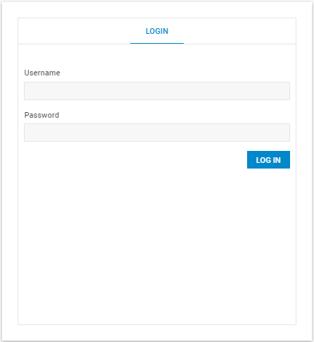 Check the sample >
Step 4: Adding the Form Actions
The form acquired its final appearance, but you also need to add the login action to make it fully functional.
In this guide, we do not include any real backend, so you just have to add the click event to the form button. Also, you need to make sure that the information entered by users is valid and hide the login window at the end. Programmatically, it is done using the following piece of code:
let values = loginForm.getValue();
if (values.user == "user" && values.pass == "password") {
dhx.alert({
header: "Welcome",
text: "You have successfully logged in",
buttonsAlignment: "center"
});
winForm.hide()
}
});
To inform end-users about successful login completion, use the dhx.Alert message.
According to the docs, you can use the following code:
header: "Welcome",
text: "You have successfully logged in",
buttonsAlignment: "center"
});
As a result, you get:
let values = loginForm.getValue();
if (values.user == "user" && values.pass == "password") {
dhx.alert({
header: "Welcome",
text: "You have successfully logged in",
buttonsAlignment: "center"
});
winForm.hide()
}
});
Using this sample, you can fully reproduce the login process.
But you also have to ensure that the system will react correctly when invalid credentials are entered into the form:
- Inform the user about invalid data
- Clear the form so that it can be refilled.
To inform users about invalid input, you can make use of another Suite widget – Message.
It can be configured during the initialization process:
text: "Incorrect login/password",
icon: "dxi dxi-alert-circle",
css: "error",
});
In the icon property, you can use a set of default icons provided for the Suite library.
As for the background CSS, it can be specified in the following way:
background: #FFCACA
}
The final step is to add this message to the click event:
let values = loginForm.getValue();
if (values.user == "user" && values.pass == "password") {
dhx.alert({
header: "Welcome",
text: "You have successfully logged in",
buttonsAlignment: "center"
});
winForm.hide()
} else {
dhx.message({
text: "Incorrect login/password",
icon: "dxi dxi-alert-circle",
css: "error",
});
loginForm.clear()
}
});
That’s it, your login form is ready, and it should be similar to the form shown in this sample.
Conclusion
The Suite’s form widget is a suitable tool for building and customizing various types of forms, including login forms. Following the steps described in this blog post, you can add a basic login form to a web page with minimum time and effort. Stay tuned for Part 2, where we will show you how to complement this basic login form with additional capabilities.