We are happy to introduce the release of DHTMLX Suite v8.2! The centerpiece of this minor update is DHTMLX Form. This widget received 4 new much-anticipated controls such as Fieldset, Avatar, Toggle, and ToggleGroup. The next significant result of our work is a range of new configuration options for header/footer tooltips in Grid and TreeGrid widgets. We should also mention several API updates in DataCollection and TreeCollection that contributed to enhanced data filtering. Moreover, there are plenty of other API improvements and fixes delivered in v8.2.
In this blog post, we provide a detailed overview of this release.
New Controls for DHTMLX Form
DHTMLX Form is a popular widget of the Suite JavaScript UI widget library that allows you to implement customizable web forms, which usually serve as a key communication link between a web app and end-users. In v8.2, we expanded the functional capabilities of this widget with 4 new controls. Let us take a closer look at these controls and what they allow you to do.
Fieldset Control
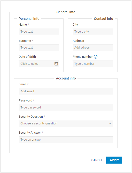
The Fieldset control is designed to give you complete freedom in grouping other controls within a web form. In other words, this control enables you to visually break the form into several logical sections, thereby making even large forms better structured and more intuitive. It allows you to create complex forms, where one fieldset can contain several other fieldsets with nested controls.
To attach this control to a form built with DHTMLX, you need to add the corresponding control type – type: “fieldset”. Multiple configuration properties give you a wide choice of options for specifying the control settings. For instance, you can give a name to the control, add a necessary label to it, arrange controls inside the group, and much more.
rows: [
{
type: "fieldset",
label: "General Info",
rows: [
{
align: "between",
cols: [
{
type: "fieldset",
label: "Personal info",
rows: [
{
type: "input",
label: "Name",
},
{
type: "input",
label: "Surname",
},
]
},
{
type: "fieldset",
label: "Contact info",
rows: [
{
type: "input",
label: "City",
},
{
type: "input",
label: "Address",
},
]
},
]
},
]
},
]
});
You can access any control within Fieldset via the getItem() method and interact with it using multiple methods and events. For instance, you can iterate through all the nested fieldset elements using the forEach() method. It takes the following parameters:
- callback: function – a function responsible for the iteration process. This function is called with the following arguments:
1) item: object – the object of an item
2) index: number – the index of an item
3) array: object[] – an array of iterated items
- tree: boolean – the parameter that determines if all the nested fieldset items should be iterated (false by default)
console.log(index, item, arr);
}, true);
With the new Fieldset control, you have an effective instrument for grouping various controls within a single web form and flexibly adjusting these structures to your liking.
Avatar Control
A standard web form commonly consists of controls for gathering textual data, but it may also be needed to have an option for uploading images. Starting from v8.2, DHTMLX Form allows adding an image to a form using the new Avatar control.
The sample below gives an opportunity to see how this control works in practice. Here you can add your own image to the form using a placeholder icon or with drag-and-drop, remove it, and play around with the Avatar settings.
To add this control to a web page, you have to specify it in the type property during the form initialization:
css: "dhx_widget--bordered",
padding: 20,
rows: [{
type: "avatar",
"label": "Employee photo",
"size": "medium", // "small" | "medium" | "large" | number
"icon": "dxi dxi-person",
"accept": "image/*",
"target": "https://docs.dhtmlx.com/suite/backend/upload",
...
//Other properties
}]
});
As you can see from the piece of code above, this control has a number of properties that allow you to define how it will be seen by end-users. It is possible to use the basic control sizing or apply custom sizes, make this type of input obligatory, add help information, set a placeholder icon when there is no image uploaded, etc.
Just like other controls of DHTMLX Form, the Avatar control also comes with a range of methods and events enabling you to manipulate this control in a variety of ways.
For instance, you can restrict file selection by applying certain validation rules using the accept and validation properties:
css: "dhx_widget--bordered",
padding: 40,
rows: [
{
type: "avatar",
...
accept: "image/png",
validation: ({ file }) => {
return file && file.size <= 2097152;
},
preMessage: "Choose a png file",
errorMessage: "The file size is more than 2Mb, or the field is empty",
successMessage: "The file was successfully validated",
},
]
});
The accept property defines acceptable extensions for uploaded files (image and png), while the validation property checks whether a file is uploaded and its size is less than 2 MB. You can also use preMessage, errorMessage, and successMessage properties to make the interaction of end-users with the Avatar control completely straightforward. Text messages implemented with these properties will help end-users understand whether they are doing things right when uploading files in the form.
Toggle and ToggleGroup controls
Toggle controls are special buttons designed to help end-users to switch between two or more states or options. They are commonly shown as compact buttons with a graphical textual representation of their state. In Suite 8.2, we added two types of toggle buttons for DHTMLX Form:
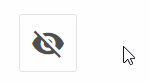
- Toggle – is a single button that operates on the principle of two states (e.g., on/off)
rows: [
{
type: "toggle",
icon: "dxi dxi-eye",
offIcon: "dxi dxi-eye-off",
},
...
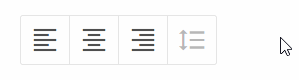
- ToggleGroup – a group of single-select or multi-select buttons linked together structurally or logically.
{
type: "toggleGroup",
multiselection: true,
value: {
left: true,
center: true,
},
options: [
{
id: "left",
icon: "dxi dxi-format-align-left",
value: 1,
},
{
id: "center",
icon: "dxi dxi-format-align-center",
value: "center"
},
{
id: "right",
icon: "dxi dxi-format-align-right
},
{
id: "space",
icon: "dxi dxi-format-line-spacing",
disabled: true,
}
]
}
...
The ToggleGroup button has more functional capabilities than a simple toggle button. The example with multiselection provided above is just one of the multiple usage scenarios for ToggleGroup. You can find more use cases of the new button types in this sample.
Tooltips for Headers and Footers in Grid/TreeGrid
The new version of the Suite library expands configuration diversity for tooltips in two widgets for data management – Grid and TreeGrid. Previously, tooltips for the whole grid were enabled/disabled via the corresponding tooltip property. Now you have several new ways to specify individual tooltips for headers and footers. Since all new configuration options are similar for both widgets, let us see how they work using the example of DHTMLX Grid.
First of all, there are new headerTooltip and footerTooltip configuration properties that give you full control over tooltips for the grid’s header and footer, correspondingly:
columns: [
// columns config
],
data: dataset,
tooltip: false,
headerTooltip: true,
footerTooltip: true,
});
If necessary, you can also enable tooltips for the header/footer of a particular grid column. To do that, you should specify the tooltip property in the corresponding header/footer object inside the column:
columns: [
{ id: "country", header: [{ text: "Country", tooltip: true }] },
{ id: "population", header: [{ text: "Population" }] },
// more columns
],
data: dataset,
tooltip: false,
});
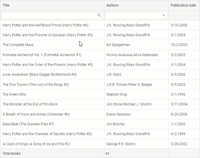
Alternatively, you are able to provide custom tooltips for headers/footers of the whole grid (or a particular column) via templates specified in the tooltipTemplate configuration property. From now on, a tooltip can also be shown as a value for the complex header/footer content of a column, such as aggregate functions (“avg”, “sum”, “max”, “min”, “count”). In addition, you have an opportunity to use templates for any kind of header/footer content, meaning that you can add tooltips for such elements as filters. Below, you can see how these novelties are implemented and put into practice.
columns: [
{
id: "title",
tooltipTemplate: (value) => `Book: ${value}`,
header: [
{
text: "Title",
tooltipTemplate: () => `Here can be an explanation for the title of this column. You can write a long description.`
},
{
content: "inputFilter",
tooltipTemplate: () => `Write something to search by book title`
},
],
},
{
id: "authors",
...
footer: [{ content: "count" }]
},
// more columns
});
Improved Data Filtering
Several significant improvements related to data filtering in Suite widgets took place in the APIs of DataCollection and TreeCollection. The work with temporary and permanent filters became more stable thanks to the updated filter() method. The second parameter of this method, namely the config object, now has the permanent property instead of the deprecated smartFilter (learn more in the Migration section) and the new id property. Using the id property, you can identify all applied filters and reset any of them with the help of another novelty – the resetFilter() method. Moreover, now you can obtain data on all applied filters with the getFilters() method. And finally, we added the filter event to enable you to keep track of all filtering events.
Other Improvements
Now we can proceed with a range of minor but still helpful updates delivered by our development team in Suite v8.2.
Form
Apart from the four new controls for DHTMLX Form described above, we should also point out that types of form elements were restructured and the type declaration file (d.ts) was updated. Also, pay attention to the SimpleVault control with renewed and improved API.
Charts
In DHTMLX Charts, the series configuration property was complemented with the label config option. It will give you a more convenient way to set the text in legends for series in “line”, “spline”, “bar”, “x-bar”, “area”, “splineArea”, “radar”, and “scatter” chart types.
Visit the following documentation page to review all the new features and other improvements included in DHTMLX Suite 8.2 in more detail.
We want to remind you that you have an opportunity to test the updated Suite library by downloading a free 30-day evaluation version. Our existing clients can get access to the latest version via their Client’s Area.
And lastly, we invite you to leave your comments on this release in the corresponding section below.