When using DHTMLX Gantt in web projects, developers frequently have to meet various requirements related to the UI appearance. So they must be sure of the customization capabilities of our JavaScript Gantt chart library. Therefore, it is time to continue our series of Gantt customization use cases.
In the new episode, you will learn how to build a Jira-like project roadmap using our Gantt component.
Use Case: Project Roadmap with Custom Timeline Icons, Status Bar, Timeline Resizer, and More
A project roadmap offers an easy-to-follow way to keep everyone interested in key project insights up to date. No wonder this functionality is often requested in project management apps and becomes a nice addition to other popular tools such as Gantt charts. In the previous blog post of the series, we demonstrated that it is not a problem to create a project roadmap using DHTMLX Gantt, but we would like to back up this claim with a new challenging scenario.
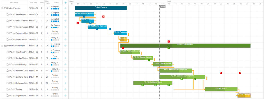
This time you will learn how our Gantt library helps create a project roadmap similar to the one made with Jira Align. That’s what it looks like:
 Check the code snippet >
This roadmap sample visualizes the project workflow, where end-users can clearly understand how their work lines up against other tasks in planning intervals. In practice, such roadmaps can be useful in achieving the following goals:
- planning future work,
- tracking the progress of already planned work,
- reporting progress against roadmap commitments.
If you take a look at the timeline, you can see custom icons of different colors with specified numeric values. They are backlog elements (subtask, improvement, user story, etc.) related to particular project tasks. When backlog elements turn out to be outside of the task timeframe, they are highlighted in red to attract the user’s attention. The total number of backlog elements for each task is shown in the “Item” column of the grid.
One more noteworthy parameter that you can see in the roadmap grid is called “Story Points”. It denotes a conventional unit used to assess time spent on a given task. The quantity and duration of story points for each task are specified by users.
In other respects, the roadmap structure is quite clear and straightforward. So we can proceed to share with you the practical customization steps that will allow you to build the same project roadmap with DHTMLX Gantt.
Customization Guide
Time Scales and Today’s Marker
A timescale is a crucial element of any tool with a time-bound structure like a project roadmap. Therefore, we start with the configuration and customization of scales and today’s marker. The roadmap timeline includes two time scales – “month” and “day”. To set these scales, you should specify the corresponding options using the unit property in the scales config:
{ unit: "month", step: 1, date: "%F" },
{ unit: "day", step: 1, date: "%d" },
];
The today’s marker is added to the timeline area with the addMarker method:
start_date: today,
css: "today",
text: "Today"
});
The marker’s appearance can be changed using CSS styles. The css parameter specifies the class name for the marker. This parameter can be used as a selector to add your styles for the marker.
You won’t need the background color in the vertical line of the marker, so you can disable this parameter and show the left border. The border-left property helps add a dashed line to the marker instead of a solid one:
border-left: 2px dashed gray;
background: unset;
}
After these changes, it is necessary to specify the background color under the text of the marker, otherwise the text won’t be visible:
background: gray;
}
Now we can consider more complex customizations of the roadmap interface.
Custom Icons for Work Items
Custom icons for work items shown in the roadmap timeline are probably the most curious elements in this scenario. We explained their meaning above, and now we want to unveil how these icons are implemented under the hood.
In practice, these square icons are added to tasks in the timeline area with an additional layer with custom elements using the addTaskLayer method. To ensure that these elements do not disappear after the reinitialization, you need to add code inside the event handler for the onGanttReady event.
gantt.addTaskLayer(function (task) {
The addTaskLayer method works for all project tasks. Thus, you should start by checking the presence of saved values in a particular task property (items).
For such saved values, you’ll have to create the main element of the additional layer for the task. This element will be returned at the end of the function, and custom icons for work items will be added to it.
After that, it is necessary to iterate through all the values in task.items:
The next step is to take the unix timestamp value and convert it into a date. The result value should be stored in a separate variable.
const value = task.items[timestamp];
Make use of the getTaskPosition method to specify the task object and the date where the custom icon should be displayed. It is needed to determine the coordinates of the icon square on the timeline.
Then you need to create an HTML element, where you will specify a particular class name and a value (number) and add an attribute with the task ID.
el.className = 'work_item';
el.innerHTML = value;
el.setAttribute("data-taskId", task.id);
The custom icon must be displayed in the center of the cell. By default, the element width is 15px.
So if half the width of timeline cells is less than the width of the custom element, then the element will automatically shrink.
if (elWidth > cellWidth / 2) {
elWidth = cellWidth / 2
}
Taking into account the width of the element and the width of timeline cells, calculate the number of required left margins to place the element in the center of the cell:
The position (coordinates) of the element is specified using styles:
el.style.top = sizes.top + 'px';
el.style.marginLeft = marginLeft + 'px';
el.style.width = elWidth + "px"
The default color of the custom icon for work items is gray. This option is used when no other color is specified for the task. In case the date of the icon is not included in the date range of the task, it will be highlighted in red.
if (+itemDate < +task.start_date || +itemDate > +task.end_date) {
background = "DarkRed";
}
If the custom icon is placed inside task dates on the timeline, its color must be taken from the parent of this task. In individual and parent tasks, the custom icon will have the color of these tasks.
if (task.parent) {
const parent = gantt.getTask(task.parent);
background = parent.color || background;
}
else {
background = task.color || background;
}
}
After that, set the icon color using styles and attach it to the main element of the additional layer for the task:
el.style.color = "#eee"
mainEl.appendChild(el);
To make the custom icon look somehow different from the taskbar, we added a style rule to make colors more saturated:
This way, it won’t affect the text color if it’s white, black, or gray.
Then, you have to add an event handler for the onEmptyClick event. This event is called when clicking on any timeline cell as well as on any point of the roadmap interface without elements associated with tasks such as taskbars and task rows.
At first, try to get a task row or a custom icon element using the closest() method:
const customElement = e.target.closest(".work_item");
The click position relative to the timeline is saved to a variable.
After clicking on the task row or custom icon, you get the task ID from the HTML element and then the task itself using the getTask() method.
const task = gantt.getTask(taskId);
After that, it is necessary to get the timeline date for the click position using the dateFromPos() method. Dates come with a time parameter, so it will be more convenient to round time to the start of the day using the gantt.date.day_start() method. This step makes it easier to iterate through date elements in the addTaskLayer() method.
Custom Dialog Window for Work Items
In custom icons for work items, it is possible to change the displayed numeric value on the fly. To do that, it is necessary to click on the needed icon and introduce the necessary changes in the opened dialog window with the help of three buttons. So let us explain to you how to implement this functionality.
You’ll need to use the modalbox() method to show a custom dialog window. Here you should specify an input element with the type “number” to make it more convenient to set values. This window also includes buttons for saving and canceling changes, as well as for deleting icon values and icons themselves.
Save the dialog window to a variable to be able to access it later and get the value from the HTML element without seeing the dialog window on the screen.
title: "Work Item",
text: `<div><label>Value: <input type='number' min=0 class='items_value' /></label></div>`,
buttons: [
{ label: "Save", css: "items_button", value: "save" },
{ label: "Cancel", css: "items_button", value: "cancel" },
{ label: "Delete", css: "items_button", value: "delete" }
],
After the dialog window appears on the screen, you should set the value from the task properties. If the task has no value for a given date, it will be set to 0.
In the callback() method, it is necessary to specify what should happen after each button in the dialog window of the custom icon is clicked:
- save – get the value from the HTML element and add/update that value for the custom icon date;
- delete – check if the task has a value for the custom icon date and if so, delete this value;
- cancel – there is no specified logic for this button in our sample, but we still included it in the code to make it easier for you to implement your logic here.
switch (result) {
case "save":
const newValue = modalbox.querySelector(".items_value").value;
task.items[clickDate] = +newValue;
gantt.updateTask(task.id);
break;
case "cancel":
break;
case "delete":
if (task.items[clickDate]) {
delete task.items[clickDate];
gantt.updateTask(task.id);
}
break;
}
}
Custom Grid Columns
The grid section of the roadmap also includes several columns that should be explained from the programming perspective. We are talking about 3 columns – Items, Story Points, and Status.
We start with the “Items” column. The total number of work items for each task can be found in the corresponding grid column. These values are displayed thanks to the use of the template function in the column configuration. It should be mentioned that there is a dependence on values in the “Story Points” column. Tasks without story points should also have 0 work items.
let total = 0;
if (task.story_points && task.items) {
for (item in task.items) {
total += task.items[item];
}
}
return total;
}
To simplify the editing of story points, you need to add an inline editor to the corresponding grid column.
...
{
name: "story_points", label: "Story Points", align: "center", width: 40, resize: true, editor: storyPointsEditor, template: function (task) {
return task.story_points || 0;
}
},
The “Status” column in the roadmap grid shows the progress bar for tasks. This parameter can be changed on the fly by clicking on the required status option. Status data is stored in a separate array:
{ key: 0, label: "Pending" },
{ key: 1, label: "Ready to Start" },
{ key: 2, label: "In Progress" },
{ key: 3, label: "Done" },
{ key: 4, label: "On Review" },
{ key: 5, label: "Accepted" },
]);
The lightbox configuration has a standard section (i.e. this type of section is available in Gantt) with the “select” type, where the list of status options is specified. The list is taken from the array gantt.serverList(“status”).
name: "status", height: 22, map_to: "status", type: "select",
options: gantt.serverList("status")
},
To show custom status values in the grid, you’ll have to use the template option in the column configuration. Then add the main HTML element, where all other elements should be placed. The textual status is shown at the top of the cell.
let html = `<div class="status_column"><div class="status_name">${statusName}</div><div class="status_progress">`
When configuring tasks, you need to indicate the status value (not the status name). To match the status number and its text, apply the custom byId function. It helps to find the required status name by its number.
for (var i = 0; i < list.length; i++) {
if (list[i].key == id) {
return list[i].label || "";
}
}
return "Pending";
}
Each task status bears a sequential number and the quantity of colored squares is determined by this number.
Programmatically, it is implemented in the following way:
- Go through all the elements of the array with statuses and each time add a square HTML element.
- Add a CSS style to the status square to color it if the status number is less or the same as the task status.
for (var i = 1; i < statuses.length; i++) {
const item = statuses[i];
let filled = "";
if (item.key <= task.status) {
filled = "filled"
}
const el = `<div class="bar ${filled}" data-status=${item.key}></div>`;
html += el;
}
Use the onTaskClick event handler to make the status task change after clicks on squares in the status column:
In square elements, it is necessary to take the status number from the HTML element and change the status of the task object. After that, the task should be updated for rendering the changes. Finally, you need to return false so that the onTaskClick event does not fire when the task status changes. Otherwise, Gantt will select the task from the clicked line and the previous task will no longer be selected.
if (statusBar) {
const task = gantt.getTask(id);
task.status = statusBar.dataset.status;
gantt.updateTask(id);
return false;
}
return true;
Custom Timeline Resizer
There is also a double-sided resizer on top of the roadmap that can be used to change the displayed date range. The roadmap includes a date range for tasks and a displayed date range. They are not the same thing. The range of task dates depends on loaded tasks and changes depending on task dates. By default, the displayed date range is not specified and depends on task dates. But if you set your date range, it will remain the same until you change it.
Now we should say a couple of words about the structure of HTML elements for date ranges in the resizer. In the background, there is an element for showing the total range of task dates. In the foreground, you can see two round elements that serve as resizers. Between these two elements, we used another element that highlights the displayed date range relative to the task date range.
<div class="total_range">
<div class="range_indicator"></div>
<div class="left_resizer"></div>
<div class="right_resizer"></div>
</div>
</div>
To make these elements manageable, you have to add event handlers to the window object. Upon clicking on the mouse button, event handlers check if the mouse is over the left or right resizer. If so, the resizer element is saved in the resizeElement variable.
const element = e.target.closest(".left_resizer") || e.target.closest(".right_resizer")
if (element) {
resizeElement = element;
}
});
After the mouse button is released, the variable must be reset so that nothing else changes when the mouse pointer is moved.
resizeElement = false;
});
The main action takes place inside the mousemove event if the resizer element is stored in a variable. First, you need to add two constants for specifying half the width of the resizer element (resizerWidth) and the left/right indents (margin).
if (resizeElement) {
const resizerWidth = 8;
const margin = 10;
Then, add half the width of the resizer to the variable with the new element position. Thus, the element will be positioned in the center (not on the right) when the mouse is moved.
After that, you receive HTML elements of two resizers and the date range for tasks as well as their coordinates.
const leftResizer = document.querySelector(".left_resizer");
const rightResizer = document.querySelector(".right_resizer");
const totalRect = totalRange.getBoundingClientRect();
const leftRect = leftResizer.getBoundingClientRect();
const rightRect = rightResizer.getBoundingClientRect();
Then you have to modify a new resizer’s position depending on the coordinates and the type of resizer (left or right). Resizers should not extend beyond the date range element and should be placed correctly relative to each other.
if (newPosition < totalRect.x) {
newPosition = totalRect.x
}
if (newPosition + resizerWidth >= rightRect.x) {
newPosition = rightRect.x - resizerWidth;
}
}
else {
if (newPosition > totalRect.x + totalRect.width - resizerWidth * 2) {
newPosition = totalRect.x + totalRect.width - resizerWidth * 2;
}
if (newPosition - resizerWidth <= leftRect.x) {
newPosition = leftRect.x + resizerWidth;
}
}
Add a new coordinate to the resizer that is being dragged.
Set the coordinates for the indicator element of the displayed resizer’s date range.
rangeIndicator.style.left = leftResizer.offsetLeft + margin + "px";
rangeIndicator.style.width = rightResizer.offsetLeft - leftResizer.offsetLeft + "px";
The next step is to correlate the coordinates of two resizers with the roadmap data. Here you should get the range of task dates and count the duration in days within this range.
const rangeDuration = gantt.calculateDuration(range.start_date, range.end_date);
Now we should mention the logic used for converting values. For the left resizer, you should take its coordinate along the x-axis (offsetLeft) and subtract the left margin. The result value should be divided by the duration of the date range for tasks and multiplied by the width of the element indicating the date range for tasks. A similar logic is applied for the right resizer, only you have to add the margin instead of subtracting it.
const rightPos = Math.round((rightResizer.offsetLeft + margin) / totalRect.width * rangeDuration);
The results will be numbers of days that must be added to the start date of the task date range. You have to add these values to the start_date and end_date configs. To repaint changes, you’ll need the render() method.
gantt.config.end_date = gantt.date.add(range.start_date, rightPos, "day")
gantt.render()
These are the main steps that will allow you to build a Jira-like roadmap similar to our sample.
Final Words
As you can see, DHTMLX Gantt is well-suited for building project roadmaps that look like popular ready-made planning tools. Enhanced customization capabilities of our JavaScript library enable you to implement various custom elements, making it much easier to meet any project requirements related to the roadmap appearance. If you want to test DHTMLX Gantt in your project, download a free 30-day trial version.
We invite you to share with us your customization scenario and we might choose it for one of our future articles of the series.
Related Materials:
- Deep DHTMLX Gantt Customization: Project Roadmap with Split Tasks and Milestones Organized via Swimlanes
- Deep DHTMLX Gantt Customization: New Looks of Tasks, Month Marker, and Customized Grid
- 200+ Code Snippets with DHTMLX Gantt
- DHTMLX Gantt Documentation
- 100+ DHTMLX Gantt Samples
- 30-day Free Trial Version