The summer season at DHTMLX opens with a major release of our JavaScript widget library – Suite 6.5.
The update accommodated some highly demanded features requested by our clients like TypeScript support, grouping TreeGrid data, and drag-n-drop of columns in Grid and TreeGrid. Besides, our development team designed new examples of using Suite UI components with Angular. Other features and improvements cover new configuration options and methods for manipulating content in Grid and TreeGrid, List and DataView, and managing Form controls and Sidebar options.
Jump into evaluating Suite UI library 6.5 free of charge for 30 days right now.
Or read the release article to take in every detail.
Built-in TypeScript Definitions
As TypeScript gained considerable popularity among web developers and its support was particularly demanded by our users, we incorporated TypeScript definitions into our UI components.
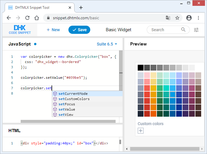
From now on, built-in type definitions will help you save time and write clean and stable code with the help of type suggestions, autocompletion, and type checking. Check how it works in our code snippet >
Angular Examples
Together with the release of Suite 6.5, our dev team prepared examples of all Suite components with Angular. The examples cover basic initialization and usage as well as event listening. The full source code of our components used with Angular can be found on GitHub.
To get the idea of how it works, have a look at the initialization of DHTMLX Calendar with Angular:
import { Calendar as CalendarDHX } from 'dhx-suite';
@Component({
selector: ‘app-calendar’,
template: `
`,
})
export class CalendarComponent implements OnDestroy {
@ViewChild(‘widget’, { static: true })
container: ElementRef;
calendar: CalendarDHX;
wait: Promise;
@Output() ready: EventEmitter = new EventEmitter();
ngOnInit() {
this.calendar = new CalendarDHX(this.container.nativeElement, {
css: ‘dhx_widget–bordered’,
value: new Date(),
});
}
ngOnDestroy() {
this.calendar && this.calendar.destructor();
}
}
Check full source code on GitHub >
Besides, our team revised DHTMLX React examples on GitHub and got down to preparing samples with Vue.js.
Dragging and Dropping Columns in Grid and TreeGrid [PRO]
In addition to reordering rows, starting from v6.5, it became possible to move Grid and TreeGrid columns via drag-n-drop. To enable this functionality, you only need to specify the dragItem: “column” property in the configuration of Grid or TreeGrid:
columns: [// columns config],
dragItem:"column",
data: dataset
});
If you need to prevent a particular column from being moved, you can add the draggable: false option to its config:
columns: [
{ width: 200, id: "country", header: [{ text: "Country" }], draggable: false },
{ width: 150, id: "land", header: [{ text: "Land" }] },
{ width: 150, id: "density", header: [{ text: "Density" }], draggable: false }
],
data: dataset,
dragItem: "column",
});
To help you customize the user experience, we enlarged the list of events with new ones: beforeColumnDrag and beforeColumnDrop, which fire before users drag and drop columns.
Grouping TreeGrid Data
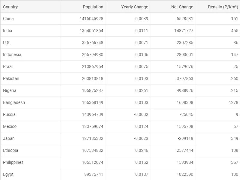
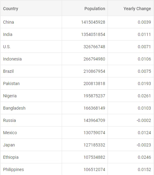
Another long-awaited feature of Suite 6.5 is the ability to group data in TreeGrid columns according to specific criteria.
A basic example is grouping TreeGrid data by values of a particular column. In order to implement this functionality, you need to make use of the groupBy() method and pass the id of the column as its parameter:
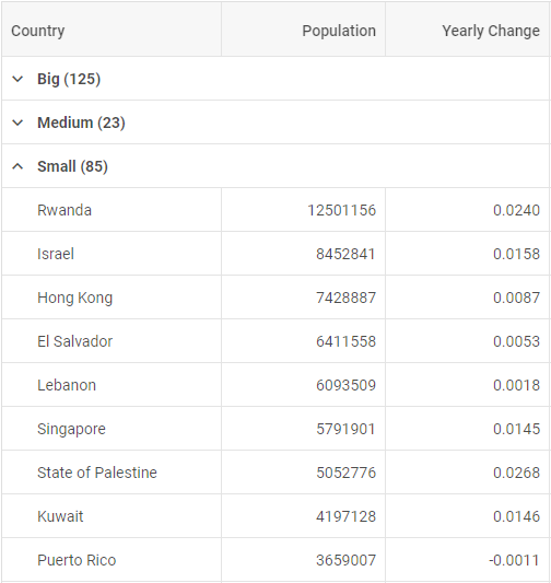
However, some use cases presuppose a more advanced approach. For instance, we need to group countries according to their size and split them into three categories: small, medium, and big. TreeGrid enables you to pass a function with a rule as a parameter to the groupBy() method, which will determine how to group data.
In the example below, we define that all countries with an area less than 25000 square km fall into the “Small” group, while the “Medium” group includes countries smaller than 60000 square km. If there are countries with values less than 0, they are categorized as N.A. The rest of the countries constitute the “Big” group:
if (!item.area || item.area < 0) {
return "N.A.";
}
if (item.area < 25000) {
return "Small";
} else if (item.area < 60000) {
return "Medium";
}
return "Big";
});
Moreover, you can modify the title of a group by setting a template with the help of the groupTitleTemplate configuration option. Thus, you can include the group name and any other attributes you need there. For instance, in the sample below, group titles include not only their names but also the calculated average density of countries:
 Check the sample >
return groupName + " (Avg. Density: " + Math.floor(items.reduce((acc, i) => acc + Number.parseInt(i.density), 0)/items.length) + ")";
}
Changing the Alignment of Columns in Grid and TreeGrid
V6.5 enriched the abilities of Grid and TreeGrid with one more configuration option for aligning the content of columns and their headers. The new align config allows you to implement left, right, or center alignment of content:
columns: [
{ id: "name", header: [{ title: "Name", align: "center" }], align: "left"}
// more options
],
data: dataset
});
Disabling Tooltips in Grid and TreeGrid
Another enhancement concerns the usage of tooltips in DHTMLX Grid and TreeGrid. From now on, you can disable tooltips for any chosen element of these components: entire columns or specific cells.
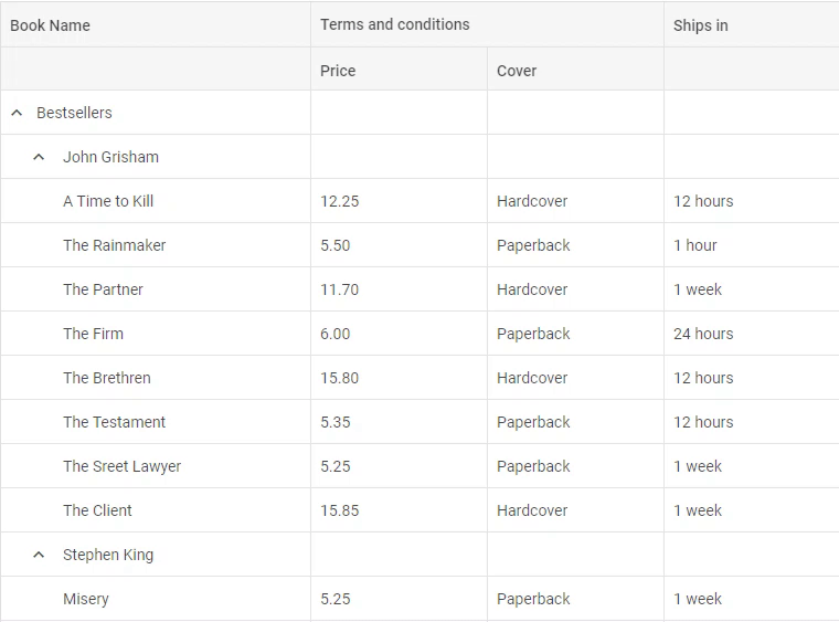
It can be done via the tooltip configuration option like in the example below:
columns: [
{ width: 280, id: "name", header: [{ text: "Book Name" }], tooltip: true },
{ width: 160, id: "price", type: "string", header: [{ text: "Terms and conditions", colspan: 2 }, { text: "Price" }] },
{ width: 160, id: "cover", type: "string", header: [{}, { text: "Cover" }] },
{ width: 160, id: "ships", type: "string", header: [{ text: "Ships in" }] },
{ width: 160, id: "inStock", type: "string", header: [{ text: "In stock" }] }
],
data: dataset,
tooltip: false
});
Adjusting Columns’ Width to Their Footer in Grid and TreeGrid
As a final touch, we updated the adjust property in the configuration of Grid and TreeGrid components. Now the width of columns (all at once or separate ones) can be adjusted to the width of their footer:
columns: [// columns config],
adjust: "footer",
data: dataset
});
Manipulating the Selection of Items in DataView and List
V6.5 provides you with the ability to manage the selection of DataView and List items with the help of the newly introduced configuration options and methods.
Starting with v6.5, the selection configuration property serves to enable and disable items selection:
selection: false
});
Besides, you can apply the enableSelection and disableSelection methods for this purpose.
Manipulating the Visibility of Form and its Controls
V6.5 delivered plenty of new methods and options for improving your work with DHTMLX Form.
Now it’s much easier to manage the visibility of the entire Form as well as separate controls. You can make a form hidden via the new hidden configuration property or using the hide method. The show method makes a form visible. The isVisible method enables you to check if a form is visible at the moment.
You can apply the same methods to manipulate the visibility of Form controls (buttons, input fields, select boxes, etc.). In order to add interactivity to your form, you can attach new event handlers to Form controls: afterHide, afterShow, beforeHide, and beforeShow.
Besides, we enriched the abilities of the select control and simpleVault control.
Now you can get an array of all options of the select control via the getOptions() method. The setOptions() method enables you to modify select options dynamically.
New methods of the simpleVault control allow you to open the dialog box and select files for uploading via the selectFile() method, send a POST request for uploading files to the server via the send() method and specify the default list of loaded files via the setValue() method.
Selecting Sidebar Items
DHTMLX Sidebar was also updated with new methods for selecting and deselecting Sidebar options as well as checking if an option is selected or not. Check the sample >
Now that you have learned about the update of our Suite UI library v6.5, we invite you to test all the components during a free 30-day evaluation period.
We’re looking forward to your feedback – feel free to let us know what you think in the comment section below or via our email: contact@dhtmlx.com.
Current clients are invited to download the latest version in their Client’s Area.
Stay safe and stay tuned for DHTMLX summer updates!