As promised, we come back with a new tutorial that will help us further unleash the customization potential of the DHTMLX Form. Last time, you learned how to build a basic login form using this JavaScript widget from our Suite library. Now it is time to take a step forward and show you how to enrich the existing form with a registration option.
Step 1: Adding a New Tab to the Tabbar in the Form
If you need to be reminded how to initialize the Form widget, take a look at the previous tutorial. Now we’ll continue from the point we stopped last time.
We start by adding a new tab to the tabbar:
mode: "top",
tabAlign: "middle",
css: "dhx_widget--bordered",
views: [
{ tab: "login", id: "login" },
{ tab: "signup", id: "signup" }
]
})
After that, you need to create a new form object that will be used for registration:
rows: []
})
Next, you attach the object to the created tab:
Here is what the result should look like:
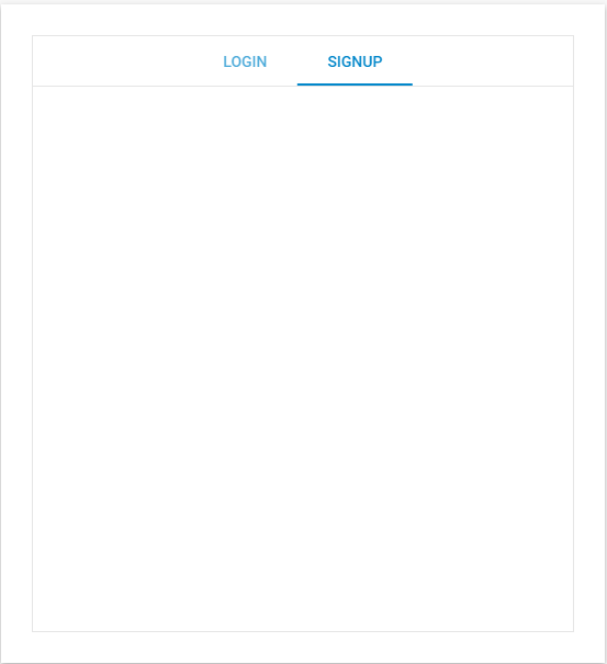 Check the sample >
Step 2: Populating the Form
Now, we can proceed to the most time-consuming stage of the tutorial, namely, populating a blank “SINGUP” tab with necessary controls.
First, add the fieldset control to the form. This control serves for organizing form elements into groups.
rows: [
{
type: "fieldset",
label: "Account",
rows: []
},
{
type: "fieldset",
label: "Personal information",
rows: []
}
]
})
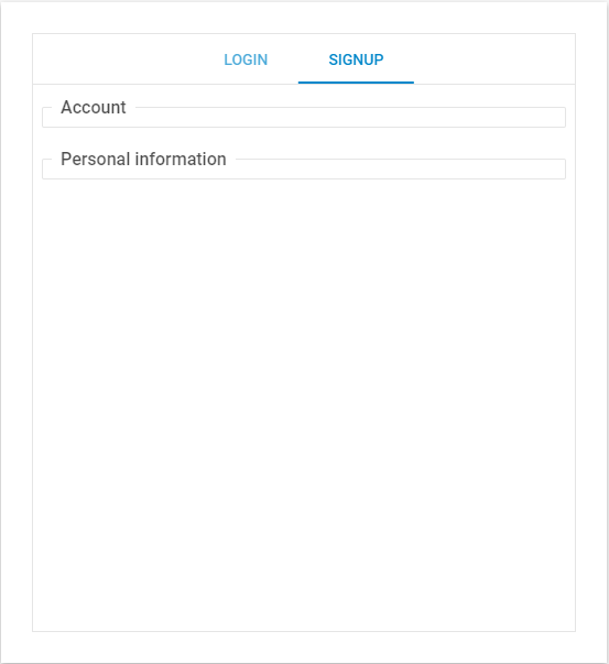
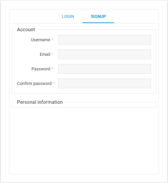
As a result, the registration form now includes two fieldset sections – “Account” and “Personal information”.
Next, you add the input field for the “Username” to the “Account” section:
type: "fieldset",
label: "Account",
rows: [
{
label: "Username",
type: "input",
name: "user",
labelPosition: "left",
labelWidth: 120,
required: true,
},
]
},
It is required to add some validation for this field to ensure data integrity in the form. It will be allowed to enter only A-Z, a-z, and “-” characters in this field:
label: "Username",
type: "input",
name: "user",
labelPosition: "left",
labelWidth: 120,
required: true,
validation: function (value) {
const regexp = /^[a-zA-Z\-]+$/;
return regexp.test(value)
},
},
Also, specify an error message that will be displayed in case end-users enter some other symbols:
label: "Username",
type: "input",
name: "user",
labelPosition: "left",
labelWidth: 120,
required: true,
validation: function (value) {
const regexp = /^[a-zA-Z\-]+$/;
return regexp.test(value)
},
errorMessage: "Must contain only characters A-Z, a-z, and -"
},
That’s how it should work:
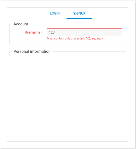 Check the sample >
Now you need to add the input field for email.
label: "Email",
type: "input",
name: "email",
labelPosition: "left",
labelWidth: 120,
required: true,
validation: "email",
errorMessage: "Please, enter a valid email"
},
Just like with “Username”, this field should also follow certain validation rules.
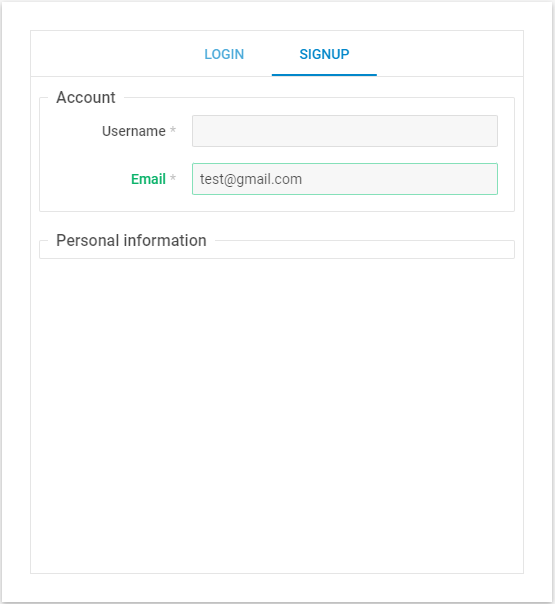 Check the sample >
When using our Form widget, you don’t need to worry about setting your own validation rules, as our widget suggests a suitable solution by default. The list of all available predefined validation rules can be found on this documentation page.
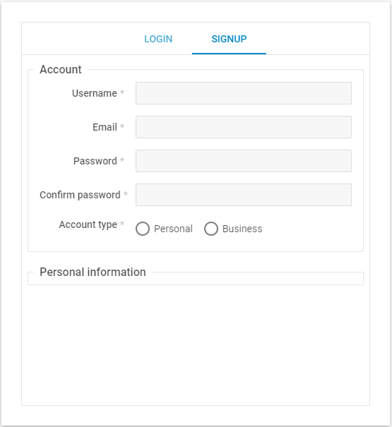
It is hard to imagine a registration form without fields for the password and its confirmation. The configuration of these fields must also include validation and error messages.
label: "Password",
type: "input",
name: "pass",
inputType: "password",
labelPosition: "left",
labelWidth: 120,
required: true,
validation: function (value) {
const regexp = /(?=.*\d)(?=.*[a-z])(?=.*[A-Z]).{8,}/;
return regexp.test(value)
},
errorMessage: "Must contain at least one number and one uppercase and lowercase letter, and at least 8 or more characters"
},
{
label: "Confirm password",
type: "input",
name: "pass_conf",
inputType: "password",
labelPosition: "left",
labelWidth: 120,
required: true,
validation: function (val) {
return val && signUpForm.getItem("pass").getValue() == val
},
errorMessage: "Please, verify your entered password"
},
After adding these fields, your form should look as follows:
 Check the sample >
At this stage, you get a basic registration form with all the necessary fields, but you can extend it with some additional controls.
You can add the possibility of choosing the type of account: personal or business. You can do it using the radio group control of DHTMLX Form:
type: "radiogroup",
label: "Account type",
labelPosition: "left",
labelWidth: 120,
required: true,
name: "acc_type",
options: { //list of the radioboxes used in the group
cols: [ // direction of the radioboxes
{
type: "radioButton",
text: "Personal",
name: "person"
},
{
type: "radioButton",
text: "Business",
name: "business"
}
]
}
},
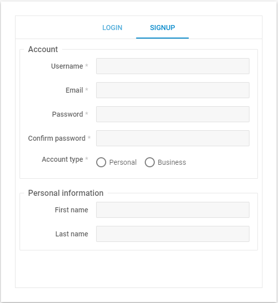
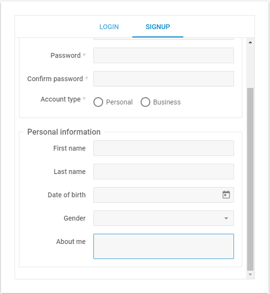
Now we come to the “Personal information” fieldset. Here you can also add several basic controls. For instance, you can add inputs for “First name” and “Last name”:
type: "fieldset",
label: "Personal information",
rows: [
{
label: "First name",
type: "input",
name: "name",
labelPosition: "left",
labelWidth: 120,
},
{
label: "Last name",
type: "input",
name: "surname",
labelPosition: "left",
labelWidth: 120,
},
]
}
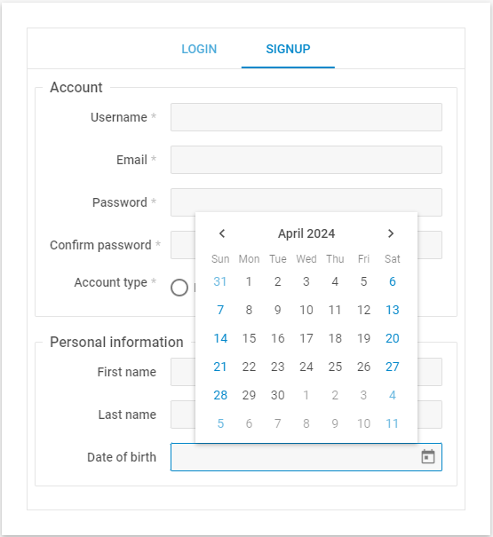
One more useful option that can be added to this section of your form is the date of birth. You can specify this parameter with the datePicker control:
label: "Date of birth",
type: "datePicker",
name: "birth",
labelPosition: "left",
labelWidth: 120,
dateFormat: "%d/%m/%Y"
},
You also can define the preferred date format with the dateFormat property. The value of this property includes a mask of the date according to the template. The details can be found on this page.
One more possible option is specifying the user’s gender. To add this to your form, you’ll need the Select control that provides a set of options to choose from.
type: "select",
label: "Gender",
name: "gender",
labelPosition: "left",
labelWidth: 120,
options: [ //list of the select options
{ content: "", value: "" },
{ content: "Man", value: "man" },
{ content: "Woman", value: "woman" },
{ content: "Another gender identity", value: "other" }
]
},
It is also common to enable end-users to enter multi-line text in the form. In our case, it is the “About me” section implemented with the textarea control.
type: "textarea",
label: "About me",
labelPosition: "left",
labelWidth: 120,
}
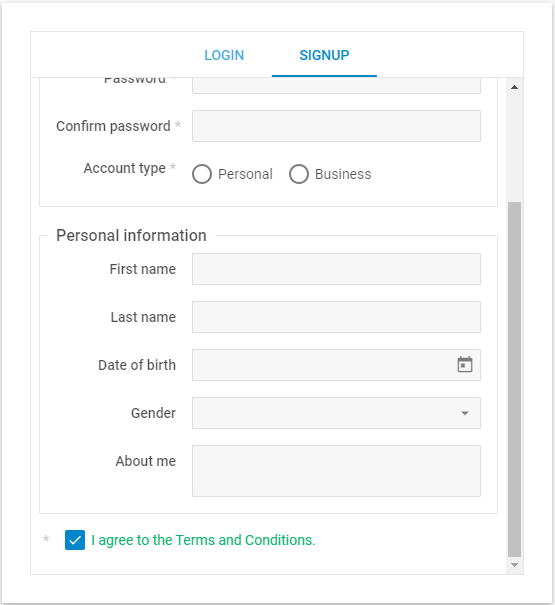
It is also useful to establish a legal agreement with end-users related to the use of their personal information by adding a corresponding checkbox. This control is also available in our Form widget.
The config may look like this:
type: "checkbox",
labelPosition: "left",
text: "I agree to the Terms and Conditions.",
required: true
},
As the final touch, you need to add the “Signup” button with the corresponding Form control:
type: "button",
name: "register",
submit: true,
value: "Submit"
}
In terms of the form appearance, the final version should be similar to this sample. But we also want to show you how to add the submit action logic to your form.
Step 3: Adding Actions to the Form
In this tutorial, we do not use any real backend, so we just want to show you how to implement the mechanism that detects when an end-user presses the Submit button. You need to add the click event to the form configuration. This event fires after a click on the Button control.
})
It will trigger the validation of your form. As a result, an end-user will be informed that the form is filled out correctly:
if (signUpForm.validate()){
dhx.alert({
text: "Thank you for signing up",
buttonsAlignment: "center"
});
signUpForm.clear();
}
})
Otherwise, the form will show an error message:
if (signUpForm.validate()){
dhx.alert({
text: "Thank you for signing up",
buttonsAlignment: "center"
});
signUpForm.clear();
} else {
dhx.message({
text: "Please, fill in all the required fields",
css: "error"
});
}
})
That’s it. You can test the core functionality of the form using this sample.
Wrapping Up
According to Capterra, 86% of event management software reviewers identify registration management as a highly important feature. Therefore, it can be a tricky and time-consuming task to implement a registration form from scratch. This tutorial gives you a complete understanding of how to do it much faster using DHTMLX Form. You can test this and other UI widgets from DHTMLX Suite for free in your web project by downloading a 30-day trial version.