Today, we are excited to announce the release of DHTMLX Suite 9.1. It is our first product update in 2025, where we continue addressing the needs of the web community. As web applications are required to handle larger and more complex data sets, it is not surprising that developers want to see more useful features in our Grid widget to face these challenges. And our development team did a great job extending the functionality of DHTMLX Grid.
In version 9.1, you can enjoy new features for more advanced data analysis. The updated JavaScript data grid provides the row expander feature that allows embedding subgrids, other Suite widgets, or custom HTML into table rows. Now, it is possible to sort grid data by multiple columns and get more valuable insights. As a cherry on top, our developers offer you a new demo demonstrating a multiuser backend for data-centric Suite UI widgets and a collection of new samples focused on further unveiling Grid strengths in real-case scenarios.
Row Expander for Enhanced Data Management (PRO)
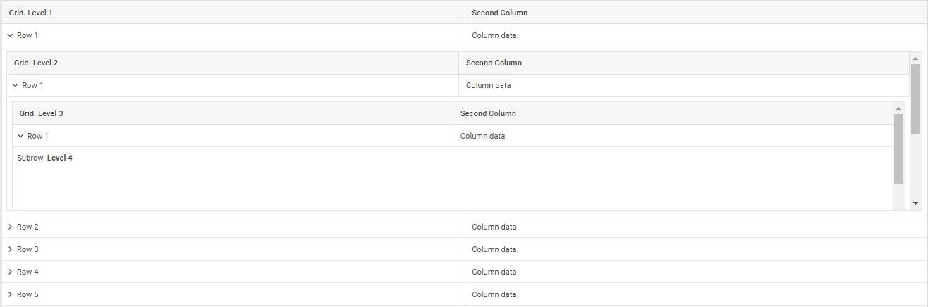
Starting from v9.1, DHTMLX Grid provides a new row expander feature for handling hierarchical or related data more efficiently. With this novelty, you enable end-users to expand (and collapse) rows to show extra info via sub-rows without navigating away or loading another page.
The updated Grid API includes plenty of options that will allow you to make the most of this great feature. To specify the embedded content for each row of the main grid table, you’ll need to use the subRow property. However, it should be noted that this property doesn’t work in the TreeGrid mode.
Here is an example of adding a sub-row with an extra grid (i.e. subgrid) to your JavaScript data table:
columns: [
{ id: "zone_name", header: [{ text: "Zone name" }] },
{ id: "temperature", header: [{ text: "Temperature" }] },
],
data: dataset,
subRow: ({ data }) => {
return new dhx.Grid(null, {
columns: [
{ id: "animal_type", header: [{ text: "Animal type" }] },
{ id: "name", header: [{ text: "Name" }] },
],
data,
autoWidth: true,
});
},
});
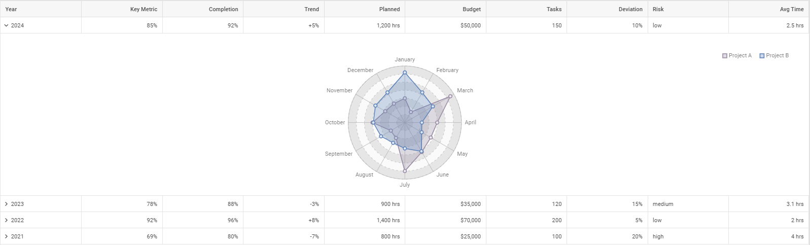
To make your data table more informative, you can embed more complex grid structures, useful visualizations using Suite widgets, or any required HTML elements like in the following examples:
- multi-level nested subgrids
- forms
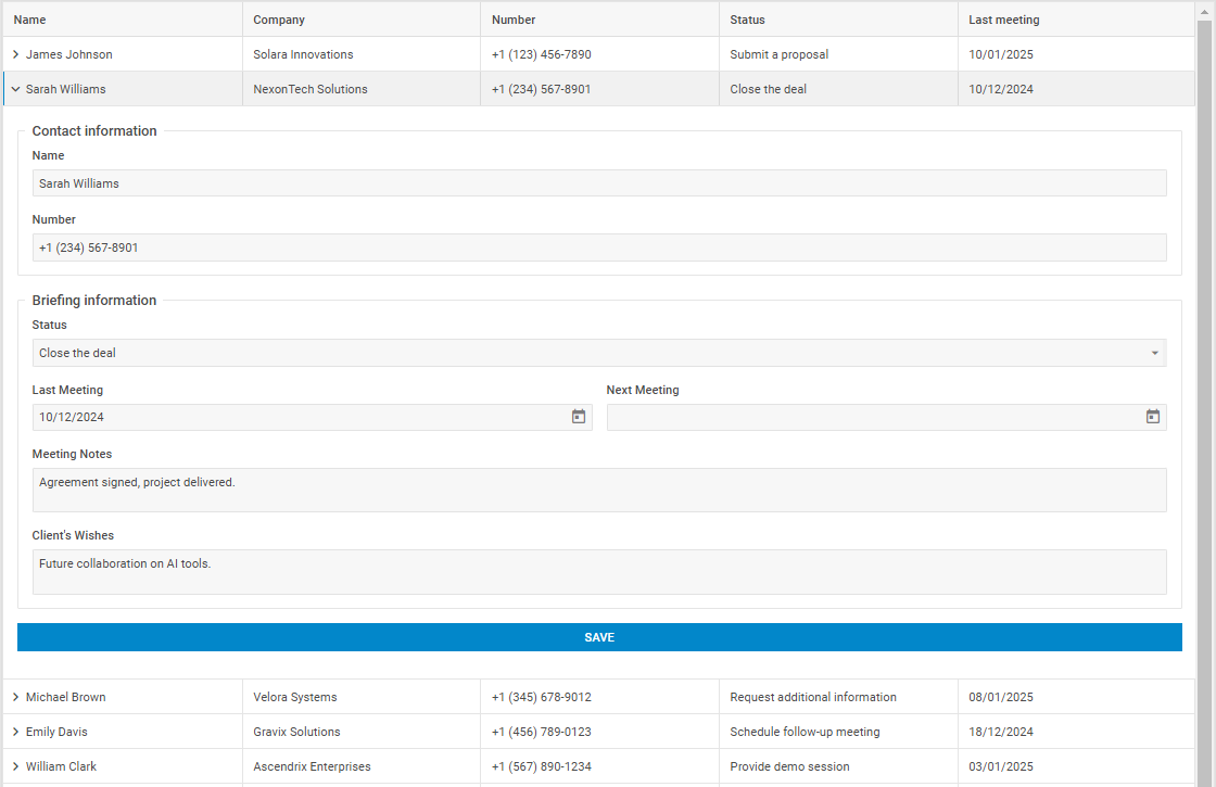
- charts
- custom HTML

- subgrids with rows expanded by criteria
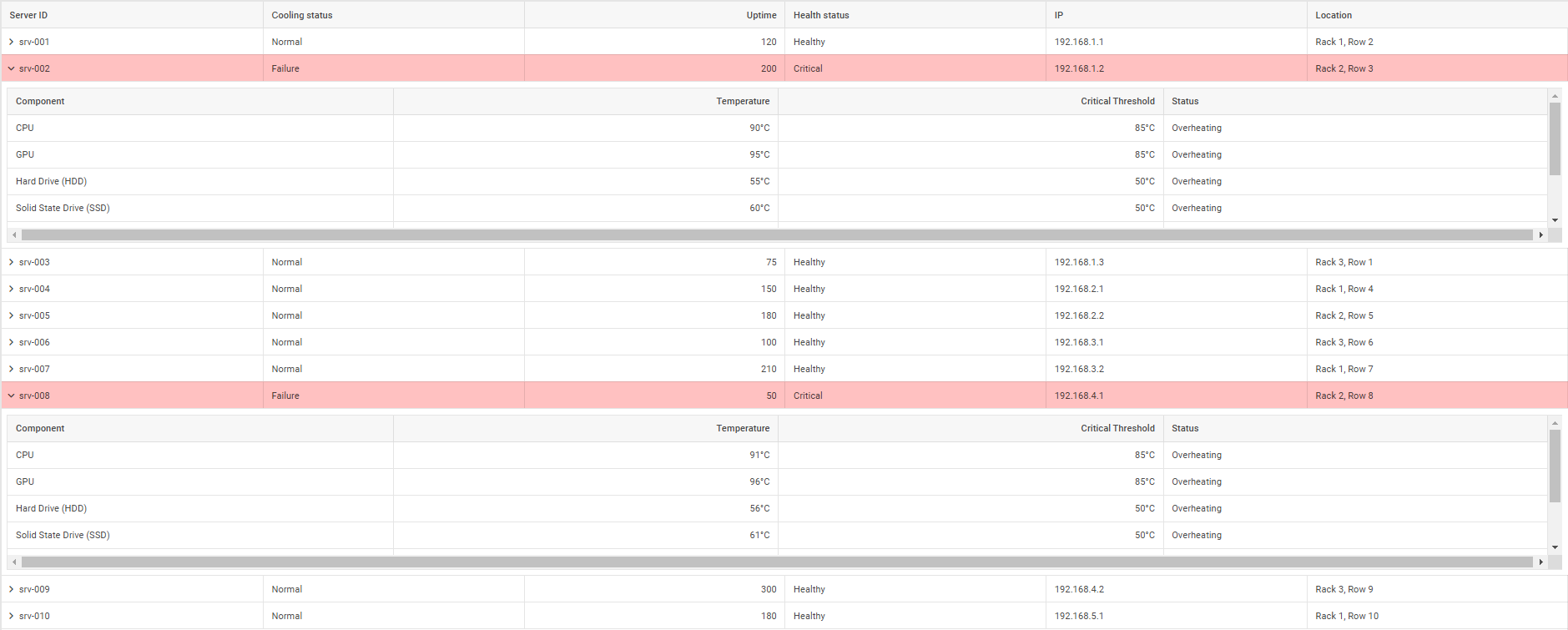
- subgrids only in specific rows
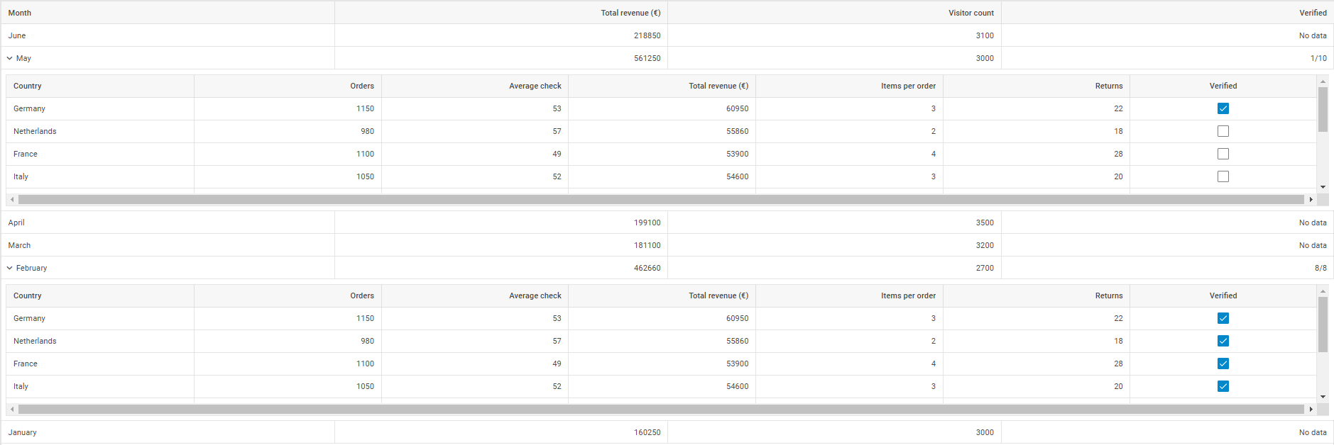
Two last examples are notable for vividly demonstrating the possibility of configuring sub-rows dynamically. In the first sample, sub-rows are dynamically configured depending on certain conditions (such as exceeding temperature limits) and trigger highlighting of corresponding rows. The second sample shows subgrids added to certain rows; or more specifically, sub-rows are not created for rows without data.
To make the dynamic configuration work, you’ll need to use the subRowConfig property added to the Grid API to specify various configuration parameters for sub-rows. It can be specified in two ways:
- as an object to apply the necessary parameters to all rows
- as a callback function to add individual settings for each row
Using this configuration option, you can set such parameters as height, padding, width, CSS classes, and even state persistence (called preserve). The latter parameter requires some explanation. It serves to keep the state of sub-rows unchanged after expanding/collapsing manipulations, data updates, and scrolling (out of visibility range).
subRowConfig: {
height: 200,
expanded: false,
preserve: false,
toggleIcon: true,
padding: 12,
fullWidth: true,
css: "",
},
…
});
The preserve parameter is useful for scenarios when interactivity and dynamic content are required, while it is excessive with static info and large datasets because of increased memory consumption. It is possible to get the current configuration and content of a particular sub-row via the getSubRow() method when the preserve parameter is enabled and the needed sub-row is visible.
The new row expander is a powerful feature to create grid hierarchies and subviews for displaying complex data parent-child relationships, while maintaining a clean and streamlined UI.
Multi-sorting for Effective Data Analysis (PRO)
In the new iteration, the Grid widget becomes an even more powerful tool for data analysis with the added ability to sort data by multiple columns simultaneously. This feature will be particularly helpful in data-intensive apps, where large amounts of data can now be analyzed and compared from different perspectives.
In the UI, end-users can easily define the order and direction of sorting in the required grid columns by clicking on their headers with the Ctrl key pressed. This key must be held down when working with multi-sorting, otherwise, a single click on any column header of your grid table will reduce sorting to this particular column.
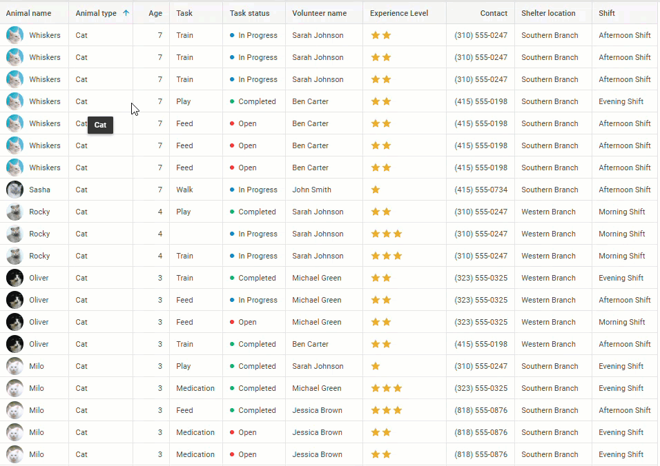 Check the sample >
You can go even further and apply the multi-sorting feature to groups of data:
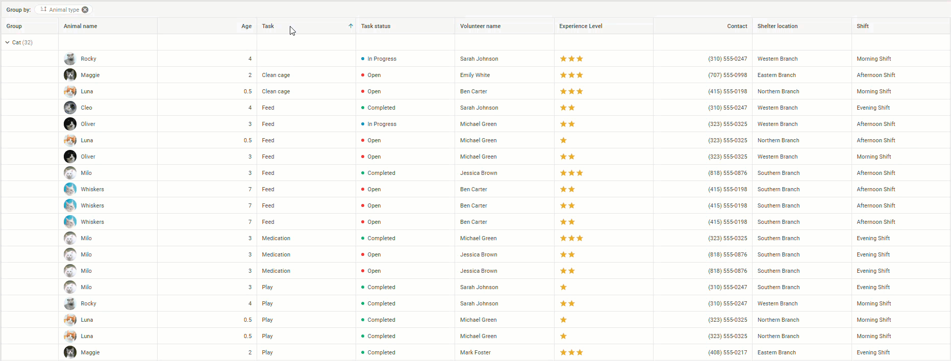 Check the sample >
Under the hood, multi-sorting is enabled by default with the multiSort property. If this feature is not needed, just change the value of this boolean property from true to false. Current sorting parameters can be obtained via the getSortingStates() method. This method is available in DataCollection/TreeCollection.
All in all, both new PRO features contribute to better organization and usability of tabular data in the JavaScript grid table, providing end-users with instruments for effective data analysis.
Multiuser Backend for Suite Widgets and Other New Samples
As the demand for real-time data synchronization in modern data-driven apps continues to grow, it is nice to be able to add this functionality to your project. Our dev team prepared a new demo for this release, where the grid table is implemented with a multiuser backend. Using this vivid example, you can enable real-time data updates for any data-centric Suite widget, ensuring enhanced collaboration, data consistency, and seamless experience with frequent data changes. You can use other languages to build the backend and any library that will provide the interaction between client and server sides via the WebSocket protocol.
In addition, we also significantly enriched the collection of Grid-related snippets with new examples that vividly show how some functional capabilities of our JS data grid widget work in practice:
- Grid. Grouping and template in group headers
- Grid. Search and highlight results
- Grid. Hiding columns using a header context menu
- Grid. Empty state
- Grid. Row pinning with checkbox
- Grid. Dynamic calculations
- Grid. Dataview editor for the second column
- Grid. Custom yes/no editor
- Grid. Additional details in the second grid (linked grids)
- Grid. Rotated (vertical) header
- Grid and Pivot. Integration
That’s it about the novelties introduced in DHTMLX Suite 9.1. You can review the new features in the “What’s New” section of the documentation.
For those who want to test the updated Suite library before making it a part of a real project, you can download a free 30-day trial version of v9.1. For our current clients, the new version is available in their Client’s Area.