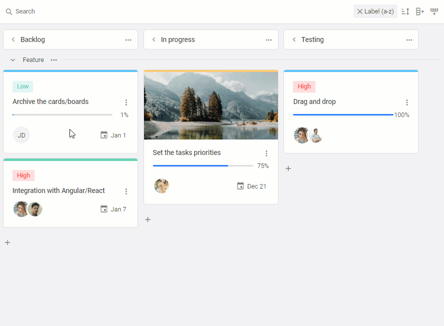
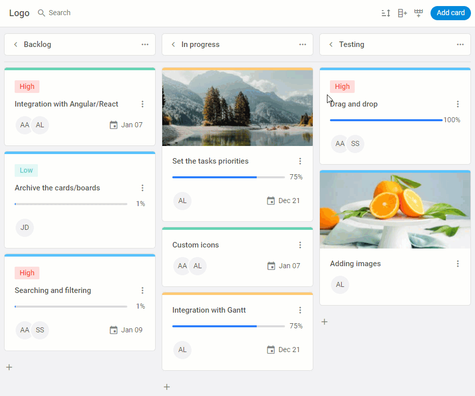
We are happy to announce the release of DHTMLX Kanban v1.2! This minor update comes with a pack of new features designed to address challenges that may occur when managing complex projects with a hefty number of tasks. After migrating to v1.2, you’ll be able to sort cards via API and UI and flexibly set sorting options, improve the performance with lazy rendering, and add a separate scrollbar to any Kanban column. Apart from that, there are plenty of API upgrades that will help customize context menus and toolbar controls. We’ve also significantly improved the way your Kanban will look and feel on mobile devices.
Download a new version of DHTMLX Kanban Board >
Without further delay, let us proceed with a detailed review of the novelties provided in v1.2.
Built-in and Custom Sorting
The new version of our Kanban component offers the possibility to sort tasks within a Kanban board via API or UI. It will help end-users to simplify the handling of tasks in large projects and better analyze the overall workflow within a Kanban board.
To enable this feature with code, you’ll have to use the new setSort() method. It is responsible for sorting task cards in specific or all columns according to different criteria. By default, tasks are sorted by label and task description, but you can also add custom sorting options. The method goes along with the set-sort event which is called when cards are sorted. You can assign values to the following optional parameters of setSort():
- by – the card field for sorting,
- dir – the direction of sorting (“asc” or “desc”),
- columnId – the ID of a particular column to be sorted,
- preserve – keeping the sorting state unchanged (boolean),
- null – resetting of the previously called sorting.
For example, you can specify the sorting of cards in ascending order by the “label” parameter in one particular column without preserving the sorting state in the following way:
by: (obj) => obj.label, // or by: "label"
dir: "asc",
columnId: "backlog",
preserve: false
});
The preserve parameter requires some clarification. Its aim is to keep the order of tasks in columns the same after the sorting is completed. By default, it is set to false, meaning that the sorting will be performed just once and its state will be altered after adding or moving tasks. If you set the value of this parameter to true, the order of sorted tasks will remain intact despite subsequent manipulations with task cards. In that case, end-users can see how cards are sorted on a special indicator that appears on the toolbar. You can reset the preserved state by invoking the setSort() method with the null parameter. See the effect of using the preserve parameter in the example below.
 Check the sample >
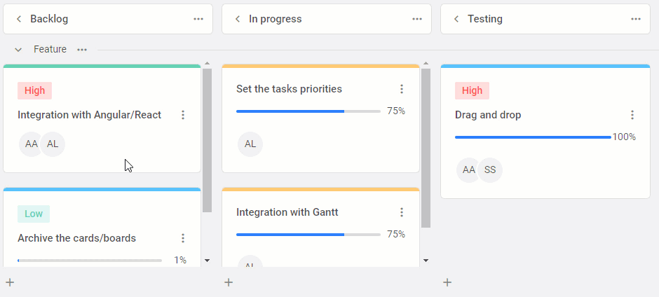
Here all cards are sorted by label in the descending order and this sorting state remains unchanged regardless of numerous manipulations with the task.
End-users can carry out a quick sorting for all columns of the Kanban board by label or description of cards. It is done using the sorting control in the toolbar.
 Check the sample >
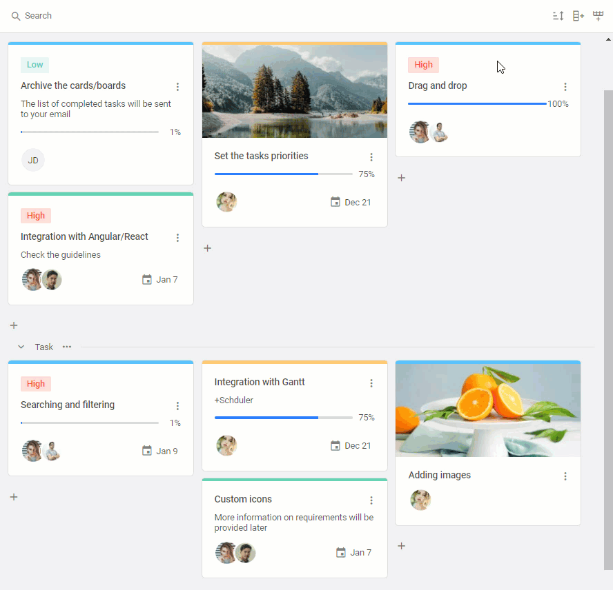
Lazy Rendering
Complex projects with hundreds of tasks can become a serious performance deterrent for your Kanban app and consequently cause a major inconvenience for users. For such cases, you’ll certainly need to have some mechanism at hand that will help to keep your Kanban equally quick under any workloads.
In v1.2, we’ve introduced the support for lazy rendering of data. This optimization technique allows rendering only the cards that are displayed on the screen at the moment. If you scroll the board, Kanban will render new cards and hide previous ones. Thus, if the project currently has around 5000 cards, end-users don’t need to wait when the data will be fully loaded to see the result. Such an approach is intended to save time and improve the user experience when managing big projects.
On the API side, this way of rendering cards is activated by attributing the renderType property with the “lazy” value.
columns,
cards,
rows,
renderType: "lazy",
// other parameters
});
Bear in mind that if you simultaneously use the renderType: “lazy” and scrollType: “default” settings, you should also specify a fixed height for task cards via the cardHeight property. Otherwise, the cards won’t be displayed on the screen.
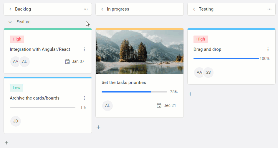
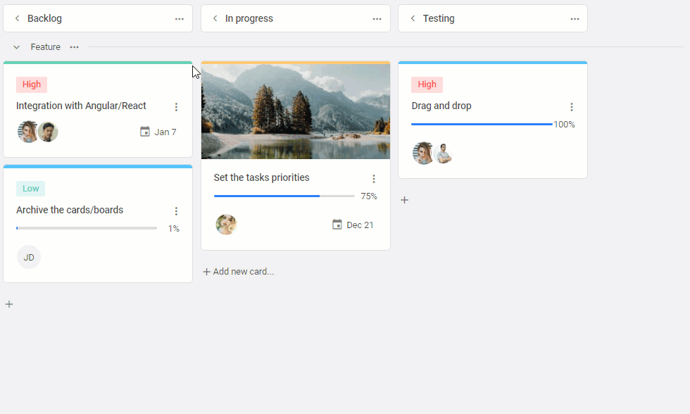
Separate Scrollbars for Kanban Columns
When the project work is in full swing, the Kanban board may contain tens or even hundreds of task cards at various phases of completion. To make it easier for end-users to review tasks at a certain stage, we’ve decided to add the ability to complement any Kanban column with a separate scrollbar. As a result, end-users will have an opportunity to quickly look through tasks that interest them at the moment and, if needed, conveniently sort them with drag-and-drop.
columns,
cards,
rows,
rowKey: "type",
cardShape,
scrollType: "column"
});
To do that, you’ll have to set the scrollType property to the “column” value. Initially, this property has the “default” value i.e. there is only one scroll for the entire Kanban board.
Custom Context Menus
Context menus provide end-users with a quick way to interact with cards, columns, and rows of the Kanban board. The new DHTMLX Kanban comprises a range of API novelties that will give you the freedom to configure this useful functionality in the desired way.
Starting from v1.2, you can implement your own vision regarding context menus using new rowShape and columnShape properties, as well as an updated cardShape property.
All three properties have a menu parameter, where you can assign the items attribute to a custom function which allows customizing context menus. For instance, each property enables you to show/hide a context menu for all (or selected) corresponding elements of the Kanban board and populate each menu with a custom list of options.
 Check the sample >
Find more detailed information on the possibilities of using these properties in the documentation.
Enhanced Toolbar API
The toolbar is an important part of the Kanban interface, where users can perform various operations such as searching, sorting, and adding rows and columns. When planning this release, we’ve come up with some ideas on how to improve your experience with this Kanban element.
The main changes have taken place in the items property. First of all, there is a new sort control that is specified with the “sort” string.
"sort", // default sort control
// other controls
]
Moreover, you can customize the sort control and its behavior in the following way:
{ // custom sort control
type: "sort",
options: [
{
by: "label",
dir: "asc",
label: "Sort by label",
},
]
},
// other controls
]
It has become possible to create a custom search bar by specifying a search object with additional search parameters. In the array of the items config, you can add different search keys and, when necessary, specify search rules.
api: board.api,
items: [
() => `<div style="font-weight:500;font-size:18px;padding:0 10px;">Logo<div/>`,
{
type: "search",
options: [
{
id: "label",
label: "By label",
},
{
id: "start_date",
label: "By date",
searchRule: (card, value, by) => {
const date = card[by];
return date?.toString().toLowerCase().includes(value?.toLowerCase());
},
},
],
},
//other controls
],
});
The toolbar configuration scheme has also been standardized. Now each control is specified with a separate parameter and their positioning in the toolbar has become more convenient and flexible. You can show and hide any of the controls and apply a special spacer to arrange them nicely along the toolbar.
api: board.api,
items: [
"search",
"spacer",
"sort",
"addColumn",
"addRow",
]
});
Convenient Work on Mobile Devices
It has become a common practice to access business apps on different mobile devices. We follow this popular trend and try to make our products as mobile-friendly as possible. Our Kanban component allows adding rows, columns, and task cards as your projects grow in scale and complexity. From now on, you can enable scrolling to a newly added element in the board panel to see it without extra searching. It will help to ensure better adaptation of the Kanban layout to the size of the used device.
To bring this feature into effect, we’ve enriched the Kanban API with the scroll() method. It is based on the scroll event that is called when scrolling to the target element. The new method takes the following parameters:
- id – identifies the destination element of the scrolling,
- to – names the type of the destination element (“column”, “row”, “card”),
- options (optional) – serves for specifying additional scrolling parameters such as “behavior”, “block”, “inline”.
id: 246,
to: "card",
options: {
behavior: "smooth",
block: "end",
inline: "nearest"
}
});
Other Improvements
Up until now, new task cards could be added to the Kanban board with the “+” icon at the end of each column. But it may be inconvenient when you already have a long list of tasks. That is why we’ve provided a new way for adding task cards to the Kanban. The new option is now available in context (3-dot) menus of Kanban columns. Instead of scrolling to the column’s end, users can save time and create a new task with help of the column header context menu.
 Check the sample >
It is also necessary to share with you some other API enhancements that haven’t been mentioned above. There is a new setEdit() method for toggling the card editor. The cardShape property received updates of the start_date, end_date, and users parameters. Some changes have been made to the setLocale() method of Kanban and Toolbar. We’ve also updated all three state methods of the Kanban component, namely api.getReactiveState(), api.getState(), and api.getStores(). You can also benefit from useful addtions in the Kanban stylization guide. And last but not least, our team has also prepared a range of fixes for bugs reported by our clients.
Take time to visit this documentation page and delve deeper into technical peculiarities of the v1.2 release.
After getting acquainted with the theoretical part, grab an opportunity to test the new DHTMLX Kanban by downloading a free 30-day trial version. For our current clients v1.2 is available in their Client’s Area.
As a cherry on top, there is an example of integrating the Kanban component with our brand-new JavaScript To Do List.
Any insightful comments on this release are very welcome. Take care and stay tuned for more updates from DHTMLX!