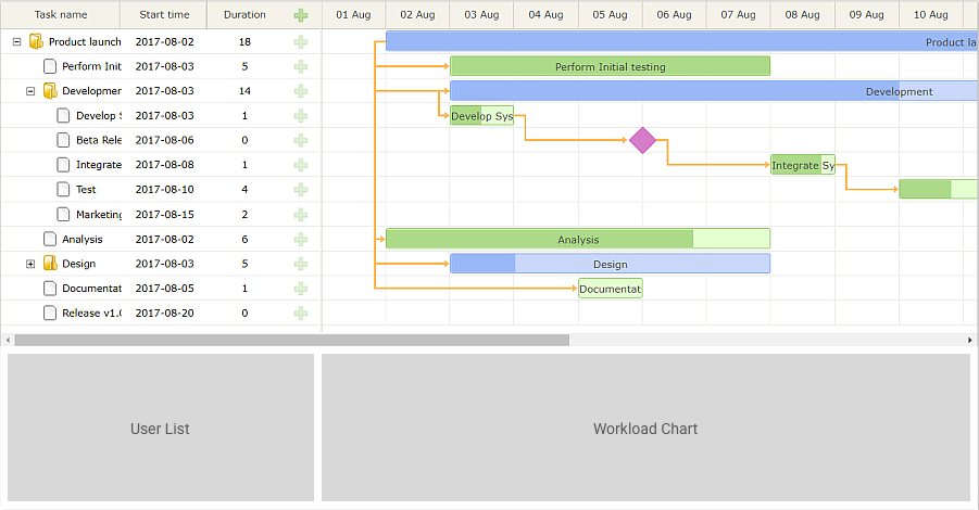
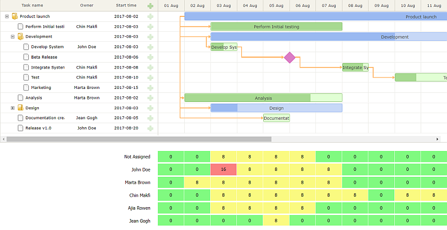
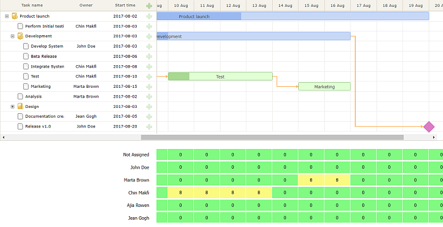
Gantt charts are essential for project management. They are very helpful when you need to see the sequencing of all tasks, the overall timeline of a project and plan deadlines. To further improve planning functionality, you can visualize daily amounts of work for each person. It allows distributing workload in a more effective way. D3 is one of those useful tools that make visualizing data happier. So I’ll show you how to expand your dhtmlxGantt chart with D3. As a result, the app will also display working hours for every employee on specific dates. You can get the demo from GitHub and view it online.
Initializing Gantt
Let’s plan the layout of the app first. The layout will consist of two parts: the Gantt chart and the extra chart for the workload. The second chart will have two columns, just like the Gantt itself. The first column will display a list of all the employees. The second column will display a number of hours for each employee. In fact, it will be an extension for the Gantt timescale and will provide additional information about employees.
Let’s begin with initializing the Gantt chart. Next, I’ll add two panels for displaying workload and create a single div for the app:
<div id='gantt_block'></div>
<div class='workload_users'>Users list</div>
<div class='workload_jobs'>Tasks list</div>
</div>
<script type="text/javascript">
gantt.init("gantt_block");
gantt.load("data.json");
</script>
For correct rendering, don’t forget to remove space around the app:
padding: 0;
margin: 0;
}
Let’s style the layout of the app. According to the design, there should be two rows and two columns. So, I’ll create a grid layout for the app:
display: grid;
grid-template-columns: 420px 1fr;
grid-template-rows: 400px 200px;
}
The Gantt chart will span 2 columns in the first row:
grid-column: 1 / 3; /* from col 1 to 3 (excl) */
grid-row: 1;
height: 380px;
}
And finally, here’s the place for the future chart of workload in the second row:
grid-column: 1;
grid-row: 2;
}
.workload_jobs{
grid-column: 2;
grid-row: 2;
overflow: hidden;
}
Adding List of Users
Next step is adding info about the employees on the project. Apart from the workload chart, employees’ names will be displayed in the gantt grid and will serve as options for assigning tasks.
Let’s create the list of employees:
{ label:"Not Assigned", key:0, job:" },
{ label:"John Doe", key:1, job:"Developer" },
//others
]);
In the real app, you can load the same data from a server-side.
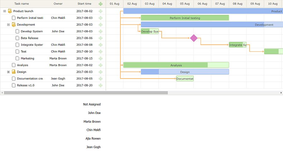
To display a list of names in the gantt grid, let’s reconfigure the grid. By default there are four columns, I’ll leave three of them (the Task name, the Start date and the Add columns) and add the column for owners of tasks:
{name:"text", label:"Task name", tree:true, width:170 },
{name:"owner", align: "center", template: function(item) {
return gantt.getLabel('assignedTo', item.assignedTo) }, width: 120},
{name:"start_date", align: "center", width: 90},
{name:"add", width:40}
];
The contents of the Owner column are taken from the assignedTo property in the tasks data. Unlike the default columns, this column also needs a header, so let’s provide it:
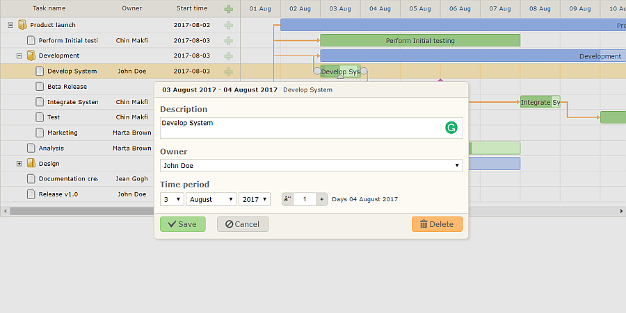
Now it’s time to enable assigning tasks to specific employees. Let’s reconfigure the Edit form (aka the lightbox). By default, the lightbox has two sections: task description and time period. Let’s also add a section for choosing a person for the task:
{name: "description", height: 38, map_to: "text", type: "textarea", focus: true},
{name: "owner", height: 22, map_to: "assignedTo", type: "select", options: gantt.serverList("users")},
{name: "time", type: "duration", map_to: "auto"}
];
Employees are selected from the user list that I added previously.
Just like in the case of the grid area, the new section needs a name:
Okay, the Gantt shows the names, and the lightbox is up and ready to serve:
Adding the Method to Get Workload per Day
The Gantt is configured and it’s time to work on the workload chart. First thing, I need to provide the data for the chart. The list of users is ready, and I need to calculate individual working hours.
Let’s define the function that will return a table with numbers — an object with arrays with working hours per day for each assignee.
The function will create the data object with zero filled arrays. The length of each array equals to the number of days in the Gantt timescale:
var state = gantt.getState();
var users = gantt.serverList("users");
var data = {};
var line = [];
var d = new Date(state.min_date);
while (d < state.max_date){
line.push(0);
d.setDate(d.getDate()+1);
}
for (var i = 0; i < users.length; i++)
data[users[i].key] = [].concat(line);
//data generating logic
return data;
}
The table is created, and now I need to fill the table with correct working hours per person. Let’s iterate through all the tasks and add working hours to people, to whom the tasks are assigned. I’ll add 8 hours for each day of the task duration:
var t = new Date(task.start_date);
var line = data[task.assignedTo || 0];
while (t < task.end_date){
i = Math.round((t - state.min_date)/(1000*60*60*24));
line[i] += 8;
t.setDate(t.getDate()+1);
}
});
Then let’s make sure that projects and milestones are excluded from calculations. I’ll add this check at the beginning of the eachTask method:
return;
Now I can load the data and calculate the workload:
console.log(getJobData());
});
Visualizing Workload
Let’s move on to the chart itself. There’s going to be a list of employees on the left, just below the gantt grid. Let’s use D3 and create the list:
d3.select(".workload_users").selectAll(".eachPerson")
.data(gantt.serverList("users"))
.enter().append("div") //append a new div
.text(item => item.label) //add the text from data
.attr("class", "eachPerson"); //add class to div
//...chart
}
Next, I’ll style the list with CSS, and here’s what I’ll have:
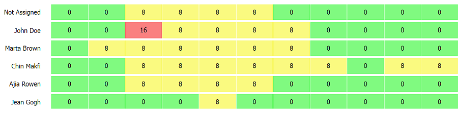
Next, let’s draw the chart itself. Chart lines will represent each employee and will consist of boxes for every day in the Gantt timescale. Let’s divide the task into subtasks:
- load data
- paint the chart
- paint a line for each person
- paint a box for each day of the project duration
Let’s begin:
var data = getJobData();
//user list
var line = d3.select(".workload_jobs").selectAll(".eachPerson")
.data(gantt.serverList("users"))
//...add new lines and paint them
}
New div elements can be added by line.enter().append(“div”). After a line is created, it needs painting:
var boxes = line
.style("width", (data[0].length * 72 + 20)+"px")
.attr("class", "eachPerson")
.selectAll(".eachDay")
.data(item => data[item.key]);
//...add new boxes and paint them
}
To paint new lines, you need to call the paintLine() function with the following parameters:
paintLine(line.enter().append("div"), data);
Like lines, boxes are added by boxes.enter().append(“div”). To paint each box you need to render the working hours:
boxes.text(a => a)
.attr("class", "eachDay");
}
By analogy with paintLine(), markBoxes() should be called with a newly created div as a parameter for rendering a new box:
markBoxes(boxes.enter().append("div"));
Next, I need to style the chart with CSS. The main point of styling is to set display: inline for each box and set size. Besides, it’ll be good to color each box according to the amount of work. Add a few lines of code to markBoxes():
if (data == 0) return "#80fa80";
if (data <= 8) return "#fafa80";
return "#fa8080";
})
After everything is done, you can load the data and draw the chart:
Making Visualization Dynamic
The app is almost ready. If the timescale is long like in this case, you need to scroll the Gantt. And it’s natural to expect that the lower chart with working hours will be scrolled with the Gantt. Let’s link chart scroll to Gantt scroll and attach a corresponding event:
var state = gantt.getScrollState();
document.querySelector(".workload_jobs").scrollLeft = state.x;
});
Good, the UI of the app is complete. However, there’s still one problem: if you try adding tasks and assigning them, the workload won’t update. Let’s add a few lines of code that will redraw the chart on every change of data in the Gantt. First, let’s complete renderD3Diagram() and add code for rendering already existing lines before painting new ones:
//...old code
//redraw the existing lines
paintLine(line, data);
//add new lines and paint them
paintLine(line.enter().append("div"), data);
}
And let’s do the same for repainting the existing boxes:
//...old code
//repaint the existing boxes
markBoxes(boxes);
//add new boxes and paint them
markBoxes(boxes.enter().append("div"));
}
Finally, let’s attach corresponding events:
gantt.attachEvent("onAfterTaskUpdate", renderD3Diagram);
gantt.attachEvent("onAfterTaskDelete", renderD3Diagram);
Conclusion
Gantt charts are well-known means of visualizing the workflow. You can make them even more effective and add other features, like the chart for daily workload of every employee involved in the project. You can download the source code from GitHub. D3 helps create amazing and useful things. Have great ideas on further improvements for Gantt or other UI components? Let me know in the comments. I hope the article will inspire great ideas and help you with your projects.
Written by Asta Vebraite, a tech writer at DHTMLX.