Updated on January 26, 2026
Note: Please keep in mind that the current tutorial follows a legacy approach to embedding DHTMLX JS Scheduler into React apps using class components. While this method still works, class components are no longer recommended for new projects. There is a much simpler way to achieve the main goal of this tutorial – our new DHTMLX React Scheduler. Those who still want to use the JS Scheduler in React, check the DHTMLX Scheduler in React tutorial based on the modern pattern of React function components.
We continue a series of tutorials devoted to the integration of our web app components with different client-side frameworks. Meet our new step-by-step guide on using DHTMLX Scheduler with the popular React JS component-based library.
Here you will learn how to:
- create a basic React Scheduling application
- extend the DHTMLX Scheduler functionality with custom features
- make it listen and react to user actions in real time
Before diving deeper into the subject, we invite you to check a complete demo on our React Scheduler GitHub repository.
You can also watch our video guide covering all the steps of adding and configuring DHTMLX Scheduler in a React-based app.
How to Start
Our first step is to initialize the application structure. For this, we will use the Create React app tool. You can find additional information about it in this article.
To create an app run the following command:
Then we go to the app folder and run the application with the following command:
yarn start (if you use yarn)
npm start (if you use npm)
Now our application should start on http://localhost:3000/
Adding DHTMLX Scheduler to React App
Let’s start with our Scheduler component.
The first thing you need is to add the DHTMLX Scheduler package to your project.
A free version of it can be added via npm or yarn:
or
npm install dhtmlx-scheduler (for npm)
Then, create the src/components/Scheduler folder. Here we’ll add a React Component wrapper for DHTMLX Scheduler.
Create the Scheduler.js file and open it:
import React, { Component } from 'react';
import 'dhtmlx-scheduler';
import 'dhtmlx-scheduler/codebase/dhtmlxscheduler.css';
const scheduler = window.scheduler;
export default class Scheduler extends Component {
componentDidMount() {
scheduler.skin = ‘material’;
scheduler.config.header = [
‘day’,
‘week’,
‘month’,
‘date’,
‘prev’,
‘today’,
‘next’
];
const { events } = this.props;
scheduler.init(this.schedulerContainer, new Date(2020, 5, 10));
scheduler.clearAll();
scheduler.parse(events);
}
render() {
return (
style={ { width: ‘100%’, height: ‘100%’ } }
>
);
}
}
Now create the Scheduler.css file and add styles for the scheduler-container:
.scheduler-container {
height: 100vh;
width: 100vw;
}
And finally, create the index.js file with the following content:
import Scheduler from './Scheduler';
import './Scheduler.css';
export default Scheduler;
As DHTMLX Scheduler is a regular JS library that lives outside of the ReactJS world, we created a wrapper component. Once our component is mounted, we initialize DHTMLX Scheduler and attach it to DOM. We can also populate it with the data passed via props.
Note that since a free version of DHTMLX Scheduler has no destructor, we do not define the componentWillUnmount. That also means that if we remove a component from React at some point, the instance of DHTMLX Scheduler will stay in memory and will be reused the next time when the component is mounted again.
Now let’s add Scheduler to our App component. Note that we use hard-coded data for this sample:
import React, { Component } from 'react';
import Scheduler from './components/Scheduler';
import './App.css';
const data = [
{ start_date:’2020-06-10 6:00′, end_date:’2020-06-10 8:00′, text:’Event 1′, id: 1 },
{ start_date:’2020-06-13 10:00′, end_date:’2020-06-13 18:00′, text:’Event 2′, id: 2 }
];
class App extends Component {
render() {
return (
);
}
}
export default App;
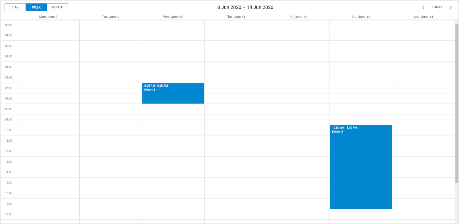
If we run the app now, we should see a simple scheduling calendar with initial events on a page:
or
npm start
Configuring React Scheduler Component
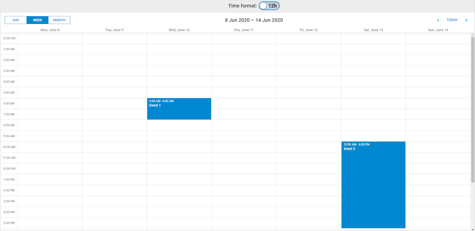
Let’s add some custom functionality to our React js scheduler. Suppose we need to add a toolbar with a checkbox that will be responsible for switching the time format on the hour scale.
We can change the time format using the hour_date config and the hour_scale template. After that, we need to redraw the view with a new format using a render. Let’s try to implement it in React. Firstly, let’s go to the Scheduler component and implement a couple of presets for the view configuration.
Open Scheduler.js to add the following code to it:
componentDidMount() {
scheduler.skin = 'material';
scheduler.config.header = [
'day',
'week',
'month',
'date',
'prev',
'today',
'next'
];
scheduler.config.hour_date = '%g:%i %A';
scheduler.xy.scale_width = 70;
const { events } = this.props;
scheduler.init(this.schedulerContainer, new Date(2020, 5, 10));
scheduler.clearAll();
scheduler.parse(events);
}
shouldComponentUpdate(nextProps) {
return this.props.timeFormatState !== nextProps.timeFormatState;
}
componentDidUpdate() {
scheduler.render();
}
setTimeFormat(state) {
scheduler.config.hour_date = state ? ‘%H:%i’ : ‘%g:%i %A’;
scheduler.templates.hour_scale = scheduler.date.date_to_str(scheduler.config.hour_date);
}
Here we added the componentDidUpdate handler, which will repaint the view on updates, and the shouldComponentUpdate handler, where we will determine if we need to update the view.
And add a call to the setTimeFormat function at the beginning of the render method:
render() {
const { timeFormatState } = this.props;
this.setTimeFormat(timeFormatState);
return (
style={ { width: ‘100%’, height: ‘100%’ } }
>
);
}
Now Scheduler displays the time in the 24 hour format. When the hour_date property and the hour_scale template change, we need to invoke the update of the view.
Let’s add UI for changing the time format. We’ll do with a simple toolbar and switcher.
Create the Toolbar component:
import Toolbar from './Toolbar';
import './Toolbar.css';
export default Toolbar;
import React, { Component } from 'react';
export default class Toolbar extends Component {
handleTimeFormatStateChange = (e) => {
if (this.props.onTimeFormatStateChange) {
this.props.onTimeFormatStateChange(e.target.checked)
}
}
render() {
return (
);
}
}
.tool-bar {
background: #ededed;
height: 40px;
line-height: 14px;
padding: 5px 10px;
text-align: center;
padding-left: 60px;
}
.time-format-chkbx {
display: inline-flex;
padding-top: 10px;
font-family: Roboto,Arial;
user-select: none;
font-weight: 500;
font-size: 20px;
color: rgba(0,0,0,.75);
}
.time-format-chkbx input {
position: absolute;
z-index: -1;
opacity: 0;
margin: 10px 0 0 20px;
}
.chkbx-text {
position: relative;
cursor: pointer;
user-select: none;
font-weight: 800;
font-size: 20px;
line-height: 30px;
font-family: Roboto,Arial;
margin-left: 10px;
}
.chkbx-text:before {
content: ’12h’;
text-align: right;
padding: 0 10px;
position: absolute;
top: -8px;
left: 0;
width: 60px;
height: 30px;
border-radius: 15px;
background: #CDD1DA;
box-shadow: inset 0 2px 3px rgba(0,0,0,.2);
transition: .2s;
}
.chkbx-text:after {
content: ”;
position: absolute;
top: -6px;
left: 2px;
width: 25px;
height: 25px;
border-radius: 15px;
background: #FFF;
box-shadow: 0 2px 5px rgba(0,0,0,.3);
transition: .2s;
}
.time-format-chkbx input:checked + .chkbx-text:before {
content: ’24h’;
color: white;
text-align: left;
background: #0288d1;
}
.time-format-chkbx input:checked + .chkbx-text:after {
left: 53px;
}
.time-format-chkbx input:focus + .chkbx-text:before {
box-shadow: inset 0 2px 3px rgba(0,0,0,.2), 0 0 0 3px rgba(2,136,209,.7);
}
And update the height of the scheduler-container:
.scheduler-container {
height: calc(100vh - 50px);
width: 100vw;
}
Here we add the checkbox for changing the time format and provide the onTimeFormatStateChange handler for a parent component. Now you need to add the toolbar to the App component:
import Toolbar from './components/Toolbar';
and a handler for changing the event:
state = {
currentTimeFormatState: true
};
handleTimeFormatStateChange = (state) => {
this.setState({
currentTimeFormatState: state
});
}
JSX:
render() {
const { currentTimeFormatState } = this.state;
return (
);
}
So, as a result, we get the opportunity to pass the updated state to our React Scheduler every time the user changes the time format:
Processing Changes Made in DHTMLX React Scheduler
Now we’ll show how to capture calendar view changes and then pass them somewhere in the app.
We’ll capture Scheduler changes using the dhtmlxScheduler events.
Let’s see how this is done in practice. Open src/components/Scheduler/Scheduler.js and add the following method:
initSchedulerEvents() {
if (scheduler._$initialized) {
return;
}
const onDataUpdated = this.props.onDataUpdated;
scheduler.attachEvent(‘onEventAdded’, (id, ev) => {
if (onDataUpdated) {
onDataUpdated(‘create’, ev, id);
}
});
scheduler.attachEvent(‘onEventChanged’, (id, ev) => {
if (onDataUpdated) {
onDataUpdated(‘update’, ev, id);
}
});
scheduler.attachEvent(‘onEventDeleted’, (id, ev) => {
if (onDataUpdated) {
onDataUpdated(‘delete’, ev, id);
}
});
scheduler._$initialized = true;
}
componentDidMount() {
scheduler.skin = ‘material’;
scheduler.config.header = [
‘day’,
‘week’,
‘month’,
‘date’,
‘prev’,
‘today’,
‘next’
];
scheduler.config.hour_date = ‘%g:%i %A’;
scheduler.xy.scale_width = 70;
this.initSchedulerEvents();
const { events } = this.props;
scheduler.init(this.schedulerContainer, new Date(2020, 5, 10));
scheduler.clearAll();
scheduler.parse(events);
}
We use a global instance of the scheduler, and since it can be mounted multiple times we need to make sure that we add event listeners only once.
In order to do so, we use a custom `scheduler._$initialized` flag. When the scheduler is initialized for the first time, this flag is not defined and we add event listeners and set this flag to `true`. This way we make sure we won’t attach event listeners to the same Scheduler instance again.
That’s how we can capture all changes made in Scheduler and send them to the parent component.
And we need to catch events, create messages for them and put those messages into the local state. To do this, update the App component:
state = {
currentTimeFormatState: true,
messages: []
};
addMessage(message) {
const maxLogLength = 5;
const newMessage = { message };
const messages = [
newMessage,
...this.state.messages
];
if (messages.length > maxLogLength) {
messages.length = maxLogLength;
}
this.setState({ messages });
}
logDataUpdate = (action, ev, id) => {
const text = ev && ev.text ? ` (${ev.text})` : ”;
const message = `event ${action}: ${id} ${text}`;
this.addMessage(message);
}
After that, create a component that will display these messages on the page:
import React, { Component } from 'react';
export default class MessageArea extends Component {
render() {
const messages = this.props.messages.map(({ message }) => {
return
- {message}
});
return (
Messages:
- { messages }
);
}
}
MessageArea.defaultProps = {
messages: []
};
import MessageArea from './MessageArea';
import './MessageArea.css';
export default MessageArea;
Add styles:
.message-area {
background: #ebebeb;
height: 200px;
overflow: auto;
padding: 10px;
box-sizing:border-box;
}
.message-area ul{
margin: 0;
padding: 0;
list-style: none;
}
.message-area li:before {
content: “\003e”;
padding-right: 10px;
}
And update the height of the scheduler-container:
.scheduler-container {
height: calc(100vh - 50px - 200px);
width: 100vw;
}
And finally, connect this component to the App:
imports:
import MessageArea from './components/MessageArea';
JSX:
const { currentTimeFormatState, messages } = this.state;
return (
);
}
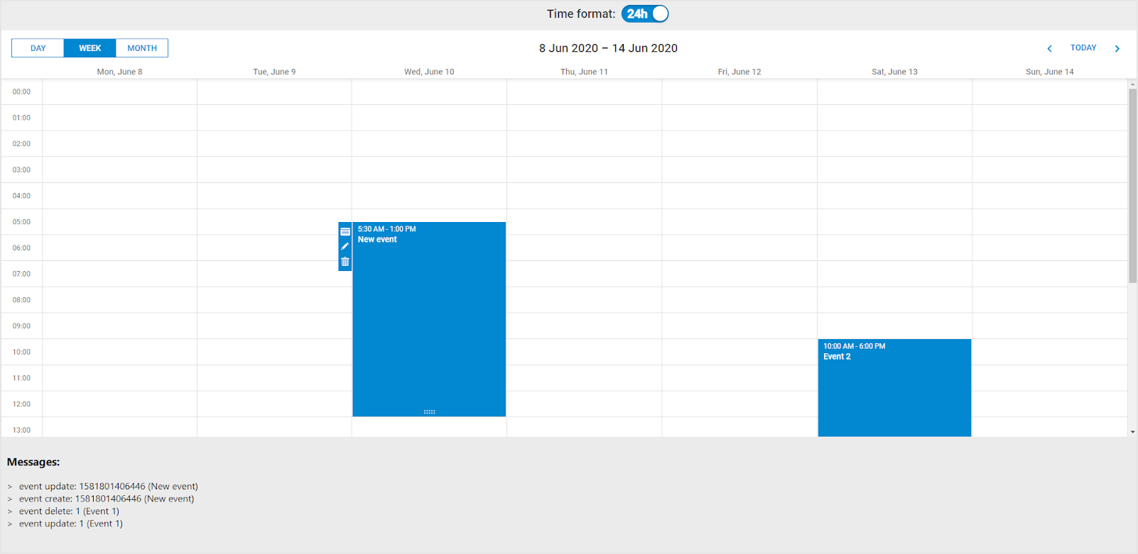
Thus, now every time a user changes calendar events, handlers call in the App component and update the MessageArea, which prints information about user actions on the page.
If we run the application, we will see the following result:
We hope that our tutorial will come in useful in your projects. Feel free to send us your questions in the comments below if you face any difficulties.
We also invite you to download a ready-made demo of our React Scheduler component from GitHub.