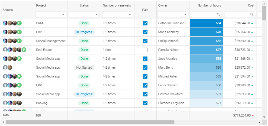
Data grid can be considered an essential component while developing web apps and interfaces. This widget allows working with massive data sets by displaying them in the form of a table.
DHTMLX Grid widget provides a comprehensive feature set to process large values of data and ensure user-friendly data management. It includes such convenient features, as data filtering and sorting, resizing, drag-n-drop of rows and columns, dynamic loading, and export to Excel and CSV.
In this article, we’ll show how to build a JavaScript Grid with DHTMLX.
Initialization
Having downloaded DHTMLX Grid (as a standalone widget or as part of Suite UI library), you have to unpack it into a folder of your project first. Then you need to create an HTML file and add full paths to JS and CSS source files into the header:
<html>
<head>
<title>Grid demo</title>
// include source files of the DHTMLX Suite library
<script type="text/javascript" src="codebase/suite.js"></script>
<link rel="stylesheet" href="codebase/suite.css" />
// add dataset for the Grid
<script type="text/javascript" src="dataset.js"></script>
// add CSS classes with custom settings
<style>
...
</style>
</head>
Next, you should add a container and give it an id, for example, “grid”:
<div id="grid" class="grid-wrapper"></div>
Then you have to initialize the Grid widget with the object constructor:
// create a data set for the first column (instead you can add your data)
var users = [
{
name: "Gary Ortiz",
ava: "01.png",
},
{
name: "Albert Williamson",
ava: "02.png",
},
{
name: "Mildred Fuller",
ava: "03.png",
},
];
// specify Grid configurations
var config = {
// configure each Grid column
columns: [
...
],
},
// initialize the Grid widget and add specified configurations
this.widget = new dhx.Grid("grid", config);
var grid = this.widget;
</script>
</body>
</html>
Read the full article about DHTMLX Grid initialization in the documentation.
Styling
DHTMLX Grid allows you to fully customize its appearance. You can add new CSS classes with required settings in the style section of your HTML file and then specify their name in the Grid configuration.
Thus, our Grid demo includes custom cells background, margins, and text alignment. Below are some examples of CSS classes that we created for:
- determining the size of your data table:
width: 1100px;
height: 560px;
}
- applying the background color to a Grid row:
background: #b4dbfe;
}
- setting the position of a user photo:
border-radius: 50%;
width: 24px;
height: 24px;
background: #61c874;
text-align: center;
line-height: 23px;
border: solid 1px #fff;
color: white;
font-weight: 500;
margin-right: -3px;
}
- specifying the appearance of cells with tasks depending on their status:
height: 24px;
max-width: 92px;
line-height: 25px;
margin: 8px auto 0 auto;
border-radius: 100px;
text-align: center;
}
.demo_grid-task__done {
background: linear-gradient(
0deg,
rgba(10, 177, 105, 0.1),
rgba(10, 177, 105, 0.1)
),
#ffffff;
color: #0ab169;
}
.demo_grid-task__progress {
background: linear-gradient(
0deg,
rgba(2, 136, 209, 0.1),
rgba(2, 136, 209, 0.1)
),
#ffffff;
color: #0288d1;
}
.demo_grid-task__not-started {
background: linear-gradient(
0deg,
rgba(122, 134, 140, 0.1),
rgba(122, 134, 140, 0.1)
),
#ffffff;
color: rgba(0, 0, 0, 0.7);
}
Configuration
The Grid widget allows adjusting the configuration of its columns via the corresponding option. You can resize the header and footer, set the desired type of column editor, add content filtering functionality, etc. Check the full list of Grid API commands.
Let’s configure the first column:
{
// assign column width
width: 150,
// set the id of a column
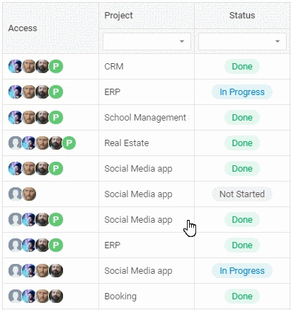
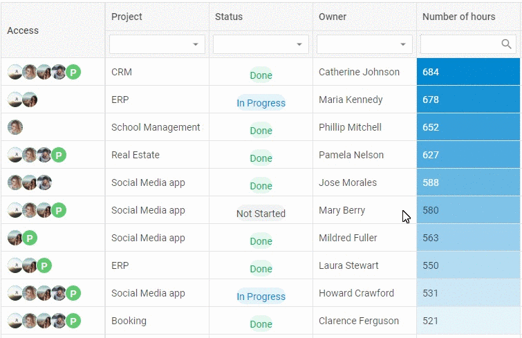
id: "access",
// define the type of the editor and the content alignment
type: "string",
// configure the header and footer
header: [{ text: "Access", rowspan: 2 }],
footer: [{ text: "Total" }],
// define the ability to edit data
editable: false,
// set a template with content for a cell
template: function (value) {
if (!value) {
return;
}
var photos = value.reduce(function (total, user) {
return (
total +
(user.ava
? '<img src="./images/' +
user.ava +
'" class="demo_grid-user-photo"/>'
: '<div class="demo_grid-user-photo" style="background:' +
user.color +
';">' +
user.name.slice(0, 1) +
"</div>")
);
}, "");
return '<div class="demo_grid-user">' + photos + "</div>";
},
}
Data editing
DHTMLX Grid includes 7 types of editors that are applied depending on the cell content. You can choose a proper option and specify the way of editing Grid columns via the editorType property. The example below demonstrates how to add a select control with three available options:
editorType: "select",
options: ["Done", "In Progress", "Not Started"],
}
Besides, you can apply created CSS classes that will modify a Grid cell depending on the option selected:
if (value === "Done") {
return (
'<div class="demo_grid-task demo_grid-task__done">' +
value +
"</div>"
);
}
if (value === "In Progress") {
return (
'<div class="demo_grid-task demo_grid-task__progress">' +
value +
"</div>"
);
}
if (value === "Not Started") {
return (
'<div class="demo_grid-task demo_grid-task__not-started">' +
value +
"</div>"
);
}
if (value === "Active") {
return (
'<div class="demo_grid-task demo_grid-task__active">' +
value +
"</div>"
);
}
},

Filtering
It’s possible to set content filtering by specifying a filter type in the column header. Thus, for example, you can specify the selectFilter property to allow users to filter column data by choosing an option from a dropdown list:
header: [{ text: "Project" }, { content: "selectFilter" }],
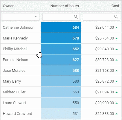
The comboFilter property provides a way to filter column data by entering text into the edit control and choosing an option from a dropdown list:
header: [{ text: "Owner" }, { content: "comboFilter" }],
Having specified the inputFilter property, you allow your users to filter data by using a text field:
header: [{ text: "Number of hours" }, { content: "inputFilter" }],
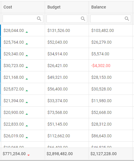
Footer with math functions
You can configure DHTMLX Grid to work with math functions and show the results in the footer. It’s possible to use default functions or create custom ones. Thus, for example, you can configure a grid column to display the total value of a column and specify its format:
calculate: function (data) {
return data.reduce(function (sum, c) {
return sum + parseFloat(c) || sum + 0;
}, 0);
},
toHtml: function (column, config) {
if (grid.data) {
var data = grid.data.map(function (item) {
return item[column.id];
});
return this.calculate(data).toLocaleString("en", {
style: "currency",
currency: "USD",
});
}
},
};
Moreover, you have to mention this formula in the column configuration:
footer: [{ content: "moneySum" }],
Conclusion
Being a part of the Suite UI library, DHTMLX Grid is a feature-rich widget to build data-intensive and user-friendly tables. You can estimate our Grid component by downloading a free 30-day trial.
Access our documentation to get more information about DHTMLX Grid.
If you still have questions, do not hesitate to contact us. You can also share your experience of working with DHTMLX Grid or any other DHTMLX library by interviewing with our team.