DHTMLX Grid has always been the ultimate driver of the Suite’s popularity among web developers. It enriched many business apps with numerous features required for effective presentation and manipulation of large data sets aligned with a user experience. The new v9.0 of our JavaScript UI widgets library comes with significant updates for this widget that will bring your data management capabilities to a new level.
You won’t find the TreeGrid widget in the new Suite version, because now it is a new Grid feature. But the pivotal novelty of this release is row data grouping with extensive customization options via API and UI. Another useful feature that will increase the value of the Grid widget in data analysis is the ability to use custom stats functions and define totals in the header/footer of your table. In Grid and Form widgets, you can also contribute to enhanced usability during data entry by setting input masks.
Let us consider the main features delivered in v9.0 in more detail.
TreeGrid Becomes a Part of Grid Widget (PRO)
DHTMLX TreeGrid has been an extension for the Grid widget, so they have always been very similar in terms of usage and API. That is why merging TreeGrid into Grid is a logical step that broadens the Grid’s applicability in hierarchical data representation with expandable/collapsible rows. There are other positive results such as unified functionality, faster development, and simplified maintenance. From a technical perspective, this measure is a crucial condition for the biggest feature of this release, namely data grouping, based on the tree structure.
Now, the Grid API allows configuring JS data tables to present flat and hierarchical structures. The tree mode with all TreeGrid functionality is enabled with type: “tree” in the Grid configuration:
type: "tree",
columns: [
// columns config
],
width: 400,
data: dataset
});
The new mode supports keyboard navigation to ensure convenient management of tree-like data structures with keys and shortcuts.
Flexible Row Data Grouping (PRO)
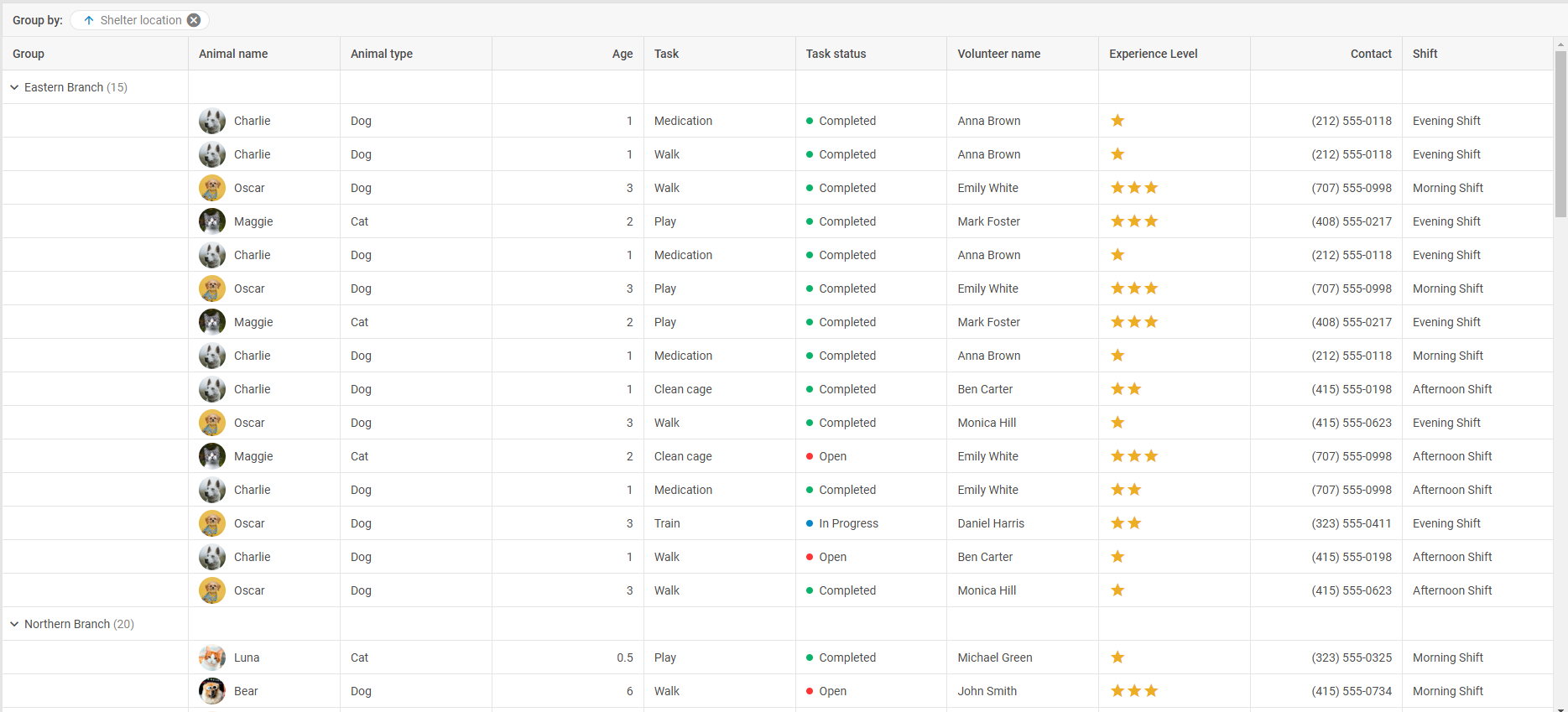
Starting from v9.0, DHTMLX Grid supports row data grouping. It is a killer feature of this major release designed to simplify the analysis of large datasets by organizing data hierarchically based on selected grouping criteria. Thus, it becomes a powerful tool to promptly notice valuable patterns and trends from aggregated data, facilitating more effective decision-making.
The great thing is that this feature is implemented with high flexibility in mind, meaning that you can configure grouping according to any project needs. For this purpose, we enriched the Grid API with new properties that allow you to specify grouping details.
The predefined grouping configuration is implemented via the new group property. This property serves to specify the behavior, visibility, and appearance of groupings in the table. It also allows managing the group panel, columns’ display, grouping order, and settings related to data aggregation.

columns,
group: {
order: ["shelter_location"]
},
//more configuration options
});
The group configuration option contains many parameters that will help you modify grouping settings as desired. For instance, you can combine grouping with data aggregation. To do that, you need the fields parameter that sets up the extended configuration for data grouping by certain columns and specifies rules for aggregation and display of total values. The order of grouping is arranged in the corresponding order parameter.
columns: [
{ id: "country", header: [{ text: "Country" }] },
{ id: "population", header: [{ text: "Population" }] },
{ id: "density", header: [{ text: "Density (P/Km²)" }] }
],
group: {
panel: true,
fields: {
population: {
summary: "bottom",
map: {
population: ["population", "sum"],
customSummary: function(rows) {
return rows.length;
}
}
}
},
order: ["population"]
},
data: dataset
});
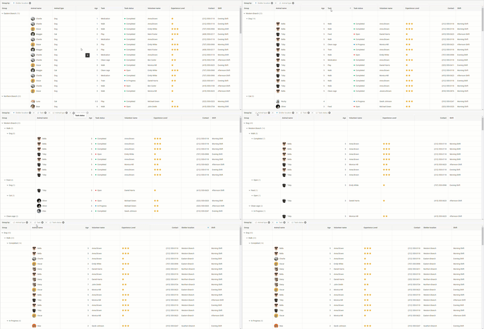
As for end-users’ capabilities in grouping, they are immense. Want to give end-users full freedom in grouping data by values of one or multiple columns of the grid table? Just enable the groupable property in the grid config. You can also add the closable property in this config, allowing users to remove any item from the grouping panel.
In the UI, all that has to be done is simply drag the headers of needed columns into the grouping panel and Grid will automatically create groups based on the values in these columns. End-users can also edit the nesting level of the grouping by reordering items in the panel or removing ones that are no longer needed. The values of grouped columns are sortable.

If grouping is only relevant for particular grid columns, you should add the groupable property (and closable, if needed) to the config of the required column.
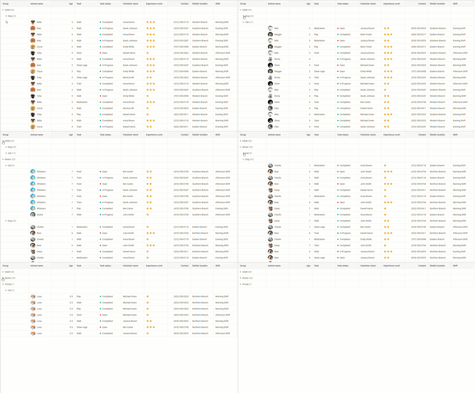
Once the grouping feature is enabled in the Grid configuration, it also becomes available in the DataCollection API. In v9.0, it includes a range of new methods and events for grouping items. For instance, you can group data and divide it into different categories:
 Check the sample >
As a result, this big feature will help you to bridge the gap between raw data and actionable insights.
Summaries of Values Calculated with Custom Functions
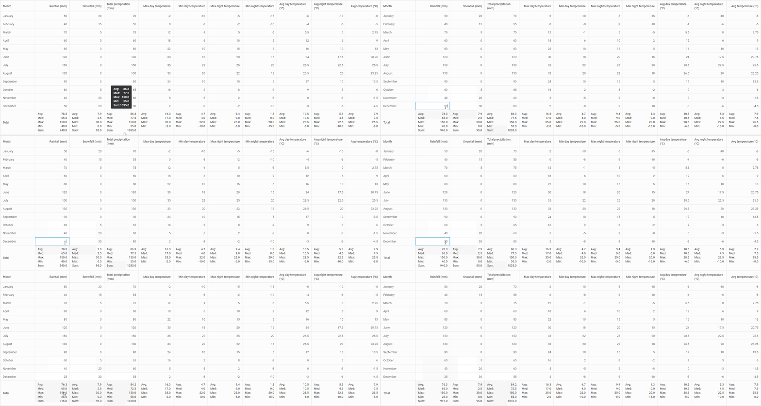
Another great novelty delivered for DHTMLX Grid in this major release lies in the area of custom computing. Here we are talking about the ability to redefine the default stats functions and render the summaries of custom calculations for a certain column or the whole JS grid table. This will come in handy in scenarios, where predefined functions (sum, avg, etc.) are not enough. For instance, financial reports or scientific research may have specific data analysis needs that can be addressed with custom calculations and the updated Grid API empowers you to do that.
The process of generating data summaries in your JavaScript data table includes the following steps:
1) Defining a function for calculation during the summary list creation.
For this purpose, you need the dhx.methods helper that serves for defining default statistical functions or creating custom functions like the one below:
return rows.reduce((sum, row) => sum + row[field] * 2, 0); };
2) Forming a summary list on the required level.
You can create summaries for a particular column or the whole data table:
- For a column, you should use the summary property to initialize the summary (as an object or a string) in the Grid column configuration.
- For the summary that will cover the whole table, you need the summary config option of Grid.
To render custom statistics in column and grid summaries, it is necessary to set the text and tooltipTemplate properties of a column and of the Grid spans configuration object as callback functions.
3) Getting the summary object with the calculated values.
The Grid API now includes the getSummary() method that can be used to get the summary data for the whole grid or a certain column. If you call the method without any parameters, you’ll get the summary for the whole Grid. After specifying the id parameter, you’ll get summaries for both column and grid.
Such customizations enhance the usability of DHTMLX Grid in applications requiring complex calculations.
 Check the sample >
In this sample, you can see how these new capabilities can be applied in a real-case scenario with dynamic updates after editing.
Enhanced Accuracy with Input Masks in Grid and Form
When working with complex tables, end-users may need to enter data in a certain format (dates, phone, numbers, credit card details, etc.) and errors are likely to occur. Web developers can implement extensive validation logic to reduce the possibility of such errors, but Suite 9.0 offers a simpler solution for such issues. These are input masks that can be specified for various data formats using the following properties in the Grid column object:
- numberMask
It is used to specify input masks for numeric values only. This property includes a range of parameters, provided on this page, that help you form the required number format. For instance, the input mask for the Salary column in the example below is configured the following way:
{
id: "salary",
header: [{ text: "Salary" }],
numberMask: { prefix: "£", maxDecLength: 0 }
}
...
- patternMask
Using this property, you can specify an input mask for columns, where cells can contain number and string values. A common scenario is a mask for credit cards:
{
id: "card_number",
header: [{ text: "Card number" }],
patternMask: "0000 0000 0000 0000"
}
...
Use the sample below for testing various types of input masks in the data table built with the DHTMLX Grid widget:
Check the sample >
Find more details on configuring Grid input masks in the documentation.
These input mask novelties are now available in another data-centric Suite widget, Form. The API of this widget also received numberMask and patternMask properties for specifying required mask templates in Input and Textarea controls of the Form widget. The Input control API has the getText() method for managing input masks. Try number masks and pattern masks for JS forms in action.
The “What’s new” section will help you to get the complete info on all new features reviewed above and other minor novelties delivered in this major update.
Check out the Migration page to get acquainted with breaking changes associated with migrating from v8.4 to v9.0.
Note: If you have an active support subscription for the DHTMLX TreeGrid widget, you will get the updated DHTMLX Grid widget for free now. We will provide bug fixes for DHTMLX TreeGrid upon request within a year.
If you want to test all the exciting features in v9.0, download a free 30-day trial version of DHTMLX Suite and try things out. For our current clients, v9.0 is available in their Client’s Area.