The year 2022 has just begun and we would like to start it with the release of DHTMLX Suite v7.3. The new version of our JavaScript UI widget library includes a range of anticipated features and improvements. The primary novelty in v7.3 is a new data visualization option for DHTMLX Chart – treemap chart. The ComboBox widget now allows expanding a range of options in the drop-down list from the UI. Combo editors of Grid, TreeGrid as well as Combo control of Form also include this functionality. It has become possible to create custom filters in the DHTMLX Grid and TreeGrid. Apart from that, our development team took measures to protect DHTMLX Combo and Message widgets from XSS attacks and provided some improvements to the Suite API.
Download the latest version 7.3 of DHTMLX Suite >
New Treemap Chart in DHTMLX Chart
The list of chart types that can be built with our JavaScript charts component is expanded with a treemap chart. It is designed for depicting and analyzing hierarchically-ordered sets of numerical data (product sales, staff turnover, etc.). Nested rectangular tiles of different colors are commonly used to display data in treemap charts. The dimensions of tiles correlate directly with the quantitative value that each of them represents. With tooltips, legend, and other features provided in this visualization tool, it is much easier to analyze data and detect patterns or inconsistencies.
The needed type of chart is specified with the type:”treeMap” property in the configuration object. Legend items are placed horizontally or vertically using the direction property in the legend config. More details on the initialization process can be found in the documentation.
You can also create a treemap chart where rectangular tiles are arranged into groups like in the example above. Moreover, it is possible to expand/collapse each group of tiles by clicking on their titles.
Adding New Options into ComboBox from UI
Previously, JavaScript select boxes built with the DHTMLX ComboBox could contain only predefined options. Starting from v7.3, our widget allows adding free text as a new value for the ComboBox input right from UI. This feature can be implemented with the newOptions property that has become a part of the ComboBox API. It is enabled by setting the property value to true.
multiselection: true,
newOptions: true
});
 Check the sample >
After entering a new value in the input field, there are two ways for end-users to add a new option to the collection of Combo options:
- Press the ENTER button
- Click on the emerging text (Create “newValue”) in the drop-down list.
Alternatively, you can make use of the addOption() method added to the ComboBox API for this purpose.
This new functionality has become available in the Combo control of the Form widget as well as in the ComboBox editor embedded in the Grid and TreeGrid components.
We added a new editorConfig property for columns of the DHTMLX Grid and TreeGrid. It comes with the newOptions attribute that gives an opportunity for users to add custom text in the ComboBox editor (editorType: “combobox”). You just need to set the value of the attribute to true in the configuration of the Grid/TreeGrid column to enable it.
 Check the sample >
The newly added option will also be shown in the header/footer filter of the column if it is specified in the Grid/TreeGrid.
The newOptions property can be applied to the Combo control of the Form widget, enabling similar functional capability. The addOption() method is also available for adding arbitrary input:
When a new option is added to the dropdown list by users, the Combo control (just like the ComboBox widget) calls the beforeAdd and afterAdd events from the ComboBox data collection. If it is necessary to prevent users from entering any specific values, you can apply the beforeAdd event. For instance, you can prohibit adding options with the value “new” in the following way:
In addition, we added a new createItem locale option that helps to adapt the Create option to any language.
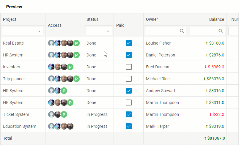
Custom Filters in Grid and TreeGrid Components
DHTMLX Suite v7.3 expands customization options in the Grid and TreeGrid components. Now you are able to create custom header and footer filters for facilitating user experience in data management. To do that, we’ve introduced a new property of the column’s header/footer named customFilter intended for setting your own filtering logic in Grid/TreeGrid. It should be emphasized that this property is applicable only when content: “inputFilter” | “selectFilter” | “comboFilter” is specified.
columns: [
{
width: 150, id: "population",
header: [
{ text: "Population" },
{
content: "inputFilter",
// selects values greater than the entered value multiplied by 100 million
customFilter: (value, match) => value > match * 100000000
}
]
},
{
width: 150, id: "yearlyChange",
header: [
{ text: "Yearly Change" },
{
content: "selectFilter",
// selects values less than the entered value
customFilter: (value, match) => value < match
}
]
},
... // more columns
],
data: dataset
});
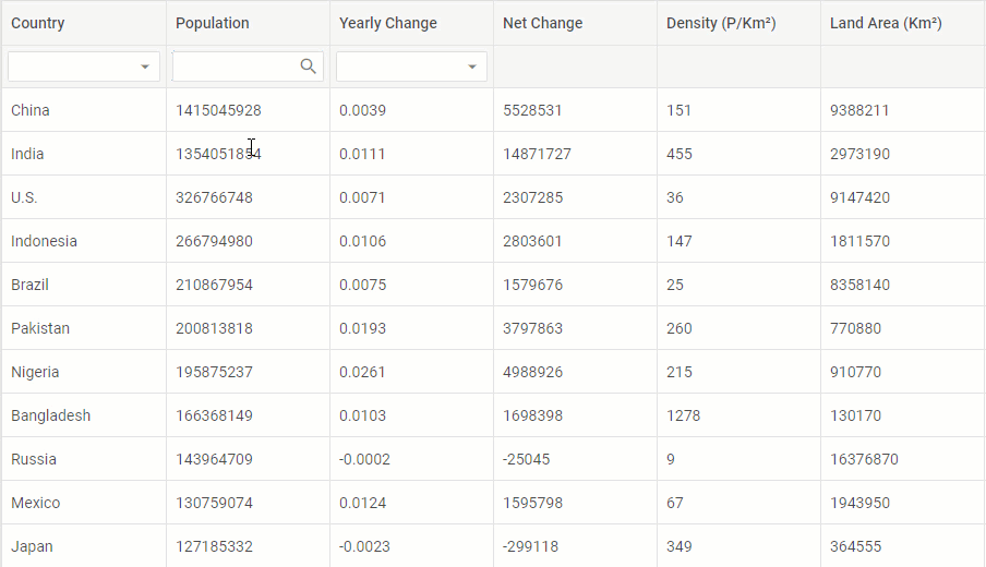
The customFilter property serves as a function for comparing the value selected in the header filter with each value in the grid column and returns either TRUE or FALSE as a result. Users will see only the options that meet the specified criteria.
Other Improvements
The DHTMLX development team added the htmlEnable property to configurations of the Message, ComboBox, and List widgets. This property serves to disable the display of the HTML content, thereby eliminating the threat of XSS attacks.
Now if you provide the “id-value” combinations for options of the “combobox” or “select” editor in a Grid column, both the editor and a grid cell will display the value of the option by its id.
The Toolbar widget has been complemented with the beforeChange event which fires before a user switches an active tab by clicking on another one. It can be helpful if you need to prevent switching to certain tabs.
Visit the following documentation page to become familiar with new features in more detail and a slew of fixes delivered by our team.
Take advantage of a free 30-day evaluation version to estimate the new DHTMLX Suite 7.3 in practice. Our existing clients can download the latest version via their Client’s Area.
Share your impressions on this update in the comments below and stay tuned for future releases from DHTMLX.