We continue delivering new releases of DHTMLX products enriched with top-requested features. This time we invite you to get acquainted with DHTMLX Suite 8.0. This major update brings your styling capabilities to a new level with built-in customizable themes, including high-contrast ones, and a theme configurator tool. The appearance of contrast themes and support for WAI-ARIA attributes now make our library fully accessible.
We also introduced a range of noteworthy features for the most popular Suite widgets, namely Chart and Grid widgets. DHTMLX Chart received a new chart type – calendar heatmap chart, and exporting options to PDF and PNG formats. Grid was complemented with the ability to drag and drop multiple rows, timePicker editor, and expanded the freezing feature. Moreover, there is also a wide range of minor features and improvements for popular Suite widgets.
Let us go through the essential parts of this release.
New Built-in and Custom Themes
The visual appearance of your web application is often just as important as functional aspects for ensuring the optimal user experience. Based on Google’s Material Design, our UI widgets library has always been quite flexible in terms of styling, allowing you to adjust the look and feel of any element in widgets using CSS classes with custom settings. But now the whole process of styling can be simpler and less time-consuming with useful auxiliary tools.
DHTMLX Suite v8.0 is shipped with 4 new built-in themes: Light, Dark, Light High Contrast, and Dark High Contrast. To apply any of these themes to a particular Suite widget in your project, you should use the setTheme() method in the global object dhx. It takes two parameters:
- theme (required) – names the theme that should be set with a string value (default value – “light”)
- container (optional) – specifies the container, where the preconfigured theme will be applied, taking an HTMLElement, an ID of the container or an ID of the Layout cell, document.documentElement (default value).
Alternatively, you can activate the required theme via the data attribute of the chosen container. Learn how to do it in the documentation.
If you take a look at the styling settings of the default theme (light), you can see variables of the color scheme in CSS variables. They enable you to change the color scheme (specified in the HSL format) of other themes automatically. To be more precise, when you modify any value of the CSS variable from the color scheme in the root element of the light theme, it will be also calculated for other basic themes in real time.
--dhx-s-primary: 98%;
--dhx-l-primary: 40%;
These colors can be changed for all Suite themes in the following way:
:root {
--dhx-h-primary: 0;
--dhx-s-primary: 94%;
--dhx-l-primary: 30%;
}
</style>
You can also override the primary color dynamically using the ColorPicker component.
Check the sample >
Other CSS variables based on the primary colors are recalculated accordingly. For instance, the focused color will be calculated as follows:
When it is necessary to make adjustments in a single theme, you should perform all the manipulations in the data-dhx-theme attribute. Find more details on this documentation page.
Apart from that, it has become possible to configure a custom theme by overriding the values of internal CSS variables in basic themes. Similar to predefined themes, custom ones are enabled via the setTheme() method.
Moreover, there is one more new and more straightforward way to style Suite widgets in accordance with your project requirements. This version of the DHTMLX Suite library is complemented with a special theme configurator.
This tool includes several custom themes that can be modified via an intuitive UI using multiple presets. When the theme is ready, you will be able to copy and paste it right into your web project.
Accessibility Support
With the release of v8.0, we can finally say that DHTMLX Suite fully complies with web content accessibility guidelines (WCAG 2.0) of the highest AAA level. To previously available keyboard navigation, the new Suite provides two more missing pieces – high contrast themes and WAI-ARIA support. It means that now you are fully equipped to build web apps that can be used by people with disabilities and impairments.
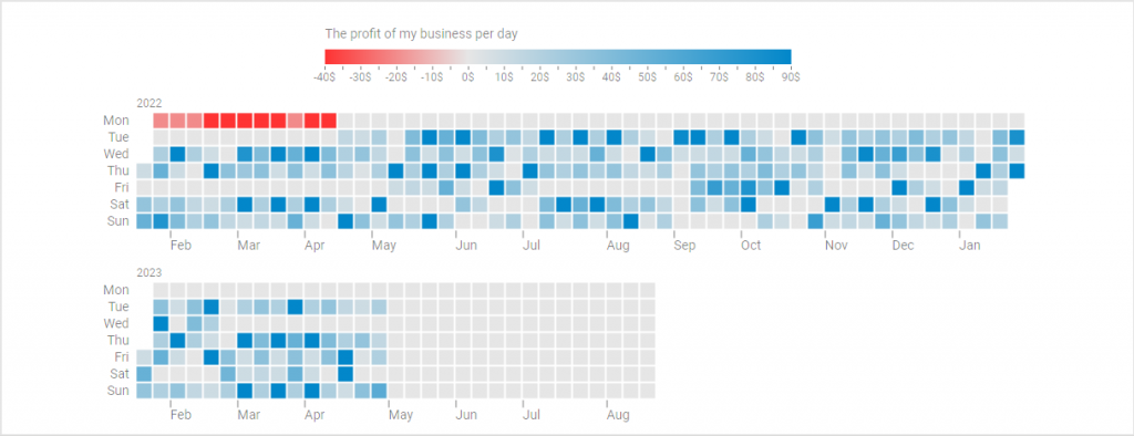
New Calendar Heatmap Chart in DHTMLX Chart (PRO)
Starting from v8.0, our JavaScript chart widget allows visualizing data with a new chart type – a calendar heatmap chart. It serves for displaying how numerical data varies over time using a two-dimensional calendar grid, where values are replaced with color gradients. The chart allows visualizing data over various periods of time, from a week to a year, with each chart cell corresponding to a single weekday. The use of bright-to-dull color spectrums and a legend along the chart makes it much easier to compare data and quickly reveal various patterns or any deviations. This type of chart is particularly useful for data analysis.
If you want to add the calendar heatmap chart to your project, you’ll have to specify the type:”calendarHeatMap” property in the Chart configuration object. Other available properties for this type of chart are series (required) and legend (optional). They have multiple parameters that can be specified in the corresponding configs.
It is also worth noting that our new chart offers a variety of options for displaying uploaded data depending on date ranges. By default, the heatmap chart will display data, starting from the 1st of January of the earliest year to the 31st of December of the latest year presented in the dataset.
But what if you have to deal with a large dataset and need to see just a particular piece of it? It is not a problem since you have an opportunity to set custom date ranges using optional startDate and endDate parameters in the series property.
In the example above, the chart covers the period from “20/01/22” to “20/08/23” inclusively.
type: "calendarHeatMap",
css: "dhx_widget--bordered",
series: [
{
value: "value",
date: "date",
dateFormat: "%d %M %Y",
startDate: "20 Jan 2022",
endDate: "20 Aug 2023",
// other series parameters
}
],
}
But if, for instance, we did not specify the startDate parameter, the chart would display data based on the other parameter and the dataset (i.e., from the 1st of January of the earliest year found in the dataset). In our case, the chart would display the info in the period from “01/01/22” to “20/08/23” inclusively.
More details on this and other peculiarities of the heatmap chart configuration can be found in the documentation.
As a nice bonus, we also created examples of the heatmap chart integration with popular DHTMLX tools for project management – Gantt, Event Calendar, and Scheduler. It will help you to get one more useful source of information for handling projects more efficiently.
Note that the calendar heatmap chart is available only in the PRO edition of DHTMLX Chart and DHTMLX Suite.
Drag-n-drop of Multiple Selected Rows in Grid (PRO)
DHTMLX Grid is one of the most widely used widgets from our Suite library. No wonder we frequently receive many requests for possible improvements in this widget. For this release, we’ve prepared several significant Grid updates. We start with the ability to simultaneously drag and drop any number of selected rows.
It is often the case that end-users need to reorder records in the table and this feature will do the job in no time. To enable this novelty, you should enable the multiselection feature using the multiselection:true configuration property and specify drag-n-drop for rows as follows:
columns: [
// columns config
],
data: data,
selection: "row",
multiselection: true,
dragItem: "both" // or dragItem: "row"
});
As a result, end-users will be able to select any number of rows with the “Ctrl + click” combination and drag them to the right spot on the grid.
Note that this feature is available only in the PRO edition of DHTMLX Grid and DHTMLX Suite.
Specifying Time in DatePicker Editor of Grid/TreeGrid
The new version 8.0 of the Suite library expands the capabilities of the DatePicker editor in Grid and TreeGrid widgets. From now on, you can enable end-users to set the time in addition to the date in both widgets the same way as in DHTMLX Calendar.
Under the hood, it is implemented by passing the Calendar properies (except for mark, disableDates, value, range, and dateFormat) to the editorConfig object when configuring the DatePicker editor in the Grid or TreeGrid widget. As you can see in the example below, the grid column “Start date” comes with the “date” type editor, “%d/%m/%Y %H:%i” format, and the timePicker parameter set to true in the editorConfig property.
columns: [
// other column configuration parameters
{ id: "start_date", header: [{ text: "Start date" }], type: "date", format: "%d/%m/%Y %H:%i", editorConfig: {timePicker: true} },
],
};
One more useful feature added in v8.0 is the ability to clear date values in Grid cells right from the UI.
 Check the sample >
New Exporting Opportunities in Charts
When building a business web app, it can be beneficial to have exporting options for tabular data and various graphs or charts. For instance, end-users may need to work with some project-related information offline during meetings or send it to colleagues via email. That is why the most info-packed Suite widgets, namely DHTMLX Charts, now include the possibility to convert data to PDF and PNG formats.
The exporting functionality in the Chart widget is incorporated just like in DHTMLX Diagram. The API of DHTMLX Charts now has export.pdf() and export.png() methods that are called using the chart.export object the following way:
- chart.export.pdf(config)
- chart.export.png(config)
On the users’ side, exporting to PDF and PNG will be performed via corresponding UI buttons. You can try how it works in practice by using this example.
The export to PDF/PNG will be available via our online export service free of charge. By default, there will be a watermark on the exported charts. Developers with an active support plan will be able to export charts without the watermark during their support plan period. If you don’t want to send data to our online service, we will offer a standalone export module, which you can install as a Docker image. We will ship this module free of charge under the Commercial, Enterprise, and Ultimate licenses of DHTMLX Suite, or you can purchase it in addition to the DHTMLX Charts license.
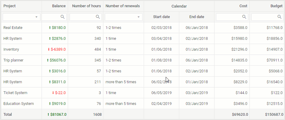
New Freezing Options in Grid and TreeGrid
The ability to freeze columns and rows is one of the most popular features provided in Grid and TreeGrid widgets. In v8.0, we expanded it with new options. Previously, end-users could make columns static on the left side and rows – at the top of the table. Now they can do the same with the right-sided columns and bottom rows. Thus, it will be even more convenient for end-users to analyze tabular data.
Programmatically, frozen right-sided columns and bottom rows are enabled with the rightSplit and bottomSplit properties accordingly:
// configuration parameters for columns
adjust: true,
data: dataset,
topSplit: 2,
bottomSplit: 2,
leftSplit: 1,
rightSplit: 2,
selection: "row",
resizable: true,
});
 Check the sample >
Thus, if necessary, you can freeze any number of records on all sides of the table and leave only the middle part scrollable.
Progress Bar for Layout Widget
When specifying the structural scheme of your app using DHTMLX Layout, you may need to add a progress bar (i.e., a loading spinner) to indicate ongoing processes on the backend. The new Suite 8.0 comes with such a capability that will allow you to inform end-users when the content is loaded or updated.
The progress bar can be shown or hidden via API calls in two ways:
- In the Layout container with progressShow() and progressHide() methods:
layout.progressHide();
- In a separate Layout cell with similar progressShow() and progressHide() methods:
layout.getCell("two").progressHide();
In addition, you can make the progress bar appear in the Layout cell that does not include any attached components or HTML content. In practice, it is enabled with the progressDefault attribute in the configuration object of the required cell.
type: "line",
rows: [
{
id: "one",
header: "Header",
height: "250px",
resizable: true,
progressDefault: true
},
{
id: "two",
height: "250px",
progressDefault: true,
},
]
});
By default, this attribute is disabled, so you should set its value to true to make it work. It is also worth noting that the progress bar enabled this way will disappear once you attach a component or HTML content to the cell.
There is also a new detach() method that allows detaching a component or HTML content from a Layout cell.
This example gives a clear idea of how to apply this feature with DHTMLX Layout.
Other Improvements
Now it is time to highlight other minor updates delivered in DHTMLX Suite v8.0.
Grid and TreeGrid
As a finishing touch to a considerable list of new features for DHTMLX Grid and TreeGrid described above, we should also mention several other updates. The first one is the ability to control the process of data filtering with a new beforeFilter event. In both widgets, now you can see the icon indicating the current sorting state of columns after sorting data using the data.sort() method. And lastly, the getHeaderFilter() method now returns an object with a range of methods: blur(), clear(), focus(), getFilter(), and setValue().
Form
Some methods and events of the RadioGroup and CheckboxGroup controls received a new id parameter. It enables you to hide/show not only the whole controls but also individual radio buttons and checkboxes. The new beforeChange event gives you a way to prevent changing the values of the Form. Most of the Form controls also received this event (find the full list on this documentation page). In addition, we added the id parameter to a number of Form events: afterHide, afterShow, beforeHide, beforeShow.
Toolbar
In the Toolbar widget, we’ve added the editable property that enables end-users to enter the date manually in the input of the DatePicker control. In addition, it has become possible to set focus on the Input control of the Toolbar using the setFocus() method. From now on, you can also make use of multiple new properties added to the DatePicker control. They are valueFormat, disabledDates, mark, mode, thisMonthOnly, timeFormat, timePicker, weekNumbers, and weekStart.
Message
Message boxes built with the Message widget now can be closed thanks to the close() method. The new margin property will help to set a margin between the node and the tooltip. The position property of the tooltip now takes the “left” and “top” values.
ComboBox
In v8.0, the ComboBox widget allows adding extra items to the list of options selected in ComboBox via the new join parameter in the addOption() method. It also received the beforeChange event aimed to prevent value changes in the select box.
TreeCollection
The TreeCollection API was enriched with beforeItemLoad and afterItemLoad events. They will help control the autoloading process of items in Menu, Ribbon, Sidebar, Toolbar, Tree, and TreeGrid widgets.
You can look through all the novelties introduced in the new Suite version by going to the “What’s new” page.
Don’t forget to get acquainted with the peculiarities of migrating to v8.0 in the corresponding section of our documentation.
Those who are eager to try the updated Suite library in action can easily do it by downloading a free 30-day evaluation version. Our current clients can get access to the latest Suite version via their Client’s Area.
Any feedback and comments on this major release are welcome in the comment section.