DHTMLX development team has been working hard on the major release of the Suite JavaScript widget library. As a result, DHTMLX Suite receives plenty of brand new powers in version 7.0.
Meet the highlights of the major update:
- Pagination widget
- code examples of using Suite widgets with Node.js
- CSS templates for styling widgets
- perfect work on touch devices
- Layout, Form, and Tabbar reworked
Download the trial version of DHTMLX Suite 7.0 now >
DHTMLX Pagination [PRO]
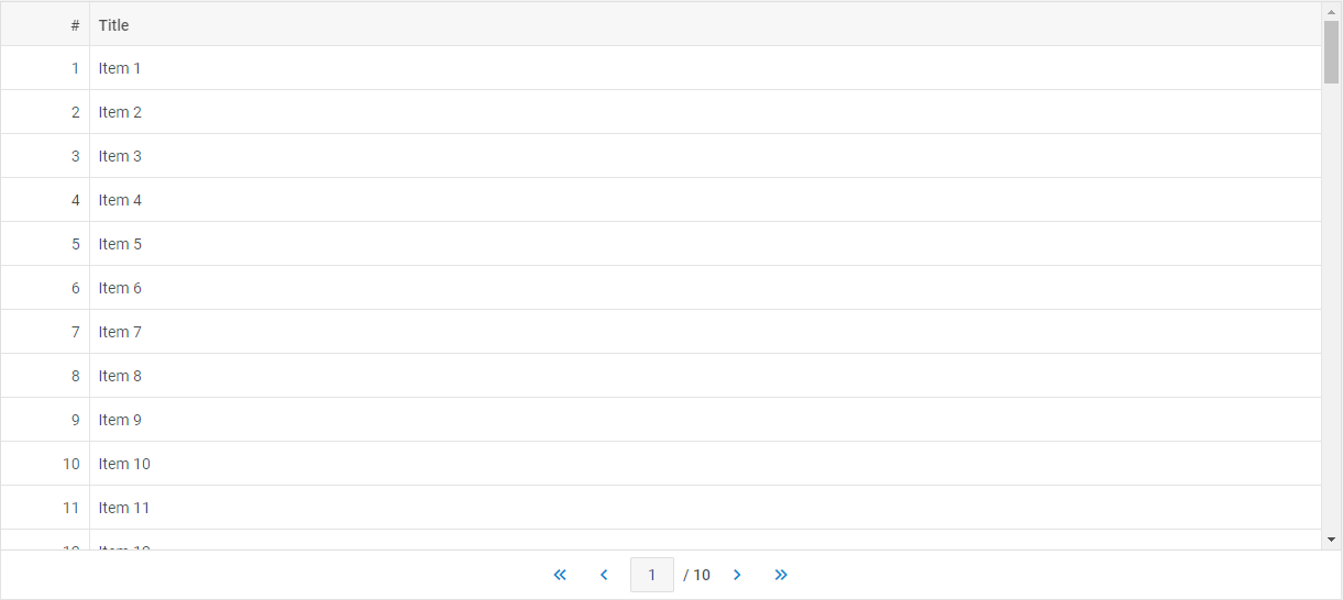
Interacting with data is one of the biggest challenges users face in web apps. When there is a huge amount of data rows in a table spread across numerous pages, it is essential to provide users with a proper navigation control. Starting with v7.0, DHTMLX Suite is supplemented with the JavaScript Pagination widget for navigating content in DHTMLX Grid, TreeGrid, Tree, List, and DataView.
DHTMLX Pagination enables end-users to quickly search for the necessary information with the help of an input field and navigation buttons. It works out-of-the-box but can also be adjusted to the requirements of your web application. A range of API properties allows manipulating the input width, the number of items displayed per page, and defining the initial page. API methods for working with the widget together with event listeners ensure an interactive and user-friendly experience for your end-users. Learn more in the documentation >
Note that DHTMLX Pagination is available in the PRO edition only.
Node.js Demos
At the request of DHTMLX clients, we have prepared code examples of how to implement DHTMLX widgets using Node.js for the backend. The samples show how to get, edit, delete and send data in DHTMLX Grid, Tree, Form, DataView, List, Chart, and SimpleVault widgets. You can access and explore the Node.js demo on GitHub.
CSS Widget Templates
One of our primary goals is to accelerate web development. To achieve it we have laid out the core design principles of a successful application in a step-by-step guide “How to create a user-friendly application in JavaScript”. There we uncover the key points of convenient navigation, data editing, filtering, and styling.
We have also presented a novel way of styling DHTMLX widgets in your web applications using CSS templates. Now you can choose the desired look of the widget, copy the CSS styles from the snippet, and apply them in your app. Here is an example of a dark toolbar:
 Check CSS styles in the code snippet >
Perfect Touch Support
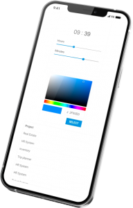
From now on, DHTMLX Suite provides smooth work of all UI widgets on touch devices so that end-users can enjoy a truly native experience using your app on any device. All events triggered by a click and double-click are preserved and will fire as usual. You can test DHTMLX widgets on your mobile device following the link: https://snippet.dhtmlx.com/q3cu6x1a?mode=mobile
Layout Reworked
In v7.0 DHTMLX Layout offers a new approach to arranging widgets on a page compared to the previous versions.
First of all, we added a number of anticipated API properties for managing the size of Layout cells such as width and height for automatically adjusting to the content size, maxHeight, maxWidth, minHeight, and minWidth. The gravity property now serves to specify the weight of a cell in relation to other cells in the same row and within one parent.
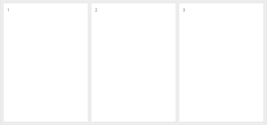
Secondly, we introduced three types of borders between Layout cells: “space”, “wide”, and “line”. These are values of the type configuration property of a Layout cell. Cells with the “space” type have wide space around them. The “wide” type adds a cell border and leaves a wide space only between sibling cells. The “line” type adds only borders to cells.
Children cells inherit the type of borders of their parents if they don’t have their own type specified. Thus, you can quickly apply the necessary Layout configuration and define the desired border types to visually separate cells from each other.
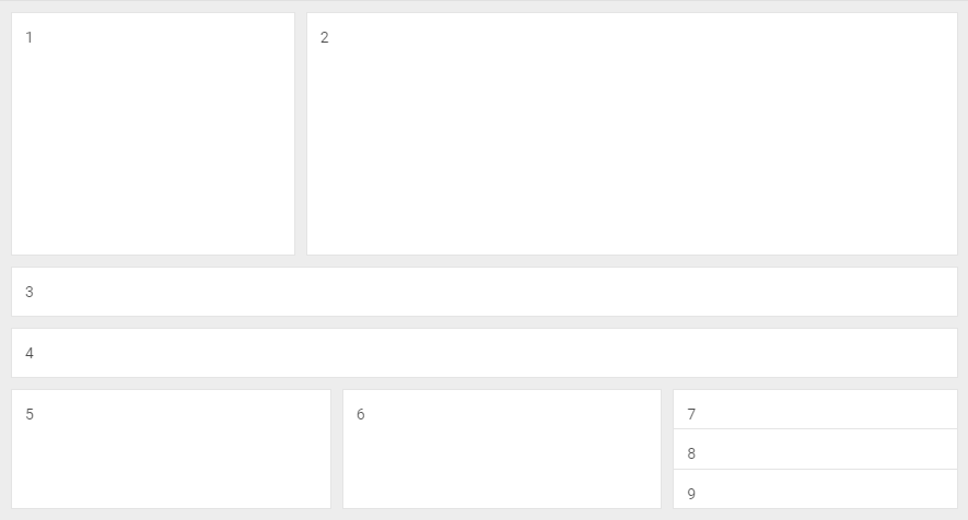 Layout with combined types. Check the sample >
Form Reworked
Our development team reshaped the Event System of DHTMLX Form to enhance interactivity. We created new Form events as well as events for individual controls.
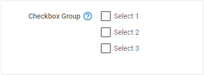
In v7.0 we also introduced a new type of Form controls – CheckboxGroup. It represents a group of checkboxes arranged together in one block. The CheckboxGroup has its own API with methods and attributes for controlling its look and feel.
Besides, there appeared a new Spacer element in DHTMLX Form. It allows separating the controls by occupying space between them. Learn more about Spacer and its API >
Such HTML attributes as minlength, maxlength, min, and max are available for the Input and Textarea controls now.
We added a new property for specifying the initial value in the RadioGroup control. Learn more >
Additionally, v7.0 delivered the ability to set focus on a specified Form control with the help of new API methods: setFocus and focus().
Tab Bar: Size, Alignment, Content Overflow
DHTMLX Tabbar got new API properties for controlling the size of tabs. Starting with v7.0, you can define the size of each tab with the help of the tabWidth and tabHeight properties. Besides, now it is possible to adjust the width and height of tabs automatically to the size of the container via the tabAutoWidth and tabAutoHeight properties.
In v7.0 you can easily align tabs to the left, center, or right with the help of the tabAlign property.
If the container overflows with content in tabs, a user can switch between tabs with the help of nice-looking arrows and smoothly scroll through tabs.
 Check the sample >
Grid and TreeGrid: Hiding and Showing Rows
Another much-awaited feature brought out in v7.0 is the ability to hide and show rows in DHTMLX Grid and TreeGrid. For that purpose, we added new API methods: showRow() and hideRow(). Check the sample >
Drag-n-Drop Events
V7.0 has presented new drag-n-drop events in DHTMLX DataView, Grid, List, Tree, and TreeGrid. Now all end-user actions can be covered with specific events that will let you gain complete control over the functioning of your web application. V7.0 includes event listeners for such user actions as starting and finishing dragging or dropping a row, for example. You can get acquainted with new events for each widget in the documentation.
Other Updates
The list of new functionality and updates in v7.0 is far from being finished. Let’s take a brief look at other novelties and enhancements.
- The sort and filter methods of the DataCollection were improved. The new smartSorting method appeared for sorting data whenever the dataset changes.
- The event collection was updated and enriched for the Form, TimePicker, Tree, and TreeGrid widgets. The DataView, Grid, and List widgets received the ability to add event listeners to custom templates of items.
- The Selection API was updated in the Tree, List, DataView, and Grid widgets.
- It became possible to access and manipulate filters in the header of a Grid, for example, to focus on a filter of your choice, to change or to clear it.
- New API methods for manipulating the selection of items were created in the Menu, Toolbar, and Ribbon widgets.
- The property value for setting an initial value during the initialization of the widget was added to the ComboBox and TimePicker widgets.
Please check out the entire “What’s new” list in the documentation to catch up on all updates.
We are looking forward to hearing your feedback. Leave your comments in the discussion below!
Current clients can access the latest version of DHTMLX Suite in their Client’s Area.
If you would like to test the update first, here is a free 30-day trial version.
