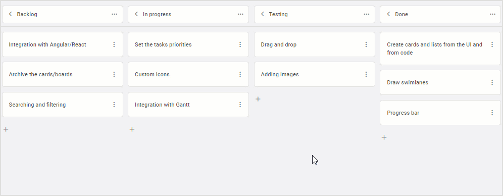
Today we are excited to announce the release of DHTMLX Kanban v1.4. Despite its minor status, this update of our JavaScript Kanban library delivers a range of significant new features and improvements that will benefit both web developers and end-users.
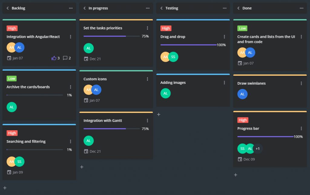
The new version makes it much easier for you to change the overall look of your task board with new Willow and Willow-Dark themes as well as any separate elements with new css parameters. Our Kanban also helps teams collaborate using new capabilities to leave comments for tasks and vote for them. Now you can specify dependencies between cards, set the default context menu for custom cards, set a custom format for date inputs in the editor, and limit the number of assignees for one task. Moreover, there are two new demos on popular use-case scenarios.
Let us delve deeper into the details of this release.
New Built-in Kanban Themes
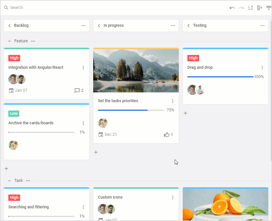
When you integrate a JavaScript Kanban board into a web app, a nice modern design is as important as features and efficiency. We have added two new built-in themes – Willow and Willow-Dark. These new options will complement the default Material theme and help you with styling.
 Willow Dark theme. Check the snippet >
There are 3 ways to apply a theme in our Kanban.
1) Use the theme property containing the following parameters:
- name – defines the name of the theme that you want to use
- fonts – specifies whether fonts from the CDN should be loaded or not (loaded by default)
name: "material"| "willow" | "willow-dark",
fonts: true|false
}
The theme property was also added to the Toolbar configuration:
api: board.api,
theme: "material", | "willow" | "willow-dark"
});
To apply the required theme to the Kanban container and Toolbar dynamically, use the setConfig() method.
2) Apply the needed theme by adding the corresponding css classes to the Kanban containers:
<div id="toolbar" class="wx-willow-theme"></div>
<!-- Kanban container -->
<div id="root" class="wx-willow-theme"></div>
3) Include the theme on the page from the skins folder:
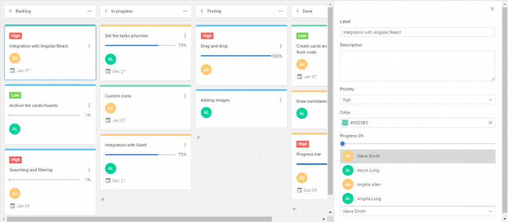
Comments in Kanban Cards
Teams of various sizes use Kanban apps for visually arranging and tracking their workflow. Therefore, it will be nice for web developers to be able to offer them some means of communication within the Kanban board. And DHTMLX Kanban 1.4 comes with the ability to add, update, and delete comments in cards.
 Check the sample >
Comments aren’t displayed by default. To show the number of comments on each card, use the comments parameter of the cardShape property:
... // other card settings
users: {
show: true,
values:[
{ id: 1, label: "Steve Smith", avatar: "../assets/user.jpg" },
{ id: 2, label: "Aaron Long" }
comments: true,
}
Comments can be added, edited and removed via the Kanban editor. For this, the editor supports a a new field type – type: “comments”, so you can add it in the editorShape object:
columns,
cards,
cardShape,
editorShape: [
...defaultEditorShape,
{
type: "comments",
key: "comments",
label: "Comments",
config: {
placement: "editor",
},
},
],
currentUser: 1,
});
You should specify the ID of the current user in the currentUser property. The value of this property must correspond to one of the IDs set in the cardShape.users property. Otherwise, comments will be available only for reading.
The ID specified in the currentUser property is also necessary for the correct operation of addComment(), updateComment(), and deleteComment() methods, which are responsible for basic actions related to comments. These methods come with add-comment, update-comment, delete-comment events that are called when the corresponding action takes place.
Votes for Tasks
There is one more great feature included in v1.4 to ensure better interaction between Kanban users on ongoing activities. We are talking about the ability to add votes for tasks. It is a simple yet reliable way to prioritize tasks or vote on some issues taking into account the opinions of all team members.
In a Kanban board built with DHTMLX, voting for a card is simple: just click on a thumbs-up icon in the editor. A repeated click on the icon will cancel the vote.
 Check the sample >
To add voting to Kanban, you need to set the value of the votes parameter to true in the cardShape object:
... // other card settings
votes: true,
};
We also created a new demo demonstrating how to extend the backend to support the voting functionality.
Dependencies between Tasks
When you manage day-to-day business activities with a Kanban app, the completion of one task might affect other tasks. In other words, Kanban tasks may be linked with each other via parent-child, predecessor-successor relations or they can simply belong to one part of the project. For instance, it happens when a complex task is broken down into more manageable pieces.
The new version of our Kanban component gives you a way to specify such relations (or dependencies) between tasks with so-called links. It is done via the editor, where end-users can specify either a dominant or subordinate role for a given task and link it to other tasks with a particular type of dependency.
The editor now supports a field for links, thus you can add it to the editorShape property:
editorShape: [
{
type: "links",
key: "links",
label: "Links",
},
// settings of other fields
]
});
Links data are stored in the links property of Kanban API. It’s an array of objects, each with a set of required parameters:
- id – the ID of the link
- masterId – the ID of the card assigned to the dominant role in the link
- slaveId – the ID of the card assigned to the subordinate role in the link
- relation – the type of link that helps to define various dependencies between tasks such as:
- “relatesTo” – marks tasks as related without specifying any dependency between them
- “requiredFor” – makes one task dependable on the completion of the other one
- “duplicate” – links duplicated tasks
- “parent” – creates a parent (master) – child (slave) hierarchy
The links property is used in code like that:
{
id: string | number,
masterId: string | number,
slaveId: string | number,
relation: "relatesTo" | "requiredFor" | "duplicate" | "parent",
},
{...}
];
You can also load new data for links dynamically using the parse() method.
This feature is also complemented with two new events – add-link and delete-link. They are called when links in cards are added and deleted respectively.
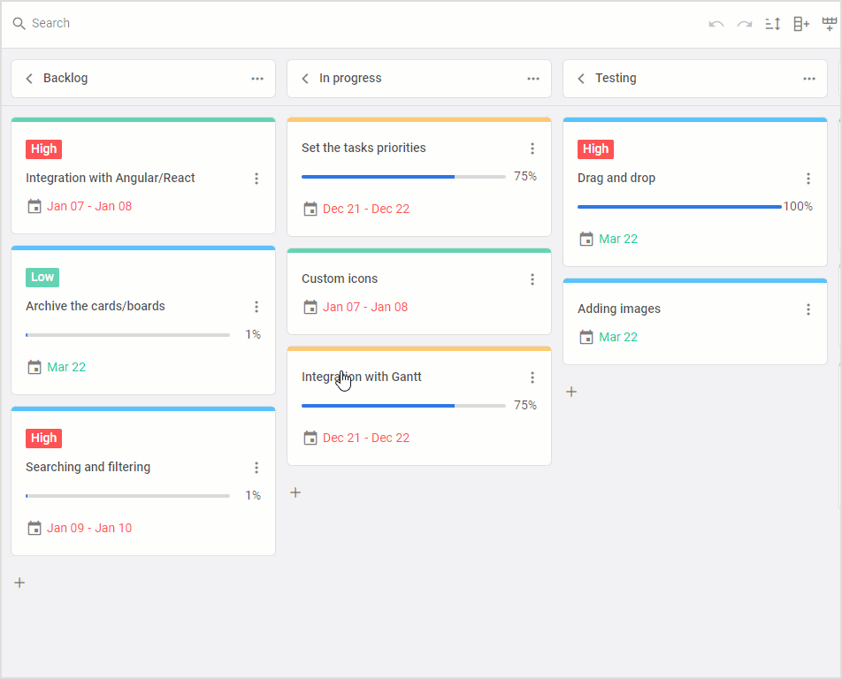
Expanded Styling Capabilities
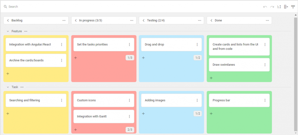
As a nice addition to new themes, we also decided to enrich v1.4 with new capabilities requested by our clients and allow you to introduce more targeted styling changes to your JavaScript Kanban. We added a CSS parameter to Kanban properties responsible for configuring different elements of the board.
You can add CSS classes to specific cards, rows, and columns or define common CSS classes for all or several cards, rows, and columns at a time via their shapes.
For instance, that’s how Kanban columns may look like after manipulations with the css parameter in the columns config:
 Check the sample >
Moreover, the columns property also received the overlay parameter that defines an overlay layer for a specific column, where you can set a custom template for this column. For instance, you can prohibit moving cards to a particular column and add text content on top of the column with the clarification:
overlay: template(`
<div class="blockOverlay disable-drop">
<span class="disable-drop-header">Drop is not allowed</span>
<span class="disable-drop-description">Only testers can move cards to this column</span>
</div>`),
},
But you can go even further. For instance, you can modify the styling of cards depending on their relevance and highlight relevant and outdated tasks in different colors. Now it can be done with the css parameter in the cardShape object:
// card settings
css: (card) => card.type == "feature" ? "green" : "red",
headerFields: [
{ // custom field
key: "sprint",
css: "custom_style",
label: "Sprint"
}
]
};
Here css is a function that applies a css class for changing the card style depending on the date. Cards with dates preceding the current date are colored differently on the fly.
 Check the sample >
The css parameter with the same functionality is now also available in columnShape and rowShape properties.
As a result, you can change the appearance of the main Kanban elements to your liking during the initialization or depending on some logic.
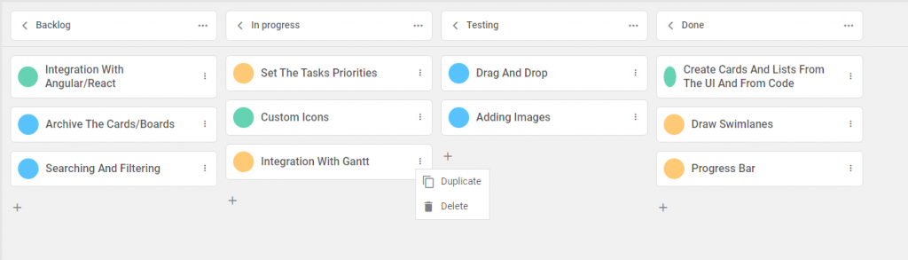
Context Menu in Custom Cards
Since its inception, DHTMLX Kanban provided you with an opportunity to customize the appearance and behavior of cards by creating a custom template with the cardTemplate property. However, this approach presupposes that the default card is fully replaced with the custom one. It became an obstacle for those who wanted to use their custom templates in combination with a handy default context menu.
We solved this issue in v1.4. Now you can add a context menu in your custom template. You just need to specify a custom icon in the template markup and add the data-menu-id=${cardFields.id} expression as shown in the example below.
if (selected) {
return `
<div className="custom-card" style={{padding: '20px'}}>
<div className="status-color" style={{background: '${cardFields.color}'}}></div>
<div data-menu-id=${cardFields.id} >
<i className="wxi-dots-v"></i>
</div>
Selected:${cardFields.label}
</div>
`;
}
}
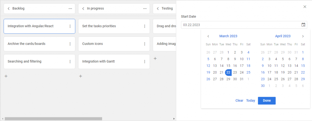
Custom Date Format in Kanban Editor
Using the new version of our Kanban library, you are not limited to showing dates in the Kanban editor using just the default format. Starting from v1.4, you are free to define your own date format by setting the newly added format parameter for date and dateRange types in the editorShape config.
columns,
cards,
editorShape: [
{
type: "dateRange"|"date",
key: "start_date",
label: "Start Date",
format:"%m.%d.%Y"
}
],
});
Controlling Number of Assignees for Tasks
Resource management plays a crucial role in the success of any project. Therefore, it is great to have a reliable mechanism for keeping track of resource allocation. And DHTMLX Kanban 1.4 comes with the ability to limit the number of participants for a given activity. You can define whether one or several users can be assigned to a card.
In the example below, for instance, it is shown that you can select just one assignee via the drop-down list.
 Check the sample >
So, there are two possible options specified with the type parameter in the editorShape property:
- “select” or “combo” type to allow adding just one user to a card
- “multiselect” type to allow adding several users to a card
...kanban.defaultEditorShape, // include the default settings
{ // add custom fields
type: "select"|"multiselect",
key: "users"|"users",
label: "User"|"Users",
values: users|users
},
];
And do not forget that the users field must be enabled in the cardShape object for this to work (disabled by default). To do that, set the show parameter to true and add users data via the values parameter.
users: {
show: true,
values: [
{ id: 1, label: "John Smith", avatar: "../assets/user.jpg" },
{ id: 2, label: "Aaron Short" }
]
}
}
Other Improvements
This release also includes some minor, but still noteworthy improvements:
1. Starting from v1.4, you get new events for handling the drag-and-drop process of cards. Now you can keep track of all 3 drag-and-drop stages using the corresponding start-drag-card, drag-card, and end-drag-card events.
2. The api.getState() method was updated. We deprecated the following parameters: dropAreaItemsCoords, dropAreasCoords, overAreaMeta.
3. Moreover, our development team prepared two live samples to give you a clear idea of how to manage several projects and load data dynamically when a column is expanding in Kanban.
Take time to visit this documentation page and review all the new features and improvements provided in this update.
All you need to know about the migration to v1.4 is provided in the “Migration to newer versions” section.
To get acquainted with the DHTMLX Kanban v1.4 on the practical level, download a free 30-day trial version. For our current clients, v1.4 is available in their Client’s Area.