Here is a second video from a series of tutorials devoted to the configuration of the grid in dhtmlxGantt. In this video, we’ll discuss how all kinds of buttons, icons, and dropdown menus can be added into the grid cells and headers of a JavaScript Gantt chart:
Let’s say we need to create a column with custom buttons for performing user actions:
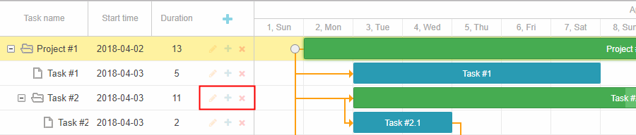
We can add buttons using the following template and “Font Awesome” icons, for instance:
{name: "text", tree: true, width: '*', resize: true},
{name: "start_date", align: "center", resize: true},
{name: "duration", align: "center"},
{name: "buttons",label: colHeader,width: 75,template: function (task) {
return (
'<i class="fa fa-pencil" data-action="edit"></i>' +
'<i class="fa fa-plus" data-action="add"></i>' +
'<i class="fa fa-times" data-action="delete"></i>'
);
}}
];
Since buttons will be repainted together with the rest of the row, we can’t just use something like ‘addEventListener’ or jquery click handler to add an event listener to each button. Instead, we can either add a handler using an inline onclick attribute or use an approach called event delegation – add a single event listener to a parent element that won’t be affected by the repaints and capture a click there. Luckily, Gantt provides a public click event that will fire each time a user clicks an element related to the task.
We can capture user clicks there:
var button = e.target.closest("[data-action]")
if(button){
var action = button.getAttribute("data-action");
switch (action) {
case "edit":
gantt.showLightbox(id);
break;
case "add":
gantt.createTask(null, id);
break;
case "delete":
gantt.confirm({
title: gantt.locale.labels.confirm_deleting_title,
text: gantt.locale.labels.confirm_deleting,
callback: function (res) {
if (res)
gantt.deleteTask(id);
}
});
break;
}
return false;
}
return true;
});
In the handler, we check whether a clicked element is one of our buttons, and if so – figure out what action should be done and then do it.
As for the column header, we can put its HTML into the label property of the column and add the inline onclick handler there:
gantt.config.columns = [
{name: "text", tree: true, width: '*', resize: true},
{name: "start_date", align: "center", resize: true},
{name: "duration", align: "center"},
{name: "buttons",label: colHeader,width: 75,template: function (task) {
return (
'<i class="fa fa-pencil" data-action="edit"></i>' +
'<i class="fa fa-plus" data-action="add"></i>' +
'<i class="fa fa-times" data-action="delete"></i>'
);
}}
];
The same approach can be used for more complex controls like adding a dropdown menu into the grid header:
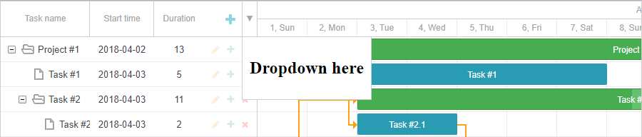
As you might have guessed, we will also add the required HTML into the column label. In that case, we will have an inline onclick argument, which would open a dropdown menu. Note that the handler has to be available from the global scope, so we define it in the gantt object:
var position = node.getBoundingClientRect();
var dropDown = getDropdownNode();
dropDown.style.top = position.bottom + "px";
dropDown.style.left = position.left + "px";
dropDown.style.display = "block";
dropDown.keep = true;
setTimeout(function(){
dropDown.keep = false;
})
}
gantt.$hideDropdown = function(){
var dropDown = getDropdownNode();
dropDown.style.display = "none";
}
window.addEventListener("click", function(event){
if(!event.target.closest("#gantt_dropdown") && !getDropdownNode().keep){
gantt.$hideDropdown();
}
})
var colHeader = '<div class="gantt_grid_head_cell gantt_grid_head_add" onclick="gantt.createTask()"></div><div class="gantt-dropdown" onclick="gantt.$showDropdown(this)">▼</div>';
gantt.config.columns = [
{name: "text", tree: true, width: '*', resize: true},
{name: "start_date", align: "center", resize: true},
{name: "duration", align: "center"},
{name: "buttons",label: colHeader,width: 75,template: function (task) {
return (
'<i class="fa fa-pencil" data-action="edit"></i>' +
'<i class="fa fa-plus" data-action="add"></i>' +
'<i class="fa fa-times" data-action="delete"></i>'
);
}}
That’s how you can easily add custom elements such as a button or an input into grid columns with the help of HTML.
In order to try it all out yourself, try a free trial version of our JavaScript Gantt or the Gantt Community Edition under the MIT license and follow the steps from our video tutorial!
We’ll be looking forward to your feedback and any ideas on what else you’d like to see in our videos. Meanwhile, check our YouTube channel and subscribe to stay tuned!
Check the first video in the series of tutorials about Grid configuration in Gantt: