Features of DHTMLX Scheduler Library
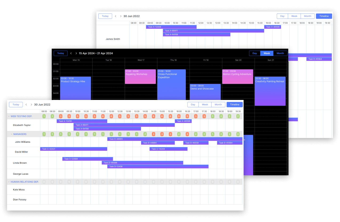
Timeline view
For your appointment/booking calendar you'll definitely need Timeline view that provides a horizontal layout and represents multiple schedules in a more convenient way. This mode also included tree timeline and daily timeline.
The smart rendering functionality optimizes the performance of the Timeline view as it allows loading only the rows, columns and events displayed on the screen. Other elements are being rendered while users are scrolling through the timeline.
Horizontal scroll inside the timeline
Having enabled a horizontal scroll in the Timeline view, users can switch between days, weeks, or months without clicking the navigation buttons. You can also turn an autoscroll option on to allow changing the event’s duration or drag-n-drop it along the Timeline while it’s being scrolled automatically.
Local export module to PDF/PNG
By default, you can export DHTMLX Scheduler to PDF/PNG as well as Excel and iCal via our online export service. However, if you have any security restrictions and need to abstain from using third-party services, the solution is deploying a local export module on your own server. This module is shipped free of charge under the Commercial, Enterprise, and Ultimate licenses. In case you have the Individual license, you can purchase it separately.
Basic views
With DHTMLX Scheduler you are able to display events in basic views, including Day, Week, Month, Year, and Agenda. Users can navigate through different views using tabs on the top of the calendar.
A new event can be quickly created with a double-click. The simple drag-and-drop interface allows changing events time and duration. However, you can display the events in read-only mode, so the end-users won't be able to edit the calendar.
The flexible API of js scheduler gives you full control over the look and feel so you can change the default color to any other.
Dark theme
DHTMLX Scheduler comes with a Dark theme, which gives a modern look to the Scheduler UI and expands the possibilities to explore more design options as well as helps reduce eye fatigue and extends battery life on mobile devices.
All Scheduler themes are defined in a single CSS file, making the theme management simple and seamless. You have the option to switch between themes at runtime, thus they are applied dynamically based on application settings.
Intuitive drag-and-drop behavior
Our Scheduler library enables you to create new events by dragging elements from third-party DHTMLX components or between schedulers (for Enterprise and Ultimate licences only). Once a user drags an external element to the calendar, the scheduler opens the lightbox for adding a new event.
Easy navigation with mini calendar
To simplify the navigation through the events, you can add a js date picker. A mini month view calendar can be placed into the header, thereby allowing the end-user to quickly choose a date and see the assigned events. Moreover, you can attach it to the lightbox for selecting start and end dates, as well as add the mini calendar to any place on the page.
Dynamic loading
By default, our JavaScript schedule loads all data at once so that may reduce overall performance when using huge event collections. In such cases you can use the dynamic loading mode and upload data by parts as the end-user browses the current viewable area of the scheduler.
Theme customization
DHTMLX Scheduler includes a set of built-in themes, such as Terrace, Dark, Material, Flat, Contrast Black, and Contrast White. You have the option to easily customize any of the themes via CSS variables. Thus, you can renew colors, fonts, and other stylistic elements across the entire app with minimal code changes.
Explore DHTMLX Scheduler PRO Edition for Free
The PRO edition includes all the functionality of the Standard version and also provides extra features. By downloading Scheduler PRO trial, you get:
30 days of free evaluation
Official technical support
Extended functionality with PRO features
Complete technical guides and samples