We are excited to kick off the year 2021 with the release of DHTMLX Suite v7.1. The update rolls out wanted features in DHTMLX Grid and TreeGrid: formatting numeric values in columns and displaying and editing multiple lines of text in cells. Besides, we have introduced templates for tooltips and a range of other novelties.
Download a free trial version 7.1 to explore new functionality >
Number Formats
The keynote of the release is the ability to specify and show values in the cells of DHTMLX Grid and TreeGrid columns in the required number format. From now on, you can define how many digits to display after the decimal point and how to set thousands and decimal separators. You can set up values as percentages and easily combine the necessary numeric format with currency and any other symbols.
The example below demonstrates the configuration of six Grid columns with different format settings:
- population numbers with thousands separators in the second column
- percentage values rounded to two decimal places in the third column
- amounts of US currency with thousands separators in the fourth column
- fertility rates with an apostrophe as a decimal separator rounded to two decimal places in the fifth column
- dates according to the US date format in the sixth column
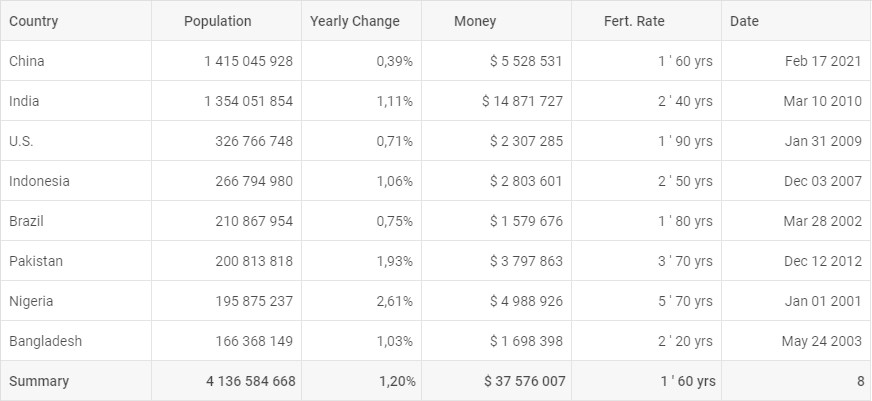
To apply the desired number formatting as in the example above, we have specified the format configuration option of each column. Percentage values are set up via the type: “percent” configuration option. Values followed by the dollar sign and yrs abbreviation in the fourth and fifth columns respectively are specified with the help of simple templates:
{ width: 150, id: "country", header: [{ text: "Country" }], footer: [{ text: "Summary" }] },
{ width: 150, id: "population", header: [{ text: "Population" }], footer: [{ content: "sum" }], type: "number", format: "# #" },
{ width: 120, id: "yearlyChange", header: [{ text: "Yearly Change" }], footer: [{ content: "avg" }], type: "percent", format: "#,00" },
{ width: 150, id: "netChange", header: [{ text: "Money" }], footer: [{ content: "sum" }], type: "number", format: "# #", template: i => `$ ${i}` },
{ width: 150, id: "fert", header: [{ text: "Fert. Rate" }], footer: [{ content: "min" }], type: "number", format: "# ' 00", template: i => `${i} yrs` },
{ width: 150, id: "date", header: [{ text: "Date" }], footer: [{ content: "count" }], type: "date", format: "%M %d %Y" }
],
The same configuration options enable number formatting in DHTMLX TreeGrid, as you can see in this code snippet. You can learn more about specifying formats in Grid and TreeGrid in the documentation.
Multiline Text in Columns
Another contribution to convenient user experience in v7.1 is the ability to display multiple lines of editable text in cells of Grid and TreeGrid columns. It is achieved with the help of the autoHeight:true configuration option of Grid and TreeGrid. It splits cell content into multiple lines fitting it to the column’s width and adjusting the column’s height automatically.
In order to make multiline content editable, you just need to specify the textarea type of editor in the configuration of the column and set the editable:true option in combination with the autoHeight:true option in the configuration of Grid or TreeGrid:
columns: [
{
// column’s config
editorType: “textarea”
}
// more columns
],
data: dataset,
autoHeight: true,
editable: true,
});
You can check an example of multiline content in DHTMLX TreeGrid in this code snippet.
Please note that the ability to edit multiple lines of text in columns is available in the PRO edition of DHTMLX widgets only.
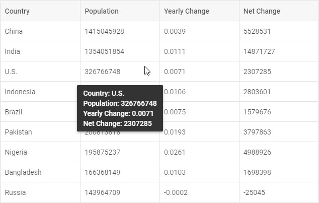
Templates for Tooltips
V7.1 expands customization opportunities of DHTMLX widgets. From now on, you can create custom tooltips for Grid and TreeGrid cells with any kind of HTML content inside. For example, tooltips can show several rows of content providing additional information on the data in tables including images:
If you have lots of rows and columns in your data table, you can include values from all cells of the row in the tooltip:
Check the Grid code snippet >
Check the TreeGrid code snippet >
Creating custom tooltips is possible via the tooltipTemplate function in DHTMLX Grid and TreeGrid.
Other Updates
Height of Separate Rows
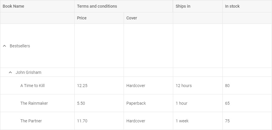
While you can define the height of all rows at once in one line of code in the configuration of DHTMLX Grid or TreeGrid, you might need to specify a different height value to one or several rows. V7.1 introduces the new height property, which you can set for particular rows right in the data set, as shown in the example below:
{
"name": "Bestsellers",
"id": "b.1",
height: 150,
},
...
{
"name": "A Time to Kill",
"price": "12.25",
"cover": "Hardcover",
"ships": "12 hours",
"inStock": "80",
"parent": "c.1",
height: 60,
},
...
];
The new height property takes precedence over the autoHeight:true configuration option. Learn more in the documentation of DHTMLX Grid and TreeGrid.
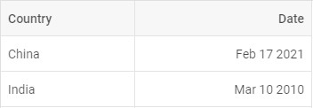
Date() Object Support
From now on, it’s easier to configure columns with dates in DHTMLX Grid and TreeGrid, as they support the Date() object:
{
"country": "China",
"date": new Date()
},
{
"country": "India",
"date": new Date(2010, 02, 10)
},
];
Managing the Full Screen Mode of DHTMLX Window
We have added two new methods to the API of DHTMLX Window for controlling the full screen mode. The isFullScreen() method checks if the window is full screen or not. The unsetFullScreen() method exits full screen. Check the code snippet >
Chart Tooltips with Multiple Series
V7.1 brings out improvements for the tooltips in DHTMLX Charts. Now users can see all series related to a certain point on the x-axis and thus work with data faster.
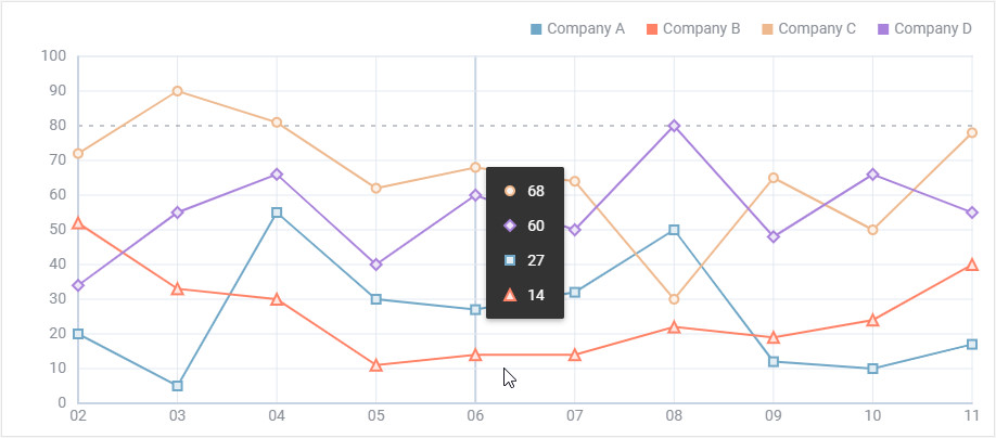
Check the code snippet >
New Events in DHTMLX Grid, Tree, and TreeGrid
To ensure interactivity we have added more events to DHTMLX Grid, Tree, and TreeGrid. The beforeRowResize and afterRowResize help to listen to changes of the row height (available in the PRO edition only). The beforeSort and afterSort fire when users sort data in columns. In DHTMLX Tree the new beforeCheck and afterCheck events allow the widget to react to the changes of the state of a checkbox item.
Root Parent in DHTMLX TreeGrid
The new rootParent configuration option allows defining the id of the TreeGrid root parent. Learn more in the documentation >
In addition to the new features and updates described above, v7.1 delivers a range of fixes. You can get acquainted with the entire list in the “What’s new” section of our docs.
Enjoy the newly introduced version 7.1 – download a free 30-day evaluation version of DHTMLX Suite.
We are looking forward to your feedback. Our technical support team is always willing to help if any questions arise.
We invite our current clients to grab the new version in their Client’s Area.
Stay tuned!