Christmas time is coming and the DHTMLX team wants to contribute to the holiday spirit with a new product update. We are excited to announce the release of DHTMLX Event Calendar 2.3, bringing new features and improvements to enhance your scheduling experience. This update focuses on providing our JavaScript event calendar with greater flexibility in customizing calendar views, improving the display of events, and enhancing user interaction with the UI.
Flexible Ranges for Custom Views
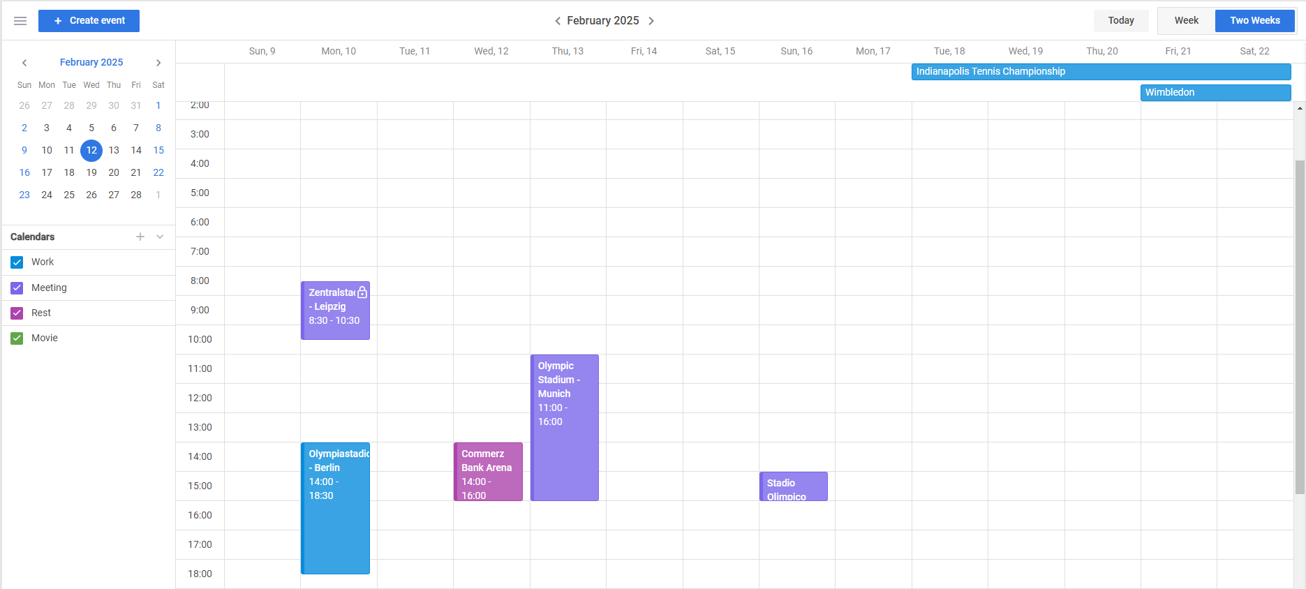
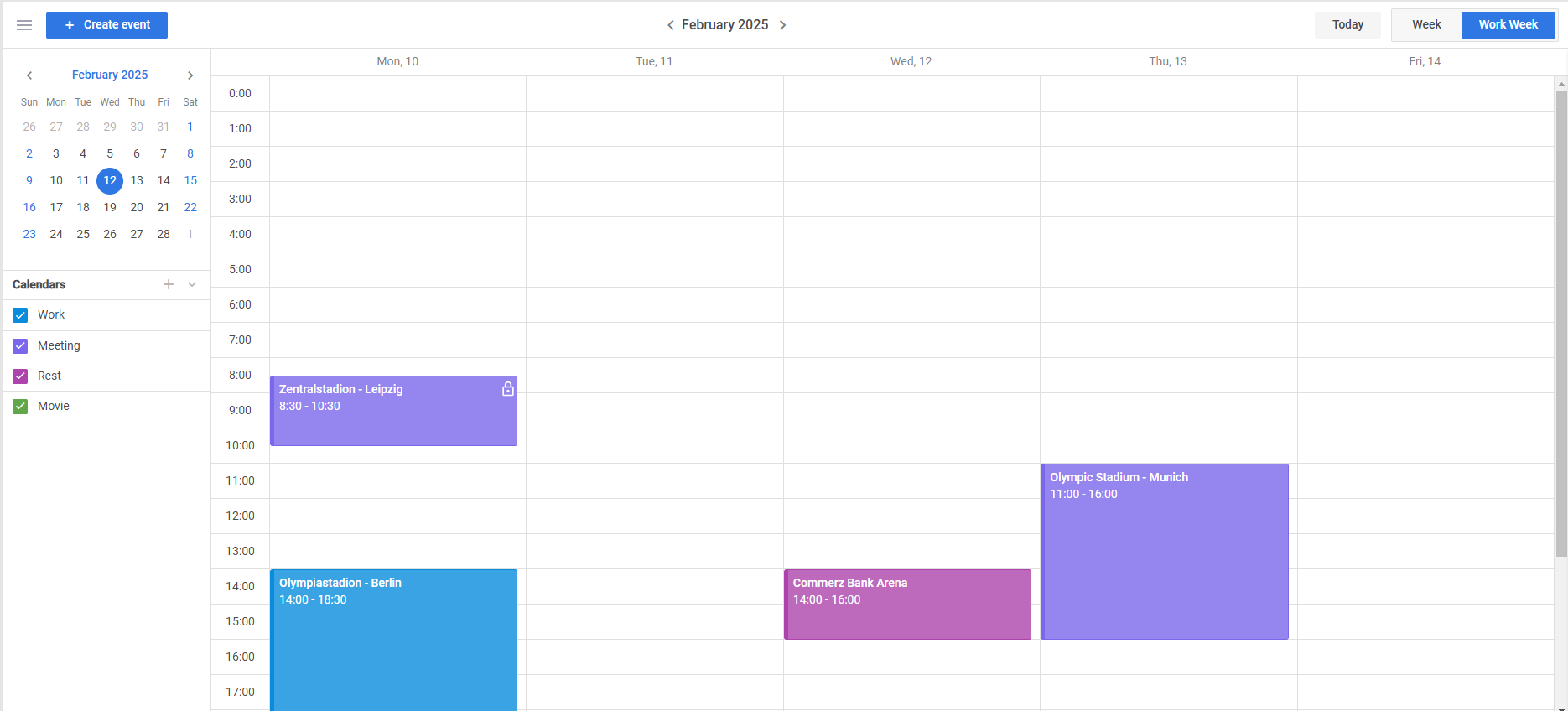
One of the standout features of Event Calendar 2.3 is the ability to redefine the range boundaries of all calendar views i.e. create custom views based on existing ones. For instance, you can create a 5-Day Workweek View, 2-Week View, or specify any other custom range that fits your application needs.
To customize the date range displayed in the calendar, you should redefine the getBounds(), getNext(), and getPrev() methods in the view’s configuration. This flexibility is available for all views, including Week, Month, and Agenda views.
Here are a few examples of such customizations:
- 2-Week View
Specifying a 14-day view starting from the current week:
{
id:"two-weeks",
label:"Two Weeks",
layout: "week",
config: {
getBounds: (date) => {
const weekStart = dateFns.startOfWeek(date);
return [
weekStart,
dateFns.addDays(weekStart, 13),
];
},
getNext: (date) => {
console.log(date)
return dateFns.addDays(date, 14);
},
getPrev: (date) => {
return dateFns.addDays(date, -14);
}
// Additional configurations...
}
}
]
- 5-Day Workweek View
Displaying only the workweek from Monday to Friday:
{
id:"workweek",
label:"Work Week",
layout: "week",
config: {
getBounds: (date) => {
const weekStart = dateFns.startOfWeek(date,
{ weekStartsOn: 1 });
return [
weekStart,
dateFns.addDays(weekStart, 4),
];
}
}
}
]
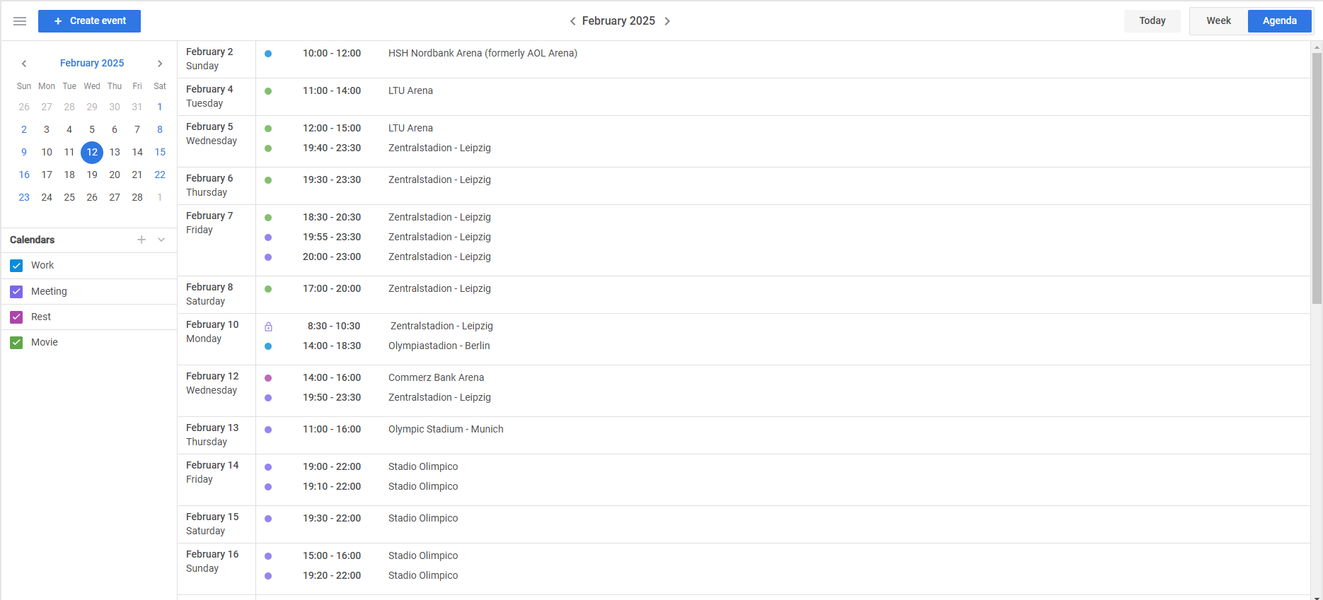
- Custom Agenda View
Setting a custom date range in the Agenda view, such as displaying events for the next 30 days:
{
id:"agenda",
label:"Agenda",
layout: "agenda",
config: {
dateTitle: (date) => {
return dateFns.format(date, "MMMM yyyy")
},
getBounds: (date) => {
const start = dateFns.startOfMonth(date);
return [
start,
dateFns.addMonths(start, 1),
];
},
getNext: (date) => {
return dateFns.addMonths(date, 1);
},
getPrev: (date) => {
return dateFns.addMonths(date, -1);
}
}
}
]
With these configuration options, you get the flexibility to display events in calendar views with any range boundaries.
Improved Display of Overnight Events
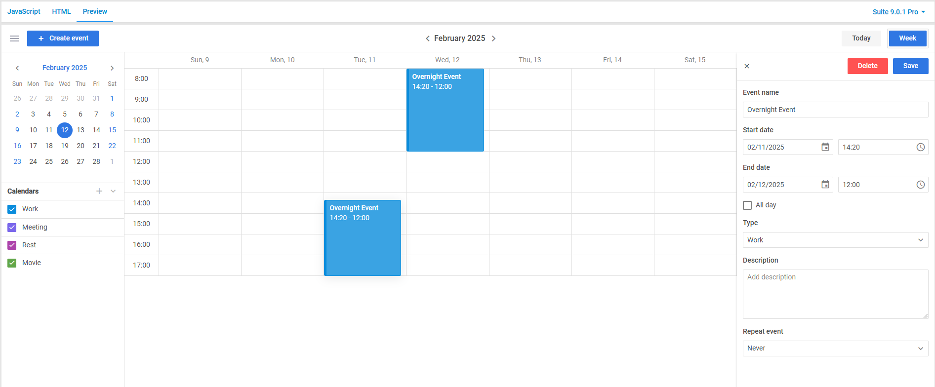
This release provides a significant improvement in managing events that take multiple days. Previously, any event lasting more than one day was displayed in the multi-day section at the top of the calendar, which could be a bit confusing for scenarios when events have timeframes that slightly span the next day.
Starting from version 2.3, events that last less than 24 hours but cross midnight (overnight events) are displayed in the main time columns as regular events. This change provides a more accurate representation of the event duration and allows end-users to see the exact timing within the day’s schedule.
For example, an event starting at 10:00 PM and ending at 2:00 AM the next day will now appear in the time slots of both days, providing more precise info on the scheduling of such events.
 Check the sample >
Refinements in Calendar Editor’s Popup
Editing is a significant part of working with event calendars because of the dynamic nature of events. Therefore, we redesigned the popup editor of our Calendar to optimize the editing process.
In v2.3, you will find the following improvements:
- Streamlined Editing: Editing a calendar now takes fewer steps, reducing effort and saving time.
- Unified Design: The popup’s updated appearance aligns seamlessly with the overall theme of the Event Calendar.
- Enhanced UI Usability: An improved layout and more intuitive controls simplify calendar settings management.
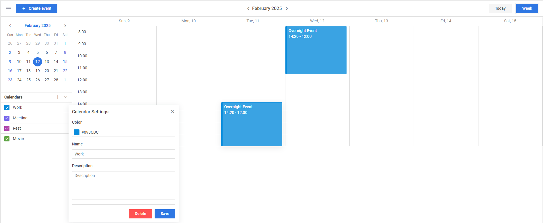 Check the sample >
These updates make events management in the calendar more intuitive, empowering end-users to handle their schedules in a faster and simpler way.
Read-Only Indicators for Calendars and Events
The updated Event Calendar component also includes the enhanced read-only mode. In v 2.3, you get an optional setting that allows adding a lock icon over read-only calendars and events. This feature provides clear visual cues to end-users about certain items with enabled read-only mode, indicating that their editing is restricted.
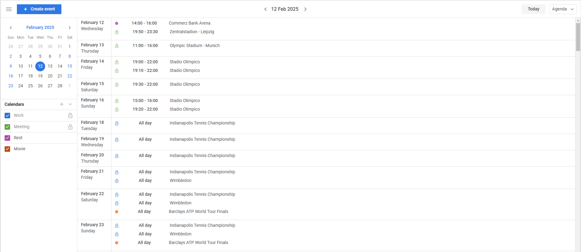 Check the sample >
Exporting date-fns Helpers for Date Operations
Starting from v2.3, it becomes easier to manipulate and format dates in your calendar. Now DHTMLX Calendar exports the date-fns helpers (previously used internally). Thus, you can access date functions used in the event calendar without separately including the date-fns library in your project.
You can import the date-fns helpers directly from the Event Calendar module:
const { format } = dateFns;
With this option, you can perform various operations with dates such as formatting, parsing, and calculations.
For instance, it allows defining a custom event template for the Week view as follows:
const start_date = dateFns.format(event.start_date, 'HH:mm');
const end_date = dateFns.format(event.end_date, 'HH:mm');
return `
<div class="week_event_wrapper">
<div>${event.text}</div>
<div>
${start_date} - ${end_date}
</div>
</div>
`;
}
Overall, it will help to avoid potential difficulties with date manipulations and focus on more complex aspects of the development process.
For more details on all the new features, visit the What’s New page.
To test all the novelties delivered in DHTMLX Event Calendar 2.3, download a free 30-day trial version. Existing customers can access the latest version through their Client’s Area.
We look forward to your feedback on this release. Please share your thoughts and experiences in the comments below.
