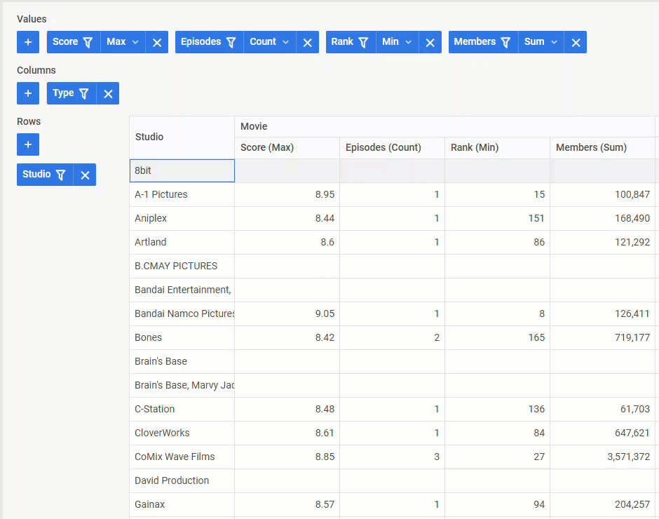
We hope you had enough time to explore the fully overhauled DHTMLX JavaScript Pivot table 2.0 and apply it efficiently for data analysis in your projects. Now, it is time to move forward and present a new version of this JavaScript component. The DHTMLX Pivot 2.1 expands developers’ capabilities in modifying the table’s appearance via newly added CSS styling options, HTML templates, and custom formatting for numbers and dates. Apart from that, the release includes the ability to freeze columns on the right, expanded export settings to Excel and CSV, and some minor improvements. As a bonus, our team also prepared integration demos that will make it much easier for you to use our JavaScript Pivot table with React, Angular, Vue, and Svelte.
In this release article, we provide a detailed overview of the Pivot 2.1 novelties.
Flexible Formatting for Number and Date Fields
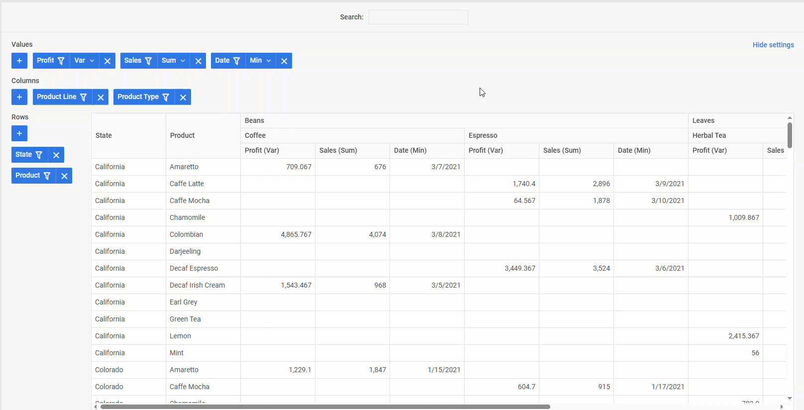
When incorporating a pivot table into a web app with a strong emphasis on international business, it is important to bear in mind existing differences in number and date formatting in various countries. Overlooking this may lead to misinterpretation of data or a poor user experience for global teams.
With the newly added support for locale-dependent formatting in DHTMLX Pivot, you can be sure that date and number fields will be automatically adjusted according to the app’s current locale. You can test how it works by switching between locales in this example and paying attention to formatting changes in the Profit and Date columns.
Date and number formats can be changed at the locale level, but if needed, you can also apply a custom format to specific date and number fields using the format parameter of the fields property:
- Custom number formatting
The format parameter allows specifying the number of fraction digits and integer digits as well as symbols before (prefix) and after (suffix) numeric values:
{ id: "marketing", label: "Marketing", type:"number", formats:{
prefix: "$", minimumFractionDigits: 2, maximumFractionDigits: 2 }
}
]
By default, the display of fraction digits in numeric values is limited to 3, and group separation is applied for the integer part.
- Custom date formatting
The default date format (“%d.%m.%Y”) is set via the dateFormat parameter of the current locale, but you can redefine it via the format parameter of the fields property:
{id:"date", label:"Date", type:"date", format:"%M %d, %Y" }
]
Check the sample >
When formatting for specific fields is not required, you can disable it by changing the value of the format parameter to false.
New Styling Options for Cells and Headers
Styling may not be a factor that directly determines the efficiency of a pivot table in data analysis, but it certainly impacts the usability of such tools. DHTMLX Pivot 2.1 provides a couple of styling novelties to make this process more convenient.
 Check the sample >
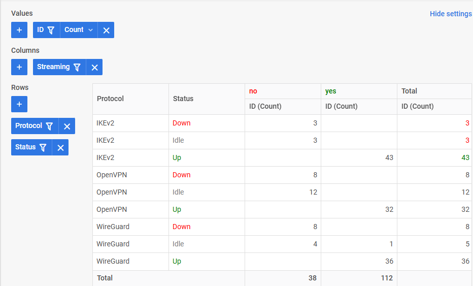
The new cellStyle parameter of the tableShape property gives you full control over the visual appearance of individual table cells. It returns a string that serves as a CSS class name used to add a custom style to a cell.
tableShape: {
totalColumn: true,
totalRow:true,
cellStyle: (field, value, area, method, isTotal) => {
if (field === "status" && area === "rows" && value) {
if (value === "Down") {
return "status-down";
} else if (value === "Up") {
return "status-up";
} else if (value === "Idle") {
return "status-idle";
}
}
}
},
...
Thus, you can dynamically assign a custom style to a cell based on the field name, cell value, part of the table a cell belongs to, and even aggregation operations.
Similarly, you can modify the appearance of headers via the cellStyle parameter of the headerShape property:
cellStyle:(field, value, area, method, isTotal) => {
if(field == "streaming")
return value ==="no"?"status-down":"status-up";
}
}
One more styling novelty delivered in v2.1 is related to the alignment of numbers. From now on, numbers in cells will be aligned to the right (except for headers and tree mode) by default. If needed, you can change the alignment setting using the wx-number CSS class:
.wx-number {
justify-content: start;
}
</style>
These styling enhancements will make your pivot table more readable and informative, which is essential for dashboards, financial reports, and any data-driven apps.
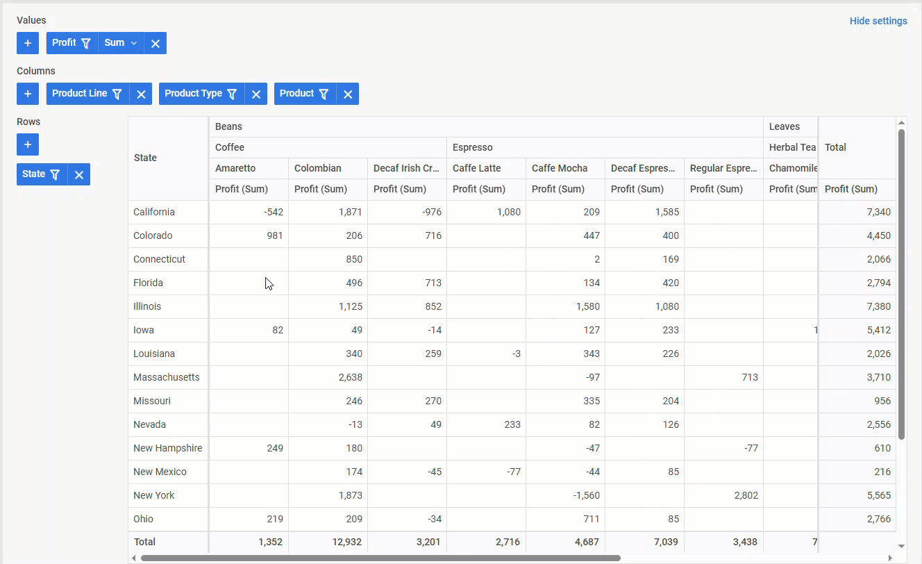
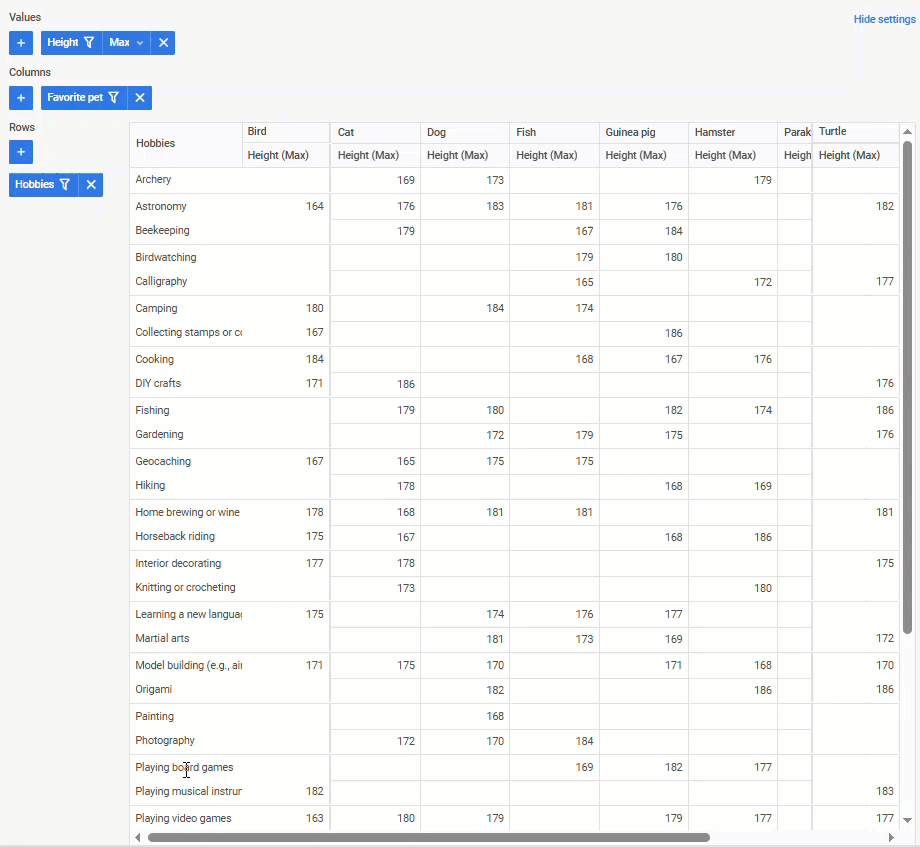
Custom HTML Templates for Pivot Cells
Continuing a series of visual enhancements delivered in v2.1, we are also happy to present a new way of applying custom HTML content in header and body cells with templates. Previously, you could add templates via the corresponding template parameter in the headerShape and tableShape properties. Now, you can go beyond plain text and enrich your JS pivot table with diverse content using the new pivot.template helper.
 Check the sample >
In the pivot table above, you can see several vivid examples of integrating HTML templates in cells. For clarity, here is how you can add flag and star icons depending on their field (id, user_score):
const field = column.fields ? column.fields[row.$level] : column.field;
if (field == "id")
return idTemplate(value);
if (field == "user_score")
return scoreTemplate(value);
else return value;
}
The pivot.template helper function should be applied right before the table rendering. For this purpose, it is necessary to intercept the render-table event with the api.intercept() method:
tableConfig.columns = tableConfig.columns.map((c) => {
if (c.area == "rows") {
c.cell = pivot.template(({value, method, row, column}) => cellTemplate(value, method, row, column))
...
return c;
});
});
Using HTML templates, you can tailor the data presentation in the pivot table to your needs, improving both usability and visual appeal in your app.
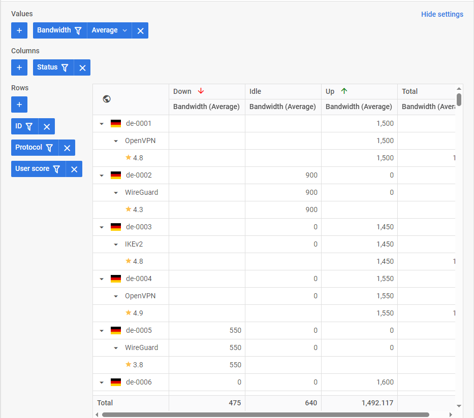
Freezing Right-Side Columns
In v2.1, our dev team also added an option to freeze the pivot table’s rightmost columns (totals or summary fields). While fixing columns on the left has been available since v2.0, the new “right” option extends this functionality for more effective data analysis and decision-making. This feature allows you to keep critical data in sight on both sides of the table when scrolling horizontally through large data sets.
 Check the sample >
Programmatically, you can enable the new option in the split parameter of the tableShape property. Just set the values of the right property to true like in the following code sample:
fields,
data: dataset,
tableShape:{
split: {right: true},
totalColumn: true,
},
...//other settings
});
To freeze an arbitrary number of columns on the right side, you need to intercept the render-table event and define the right property within the split setting of the tableConfig object:
const { config } = widget.api.getState();
tableConfig.split = {
right: config.values.length,
}
})
Overall, the ability to freeze pivot columns ensures greater control over data presentation and simplifies the analysis of large datasets.
Extended Export Settings to Excel and CSV Formats
Data export is another feature of the Pivot component empowered with new configuration options in v2.1. Now, you can deliver more meaningful data exports to Excel (XLSX) and CSV formats that match the specific needs of different users. Whether you want to add the file name, export data without a header or footer, specify styling for exported pivot elements, or exclude any styling – now it is all possible with the new export parameters provided in the options object of the export event. Before new export parameters can be applied, it is necessary to access the Table widget API with the getTable() method for triggering the exporting operation.
Here is an example of expanded export settings to the Excel format:
table.exec("export", {
options: {
format: "xlsx",
fileName: "results", // a name of file, "data" by default
header: false, // export header or not, true by default
footer: false, // export footer or not, true by default
}
});
...
Also, we have to mention a couple of enhancements related to exporting data to Excel with specified formats and templates:
- Date and number fields are exported as raw values with the default format or specified custom format.
- If a field has a specified template, the export will use the rendered value from that template instead of the raw data. Templates have a higher priority over the format even if format is defined for a given field.
The documentation contains the complete information on the new Pivot exporting settings to Excel and CSV.
Other Improvements
Apart from the main features of this release, we also have to mention a couple of minor novelties aimed to improve user experience with DHTMLX Pivot. First, there is enhanced keyboard navigation with a visual indicator.
One more useful addition is the ability to filter data via an external input like in the example below.
In addition, we also expanded the collection of live samples dedicated to providing use-case scenarios of applying the capabilities of DHTMLX Pivot and facilitating your experience with the component:
- DHTMLX Pivot with alternative row color
- DHTMLX Pivot with custom CSS styling for total column
- DHTMLX Pivot with clean rows
Ready-to-Use Integration Demos with Frameworks
The renewed DHTMLX Pivot becomes not only more customizable and functional but also easily adoptable for web projects based on popular front-end frameworks. For v2.1, our development team prepared live integration demos that vividly demonstrate how to integrate DHTMLX Pivot with highly demanded frameworks:
That wraps up the overview of the new features introduced in version 2.1. You can go through the full list of Pivot updates one more time in the “What’s new” section of the documentation.
If you’d like to try out the Pivot novelties before using them in a live project, a free 30-day trial of v2.1 is available for download. Existing clients can access DHTMLX Pivot 2.1 in their Client’s Area.