The modern world of digital technologies allows industries to significantly expand their ability to provide services over the Internet. The most striking example is the ability to order various services through booking systems. Such solutions simplify the lives of both providers and consumers of services. Companies can offer their services 24/7 without attracting additional labor, and customers can place an order anytime without leaving home.
However, the poor implementation of such a system may leave a very wrong impression of the company before potential customers even try its services. Seeing the high demand for this functionality, our team is glad to present the new DHTMLX Booking Widget 1.0 designed to provide reliable booking solutions that can be empowered with our JS Scheduler component.
Flexible Booking Structure
The DHTMLX Booking widget is a developer-friendly JavaScript tool that makes it much easier for developers to integrate the functionality for making appointments on the internet via desktops and smartphones. For instance, it is great for covering appointment scheduling needs in healthcare organizations, beauty salons, barbershops, etc. Our demos show how the new widget can be used in medical facilities’ booking systems.
The interface of our new widget is quite intuitive and easy to navigate. It consists of the filtering area and listed card views with time slots. So, it should not cause any issues among first-time users. You can try it using the sample below.
Check the sample >
The extensive API of the Booking widget ensures high UI flexibility. It is easy to change the default structure of the booking system by performing simple manipulations in the configuration settings.
Card views are specified using the cardShape property with multiple default data fields (card image, category, title, etc.) that can be hidden by setting values of the required parameters to false.
cardShape: {
subtitle: false,
price: false,
review: false,
},
data: dataset,
});
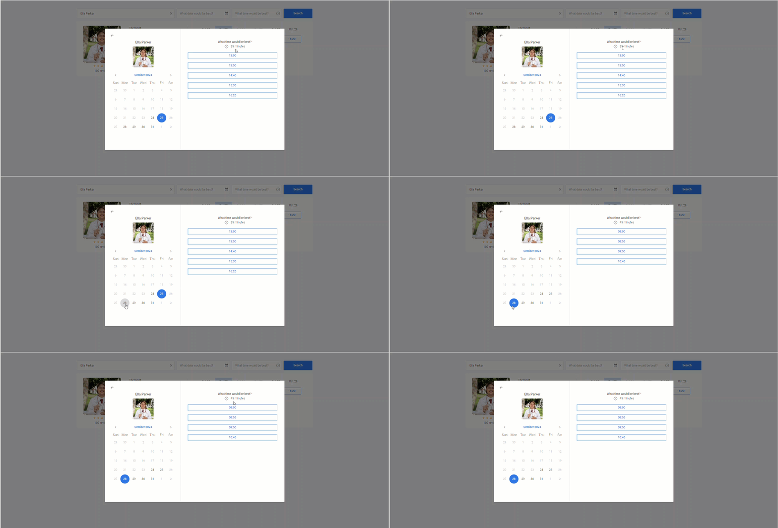
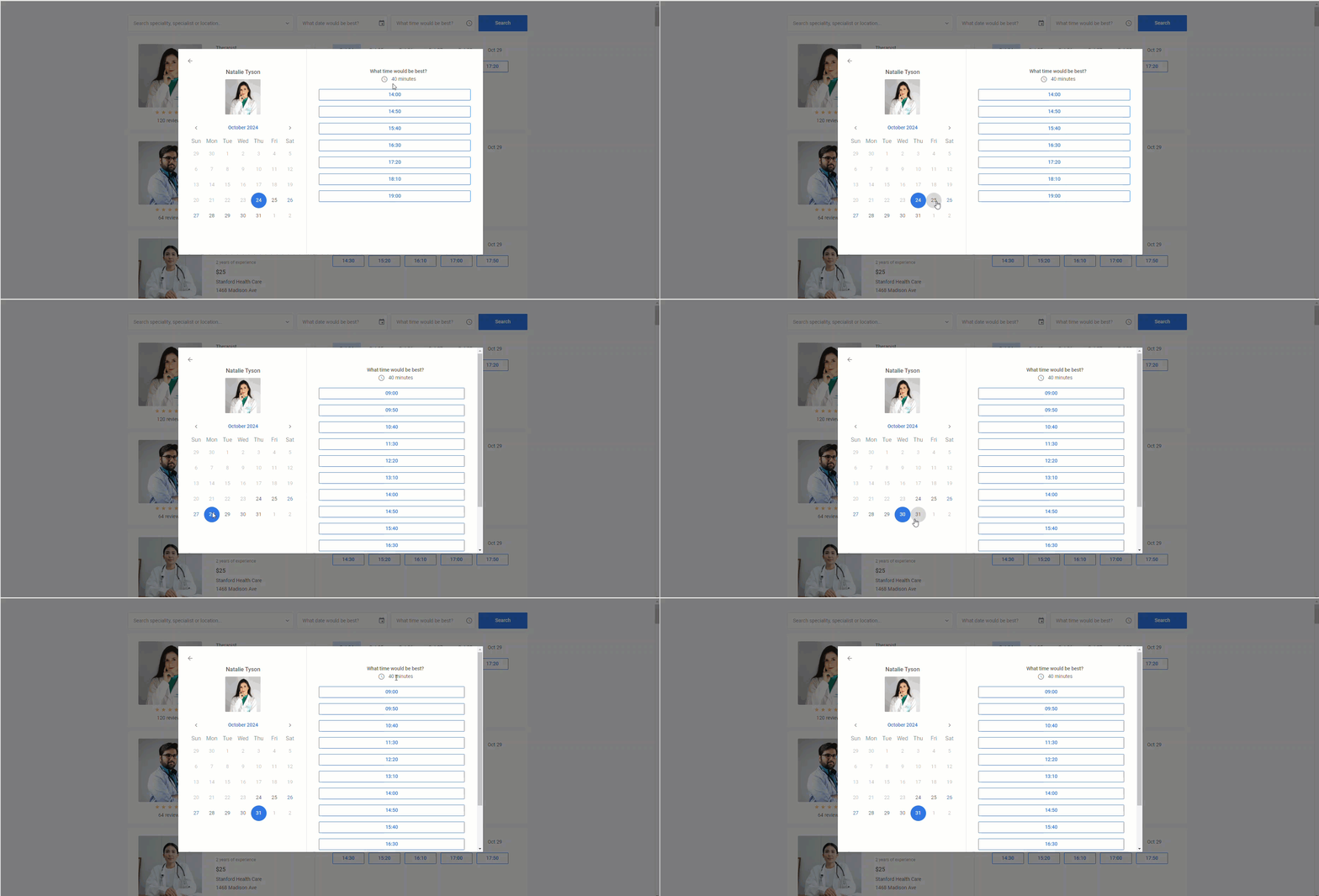
After clicking on any card in the list, end-users get to a single card view, where they can select a specific date in the calendar and choose among time slots available for this date.
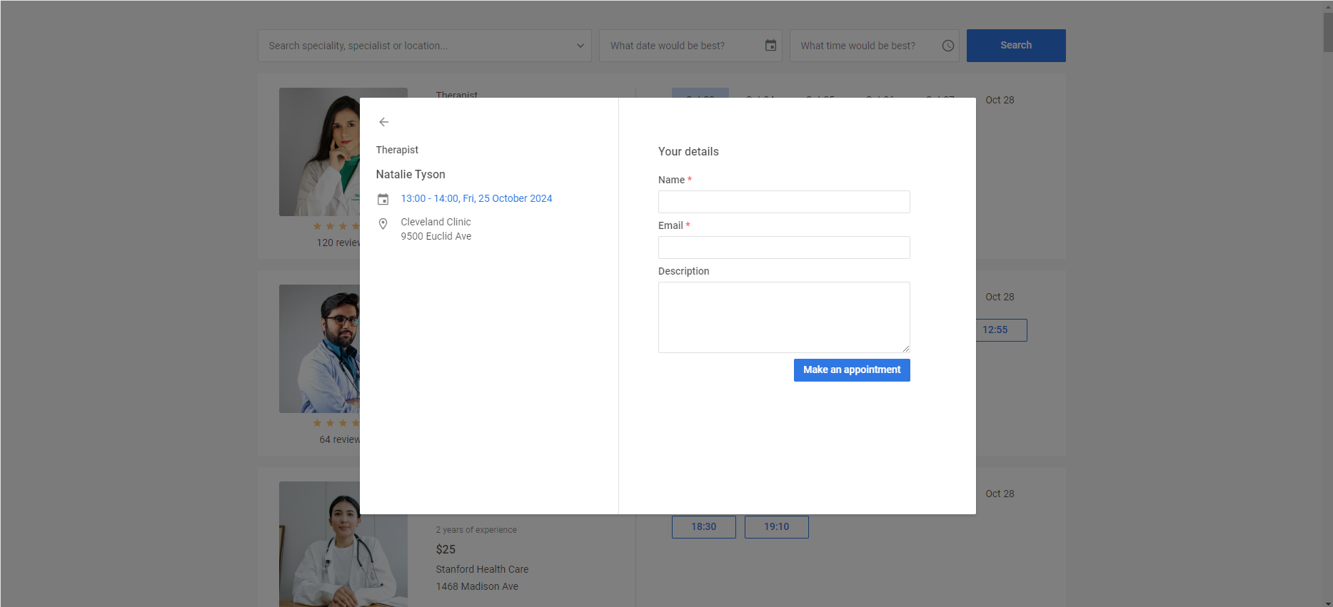
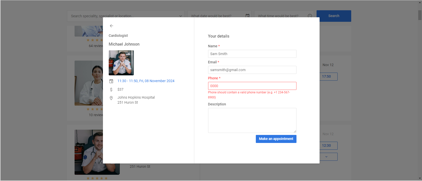
The final stage for making an appointment is a booking dialog, where end-users have to provide some personal info, and it’s done. All the fields displayed in this menu are configured in the formShape property. In this property, you can add new fields to the booking dialog such as “Phone”, make it mandatory for the completion by setting the required parameter to true, and specify validation rules for entered values.
 Check the sample >
The information shown in the left panel of the dialog window is specified via the infoShape property. If any of the default fields are excessive, they can be hidden by changing their value to false in the infoShape property.
infoShape:{
preview: false,
price: false,
},
data: dataset,
});
Working with Time Slots
When delivering a booking functionality, it is nice to have configuration options for implementing a reliable mechanism for working with time slots (time available for booking). And our new Booking widget gives plenty of opportunities in this direction.
From a coding perspective, the rich API for configuring time slots offers a wide range of options for planning schedules. So let us elaborate on the matter.
When reaching the stage of picking a time of the visit to the selected doctor, the booking system must show end-users all available time slots and hide already booked options. There are two different ways to implement available and booked slots using parameters of the data property of our widget:
- availableSlots parameter – an array of slots (timestamp and duration in minutes) that are free for booking. This approach is great for cards with varying time slots.
- all slots + usedSlots parameter – weekly rules and dates with custom slots combined with an array of already booked slots. It is better for cards with fixed schedules.
Time slots for a specific card are created by adding a rule object to the slots array of the data property containing the card’s data. For each card, you can define various rules repeated on a weekly basis such as days of the week, start time and duration (in minutes), and the time gap between the current and the next slot, which are used to form new slots.
A card may have time slots with the same rules for all days or different rules for all or specific days of the week. For such delicate configuration adjustments in duration (slot size) and time gap (slot gap) parameters, you can use multiple options with various priority statuses.
In the example below, most doctors have different durations of appointments and breaks during their visiting hours that can be specified with size and gap parameters in the slots array. Time slots specified this way will have the highest priority.
{
from: 8,
to: 12,
size: 45,
gap: 10,
days: [1, 2, 3],
},
{
from: 13,
to: 17,
size: 35,
gap: 15,
days: [4, 5],
},
If you need to set specific duration and time gap parameters for all slots in a particular card, you can use slotSize and slotGap parameters of the data item.
{
id: "5c9b64ad-1830-4e5b-a5f9-8acea10706df",
title: "James Anderson",
category: "Allergist",
...//other settings
slotSize: 45,
slotGap: 10,
slots: [
{
from: "9:15",
to: 17,
days: [1, 2, 3, 4, 5],
},
],
},
It is also possible to specify global values for duration and gap parameters for all cards using slotSize and slotGap properties.
data: dataset,
slotSize: 40,
slotGap: 10,
});
They will be applied for all cards without specific duration and gap settings.
Note: slot rules for the same day should not overlap for the result to be correct.
It should also be noted that time slot reservations can be saved to the server, thereby ensuring data persistence and simplified integration with other systems. Here is an example, where you can see how it works in practice.
You can continue exploring configuration capabilities for time slots on this page.
Powerful Filtering Capabilities
The filtering feature plays a critical role in optimizing both the user experience and operational efficiency of any booking system. It allows end-users to narrow down available options that match specific criteria.
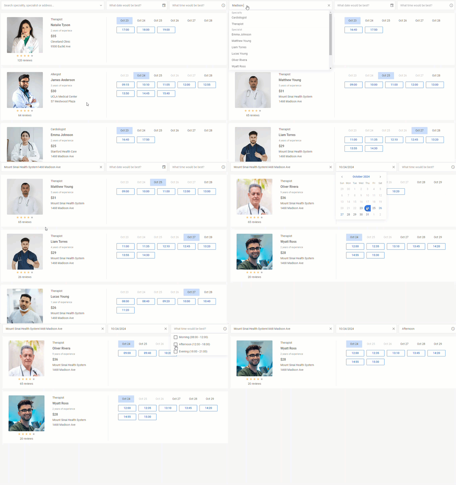
By default, our widget has three fields for filtering data: text (doctor’s name and specialty), date(-s), and time ranges (morning, afternoon, and evening). After filling in all of the needed fields, end-users must click the Search button to apply the chosen criteria.
If the default configuration does not meet your requirements, you can adjust filters as desired in the filterShape property.
For instance, it is possible to hide the search button by enabling the autoApply parameter that instantly puts the user’s input into action like in the example below:
 Check the sample >
If necessary, you can also hide any of the default input fields by changing the value of the corresponding parameter to false.
The text field allows end-users to filter data by different criteria specified in the text parameter of the filterShape property. If needed, you can specify fields by which data is filtered and optionally include them in the dropdown list via the suggest parameter.
Here is how to add an extra filtering field such as “region” and make possible values of this criterion visible in the dropdown list:
filterShape:{
text: [
{ id: "category", label: "speciality", suggest: true },
{ id: "title", label: "specialist", suggest: true },
{ id: "subtitle", label: "region", suggest: true },
{ id: "details", label: "address", suggest: true }
],
},
data
});
A separate word should be said about defining time filtering options in the time parameter of the filterShape property. By default, you see 3 options containing time ranges: morning, afternoon, and evening. For each time range, you specify from and to parameters.
It is also possible to customize default time ranges by defining other from and to parameters for each option or add a new time range (e.g. “Urgent”):
time: [
{ from: "8:30", to: "11:50", label: "Morning" },
{ from: "12:30", to: "16:50", label: "Afternoon" },
{ from: "17:00", to: "19:50", label: "Evening" },
{ from: "20:00", to: "22:50", label: "Urgent" },
],
};
This section of the documentation contains more useful information related to filtering configuration.
Customizable Appearance
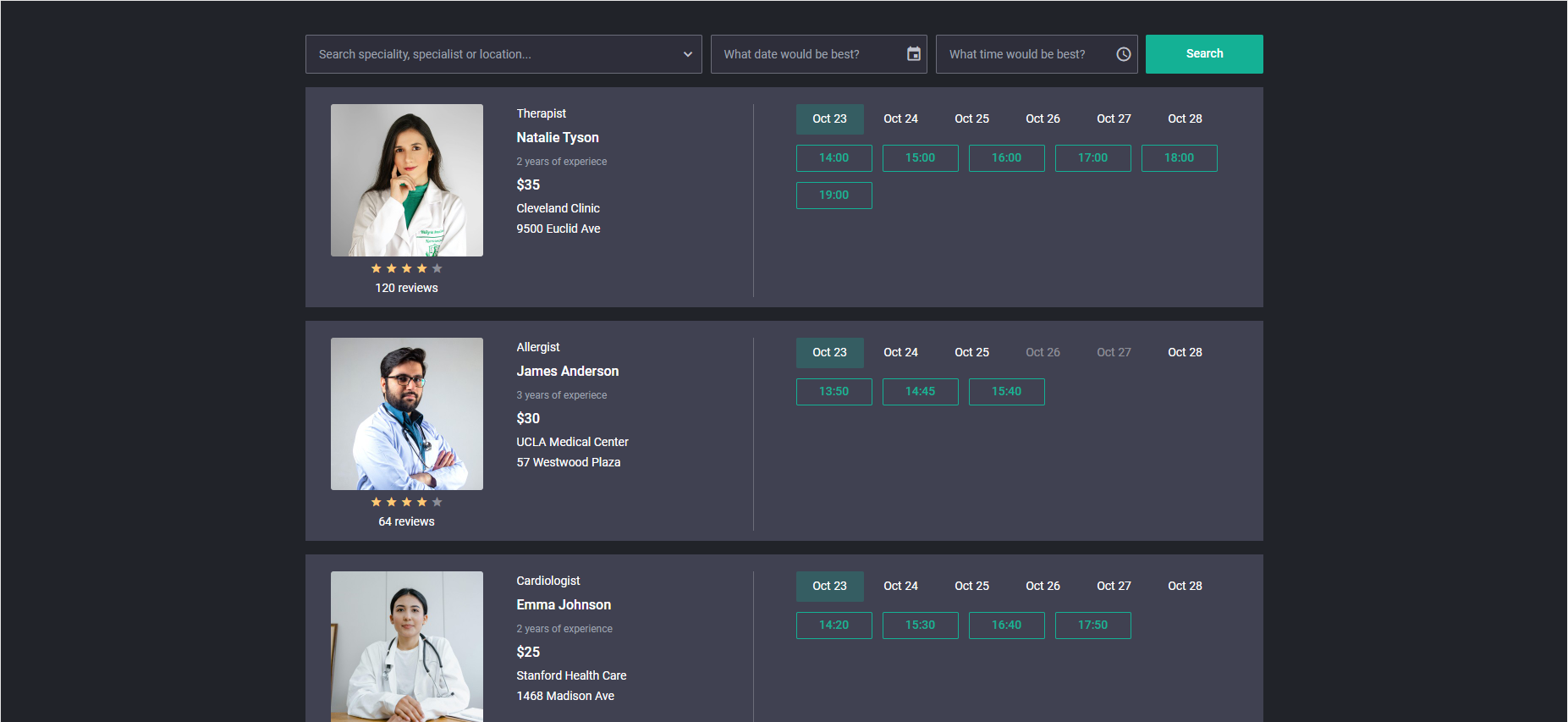
By default, our new JS widget is shipped with one built-in Material theme. It may seem not much so far, right? However, it is compensated by the simplicity with which one can customize the look and feel of the booking system based on our widget. To modify the basic theme or change the style of certain elements, you have to apply CSS variables.
For instance, you can fully change colors in the default theme by using the following code:
.wx-booking{
--wx-background: #404151;
--wx-background-alt: #212329;
--wx-button-background: #7F808C;
--wx-color-primary: #14B195;
--wx-color-secondary-font-hover: #fff;
...//other settings
}
</style>
Localization Support
Our JavaScript Booking widget comes with built-in support for localization with three built-in locales such as EN (default), DE, and CN. You can also easily add custom locales or modify the default one. This feature is important in providing a seamless experience for users from different countries. It helps to adapt textual labels in the UI to various languages and select the required time format, allowing businesses to expand their customer base internationally.
Learn more about the localization feature in the documentation.
Compatibility with DHTMLX Scheduler
The new DHTMLX Booking widget can be a great addition to DHTMLX Scheduler. The first release already includes the integration demo. Using this demo, you can smoothly combine these products to deliver more functional scheduling solutions.
It should be noted that the new Booking widget can be purchased as an add-on to the DHTMLX Scheduler component. It will come at the price of only $29 under any Scheduler license and free of charge under the Ultimate license. Existing clients can also purchase the Booking widget add-on to their current Scheduler license at $29. Please contact our licensing department for details. The DHTMLX Complete Pack, Planning Pack, and Scheduling Pack now also include the Booking widget at no additional cost.
You can go through the initial functionality of DHTMLX Booking Widget v1.0 in this section of our documentation.
To assess the functional capabilities of our brand-new JavaScript widget in real-case scenarios, download a free 30-day trial version.
This step-by-step tutorial will help you to build a modern JavaScript booking app with DHTMLX.
