We are thrilled to announce the release of DHTMLX Suite v8.3! This minor update is shipped with a pack of new features and improvements designed to facilitate your experience with our JavaScript UI widget library.
For instance, we added the ability to set the color transparency level in the Colorpicker widget. In v8.3, popular Grid/TreeGrid features such as auto height mode, HTML content in cells, and event handlers can be specifically applied in the header and footer. Now when Grid and TreeGrid configurations include a column with the “number” type, only numeric values can be entered in the cells of this column. The Form container control became more informative thanks to a new label option. We also added new events to APIs of Suite navigation widgets and a range of useful fixes.
Let us review all the novelties included in the release in more detail.
Colorpicker: Color Transparency Option
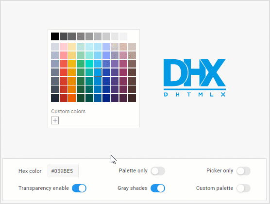
DHTMLX Colorpicker is a handy tool when it comes to implementing color selection functionality in various UI elements such as a form or popup window. In v8.3, we complemented a rich color palette of this widget with the ability to specify the transparency of the selected color.
You don’t have to add anything to the code to allow end-users to play around with color transparency since this feature is enabled by default with the new transparency property. This property is responsible for displaying the transparency scale on a web page.
To set the required color transparency level via the UI, end-users just need to drag the slider knob on the transparency scale as shown in the example below.
Check the sample >
If needed, the color transparency feature can be disabled by setting the value of the transparency property to false.
transparency: false
});
Grid and TreeGrid: New Features for Columns’ Header and Footer
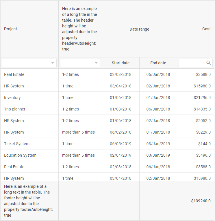
Auto Height Mode (PRO)
Back in version 8.1, we introduced the auto height mode for rows in tables built with Grid and TreeGrid widgets. The new Suite version extends this feature to headers and footers in table columns. Thus, Grid/TreeGrid will dynamically adjust the header/footer height to its content. As a result, headers and footers can contain text of various lengths and still be fully visible to end-users.
Programmatically, the auto height mode for the header/footer is activated by adding the new headerAutoHeight and footerAutoHeight parameters in the Grid/TreeGrid configuration object. They allow switching on the autoheight mode for the header or the footer independently of the common autoHeight property.
Here is how it is done in the Grid widget:
columns: [
...
],
...
autoHeight: false, // enables autoHeight in data (content)
headerAutoHeight: true, // enables autoHeight in header
footerAutoHeight: true, // enables autoHeight in footer
});
Check the sample >
Note that this feature is available only in the PRO edition of DHTMLX Grid.
Bear in mind that if your table should have the header and footer of a particular fixed height, you can also specify them via the already existing headerRowHeight and footerRowHeight properties.
Event Handlers
DHTMLX Suite 8.3 provides you with a new convenient way to add event handlers to the columns’ header and footer in Grid/TreeGrid. Instead of attaching event handlers to the header/footer by yourself, now you can rely on the eventHandlers property to complete this task much faster. If previously this property allowed adding event handlers only to HTML elements defined in the data set or custom templates in column cells, now it is also available for the header/footer cells.
For instance, here is how you can add the onclick event to the master checkbox in the header. This event should fire when the checkbox is marked as checked/unchecked and update all slave checkboxes in the column:
columns: [
{
width: 60,
id: "paid",
header: [
{
text: `
<label class="dhx_checkbox dhx_cell-editor__checkbox ">
<input type="checkbox" class="dhx_checkbox__input dhx_checkbox--check-all">
<span class="dhx_checkbox__visual-input "></span>
</label>
`,
...// more options
],
...// more options
eventHandlers: {
onclick: {
"dhx_checkbox--check-all": function(event, data) {
grid.data.forEach(row => {
grid.data.update(row.id, {
[data.col.id]: event.target.checked,
});
});
}
},
},
});
 Check the sample >
This novelty expands your opportunities to deliver dynamic and interactive data tables with DHTMLX.
HTML Content in Header/Footer Cells
Apart from the auto height mode and event handlers, there is one more Grid/TreeGrid capability added specifically for the columns’ header/footer in version 8.3. Now you are able to complement these table elements with any HTML content using the htmlEnable property.
For example, you can apply the htmlEnable property to change styling in header cells as follows:
columns: [
{ width: 200, id: "country", header: [
{
text: "<span style='font-size:16px; color: steelblue'>Country</span>",
htmlEnable: true,
}
]},
{ width: 150, id: "population", htmlEnable: true, header: [
{ text: "<span class='header-title'>Population</span>" }
...// other columns' configs
],
data: dataset,
htmlEnable: false,
});
When applied for the column’s header (or footer), the htmlEnable property redefines the value of the same config already specified for the parent column or for the whole table.
Grid and TreeGrid: Only Numeric Values in Columns with Number Type
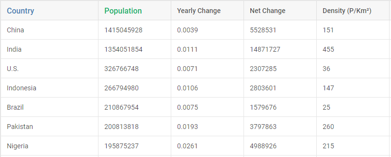
Data tables based on Grid and TreeGrid widgets are frequently used only for working with numeric data. Therefore, we always try to find new ways to optimize this process in line with the needs of our customers. In v8.3, we ensured that grid columns with specified type:number allow only numeric entries in cells. If type:number is specified, you can use two new min and max properties in the editorConfig object for setting minimum and maximum allowed values respectively.
columns: [
...
{
width: 150,
id: "density",
header: [{ text: "Density (P/Km²)" }],
type: "number",
editorConfig: {
min: 5,
max: 600,
},
editable: true,
},
...// other columns' configs
data: dataset
});
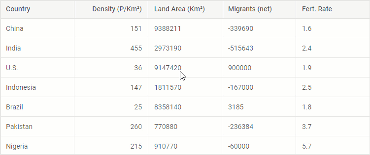
Check the sample >
As you can see in the example above, when entering values that fall outside the specified min-max range from 5 to 600, they are highlighted in red. After closing the editor, the nearest valid number is displayed i.e. 5 or 600.
All new functional capabilities related to DHTMLX Grid and TreeGrid are described above using the examples of the Grid widget. If you are specifically interested in how the same features can be implemented in the TreeGrid widget, visit the TreeGrid properties section in our documentation.
Form: Label in Container Control (PRO)
The container control of our Form widget allows enriching JavaScript forms with custom HTML content and other UI widgets. This release includes one feature related to this control, namely the ability to add a label to it via the corresponding label property. In addition, we also expanded the container’s API with a number of properties for manipulating the label (labelWidth, labelPosition, hiddenLabel, helpMessage). All these additions will help to improve the usability of this control. This sample shows this new feature can be applied to the container control in practice.
Please note that the container control of the Form widget is available in the PRO edition of the DHTMLX library only.
Other Improvements
Now it is time to go through some minor but still useful API updates provided in DHTMLX Suite 8.3.
Navigation widgets (Menu, Ribbon, Sidebar, and Toolbar) of the Suite library received useful additions to their APIs:
- Menu – keydown event
- Ribbon – input, inputChange, and keydown events
- Sidebar – keydown event
- Toolbar – input and keydown events
On top of that, we also added the Datepicker control for the Ribbon widget and a number of useful bug fixes.
The “What’s new” section will help you to make a quick revision of all new features delivered in this minor update.
To test all the novelties provided in DHTMLX Suite v8.3 on a practical level, you can download a free 30-day trial version. Our current clients can access the latest version of the Suite library via their Client’s Area.