DHTMLX Touch support and development was discontinued when all DHTMLX components became adaptive.
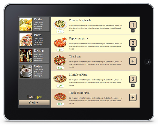
In this tutorial, we will share some experience of using the DHTMLX Touch framework for building mobile web interfaces. You will learn how to use different components, arrange them on a page, set templates, add connections, and combine the components into a single interface. As an example, we will build a restaurant menu application for iPad (it can be used on other mobile devices but the sizes are optimized for the iPad screen resolution).
STEP 1 – Getting Started
First of all, download the latest package of DHTMLX Touch beta, unpack it and include touchui.js and touchui.css files into your web page:
<script src="codebase/touchui.js" type="text/javascript"></script>
Add a special meta tag for correct representation on mobile devices:
Now we should decide about the layout of interface elements for our application. There should be menu categories, a list of dishes in the category, and Order button. So, the application interface will consist of these three sections:
- list of menu categories (pizza, pasta, drinks, etc) – placed on the left
- list of menu items – on the right
- total price counter and “Order” button – on the bottom left
When we place and configure the Layout component on the page, it will look like this:
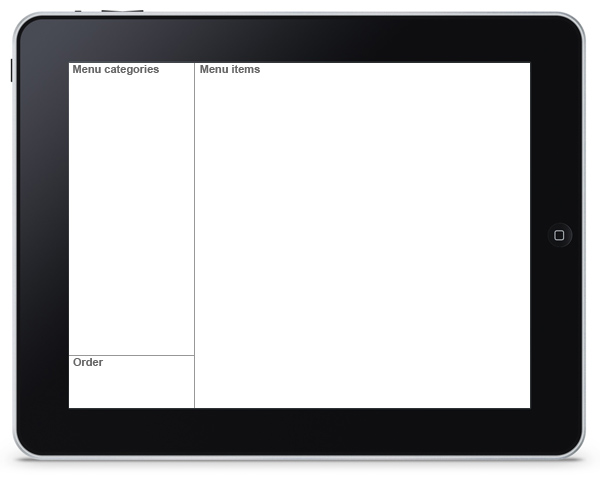
Layout defines global structure of the interface. Later we’ll add other components in the Layout cells, and connect them with each other. According to the scheme we’ve defined for our menu app, we need a Layout with 2 columns and 2 rows for the left column.
Layout is created by dhx.ui({}) construction. To set columns, you need to define “cols” array. If you need to arrange elements vertically one by one, use rows. The Layout structure for our menu interface will be:
cols:[
{rows:[
{...},
{...}
]},
{...}
]
});
If we don’t set width and height for columns and rows, their sizes will be equal. However, we need the left column to be more narrow than the right one. Also, height of the rows in the left column should be different. Therefore, we need to define the sizes manually.
We will initialize Layout from the dhx.ready() method, since the component should be initialized when the page is completely loaded:
dhx.ui({
cols:[
{
width:275,
rows:[
{
template:"Menu categories"
},
{
template:"Order",
height:120
}
]
},
{
template:"Menu items"
}
]
});
});
So, we have placed a Layout on a page and configured it for the needs of our application.
STEP 2 – Menu Categories
To display menu categories on the left part of the page, we can use any of the following components (we also call them views):
- DataView
- List
- PageList
We’ll choose DataView, although other components can be used for this task as well.
In our example we will load the data from XML files. Here is the snippet of XML for menu categories:
<item id="1">
<Img><![CDATA[imgs/pasta.jpg]]></Img>
<Name><![CDATA[Pasta]]></Name>
<Description><![CDATA[Lorem ipsum dolor sit amet, consectetum adipicing elit.]]></Description>
</item>
<item id="2">
<Img><![CDATA[imgs/pizza.jpg]]></Img>
<Name><![CDATA[Pizza]]></Name>
<Description><![CDATA[Lorem ipsum dolor sit amet, consectetum adipicing elit.]]></Description>
</item>
...
</data>
As you can see, an item in menu categories list contains 4 properties:
- id
- Img
- Name
- Description
Creating Template for DataView
Now we need to define a template for ‘menu category’ item and set width, height, margin and padding for it. These settings will differ from the default ones, so we should define a new item type for DataView. Let’s create HTML template of a new type, which will look like this:
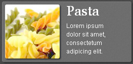
This is our HTML template:
<div class="menu_img" style="background:url(#Img#) no-repeat scroll 50% 50% transparent;"> </div>
<div class="menu_content">
<h3 class="menu_content_header" style="">#Name#</h3><p class="menu_content_description">#Description#</p>
</div>
</div>
And these are CSS classes used in this template:
float:left;
width:108px;
height:108px;
-webkit-border-radius: 3px;
-webkit-box-shadow:2px 2px 3px #2f3132;
margin: 5px;
}
.menu_content {
float:left;
width:100px;
line-height: 17px;
margin:0 8px;
}
.menu_content_header {
font-family:Georgia;
font-size:27px;
font-weight:normal;
color:white;
margin:9px 0 0;
}
.menu_content_description {
font-family:Helvetica, Tahoma, Arial;
font-size:12px;
color:white;
}
To add a new item type to the DataView, we need to use dhx.Type method and pass two parameters: component class and object with type properties.
name:"menu",
template:"html->dhx_type_menu_container",
height: 120,
width: 255,
margin: 5,
padding: 0
});
Dataview Initialiazation
Now we need to initialize DataView in a Layout cell:
dhx.ui({
id:"layout",
cols:[
{
width:275,
rows:[
{
view:"dataview",
type:"menu",
id:"menu",
url:"xml/menu.xml",
datatype:"xml"
},
{
template:"Order",
height:120
}
]
},
{
template:"Menu items"
}
]
});
});
In DataView configuration we’ve set several properties:
- view – view (component) name. In our case it’s “dataview”.
- type – the name of used type. The type that we’ve just created is “menu”.
- id – a view id. It’s required if you need to manipulate with the view (get the view object). We’ll need the id to filter menu items in the right column when menu category is selected.
- url – the URL to a datasource.
- datatype – type of data (can be XML, JSON, or CSV).
Finally, we can move to the dataview style. We have defined how data properties are represented in the menu template, but we also need to set a background color and rounded borders for dataview items. Besides, selected and unselected items should have different styles:
border-right:0;
border-bottom:0;
}
.dhx_dataview_default_item_selected{
border-left: 1px solid #4b4b4b;
border-top: 1px solid #4b4b4b;
background:rgba(255, 255, 255, 0);
-webkit-border-radius:3px;
-webkit-box-shadow:0;
}
.dhx_dataview_default_item {
border-left: 1px solid #7f7f7f;
border-top: 1px solid #7f7f7f;
background:rgba(255, 255, 255, 0.2);
-webkit-border-radius:3px;
-webkit-box-shadow:2px 2px 3px #2f3132;
margin: 0 8px;
}
This is how our page will look after all these steps:
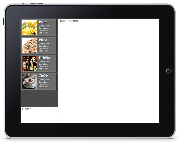
In the next step we’ll create a list of menu items that will be displayed in the right column of the Layout.
STEP 3 – Menu Items
As well as in case of menu categories, we can choose between DataView, List and PageList to display menu items on the right. All these components, or views, fit our purpose, but we’ll choose PageList because it supports scrolling items one by one and controls the position of an item on the page. It means, if user scrolls through the items, the scroll will stop and display the full view of the item.
Again, data will be loaded from XML file. Each data item will contain the following properties:
- id – item id
- Img – image for the menu item
- Name – item name
- Description – item description
- Price – item price
- Count – number of odered items (0 initially)
- Group – name of the menu category to which this item relates. In the 5th Step we’ll use this property for filtering.
XML snippet for menu item:
<item id="1">
<Img><![CDATA[imgs/pizza/pizza1.png]]></Img>
<Name><![CDATA[Pizza with spinach]]></Name>
<Description><![CDATA[Lorem ipsum dolor sit amet, ...]]></Description>
<Price><![CDATA[12]]></Price>
<Count><![CDATA[0]]></Count>
<Group><![CDATA[Pizza]]></Group>
</item>
...
</data>
Creating Template
There are three parameters for each menu item: image, name, and description. There also should be a button for ordering this item, and we shouldn’t forget about the possibility to exclude an item from the order.
Ordering features will be implemented in the last steps when the menu is associated with the order section. In this step, we’ll just create a list of menu items. A menu item will look like this:

HTML template:
<div class="landscape_img" style="background:url(#Img#) no-repeat scroll 50% 20% transparent;">
<h3 class="landscape_price">$#Price#</h3>
</div>
<div class="landscape_body">
<h3 class="landscape_body_header">#Name#</h3><p class="landscape_body_description">#Description#</p>
</div>
<div class="landscape_buy"><div class="buy_outside" ><div class="buy_inside">+</div></div></div>
</div>
We set this HTML container as a template for “submenu” type – a new type of the PageList view:
css:"content",
margin: 0,
padding:0,
name:"submenu",
template:"html->dhx_type_submenu_container",
height: 150,
width: 749,
border:0
});
List Initialization
We’re initializing the list of menu items in the right column of the Layout. We need to set the following properties:
- view – “pagelist” in this case
- id – id of this PageList component, which will be required in the last steps when we’ll set connections between different elements of menu interface
- layout – “y” since we need a vertical list
- type – name of the type created above (“submenu”)
- url and datatype of a datasource
The initialization code will be:
dhx.ui({
id:"layout",
cols:[
{
width:275,
rows:[
{
view:"dataview",
type:"menu",
id:"menu",
url:"xml/menu.xml",
datatype:"xml"
},
{
template:"Order",
height:120
}
]
},
{
view:"pagelist",
id:"submenu",
layout:"y",
type:"submenu",
url:"xml/content.xml",
datatype:"xml"
}
]
});
});
List CSS Definition
The PageList component, which we’re using to display menu items, inherits CSS classes from the List view. Therefore, we will need to define CSS classes for the List.
By default the List, like any other view of DHTMLX Touch, has white background. Therefore, we need to redefine background for the list items, and set additional background for selected items. Also, text in the List items is single-lined by default and we need it to be multi-lined, so we’ll redefine white-space property too:
white-space: normal;
font-weight:normal;
}
.dhx_list_content_item {
background: #e9d4b5;
}
.dhx_list_content_item_selected {
background: #fffcd0;
}
Some notes about these classes:
- dhx_list_item class is applied to items of all List instances on the page. There is only one List instance in our layout, so we can set it safely. In addition, this class is applied to both unselected and selected items.
- dhx_list_content_item class is applied only to the List instance that have type “content” in “css” property (in type “submenu” we have set css:”content”).
- dhx_list_content_item_selected differs from the previous class because it is applied only to selected items.
STEP 4 – Landscape and Portrait Modes
Our menu application will be mostly adjusted to iPad screen size. The screen of the iPad (and other touch devices) can be switched from portrait to landscape mode. We need consider both these modes in our Layout, which works as a container for other components.
We’ll set the fixed width for the left column which contains menu categories. Then we need to change the sizes of the right column and template for the PageList to ensure a correct look of the application in both portrait to landscape modes.
For this reason, we’ll create two views of the menu list: “landscape”, which have been already described above:

and “portrait”:
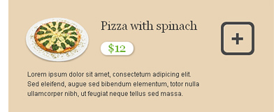
HTML template for the menu item in the PageList for portrait mode:
<div class="portrait_img" style="background:url(#Img#) no-repeat scroll 50% 0% transparent;"></div>
<div class="portrait_header">
<h3 class="portrait_header_name">#Name#</h3><div class="portrait_header_price">$#Price#</div>
</div>
<div class="portrait_buy"><div class="buy_outside"><div class="buy_inside">+</div></div></div>
<div class="portrait_description">#Description#</div>
</div>
Type Definition
Background color and some other properties are defined in the CSS classes that are associated with “css” property of the PageList type. Both “landscape” and “portrait” types will have some common properties. Therefore, we are creating an object that contains common properties and then extend a certain type with properties defined in this object.
css:"content",
margin: 0,
padding:0
}
To add these properties to “landscape” and “portrait” objects, call dhx.extend method:
name:"landscape",
template:"html->dhx_type_landscape_container",
height: 150,
width: 749
}
dhx.extend(landscape_type,pagelist_type);
portrait_type = {
name:"portrait",
template:"html->dhx_type_portrait_container",
height: 210,
width: 492
}
dhx.extend(portrait_type,pagelist_type);
/*landscape type*/
dhx.Type(dhx.ui.pagelist,landscape_type);
/*portrait type*/
dhx.Type(dhx.ui.pagelist,portrait_type);
Now both types have been defined and we need to set “orientationchange” event listener that will change the type of menu list according to the device orientation.
Changing List Type
Screen mode can be checked by window.orientation property that indicates whether the screen is in portrait or landscape mode. If window.orientation returns 0 or 180, we need to set “portrait” type, and if it is 90 or -90, the type should be “landscape”.
To redefine configuration property of any view, you may call define method. And in this case, we’ll need the list id (“submenu”). $$(“submenu”) returns the object of menu list, and we then can apply methods to it. For example, $$(“submenu”).define(“type”,”portrait”).
Here is the complete function that sets appropriate type and adjusts the Layout sizes:
var orientation = window.orientation;
if (orientation === 0 || orientation === 180){
$$("submenu").define("type","portrait");
}
else if (orientation === 90 || orientation === -90){
$$("submenu").define("type","landscape");
}
/*rendering list with the new type*/
$$("submenu").render();
/*recalculating Layout sizes (Layout has "layout" id)*/
$$("layout").resize();
};
orientation();
Setting Event Listener
When the screen of the device changes orientation, browser window fires ‘orientationchange’ event. We are using DHTMLX API to set event listener – dhx.event(object,eventName,handler):
So, our menu will be properly displayed in both portrait and landscape modes.
STEP 5 – Linking Categories and List
Since the restaurant menu may contain a large number of different items/dishes, in our application we’ll filter and display them by categories (pizza, pasta, drinks, etc.). In the right column we’ll show the list of items (the view with “submenu” id) that belong to a menu category selected from the list in the left column (the view with “menu” id).
There are two possible ways to implement this functionality. The first one is to set onItemClick event handler for the “menu” and call filter method for the “submenu”. However, in this tutorial we want to demonstrate the other way – linking views by DataProcessor.
In the DataProcessor configuration we need to define the master view. It will be “menu”, since the list of menu items displayed in “submenu” depends on the category selected by user in “menu”.
master:$$('menu')
});
Then we need to call link() method to associate master and linked views with each other. Views can be linked by some property, for example, “Group” property of “submenu” view relates to “Name” property of “menu”: “Pasta”, “Pizza”, “Drinks” or “Coffee”.
return linked.Group==master.Name;
});
In order to filter the list by default we set “onXLE” event handler for master view and select one of its items:
this.select(2);
})
Actually linking views by DataProcessor solves the problem of asynchronous loading of two different data sources, because “onXLE” event is called after datasource of a certain component has been loaded to the client side.
In our example we need to filter the menu items only when data for both components – “menu” and “submenu” – has been loaded to the browser. If views are linked by DataProcessor, the loading process is managed by inner methods and we don’t have to worry about asynchronous loading.
STEP 6 – Adding Order Button
Now let’s add an order confirmation section to our menu. We’ll place it in the bottom row of the left column of our Layout. It will contain the total order price and Order button. This is how our order pane will look:
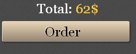
We will use “template” view, as we need to display only one data item with total price. This view will contain the following properties:
- view – “template”
- id – “order”
- css – here we’ll define the CSS class for view, since we need to set background color and remove view borders
- template – template that defines how total price counter and button will look
- data – data object for the template
- height – row hieght
In our previous steps we have used HTML templates. However, a template can also be defined by JavaScript function that takes data object as a parameter. So, now we’ll use this second approach:
id:"layout",
cols:[
{
width:275,
rows:[
{
/*this is dataview with categories*/
},
{
view:"template",
id:"order",
css:"order_row",
template:function(obj){
var str = '<h3 class="order_container_header">Total: ';
str += '<span id="order" style="color:#ffc937;">'+obj.total+'$</span>';
str += '</h3>';
str += '<a href="javascript:void(0)" class="order_container_button" onclick="saveOrder();">Order</a>';
return str;
},
data:{
total:0
},
height:120
}
]
},
{
/*this is menu list*/
}
]
});
Now, when all interface elements have taken their places, we should add a logic for making an order. For that we need to associate the menu list and order view. So, let’s move to the last step.
STEP 7 – Improving Menu Templates and Setting Event Handlers
Changing “Portrait” and “Landscape” Types
In the steps 3 and 4 we have created “landscape” and “portrait” types for the list of menu items. Now we need to modify them a bit. Icon in the right part of the menu item template should be clickbable and display the number of ordered items. Besides, there should be a button to decrease the number of ordered items.

Here is the final template for the “landscape” type:
<div class="landscape_img" style="background:url(#Img#) no-repeat scroll 50% 20% transparent;">
<h3 class="landscape_price">$#Price#</h3>
</div>
<div class="landscape_body">
<h3 class="landscape_body_header">#Name#</h3>
<p class="landscape_body_description">#Description#</p>
</div>
<div class="landscape_buy">
<div class="buy_outside" ><div class="buy_inside">{common.count()}</div></div>{common.state()}
</div>
</div>
and this is “portrait” template:
<div class="portrait_img" style="background:url(#Img#) no-repeat scroll 50% 0% transparent;"></div>
<div class="portrait_header">
<h3 class="portrait_header_name">#Name#</h3>
<div class="portrait_header_price">$#Price#</div>
</div>
<div class="portrait_buy">
<div class="buy_outside"><div class="buy_inside">{common.count()}</div></div>{common.state()}
</div>
<div class="portrait_description">#Description#</div>
</div>
These templates differ from the templates that have been created in the 3th and 4th steps by {common.count()} and {common.state()} constructions (here common represents a view type).
{common.state()} is a result which is returned by state method of a list type. count() method returns “+” or number of ordered items, state() returns empty string or HTML container that will be used to decrease the number of ordered items.
“landscape” and “portrait” types need count() and state() methods. We are defining these methods in the object which properties are inherited by both types:
css:"content",
margin: 0,
padding:0,
state:function(obj){
if(obj.Count>0){
return "<div class='buy_dec_outside'><div class='buy_dec_inside'> </div></div>";
}
return "";
},
count:function(obj){
if(obj.Count>0){
return obj.Count;
}
return "+";
}
}
dhx.extend(landscape_type,pagelist_type);
dhx.extend(portrait_type,pagelist_type);
dhx.Type(dhx.ui.pagelist,landscape_type);
dhx.Type(dhx.ui.pagelist,portrait_type);
Now we need to link menu items with the Order section.
Setting Event Listeners for HTML Elements Inside Menu Item
We need to set onclick event listener to the div container with “buy_outside” CSS class. This listener will add a menu item in the order. In the “landscape” and “portrait” types we have defined count() method that returns value of this container. This value depends on Count property of data items, number of ordered items. So, in the event handler we need to increase Count property and redraw menu item to display data modifications. Also, we may highlight ordered item by select() method.
The DHTMLX Touch library provides a ready solution to set onclick event listener – on_click object. You need to add className of a necessary HTML container into this object and set event handler as a property value:
/*id of the data item by event object*/
var id = this.locate(e);
/*data item by its id*/
var data = this.get(id);
/*incresing number of ordered items*/
if (data.Count == 99){
return;
} else {
i = parseInt(data.Count,10);
data.Count = i+1;
}
/*changing the total price of the order*/
var currentOrder = $$("order").data;
$$("order").data.total += parseInt(data.Price,10);
/*redrawing "order" view*/
$$("order").render();
/*If an item is already ordered, redraw it (apply count).
In the other case, the item is selected (selection causes redrawing)*/
if (this.isSelected(id))
this.refresh(id);
else
this.select(id, true);
return true
};
A similar approach can be used for the container with “buy_dec_outside” className which is defined in the state() method of list types. Its onlick listener will remove menu item from the order:
/*id of the clicked item by event*/
var id = this.locate(e);
/*decrease number of ordered items*/
var data = this.get(id);
data.Count --;
/*changing the total price of the order*/
var currentOrder = $$("order").data;
$$("order").data.total -= parseInt(data.Price,10);
$$("order").render();
/*If the last instance of the item is removed from an order, its selection is cleared.
In the other case, it is refreshed*/
if (!data.Count)
this.unselect(id);
else
this.refresh(id);
};
Now items can be placed in the order and removed, if needed. The total price is displayed above the Order button.
Finally, our restaurant menu application is ready. Its sizes are configured mostly for iPad, but it will also run on other touch devices and in WebKit browsers.
Posted by Alexandra Klenova